
- Time
- Post link
ray_afraid said:
I hate the PT lightsaber handles though. They just don't look the same as the ones in the OT.
The PT lightsabers in general or just the ones that are meant to be the same lightsabers used by Ben and Luke in the OT?

I agree with everything ZkinandBonez said.
I actually like most of the designs in TPM!
I hate the PT lightsaber handles though. They just don't look the same as the ones in the OT.
ray_afraid said:
I hate the PT lightsaber handles though. They just don't look the same as the ones in the OT.
The PT lightsabers in general or just the ones that are meant to be the same lightsabers used by Ben and Luke in the OT?
ZkinandBonez said:
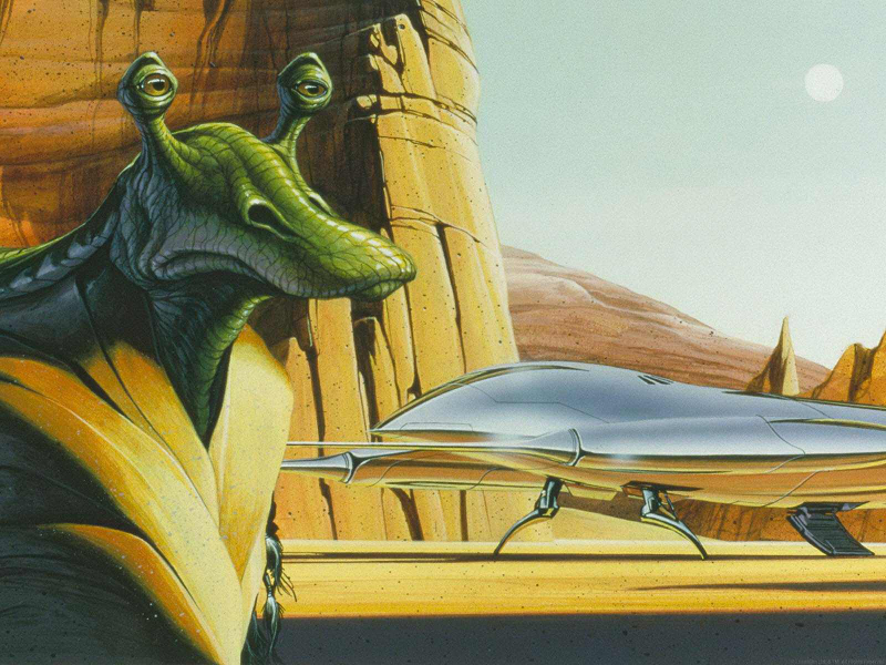
I really like this painting. Jar Jar actually looks like a dignified character, rather than being the complete goof he turned out to be. I'm curious as to who actually made this as it shows a very different version of Jar Jar than all the other concept art that was made.
Looks like Doug Chiang's work to me.
DuracellEnergizer said:
ray_afraid said:
I hate the PT lightsaber handles though. They just don't look the same as the ones in the OT.
The PT lightsabers in general or just the ones that are meant to be the same lightsabers used by Ben and Luke in the OT?
Oh, I mean the new ones.
I don't remember if the ones that are supposed to be the OT ones are good or not.
I remember Dukoos, and I actually liked it.
I just remember all the ones in TPM looking stupid. And cheap.

ray_afraid said:
DuracellEnergizer said:
ray_afraid said:
I hate the PT lightsaber handles though. They just don't look the same as the ones in the OT.
The PT lightsabers in general or just the ones that are meant to be the same lightsabers used by Ben and Luke in the OT?
Oh, I mean the new ones.
I don't remember if the ones that are supposed to be the OT ones are good or not.
I remember Dukoos, and I actually liked it.
I just remember all the ones in TPM looking stupid. And cheap.
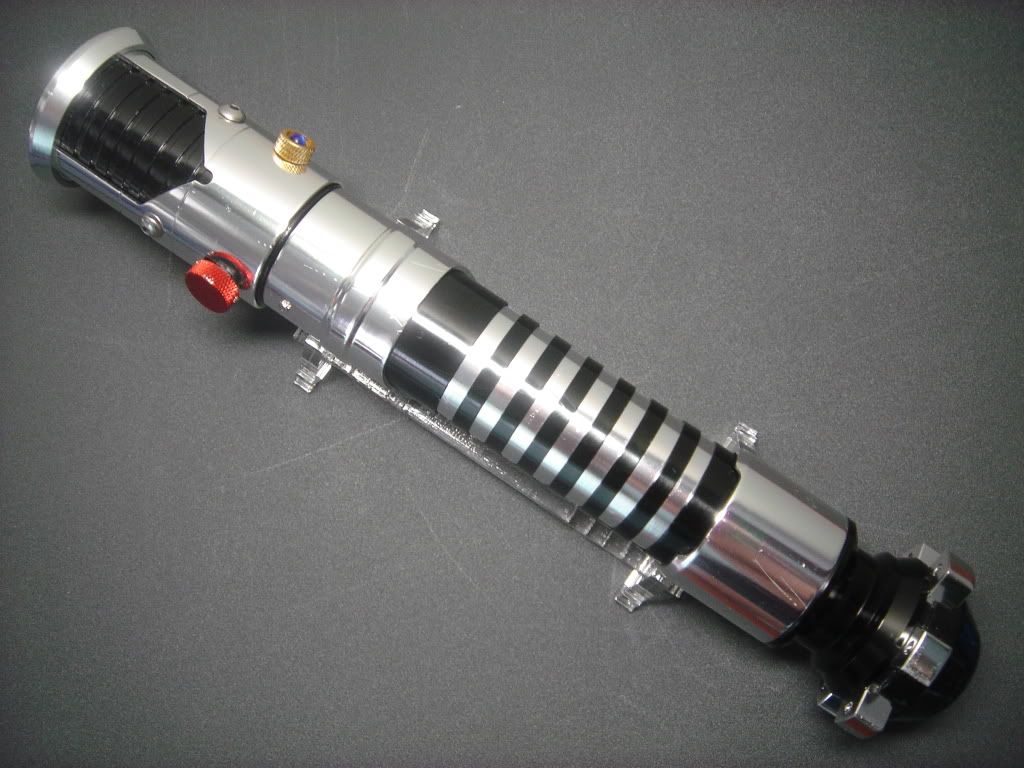
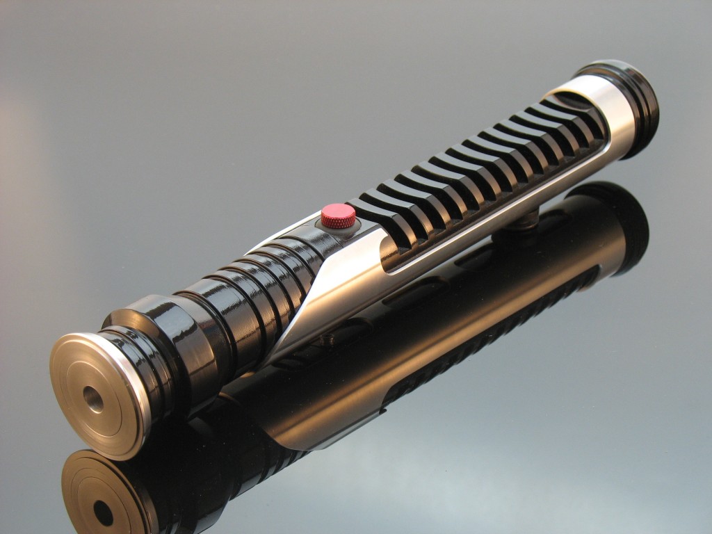
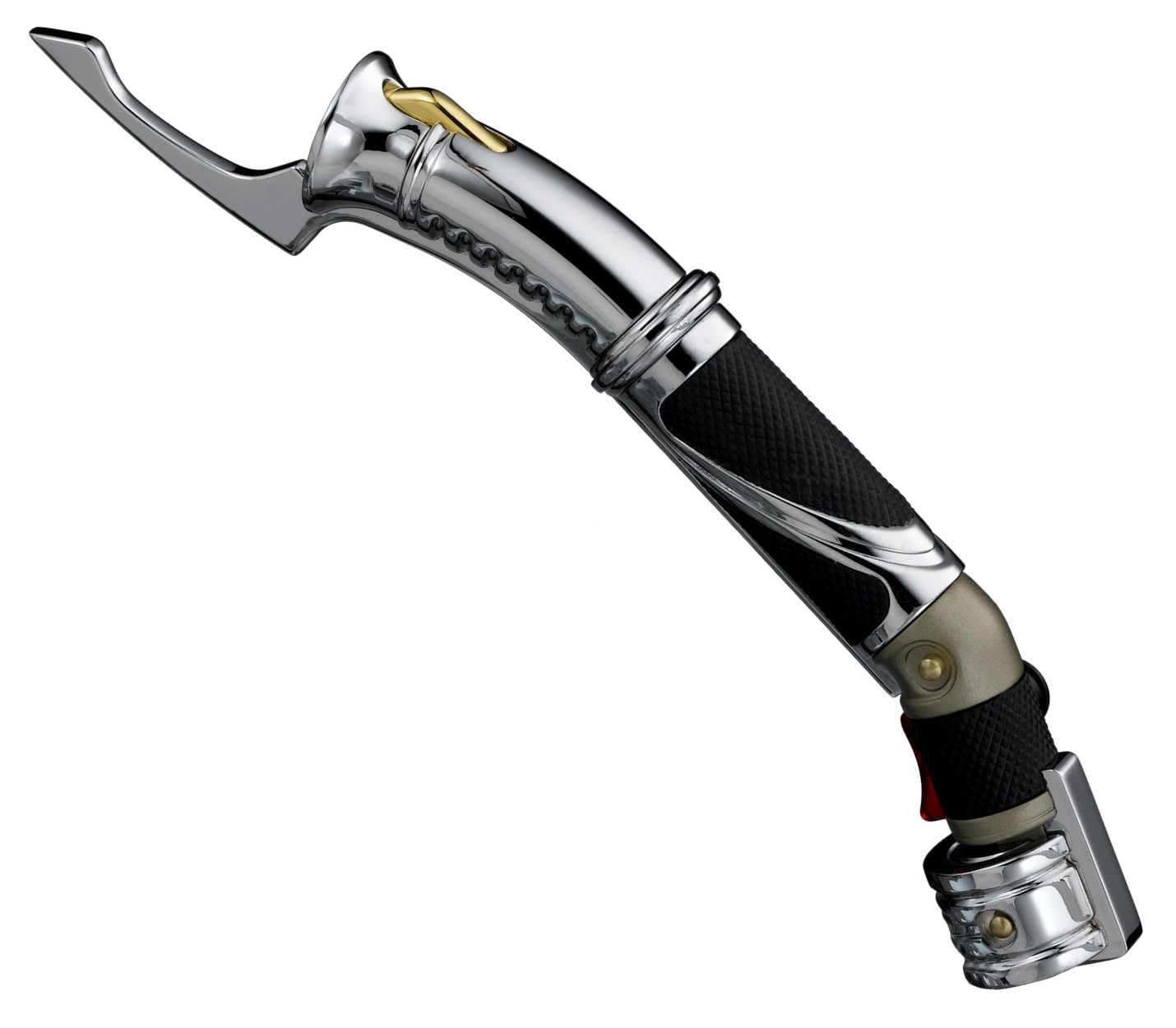
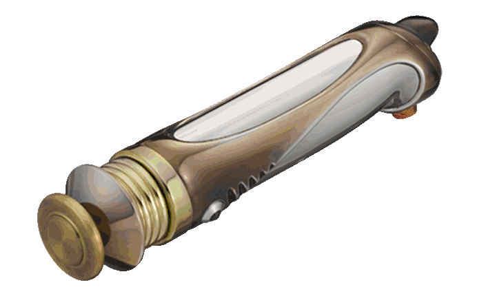
Obi-Wan's first lightsaber, and Qui-Gon's lightsaber.
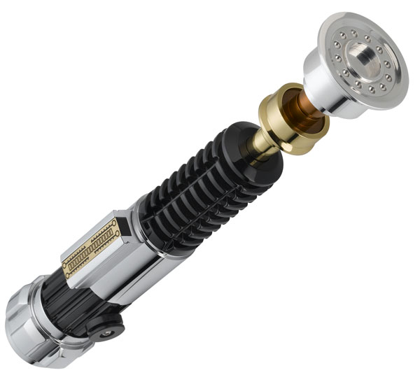
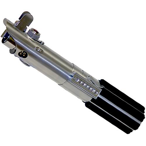
Obi-Wan's second lightsaber (ANH, AOTC & ROTS), and Anakin/Luke's lightsaber. Vader's lightsaber is practically the same design, only in black.
There's definitely a big change in lightsaber designs between the OT and the PT. But then again they were very different in the OT as well. The TPM ones seems more standardized, whereas Obi-Wan'a second lightsaber, which is almost identical to Luke's green saber look more like they've been put together using spare parts. Anakin/Vader's two lightsabers on the other hand always looked more stylized. Might be a reflection Anakin/Vader's ego, whereas Obi-Wan's lighsaber, and later Luke's, have more of a practical look.
It was really AOTC and ROTS who went all out with weird lightsaber designs. Dooku obviously had his weird bent lightsaber hilt, and Palpatine/Sidious' lightsaber was practically made out of gold and silver.
Star Wars is Surrealism, not Science Fiction (essay)
Original Trilogy Documentaries/Making-Ofs (YouTube, Vimeo, etc. finds)
Beyond the OT Documentaries/Making-Ofs (YouTube, Vimeo, etc. finds)
Amazon link to my novel; Dawn of the Karabu.
ray_afraid said:
I agree with everything ZkinandBonez said.
I actually like most of the designs in TPM!
I've always kind of liked TPM despite it's flaws because it's the only PT film that actually feels like a bad Star Wars movie. I prefer my bad SW movies to at least look like they are SW movies. Episode II and III just didn't feel like SW to me.
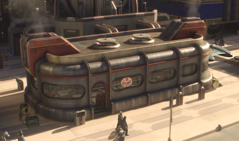
However, one of my least favourite designs in the entire PT trilogy is Dexter's Diner. It looks like something that belongs in an episode of Futurama.


This droid looks like it belongs in an episode of the Jetsons.
I'm also not a fan of the 50's and 60's retro vibe. It's just to obvious to me. It's a design that I think would have been very funny in a different Sci-Fi film, but it feels very out of place in a SW film I think. It's a bit too obvious.
Star Wars is Surrealism, not Science Fiction (essay)
Original Trilogy Documentaries/Making-Ofs (YouTube, Vimeo, etc. finds)
Beyond the OT Documentaries/Making-Ofs (YouTube, Vimeo, etc. finds)
Amazon link to my novel; Dawn of the Karabu.

Design failures:
Naboo
Coruscant
Gungans
Functional wardrobes (i.e. jedi flying in their robes, etc)
Design Successes:
Darth Maul
Jedi wardrobes
Spacecraft, any and all

Any one else but me that liked Sebulba? Granted that the “arms as legs” idea wasn’t that original but i still like the way he was designed. He looks Mean, and has that rugged, worn lock of the OT and would have fitted in nicely on Jabbas barge or in the Mos Eisley cantina. The backstory of him and he’s people is also really interesting. He also beat the crap out of Jar jar, which is a big bonus.
Sebulba’s a-okay with me.

Frink’s edit actually made Sebulba more interesting to boot. 😉
Where were you in '77?

I think Coruscant was good. Especially in AOTC. I must say that I am not inherently against CGI as most of people here.
真実

I must say that I am not inherently against CGI as most of people here.
That’s an awful broad brush you’re using.
I must say that I am not inherently against CGI as most of people here.
That’s an awful broad brush you’re using.
I am not using a brush. I am using a paint roller.
真実

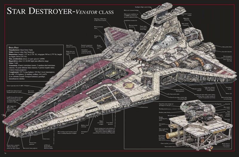
My favorite prequel ship design has to be the Venator class Star Destroyer with the nifty hatch that opens up and reveals hangars and an aircraft carrier-like landing strip:
My second favorite has to be the clone dropship
I’m also a fan of all of Naboo, Darth Maul, Coruscant, the Jedi Starfighters, the art deco-like interiors on Coruscant, the Clone Troopers (especially EPIII) and General Grievous (although I’m not much of a fan of the character)
Things I’m not a fan of: Dex’s Diner, some of the more outlandish alien designs, The super-orange look of Geonosis, the fact that all the clones are CG (effects are another story in general, but I like the designs), some of the more CG-heavy planets (Utapau I’m looking at you)

I think Coruscant was good. Especially in AOTC.
I liked Coruscant in general. The sprawling city, mostly seen from afar, with the 5th Element traffic lanes. Really didn’t care for the ‘night life’ view of it in the AoTC intro scene, though.
I must say that I am not inherently against CGI as most of people here.
That’s an awful broad brush you’re using.
I am not using a brush. I am using a paint roller.
Even worse.

I find the very initial premise of this thread to be a ridiculous matter, even though what came afterwards may have been worthy in a manner.

The technology is almost entirely perfectly designed. Some of the costumes are a bit odd but PT fails in two departments design wise.
Padme’s world defended by gleaming chrome plated Y-wings would have sold the transition better.
You should bring this idea up in “The Prequel Radical Redux Ideas Thread” (if you haven’t already).
Bingowings said:
Creatures, they look too cartoonish and being rendered as CGI does make the the world seem less physically real than even the plastic fantastic of ROTJ.
Well to be fair, creatures in ANH looked worse than the one in ROTJ.
真実
I meant all non-human beings, aliens I guess would be a better term.
But even so the Banthas look like real creatures in a way that The Parrotizard didn’t.
Despite the wonky matte lines the Rancor looks more physically real than any of the AOTC arena creatures.
The burping frog thing in ROTJ looks more real than the farting camel thing in TPM.
Obi Wan riding the farting camel thing’s cousin nearly ruined the end of ROTS for me. 😉
Who rides through a hot blazing desert all day with a baby, when there are faster ways to get out to the moisture farm?
Where were you in '77?

‘Doug Chiang Designing Episode 1 Panel’ from SWCC 2019 (with some great concept art, early sketches and inspirations, plus unused images too):-
A little patience goes a long way on this old-school Rebel base. If you are having issues finding what you are looking for, these will be of some help…
Welcome to the OriginalTrilogy.com | Introduce yourself in here | Useful info within : About : Help : Site Rules : Fan Project Rules : Announcements
‘How do I do this?’ on the OriginalTrilogy.com; some info & answers + FAQs - includes info on how to search for projects and threads on the OT•com
A Project Index for Star Wars Preservations (Harmy’s Despecialized & 4K77/80/83 etc) : A Project Index for Star Wars Fan Edits (adywan & Hal 9000 etc)
… and take your time to look around this site before posting - to get a feel for this place. Don’t just lazily make yet another thread asking for projects.


Scenic visuals for Prequels look very good. With people in scenes they look ‘flat’ or ‘fake’ a lot. A vergence in the films - not just Anakin 😉
R4

Most - if not all - the new alien creature and monster designs are shite.