- Time
- Post link
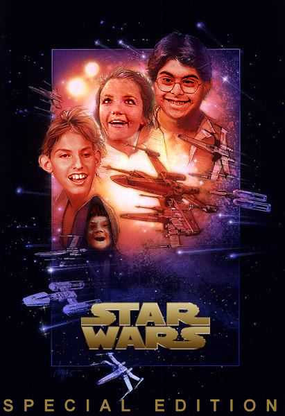
The Star Wars logo used looks pretty budget. There are definitely better versions out there. This one looks to have 'A's that are too narrow and 'R's that have too big an included area at the top. A little attention to the logo, and this bizzle will be off the hizzle.