- Post
- #376213
- Topic
- Info & Ideas: ESB and ROTJ Wishlist
- Link
- https://originaltrilogy.com/post/id/376213/action/topic#376213
- Time
yeh it is pretty funny that its coming out of the wrong end of the saber.

yeh it is pretty funny that its coming out of the wrong end of the saber.
vaderios said:005 add this image to your ROTJ list ;)
http://originaltrilogy.com/forum/topic.cfm/ESB-and-ROTJ-Wishlist/post/343302/#post343302
-Angel
Angel, the blade was correct in the original pic. you shouldn't see the tip of the lightsaber the angle it is at and the blade needs to be more centralised because of the motion blur that the saber hilt would have
I don't think the innards of the arm need anything done to them. It's the arm itself that needs fixing so it no longer looks like a horrible latex falsie
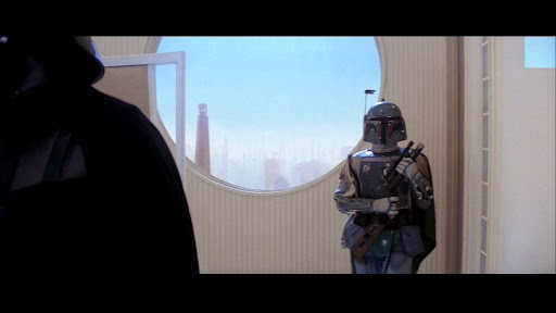
Angel Blue01 said:Darth Venal said:But even with pics, you seem to be mistaken. The building behind Vader is visible out of the window in the second shot because the camera is looking out to the left, whereas in the first shot it's straight on and the building would be off to the left. So that's not a mistake.
And the first two pics of the entrance to the room, are they even looking at the same thing?
I'll grant your first point, it might be a POV thing, just seemed odd to me to have nothing and then something.
But the first two are of whatever is behind Lando, Han and company in front of the Vader dining room, the first one is right before Lando opens the door, the second a few seconds later, there's now a stairway behind Han and company! Lando's in both shots, and he's not moved except to open the door.
Ah, do you mean the window that was added for the SE but they forgot to add it for the rest of the shots? If that's the case then just ask Bingowings. He's seen the fix in the making :)
Angel Blue01 said:Ric Olie said:Angel Blue01 forgot the pic!
Huh, I see it.
Link: http://picasaweb.google.com/lh/photo/mQyHBl4CfzYxyXxeIKeqEw?feat=directlink
no, he meant this post:
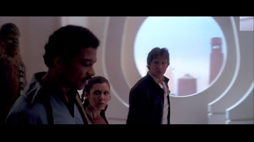
Angel Blue01 said:I apologize if this has been brought up already, but here's a couple of small Bespin details:
There's the entrance to Vader's dining room:
Initially it looks like this:
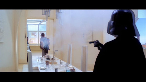
But then it looks like this:
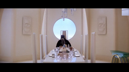
And the space behind Vader changes as well, first like this:
Then a building sprouts up in there:
There are no images showing up
Darth Venal said:He's not getting rid of the FX shot, just using a non-rotating version of it.
I haven't said i'm using a non rotating version. I like the way it rotates
vaderios said:Logicaly, the walls we see in the far shot are orange brown color. but in the close up they are white/lighter color.
What can be done to this shot anyway?
No idea if answered before
-Angel
It's already been fixed Angel :)
ron2112 said:Just to throw in one thing I didn't see mentioned about the galaxy shot (please forgive me if I missed it)... is there a reason they would be traveling intergalactically at that (or any) point in the story? Presumably that's their galaxy (far, far away) and not some other galaxy, right? I can't imagine there's a neighboring galaxy that close, or we would have seen it in countless shots throughout the trilogy. How long would it take a ship, at Star Wars speeds, to get that far outside the galaxy? And what would be the point?
Again, sorry if this has been covered. I try to read every post, but I'm trying to have a life as well. ;)
I like the idea that it is a forming star instead of galaxy. makes more sense to me.
I prefer the idea that its a forming star rather than a galaxy
Check your PM's Bingowings. Your prize has been delivered. lol
Shot 1: Has a red tint in the high levels
Shot 2: looks very washed out. No colouring in the face and mouth and the contrast levels seem way off
Shot 3: Doesn't look too bad but the reds are washed out and there does look to be some issues with the levels
Shot 4: has a green tint to it
Shot 5: Again has a red/ pink tint in the high level areas and looks too desaturated
Shot 6: Looks ok, maybe boost the saturation levels very slightly
Shot 7: looks pretty good :)
Shot 8: Gamma levels way to high. Dark areas are just a wash with noise
Shot 9: Not too bad but a little too washed out again and contrast levels need tweaking
Shot 9: Again has a pink tint and the blues are a little too shifted towards cyan
Shot 10: Too much blue has been removed. It's too monochromatic with a slight green shift.
Shot 11: Looks almost sepia, but i know just how bad some of these cockpit shots are with the colouring to begin with
What method are you using for the colour correction? One thing i found out about these movies is just how much the colour pallet changes from shot to shot. For instance just looks at the shot of 3PO in the command centre as it gets hit and the thing explodes behind him. The whole shot is green. Whoever did the colouring on the official transfers really must be colour blind. lol
Well it's the 1st September here now so the draw for the Workprint has just taken place. All the names were placed into a hat and drawn (even though a few forgot to include their forum names).
AND THE WINNERS ARE.........
First Prize: The Workprint:- GANAMAE
Second Prize: Exclusive Bespin Clip:- BINGOWINGS
Congratulations guys and thanks to everyone that has donated so far
EyeShotFirst said:vaderios said:Its not hate. its Anger!
Lags with quatro CPUs
Windows are in tabs.
Windows overlap other windows and tool boxes.
Repositioned almost all the adjustment and other tools (or whatever call them)
OpenGL features (apart the rotated canvas ) suck.
All i want for CS3 is the rotated canvas. all the rest do the job hell more difficult when you have many images open.
I hope CS5 consider all these... :)
-Angel
I have to agree with Angel on that one. CS3 is just so much easier to use. And faster to boot. It's like comparing XP to Vista. In the end XP just dominates.
It would be interesting to know what CPU you have. Is it AMD or Intel? I haven't found any of these problems with CS4. After effects & photoshop CS4 boot much quicker than CS3 for me and no lagging anywhere
Well i decided to take the plunge and try out After Effects CS4, even though people have said to stay away from it. Well, i'm hooked. It's worth the swap to CS4 for the Mocha software included alone. The motion tracking capabilities are amazing and 1,000,000x better than After Effect native motion tracker and with a handy little free script i picked up to import the mocha settings easily into after effects this is such a must have. Its solving so many problems i had that there is no way i'm going back to CS3. It's so much faster too :)
SilverWook said:Anybody got $20K to spare for this beast? ;)
http://cgi.ebay.com/URSA-DIAMOND-TELECINE_W0QQitemZ310162023416QQcmdZViewItemQQptZLH_DefaultDomain_0?hash=item483718e3f8&_trksid=p3911.c0.m14
Cintel's URSA DIAMOND TELECINE machine is only SD. Their C-Reality version is capable of HD.
doubleofive said:fishmanlee said:oh_riginal said:It's been tough to find things that bother me about ESB, knowing the majority of them are being fixed. I've made many suggestions in this thread (some rejected, some supported), and after all this time, my idea well is running more and more dry!
But... here is one thing I've been meaning to mention for a while, and just kept forgetting to do for some reason... toward the end of the asteroid chase, just before Han finds the asteroid cave, he says "there, that looks pretty good." While he says this line, he points out the cockpit with his finger, implying he VISUALLY spotted it with nothing but the eyes he was born with...
... yet in the next shot, while Leia is asking "what looks pretty good?", the view outside of the cockpit is very clearly NOT showing a cave yet! As they continue flying, only then does the cave appear. How could Han have known there was a cave there? For all he knew, it could have just been another valley!
A fix could be just replacing the footage outside the front of the cockpit to show what Han is talking about, maybe making the cave appear a lot sooner, or making the valley bigger so that they are already flying into it when Leia says the line. Otherwise, it is just illogical to see how Han spotted a cave that he couldn't possibly have seen yet, as he kept the Falcon flying low the entire time.
"What looks pretty good?" Indeed.
um he was saying it about the "ASTEROID" it self
Why would he randomly point out the asteroid they've been flying over for a minute or so already (they lose the TIEs in a canyon on the same asteroid where he points out the cave no one can see yet)?
DarthBo said:There's only two things that always bothered me in ESB. One has already been fixed in the trailer (The Falcon not retracting its landing gear on Bespin), the second is Han pointing at the cave he can't see.
Considering Adywan is rebuilding parts of the asteroid for continuity, I'm fairly sure he'll look at this as well.
I'm only building the canyon part of the asteroid. Building the crater would just be too big and i have a limited amount of space here.
I really don't see a problem with the whole crater thing. Here's how i see it:
Han is a smuggler. he knows of many hiding places to evade capture and has probably evaded the Imperials before by hiding in an asteroid field, or has heard stories of other smugglers using this trick. They think he's crazy when he says he wants to get closer to a big asteroid, but han knows what he's doing. He knows there is a chance of a hiding place. He points as he sees the large crater ahead and then says "yeh, that'll do nicely" as the cave comes into his view
Tobar said:Anyway, would love to see the progress that's been made with the new models Ady. =)
I'm saving all this stuff up for Christmas :)
ryanvb said:Why not just scan the altered scenes, and cut it together with Ady's color corrected HD version? This would save a lot of time and money, at least as a starting point. Not ideal, but at least something would be getting done.
As has been already said the HD have too many problems to do this. For one the blacks are totally crushed. Almost no detail exists in the dark areas. The whole transfer of ANH as a whole was way too dark. ESB, on the other hand, is even worse. Not only is it too dark and has the unbelievably bad blue tint but they have raised the high levels way too much which completely destroys detail in the brighter areas. For an example just look at the SE window shots as they go for the dinner with Vader on Bespin. The buildings and sky have almost disappeared. Yes, i know those scenes wouldn't be used but this demonstrates some of the problems that is apparent in the non SE scenes also.
ryanvb said:Anyways, a lot of this thread seems to be all talk, little action. It's great to see guys like Puggo who actually go out and get this stuff done rather than just get everyone riled up for years.
You see , this is one thing i just don't get. Why do people demand immediate results? How is nothing being done when i have already said that a scanner is being modified to take 35mm reels . Things are getting done but i have said all along not to get your hopes up. It may not work. Now people contacting professional transfer studios about transferring Star Wars is the biggest mistake and i would advise anyone doing or thinking about doing it to stop now. This is the quickest way for this to become a legal matter and get these prints confiscated. In reality, doing this professionally is something i really don't think we should even attempt to do as it takes this down a completely different road. Lucasfilm have been great towards editors allowing them to do all the projects but this could well bring them down upon us all. I for one am not willing to take that risk.
When there is something to show then it will be, but its not a done deal by a long shot.
Just open imgburn, select "write files/folders to disc", add the main folders (BDMV & certificate), in the options tab change the image options to UDF 2.50 then burn
focuspuller said:Don't slap me for saying this, how do I donate again? I did it before but I don't remember. A paypal link right?
yeh, it's through paypal:
adywan(at)hotmail(dot)co(dot)uk
(changing the sections in brackets for the correct characters)
Just a quick update. I'm having a few problems ripping side 2 of the laserdisc for the replacement audio. Looks like my laserdisc player might be on the way out. it keeps spitting out the disc. it plays fine on my mates though so i might see if i can borrow his for a day or two. with any luck the new audio tracks should be showing up soon and there may eb a away to replace the audio in the DVd without having to lose any of the menus, subs etc.
BOBA FETT'S WIFE said:Ady, are we close to getting Return Of The Jedi yet ?
No, unfortunately. I have taken on a bit too much at the moment so its likely to be a 2010 release.
Well just a quick update:
Started building the new hangar miniature to replace the matte in the scene with Ralph McQuarrie's cameo. And i've also begun building the new Wampa puppet. Not looking forward to attaching each individual hair on the face though.
Also just a quick reminder that its now less than a week until the draw for the workprint so if you still want to get into the draw then you have 6 days left. So far there is 6 people in the draw so your chances of winning are good. I've decided to give a runner-up prize of an exclusive clip which will be the cloud city approach and meeting of Lando
rcb said:Bingowings said:The easiest and obvious remedy for this 2004 problem is to return the hologram conversation to it's 1980 text but with Ian's voice (like what Ady has already done).
HELL NO!!!
He doesn't sound old enough to be the emperor, at least, not the one i'm used to.
ady, btw, has blended the two voices together and that works for me.
No, i haven't blended the two Emperor voices. i used Ian's voice from the 2004 DVDs but timed to match the original emperor.
Yeh, there's a huge problem with Seagate drives. Not sure if this will help at all
I can't believe that you're saying that this project couldn't even come close to the GOUT using the scripts. All the scripts in the world can't replace detail that isn't there. And its been already mentioned but the GOUT suffers with so many things including the DVNR smearing, interlacing artefacts among others. Plus the GOUT was taken from a non anamorphic Laserdisc master while this will be a scan from an anamorphic print. A home scan just can't compete with a professionally done transfer which is why we are sticking to a DVD release only. Even though it will be scanned at a high resolution it would only look like an upscaled anamorphic DVD if we decided to do it as a HD release but the detail in the DVD version will still be greater than the GOUT could ever wish for.
And yes, we had been contacting transfer houses and they all said the same that they won't touch it or that they would want upwards of $10,000 to do it and also some sounded a bit dodgy, so there was no way we were going to take the chance of the prints being taken.
If the mods to the scanner don't work then it the end of this project. There is no way it could possibly done with a flatbed scanner.
digitalfreaknyc said:I'd hate to be the party pooper but...damn. SD only is a serious bummer. DVD is so ridiculously backwards. My interest in this just dwindled to nil.
Don't think that i don't appreciate the time and effort of those involved but is it really worth it for just a DVD version?
Shouldn't we wait to do the real "work" when the job can be done properly and the best that it can? What if something happens to one of the reels on an SD-only project? Wouldn't it seem like an "all for nothing" situation if it were ruined for a DVD?
Just my thoughts. I dont' mean to offend.
yes, a HD version would be the ideal, but lets face it we have to be realistic here. No professional transfer house will touch this with a barge pole. Even a DVD version will still be better than what we have now: the GOUT.
worst edit ideas?
Gl's final Blu-ray version includes changes to the OT to match the PT:-
ANH:
In Mos Eisley, as they approach the cantina, 3PO steps in some Ronto poo
All the stormtroopers are re-dubbed with Morrison's voice
Mark Hamill is hired to provide new dialogue that turns Luke into the Ric Olie of the OT. Eg.
"Oh look. Stormtroopers. And it looks like they are going to stop us"
"Oh look. Obi-wan has cut his arm off"
"Oh look. It's yavin 4. This is the secret base of the rebel alliance"
"Oh look. There's leia. And it looks like she is going to give us medals. Well maybe not you, Chewie"
An extended lightsabre fight with Obi-Wan and Vader replaced by CG so Obi-Wan can now do back-flips and they can both twirl their lightsabres for 5 minutes without making contact.
Biggs is removed from the movie and replaced with jar jar and the deleted scenes at Anchorhead are restored with the new character.
"Meesa gonna jump ship. meesa gonna join the rebel alliance, Luke".
ESB:
The taun-Taun farts when it becomes nervous
The AT-At's are replaced with 40ft CG snowmen that throw snowballs at the rebels instead of firing lasers, to be more child friendly and also to coincide with the Hasbro cuddly Imperial snowman range of toys
Yoda become CG and floats around on his hovver-board instead of being carried on Luke's back
Chewie no longer strangles Lando but instead happy slaps him few times while filming it on his mobile to appeal to the youtube audience
ROTJ:
The rancor is removed and replaced by the CG monster from Cloverfield
All of jabbas court are replaced by Disney characters for the new tie-in range of toys
The Sarlaac beak is removed and replaced by a giant sphincter and now farts instead of burps and has giant haemorrhoids instead of tentacles
The Mon Calamari are replaced with gungans. Admiral Acbar now becomes Admiral Acbarbar
The ewoks no longer use weapons but instead tickle and hug the Imperials into submission
New Ewok characters added including Barbie ewok, Lego Ewok and Ewok Bratz to again coincide with a new range of merchandise
All communicators are replaced by the latest iPhone
As Luke is brought before the Emperor he walks over to Luke, pricks his finger and analyses his blood - " The force is strong with you, young skywalker. Your Midichlorian count is off the scale. Much like your fathers"
The ewok celebration is again changed. This time Ewoks, played by Miley Cyrus and Britney Spears, perform a benefit concert.
Luke and leia begin to glow as millions of tiny creatures appear:- the midichlorians come to party
Sebastian Shaw's ghost is replaced by a creepy looking Hayden Christensen (please tell me this didn't actually happen and its just a bad nightmare i had)
nero isn't the best program to burn DL-DVD's. Just download and install IMGBurn. Just google it and it's free and the best burning program i've used