logo Sign In

Ronster

User Group
Members
Join date
10-Dec-2011
Last activity
10-Jul-2025
Posts
3,142

Post History

Post
#1037133
Topic
Idea & Info: Highlander (1985) US theatrical cut, anyone?
Time

I have quite a few versions of this film on DVD and Blu Ray but I sold my old copy and got the immortal edition.

I got a DVD version off e-bay of the old version it was £1.00 and was free with the Sun Newspaper. It much better than the Immortal edition with weird colors.

It looks fantastic! I think it looks really nice. I think it might be the old Studio Canal version. It looks like the VHS anyway but in good quality.

I also got the extended Soundtrack and was planning to do an edit on this restoring some music cues and deleted scenes from the Kurgan fight.

I also really want to replace the background of when the Kurgan kills Ramirez and put real sky behind him when he is up the tower. One Day perhaps…

I have some pieces of the pie but not all of them.

Post
#1037100
Topic
Neverar's A New Hope Technicolor Recreation <strong>(Final Version Released!)</strong>
Time

confusedgambler said:

I’m sorry to disagree, perhaps I don’t understand but R2 looks blue to me, at least in this shot.

DrDre said:

For those that are wondering, the bootleg williarob posted is actually a pretty good color reference. It’s colors are very vibrant, and there are a few surprises:

Green corridor, but no blue R2-D2.

Sorry not trying to steer the conversation away but this shot is Interesting because It’s Clearly not color making it’s way in from Shadows like the Green walls. All of this Color on R2-D2 is coming in from the Middle range and tops that rules out that it’s not contrast issues coloring R2-D2 so vividly.

But it looks quite a turqoise light or Cyan light on him Yes? But when you account for missing Blue and probably having to increase Green and Red Contrast to remove bleed and decrease blue contrast bringing out muted highlights and I am sticking to my guns that this film is missing Blue Push at the top and the middle definitely in my opinion.

He will actually look less Cyan or Turqoise and more blue at least that is how I think it is “meant” to look. So this would not fall in to the catagory of a contrast color Bleed because it is in the middle and top of the color range. Which entirely rules out that it’s color Bleed coloring R2-D2 because of it being in the Highs and Mids. But it’s not Cyan light if that makes sense.

Post
#1037076
Topic
Neverar's A New Hope Technicolor Recreation <strong>(Final Version Released!)</strong>
Time

DrDre said:

The colors are very similar to those of the 1977 bootleg, albeit slightly less yellow. However, both the bootleg and the above photos point to a warmer yellowish tone:

Do you think that might be something to do with the actual technology of the time though? Pretty much every film from the 70’s has a yellow tone. That is too much of a coincidence.

I know when I went through Hell with Enter the Dragon with Color and Contrast issues and that is from 1973 and it’s obviously a different film all together but Blues were always quite muted from this era of film and Reds are way up with Greens. It’s like the Blue Color Spectrum did not quite make it to 70’s films.

At which point does Brightness and Contrast get introduced to a film scan?

I have no idea but I can imagine Brightness and Contrast easily being a factor introduced with either different scanning technology and / or better scanning technology. Nobody wants the horrible Contrast of the Old VHS days. The fail safe being Put the contrast and brightness up really high probably to avoid losing information when transferred to tape or simply the transfer technology was awful by today’s standards.

I think whatever analysis you are doing you are very much ignoring Brightness and contrast and are getting a bit confused by Color Bleed from Bad contrast issues. It’s messing your calculations up and you are not taking in to account how bad contrast can screw it all up. If it’s not neutral contrast you will have color Bleed and color that should not be in the image.

Rule of thumb 70’s films yeah Blue is missing in action.

Post
#1036470
Topic
Neverar's A New Hope Technicolor Recreation <strong>(Final Version Released!)</strong>
Time

DrDre said:

Ronster said:

^ That is right Blue R2-D2 in the Escape pod I think.

This hallway shot It’s all just brightness and contrast issues particularly green contrast being too high not to mention like that technicolor print it’s had a MEGABOOSTER put on it with no Shadow what so ever.

I took a screen grab after looking at the brightness and contrast issues that were very clearly apparent in the old prints small blue push and really this all just boils down to contrast issues.

This is what I get when adjusting the contrast from Willarobs old screen print which has an acceptable Brightness and Value.

It’s a problem with Green contrast bleeding in to the image. The shot is meant to be a bit more Blue like this at the top end that is all to stop R2-D2 and Leia looking yellowish.

The focus of the shot should be what is lit and the new Versions of Star Wars do a pretty bad job of brightness and Value boosting the image beyond what it was ever intended to be. It’s really that simple. You need Shadows and lit focus and then you get the meaning of the shot composition rather than seeing everything there is to see and being boosted up ruining the light levels.

I’m not sure if you are aware of this, but the frame williarob posted, and which you appear to use, is from the 1997 SE, which does not have the strong green cast, that the 1977 prints have. They altered the color timing for the SE.

It had green contrast increased because it was a problem.

It should definitely be in shadow the walls. It is not lit hardly at all.

This is what I am trying to tell you it has been boosted up destroying the light levels. It is meant to be dark and have shadows. That is the most important thing I am trying to get across to you.

If it had a green contrast issue they decided it was more aesthetically pleasing to irradicate it. And I don’t blame them.

It is not really changing the color but it is changing the contrast for which there was a problem with it.

Post
#1036451
Topic
Neverar's A New Hope Technicolor Recreation <strong>(Final Version Released!)</strong>
Time

^ That is right Blue R2-D2 in the Escape pod I think.

This hallway shot It’s all just brightness and contrast issues particularly green contrast being too high not to mention like that technicolor print it’s had a MEGABOOSTER put on it with no Shadow what so ever.

I took a screen grab after looking at the brightness and contrast issues that were very clearly apparent in the old prints small blue push and really this all just boils down to contrast issues.

http://www.mediafire.com/convkey/836c/vyqilt1wqfpu492zg.jpg

This is what I get when adjusting the contrast from Willarobs old screen print which has an acceptable Brightness and Value.

It’s a problem with Green contrast bleeding in to the image. The shot is meant to be a bit more Blue like this at the top end that is all to stop R2-D2 and Leia looking yellowish.

The focus of the shot should be what is lit and the new Versions of Star Wars do a pretty bad job of brightness and Value boosting the image beyond what it was ever intended to be. It’s really that simple. You need Shadows and lit focus and then you get the meaning of the shot composition rather than seeing everything there is to see and being boosted up ruining the light levels.

Post
#1036181
Topic
Neverar's A New Hope Technicolor Recreation <strong>(Final Version Released!)</strong>
Time

It looks fine being green walls and dark. They don’t look very green at all they are in the shadow.

This is a case of something being over bright I don’t understand the fuss now at all. I thought you were saying the walls should be bright green?

Like in the Technicolor print…

With the stills you posted previously now you post these and I really am struggling with where this is going.

I am sorry Neverar Great I agree with the Grotbags lighting witches and so on. But now It’s very clear that it’s shadow green from the Cyan light.

I think you could just as easily leave the shot uncorrected and I personally would not notice too much difference between what is available today and the print you just posted uncorrected on that shot. There is very little difference at all. A bit of green in the shadow.

If however it looked like the Technicolor print well do you think the technicolor print is over bright?

it certainly looks that way then to me and that would explain things or at least clear this up as green shadow from cyan floodlight yeah no problems.

Post
#1036099
Topic
Neverar's A New Hope Technicolor Recreation <strong>(Final Version Released!)</strong>
Time

Something like this is a distinct possibility in terms of the Lighting we can see in the film set. But there are no lights directly behind the camera.

I’m willing to concede that the flood light is Cyan and lighting the Corridor punching through the Red Lights making them look pink.

I don’t know if this is acceptable as you will argue that if you apply the settings I used here to another shot will mean that it can not be possible and by logic that this one is wrong because another shot will look the wrong color.

I think you need to accept that some shots in the film no matter what reel they are in depending on who filmed it are totally up the spout. That’s not an attack or anything A reel of film is assembled from many different camera shots and some of those a few particular offenders are wrong no matter what version of the film you watch.

But I am willing to concede that it could be Cyan from the floodlight no more than this as it is not possible any other way.

In all honestly If you apply the same logic to the Jumpsuits of the Rebel Pilots some of them are bright pink in the Original film no doubt in your Technicolor print too. So that means they put Luke in a Pink flight suit for Kicks for a few shots or they thought they would randomly swap the color of the costumes about for a laugh or something. I think you need to just accept it’s got issues with it and perhaps resolving them or reproducing them is a one way or the other approach.

I don’t know what the purpose is really or the point it’s either Green walls or not Green walls there does not seem to be any rhyme or reason to accepting anything else but I’ll try and provide you with this alternative which no doubt you will reject.

Old Floodlights were always a very Cyan white so this would make sense it’s clearly a floodlight too.

I would say there is a similar Floodlight the other end of the corridor providing the light on the front face of the panels.

This is the only other option in my eyes. But even then it would not be that Cyan either and the floodlight has no Gel in it.

Post
#1036053
Topic
Neverar's A New Hope Technicolor Recreation <strong>(Final Version Released!)</strong>
Time

towne32 said:

Ronster said:

nope the panels are not green, all of the green is at the bottom end of the color spectrum and green being the most luminous color would not act like this.

by the laws of physics it’s impossible.

You mean this color spectrum?

I don’t really mean to be antagonistic but, well, you’re being pretty damn antagonistic in this thread. I’m not sure why you’ve become a color expert overnight. You’re arguing about physics you surely can’t back in this thread, and you’ve started another thread where you stole the work from someone else’s color correction and claimed it as your own.

And this is coming from someone that agrees with you about the green. I don’t like it aesthetically, and I think it’s bizarre that prints look like they do. Hell, green and yellow color throughout SW 2.5 compelled me to spend a huge amount of my time tweaking it. But let’s not make claims we can’t back…

No I worked with Lighting for a lot of years. Green is in the middle spectrum right. Red is right up the other end of the Spectrum to the right. That means that it has no chance of Punching through the green light so precisely from a reflection. It would punch through if the light was pointing straight at it.

It could be lit a gentle cyan gel allowing a lot of white light through but definitely not green or any sort of Lime is a bit of a stretch there.

I am not being antagonistic at all sorry If I am coming across that way. I honestly think it’s a mistake. I am not a color correction expertise extraordinaire, but I am pointing out that it’s definitely not lit green. I am trying to be helpful. I don’t know if you like or agree with what I am saying though.

If you want to believe it’s lit green I don’t mind.

Was this not the same print with the mint green walls all over the Tantive IV?

So basically by this pattern of thought all the lights had green gels in them?

I mean by power of deduction I am not sure how this is debated as some sort of mystery for so long, personally I think it is a problem with the print. If everything is green it’s unlikely the LD decided to light everything green no matter what environment they were in?

I think you can reproduce the colors of a print for fun or you may as well just have a guess and go about trying to fix it and make it look acceptable and enjoyable.

I think that is really the solution.

I don’t know the answer it does not look right though. So it probably is not right. Hold on to that.

Post
#1036023
Topic
Neverar's A New Hope Technicolor Recreation <strong>(Final Version Released!)</strong>
Time

nope the panels are not green, all of the green is at the bottom end of the color spectrum and green being the most luminous color would not act like this. If there was green light you would see more light on the front faces of those tanks on the wall and the red light would not pierce so precicsely through it.

by the laws of physics it’s impossible.

If they decided to make the whole bottom color range green either by accident or on purpose it looks like a mistake to me and a pretty bad one.

Thank god it does not look like that now.

Post
#1036013
Topic
Neverar's A New Hope Technicolor Recreation <strong>(Final Version Released!)</strong>
Time

DrDre said:

The green color is also not unique to the Tech print, and seems to have been in all 1977 prints. I matched the Vader arrival scene of the raw LPP scan used for the SSE to the Vader arrival scene of the Tech scan (which is a neutral scene), and the Leia/R2-D2 shot that follows looks like this (don’t mind the artifacts, the video I have is very compressed, especially in the dark areas):

This is definitely not green or even cyan light. Light does not act like this especially Green light. It’s not lit with a green filter I can tell you that much.

Post
#1035993
Topic
Neverar's A New Hope Technicolor Recreation <strong>(Final Version Released!)</strong>
Time

R2-D2 is not Cyan

And if a photo like that is really Cyan and green it’s not really reliable. But it is now a better indicator once you remove all the color that absolutely should not be there.

It’s also brighter because the smoke machine is not on. It’s clearly not the same take as in the film and the light is dimmer in the film.

Make the walls green if you want I don’t mind. but would it have been green when it was first struck and made very much doubt it. It’s probably gone green.

Things like that to me are just not worth the time of day. But I guess it’s fun if you want to watch a simulation of an old faded print add some dirt and flek and grime.

There is a very definite problem with fluctuating color hues at least at the end of the film. Not sure about this part the lights Red anyway.

Post
#1035945
Topic
Neverar's A New Hope Technicolor Recreation <strong>(Final Version Released!)</strong>
Time

DrDre said:

I’m actually curious what NeverarGreat is doing for this shot:

It is definitely green on the Technicolor print scans I’ve seen, but all home video releases, and the 1997 SE theatrical release have neutral colors.

Not being bad or anything but unless someone went and changed the light bulbs from Red to pink in between shots then I think you can safely say that the Hue is incorrect compared to when Leia first pokes her head out with the Blaster.

So although people want to reproduce colors from different prints and so on I don’t think there is anything wrong with that. What ever is going on the film is somehow revising itself with different color hues.

The green walls make no sense what so ever it’s a problem with green in that technicolor print.

Trying to put things like this to bed should be easy I think, I don’t want to butt in and destroy things or anything like that and you never asked for my input. But this just seems a little to obvious what it’s meant to look like. From looking at the end of the film I think you can pretty much stamp “Watch out for color hues fluctuating” and not in any good way throughout the whole film. The question is what is the correct color hue?

If you put the lights red and tweak a small bit I think that now looks about right and R2-D2 and Leias dress now start to look a lot better. I can’t tell you if it’s in the right hue or not but I think the point is it is actually falling in to the bracket of color CORRECTION once the hue alteration takes place to take it away from pink and realize after all the lights were always red and the film made them pink. 😃

I think the big question is what is the correct Color hue? and it’s definitely not pink lights but it’s a shade of red whatever shade of red that is, is the final question… And I could not for the life of me tell you what shade of red it is meant to be 😃

This would need more Value added to it on the still I did which I have not done but that will bring out R2-D2 in a similar fashion or way to that of the Technicolor print. The exchange would rest on Green being the most luminous color verses simply replacing the Green with more Value probably in the Mid range (and top perhaps). So if you like the Value is correct of the technicolor print but it’s not as strong with Red and Blue or something like that. you just need to get the luminosity up to that of the technicolor print just not by using green.

Pushing Values slightly it’s around here somewhere… Like I said can’t tell you exactly and probably nobody else can either.

Post
#1035324
Topic
Info: Battle Of Yavin - Color Corrections
Time

Stolen like a true artist…

I hope you understand that difference and after all this is a forum it’s a collective and as I already said I am not taking any credit for anyone else’s work and I am also giving a lot back or at least I am trying to be as helpful as possible to anyone who might be interested. There is a big difference there and never once have I sought to jump on the back of someone else and claim credit for it.

basically I said it was going to be a series of posts I don’t have much more to offer on this part of the film or any other. I have covered all the discoveries thus far I have made If I suddenly make a very unusual discovery or something out of the ordinary I’ll add it. I don’t want to tackle the whole film. I just wanted to look at this part because it’s a nightmare.

I’ll leave you with what I am coming to roughly and conclusively as what I think it should look like… That does not mean I am right and It does not mean I am wrong. It does not mean anyone else is right or wrong. I am offering you my reference and my thoughts. I am giving to you all not stealing from anyone.

Post
#1035000
Topic
Info: Battle Of Yavin - Color Corrections
Time

Ahhhh My internet is on the blink and now windows just crashed I prepared a post and I lost it so I’ll try again.

Ady I have used revisited as a source I am not trying to hide anything please do not feel I am trying to jump on the back of your great work and claim any sort of reward. It might look that way but it’s not. With color correction you have to put a number in or slide a bar but the real nuts and bolts of color correction are in ones brain.

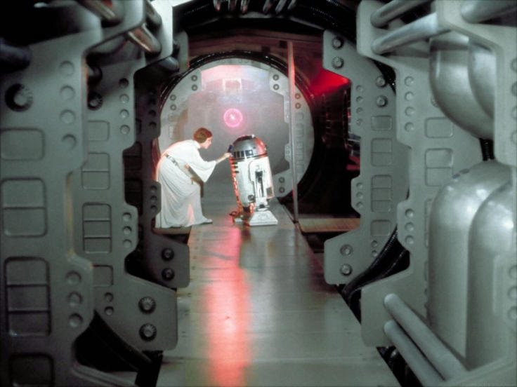
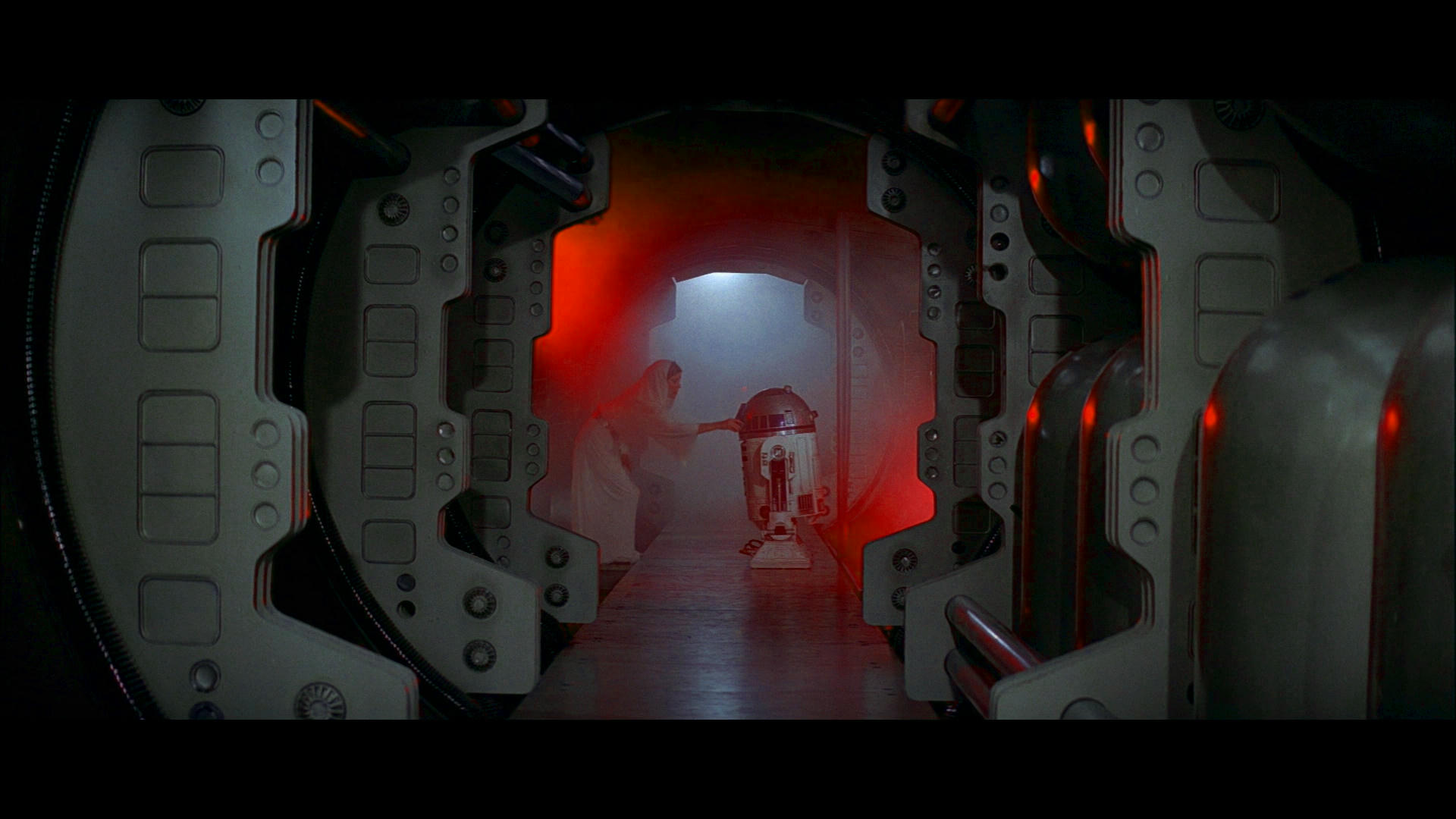
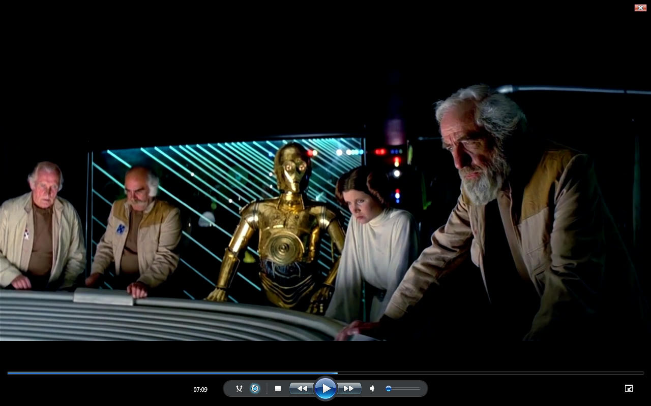
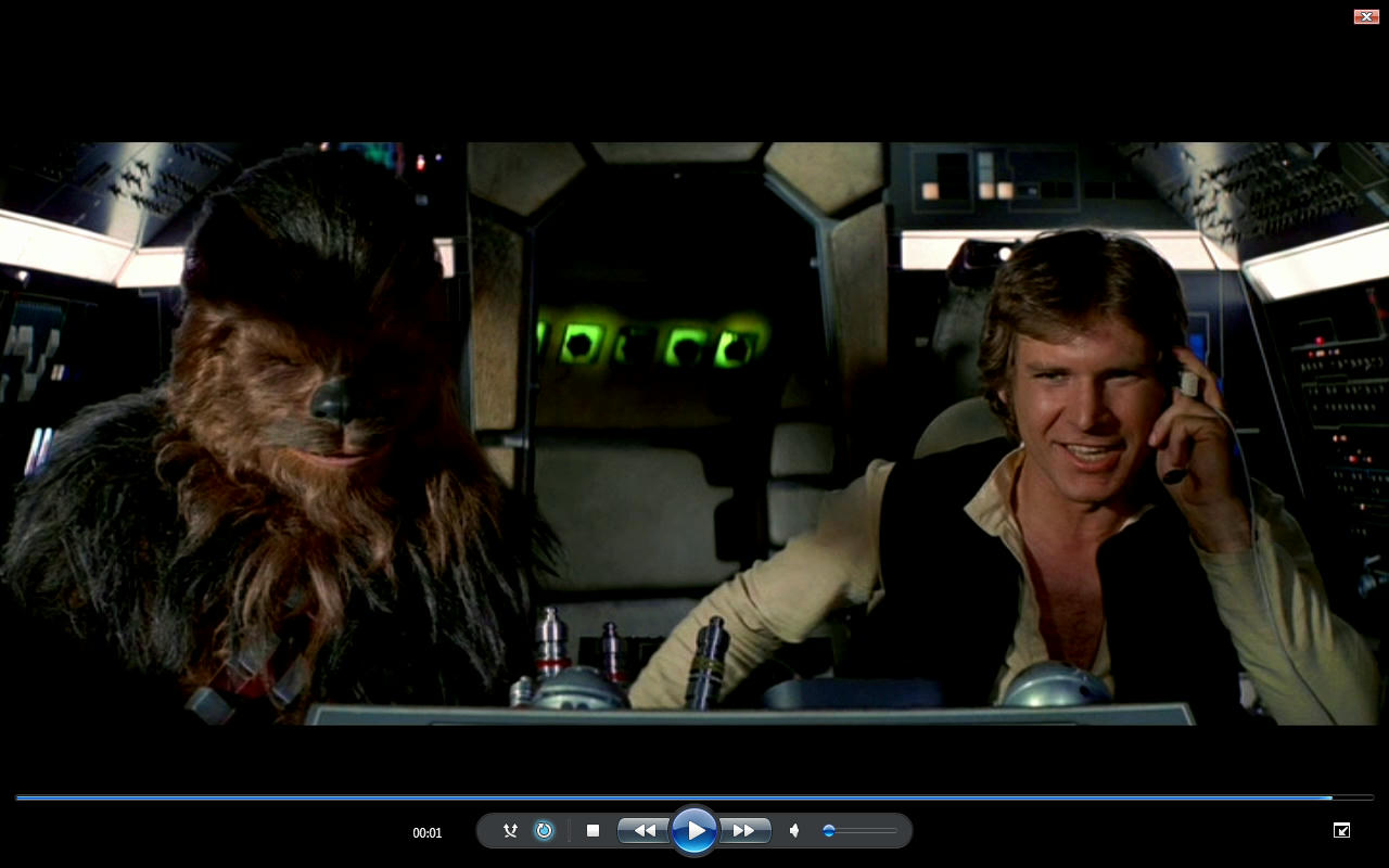
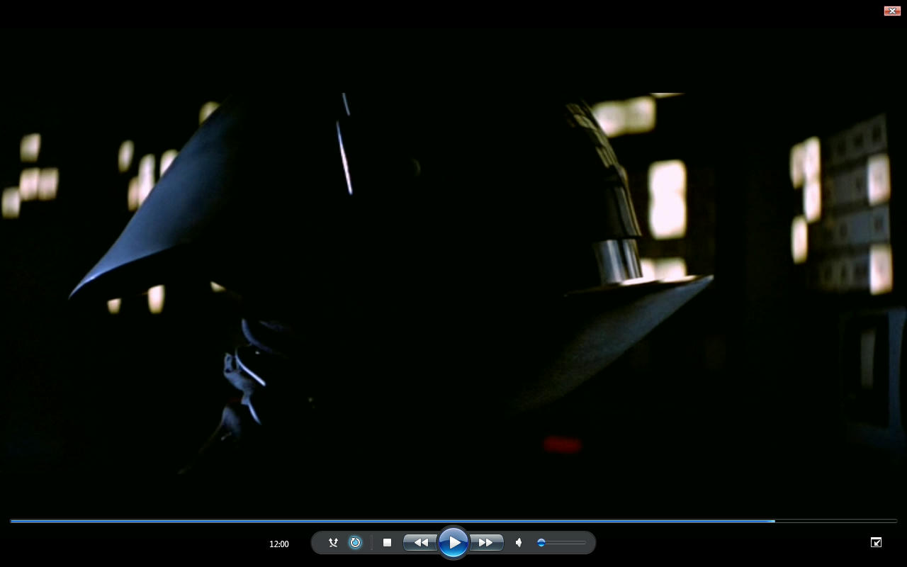
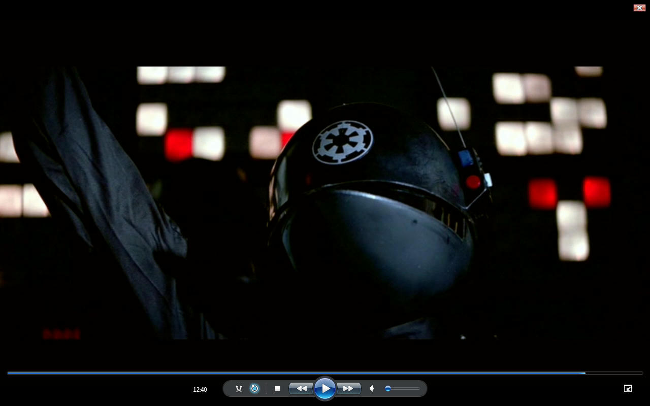
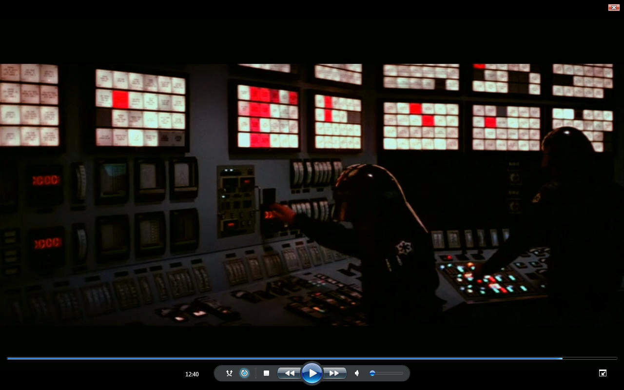
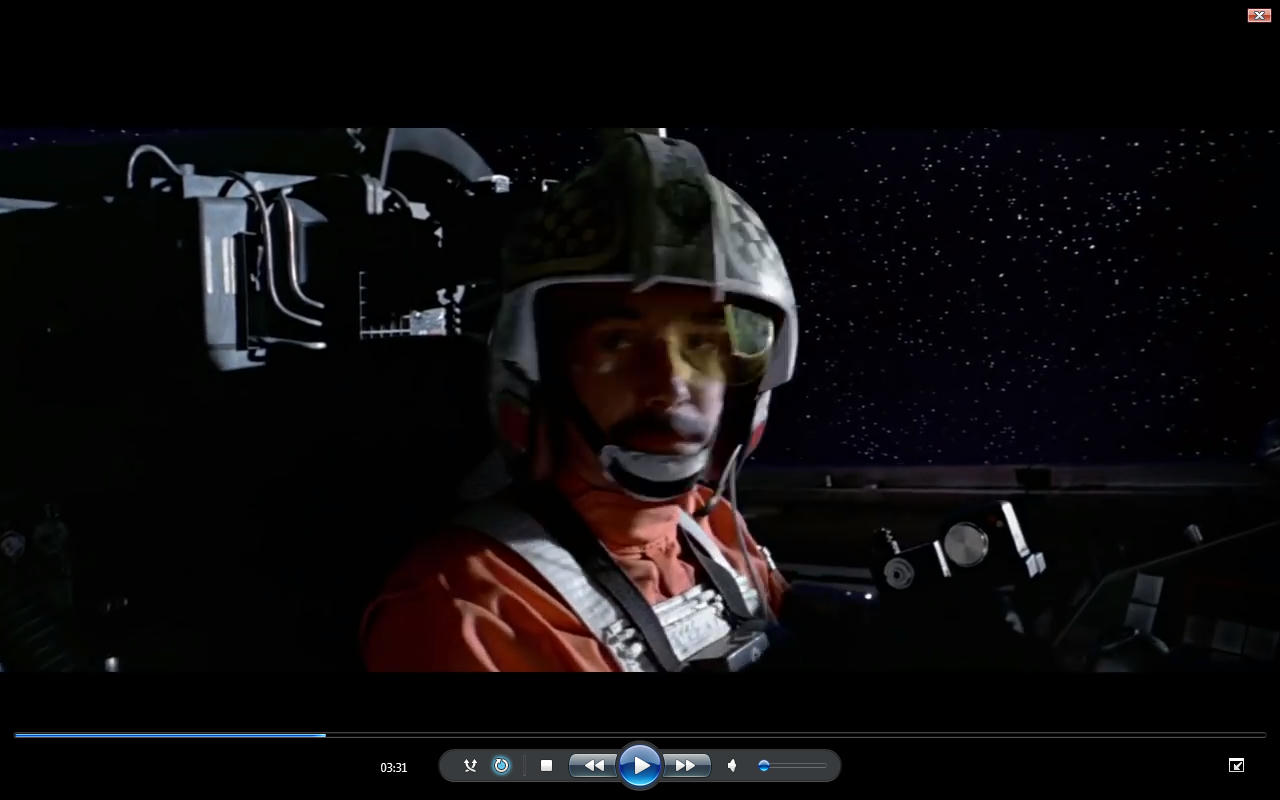
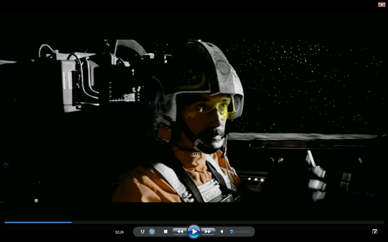
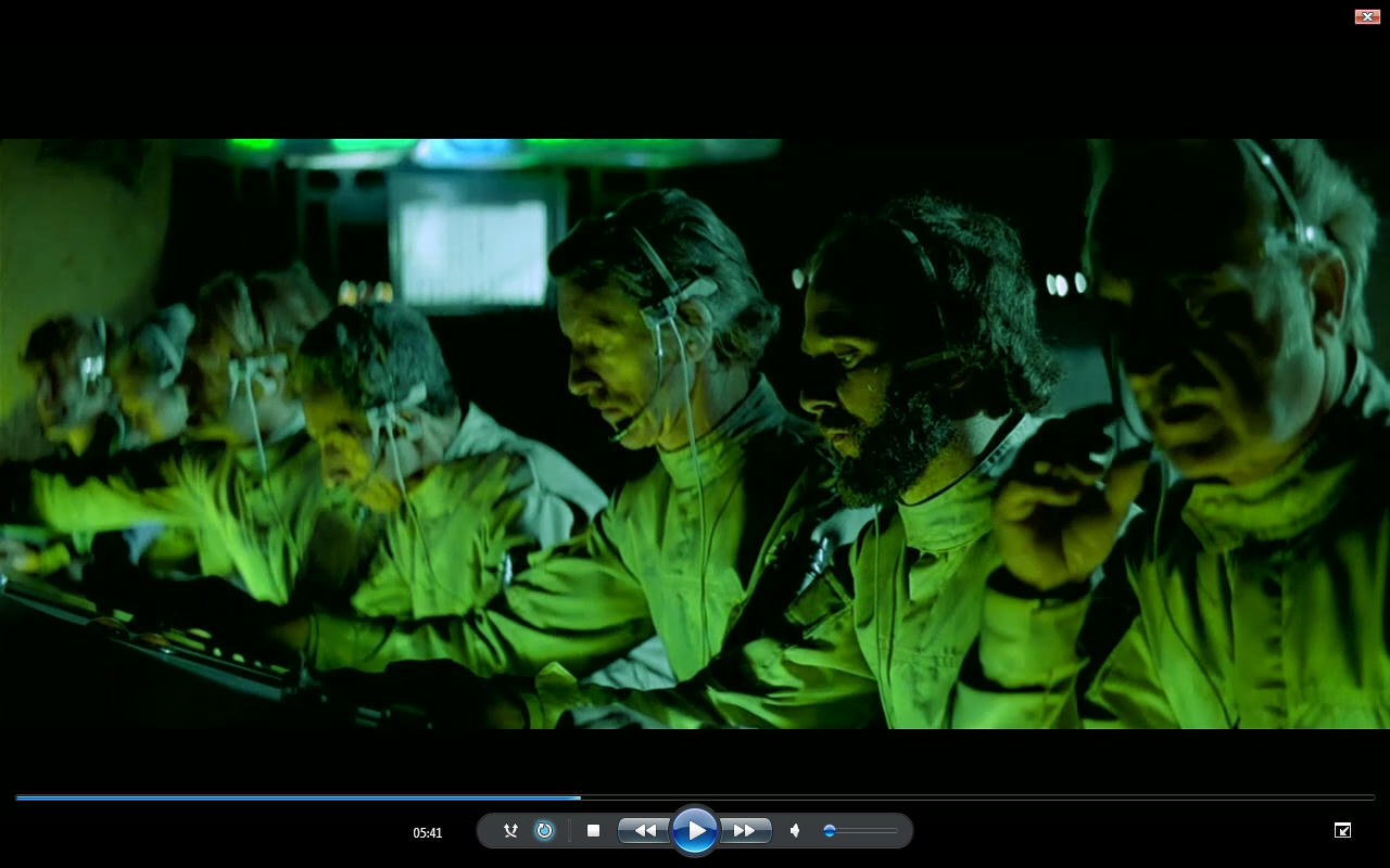
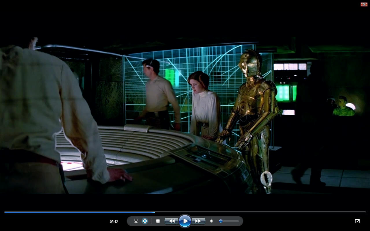
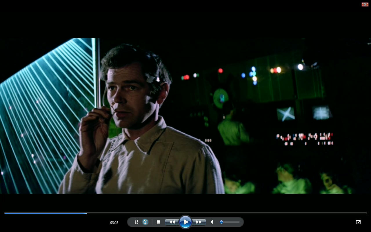
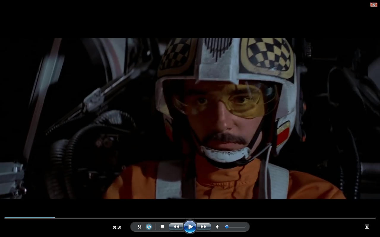
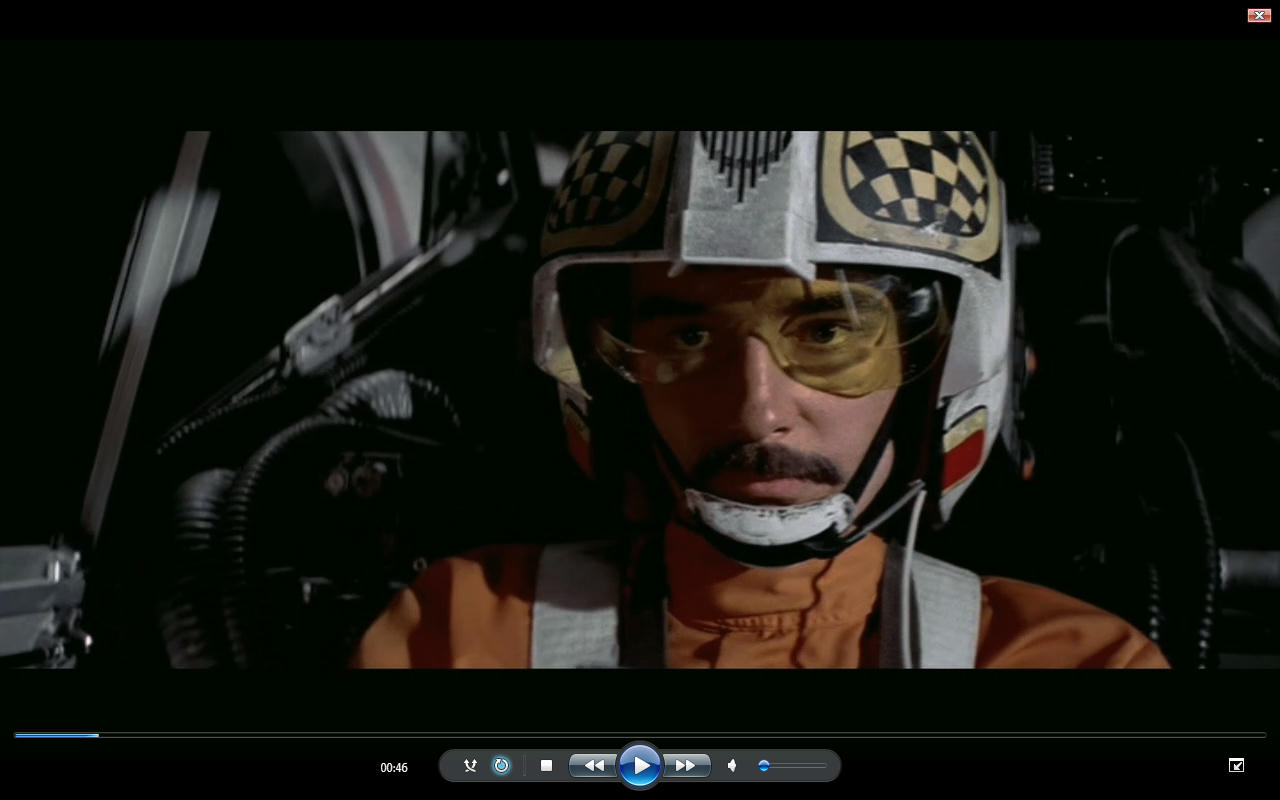
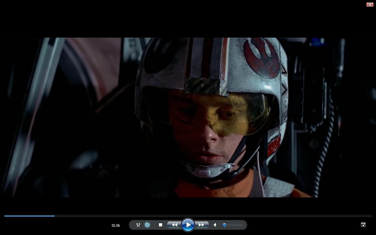
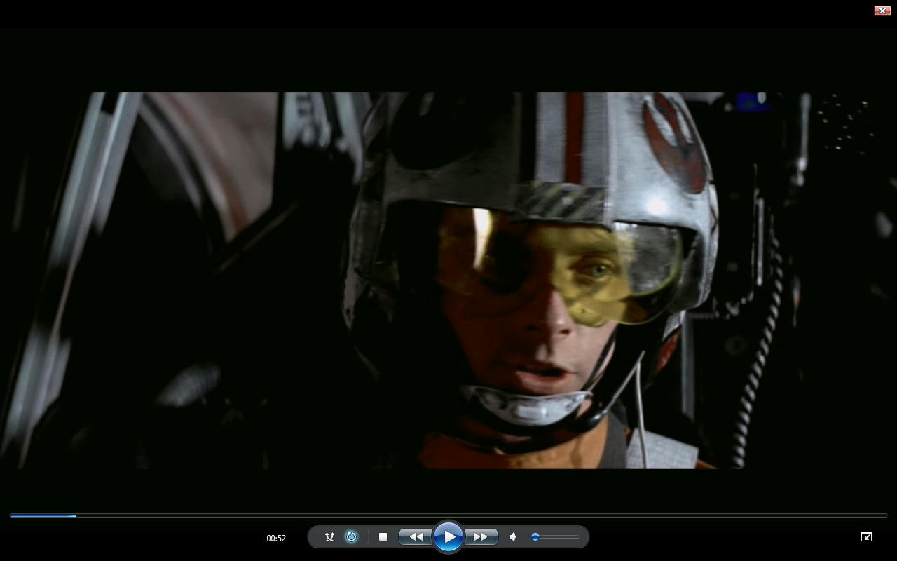
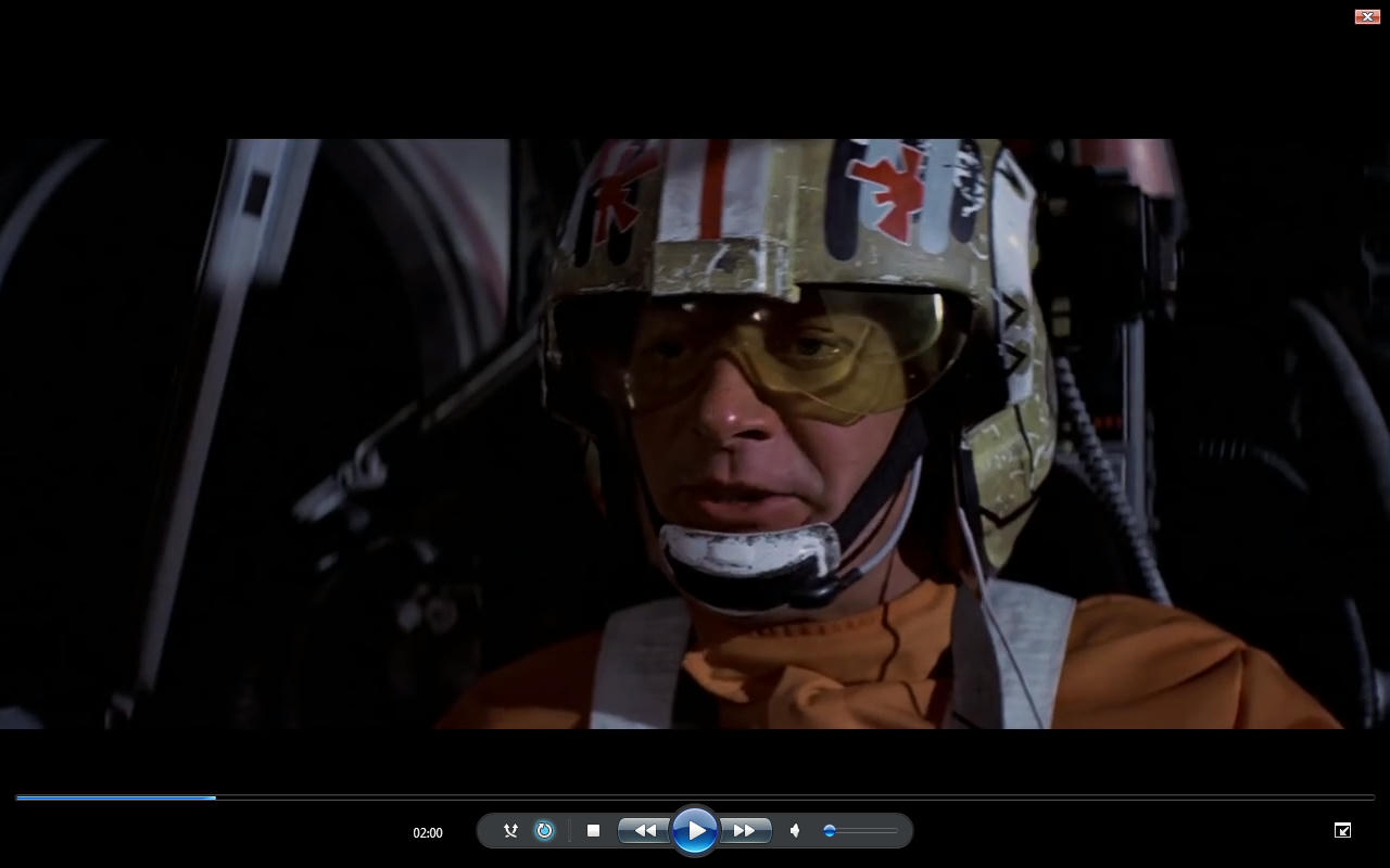
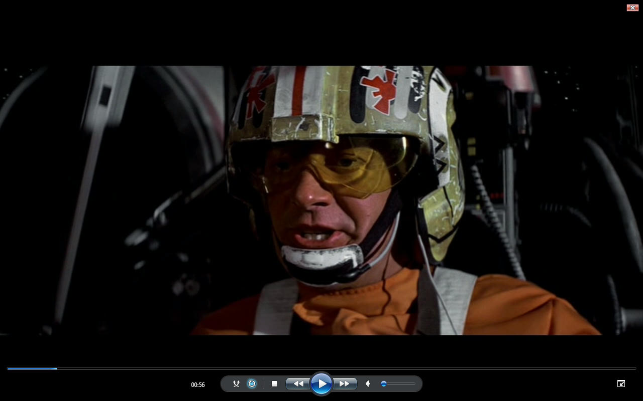
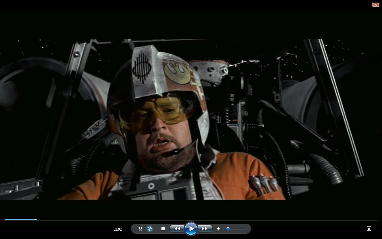
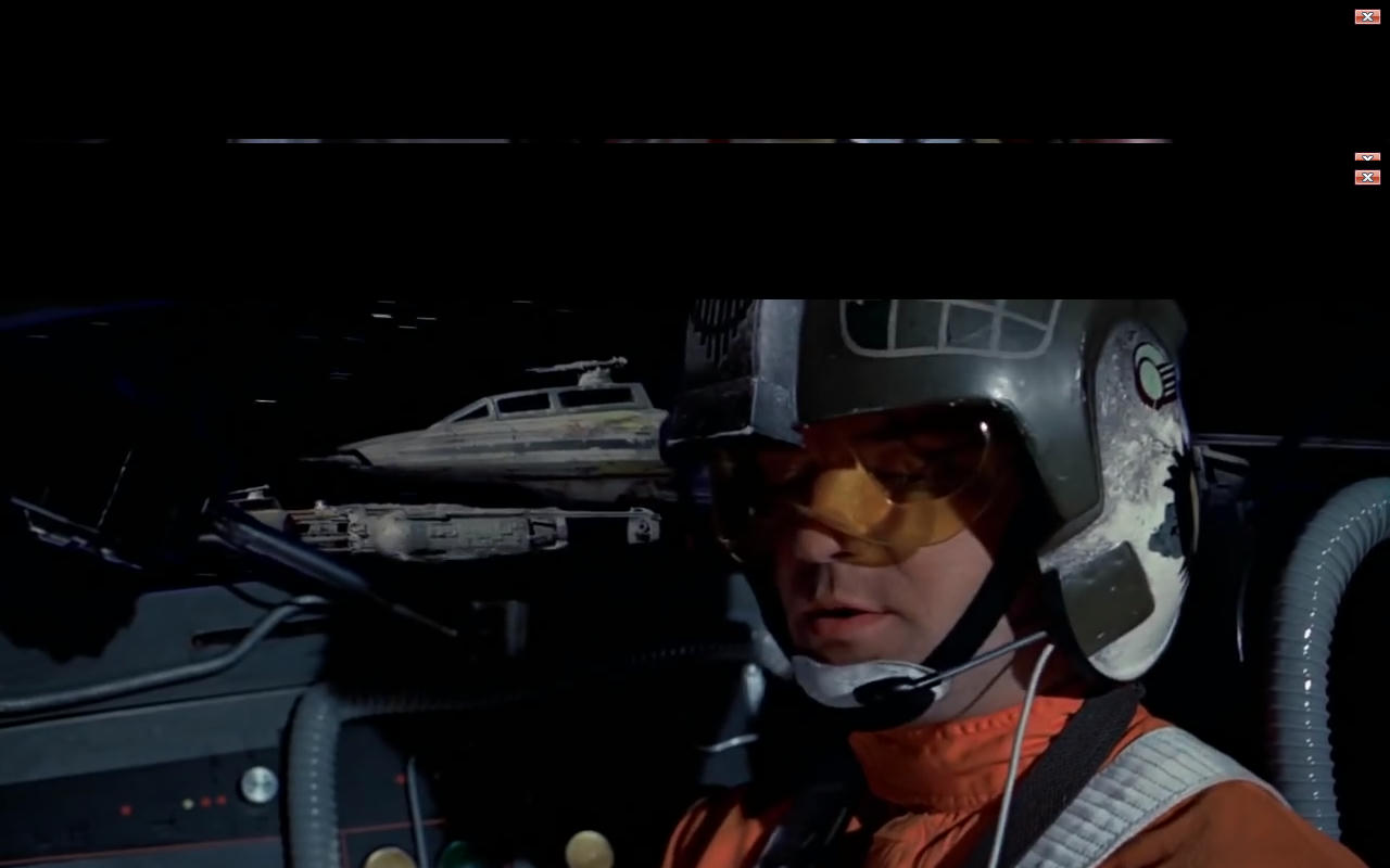
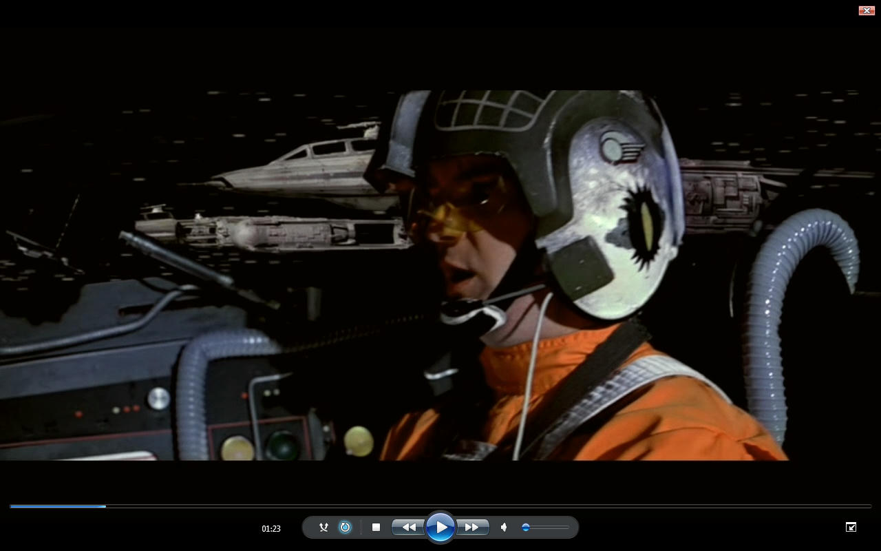
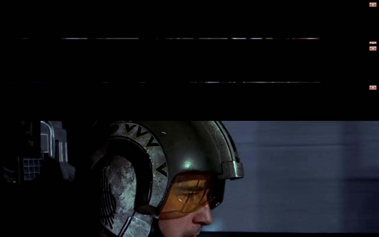
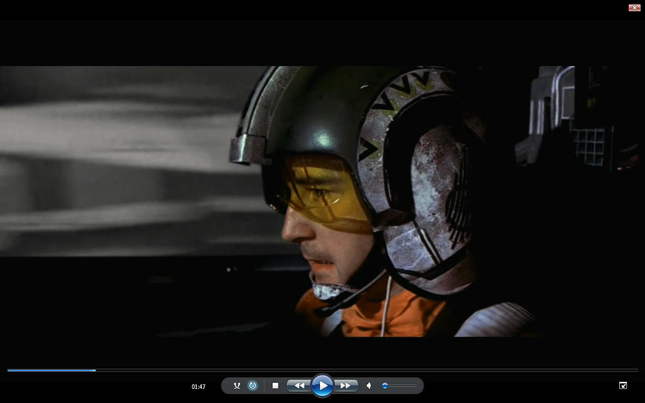
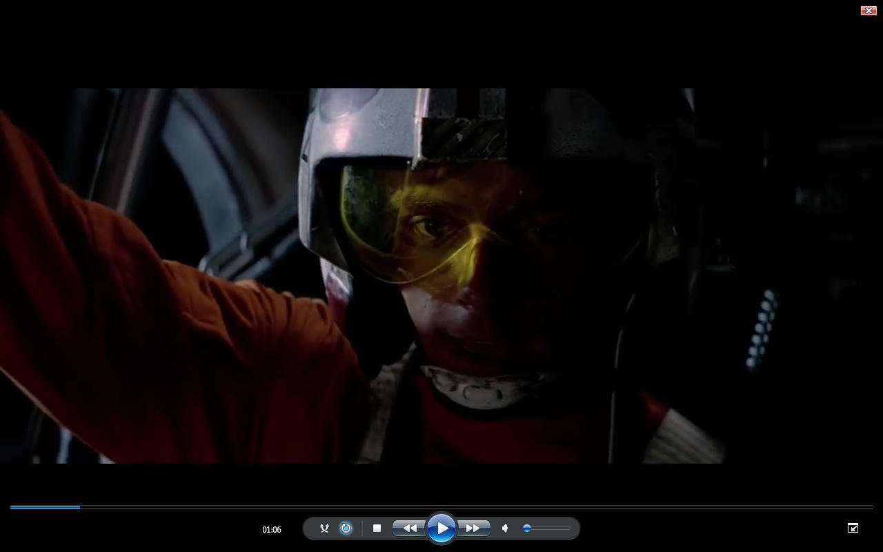
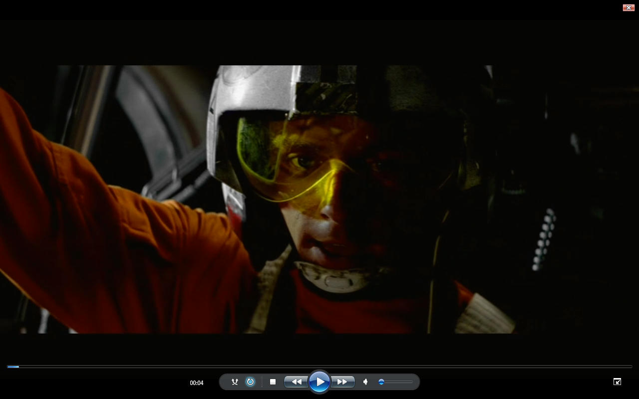
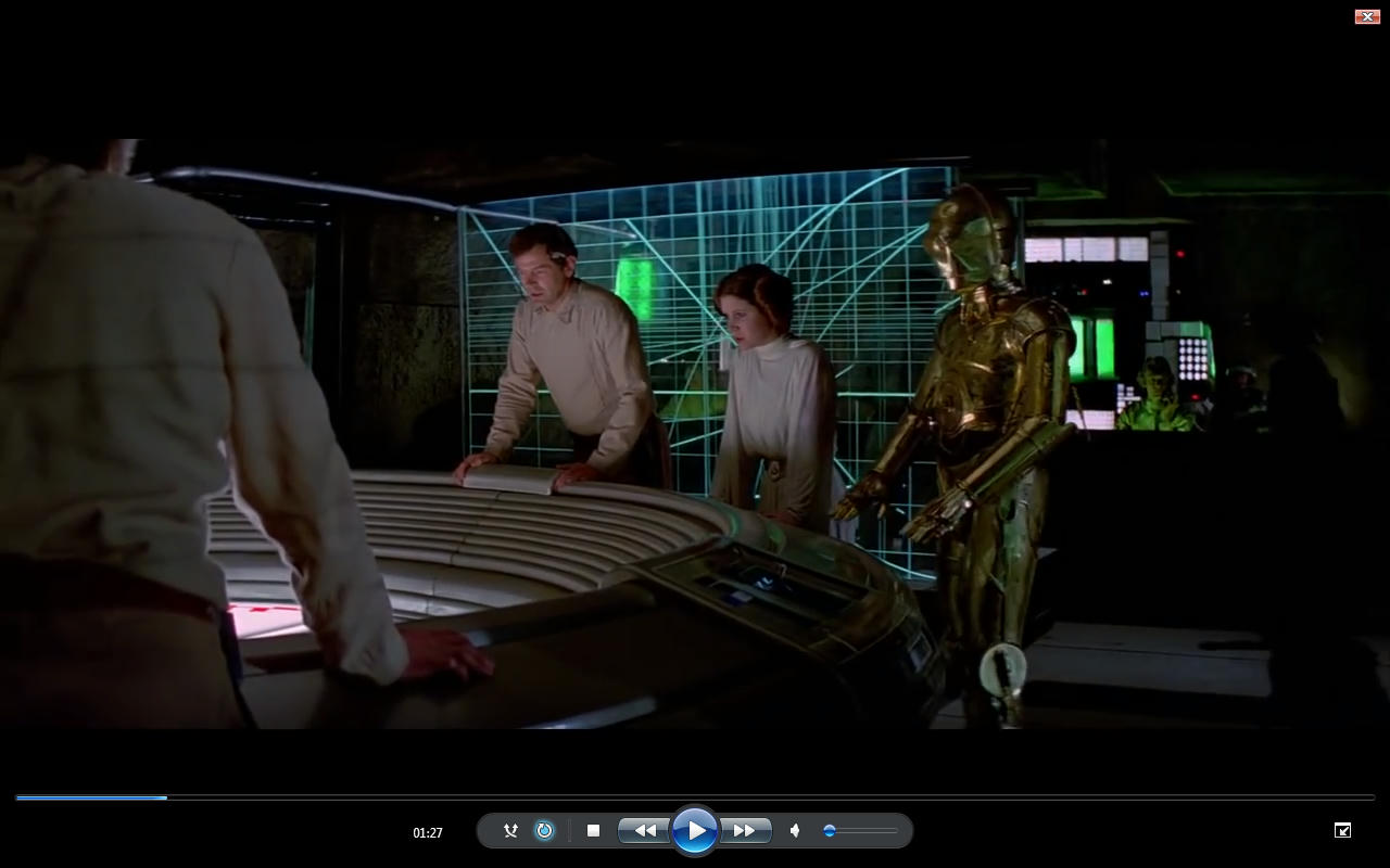
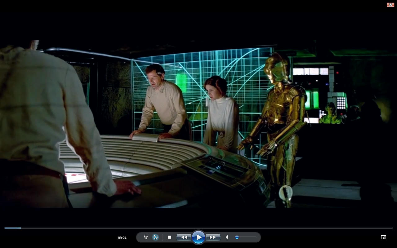
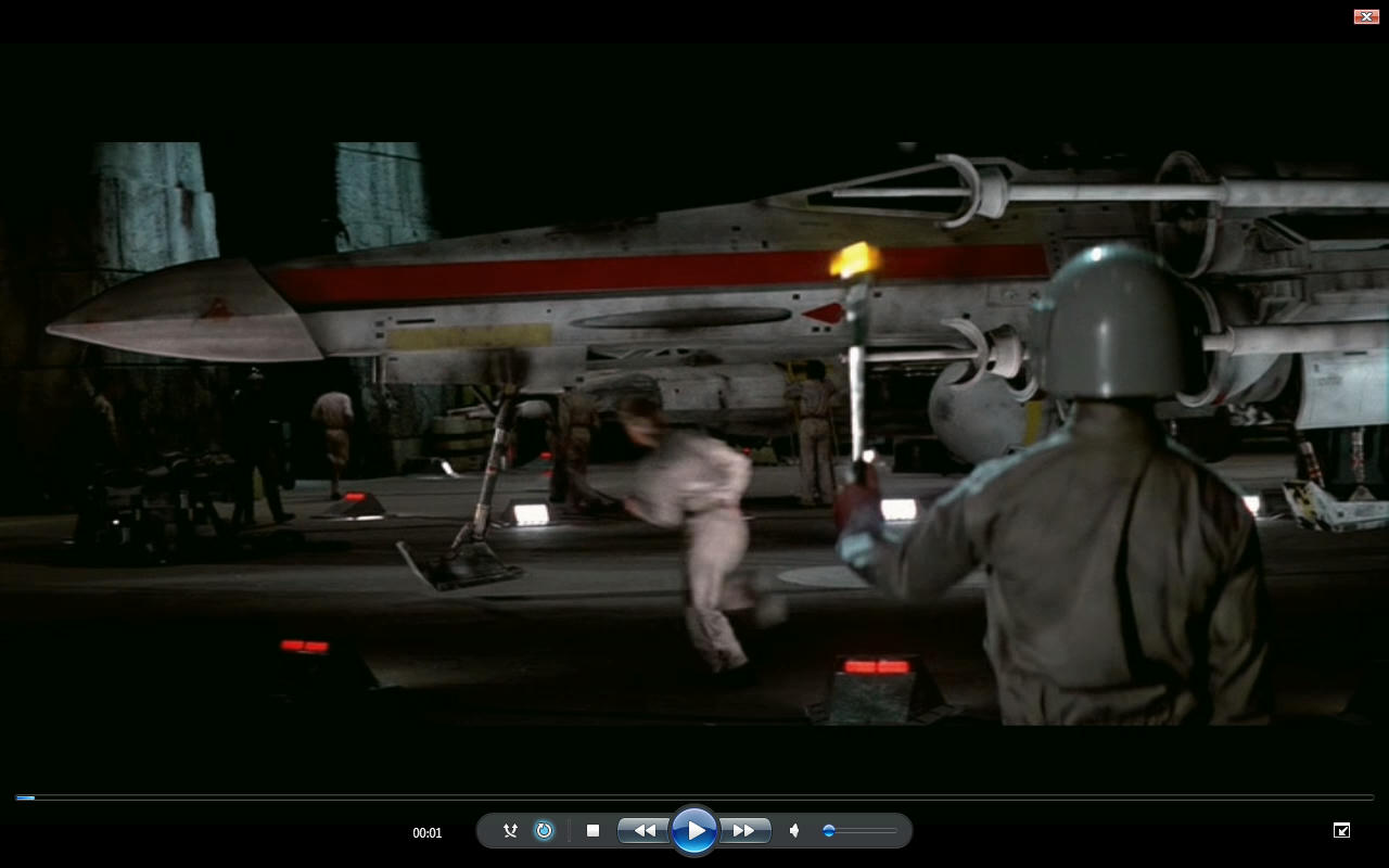
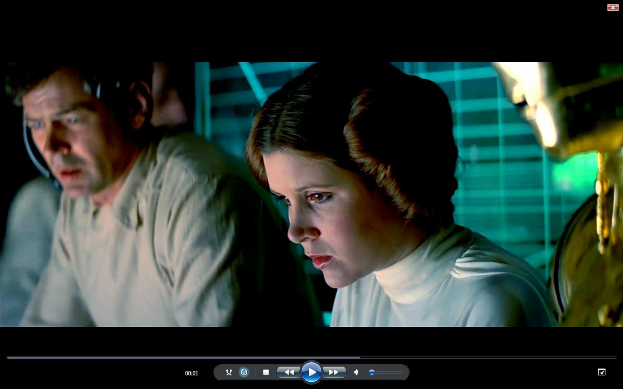
Those cockpit shots yeah some have had very little some have had quite a lot it matters not which version of the film you watch they all have this annoying hue fluctuation on the cockpit shots including your version. That of course is of no detriment to you because you still made it look a hell of a lot better.

The focus is on the Hue alteration not your color grading but I agree by and large with your color grading if that makes sense. But I have had to do a lot of color correction across the whole 15 minutes or what ever it is. A lot of contrast Value and Hue balancing.

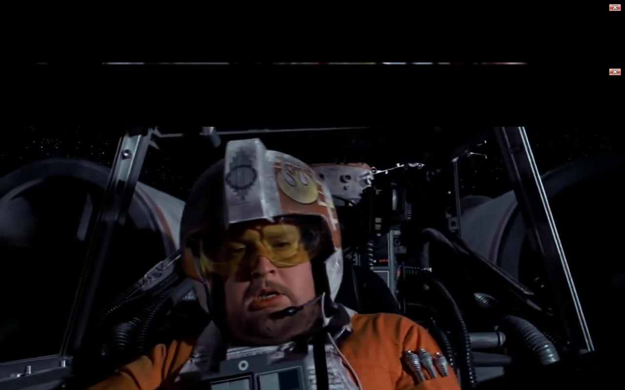
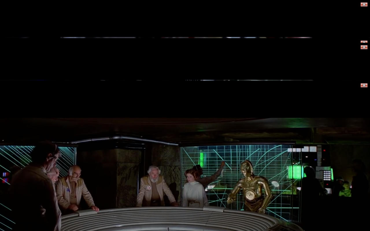
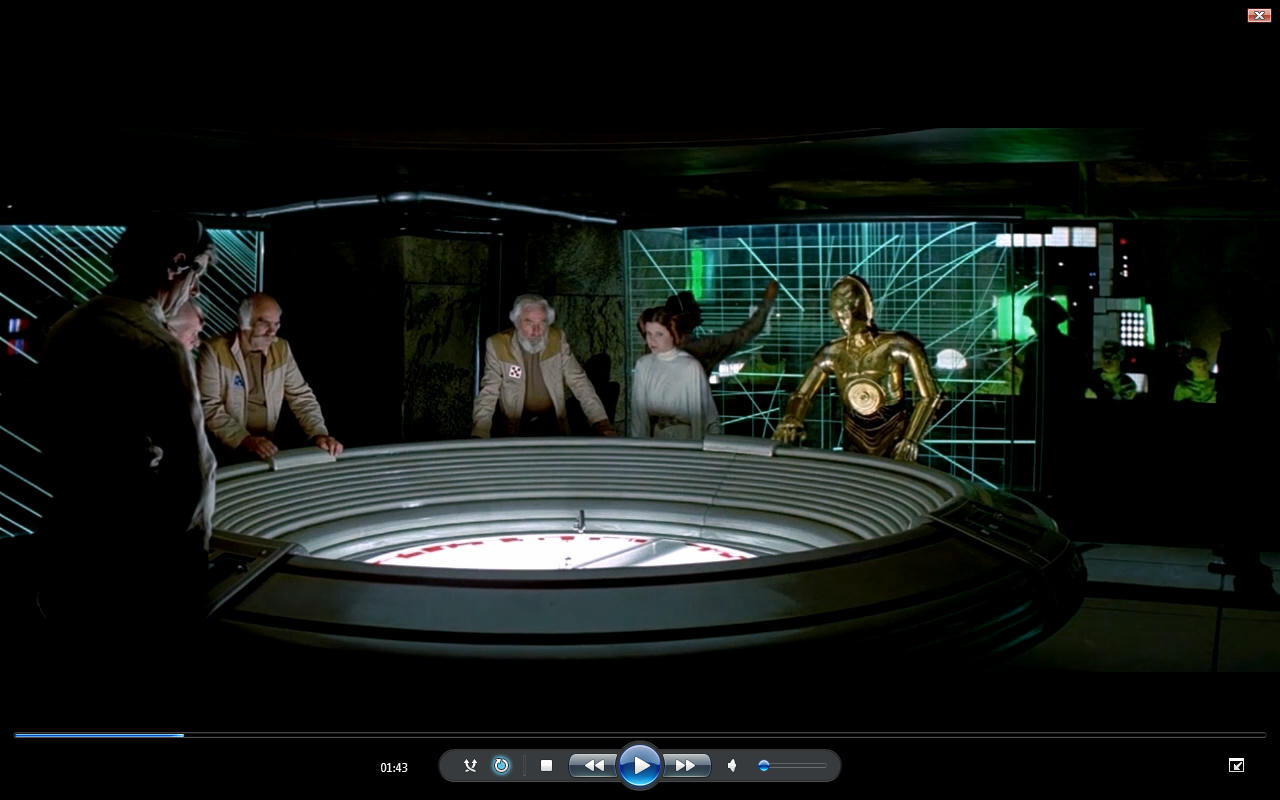
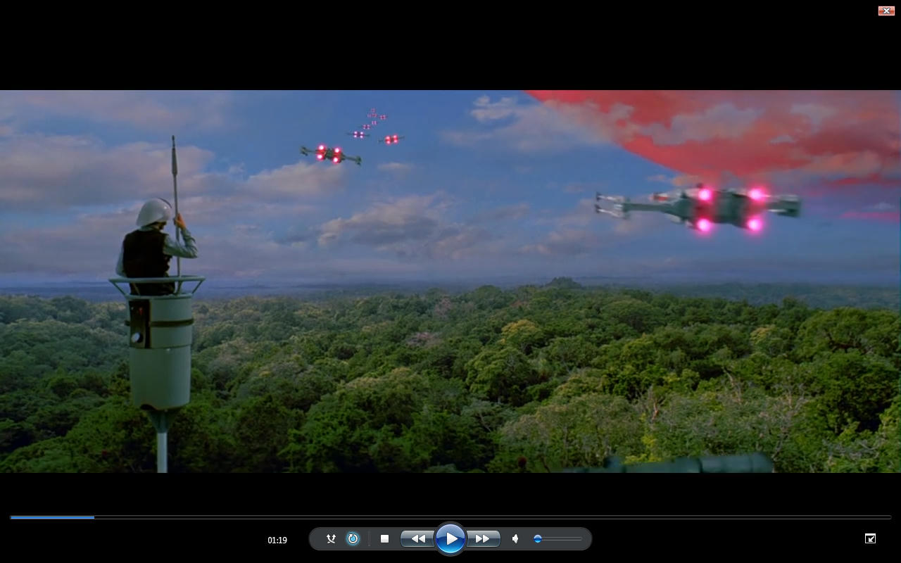
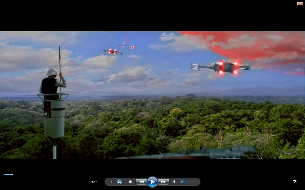
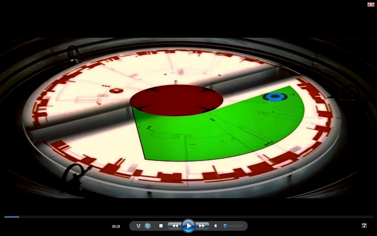
Yes the beginning shot was from revisited I assumed it was the same as the special edition either way both the special edition and your version have way too much green on that take off shot.

Basically in 3 weeks I have color corrected over 200 shots and split the whole battle individual I deliberately tried to avoid this situation and I can remove those images of the cockpits if you want?

It’s more an illustration of the hue alteration than your color grading. Not my work hands up but I have done a lot of work.

I have tried to focus more on specific discoveries rather than trying to claim on the back of your work or anyone elses work. I am talking about trying to get it right and find out what this film is really meant to look like…

Does that make for an acceptable response.

I will share it with you when it’s finished and For your eyes only… Fair? I have done a lot more than just color correction.

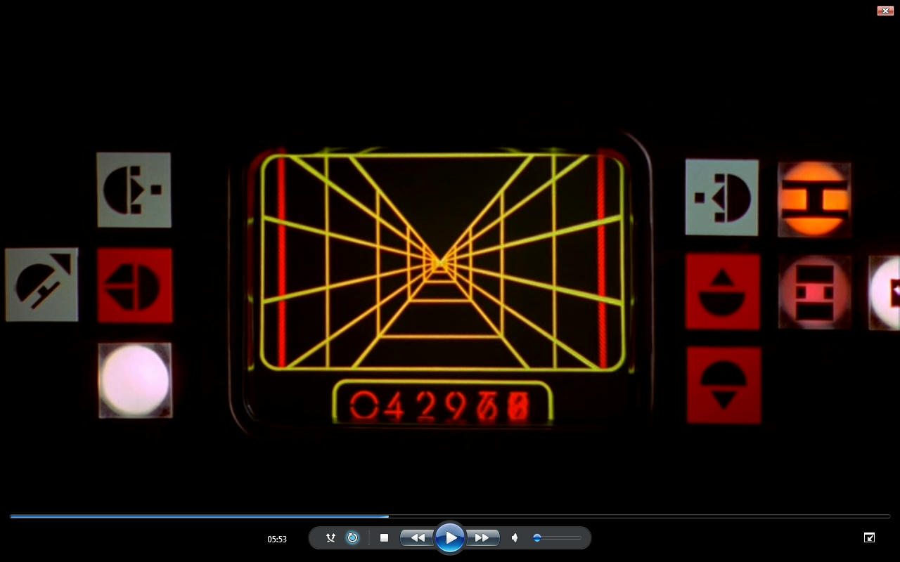
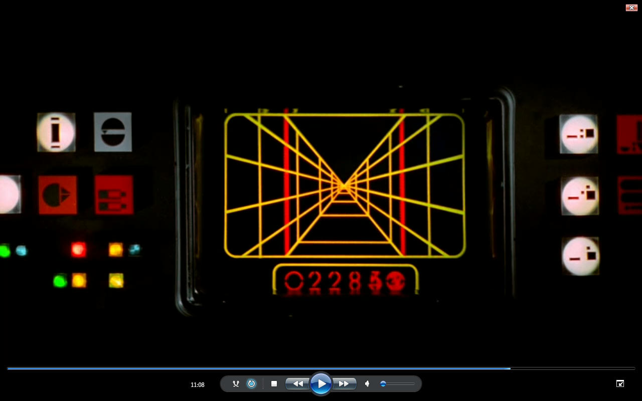
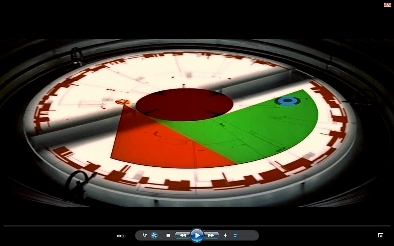
The whole Value and Saturation issue stems from Special Edition Shot inserted in original film shot and trying to strike the correct balance in Hue contrast and saturation which is a total muddle.

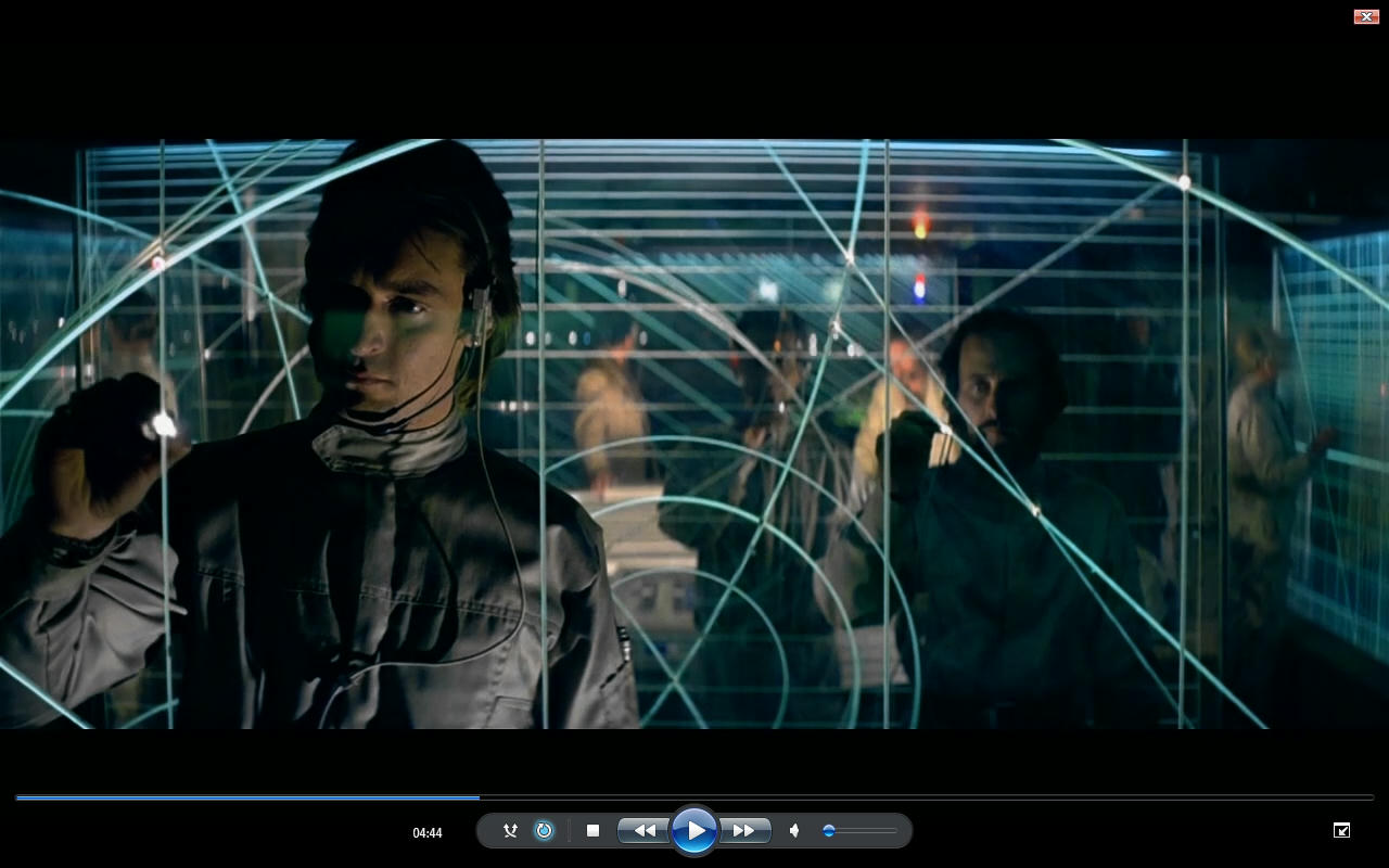
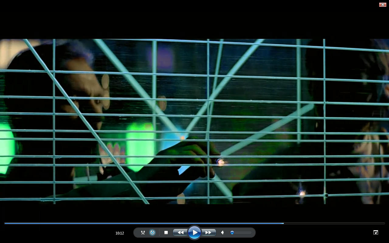
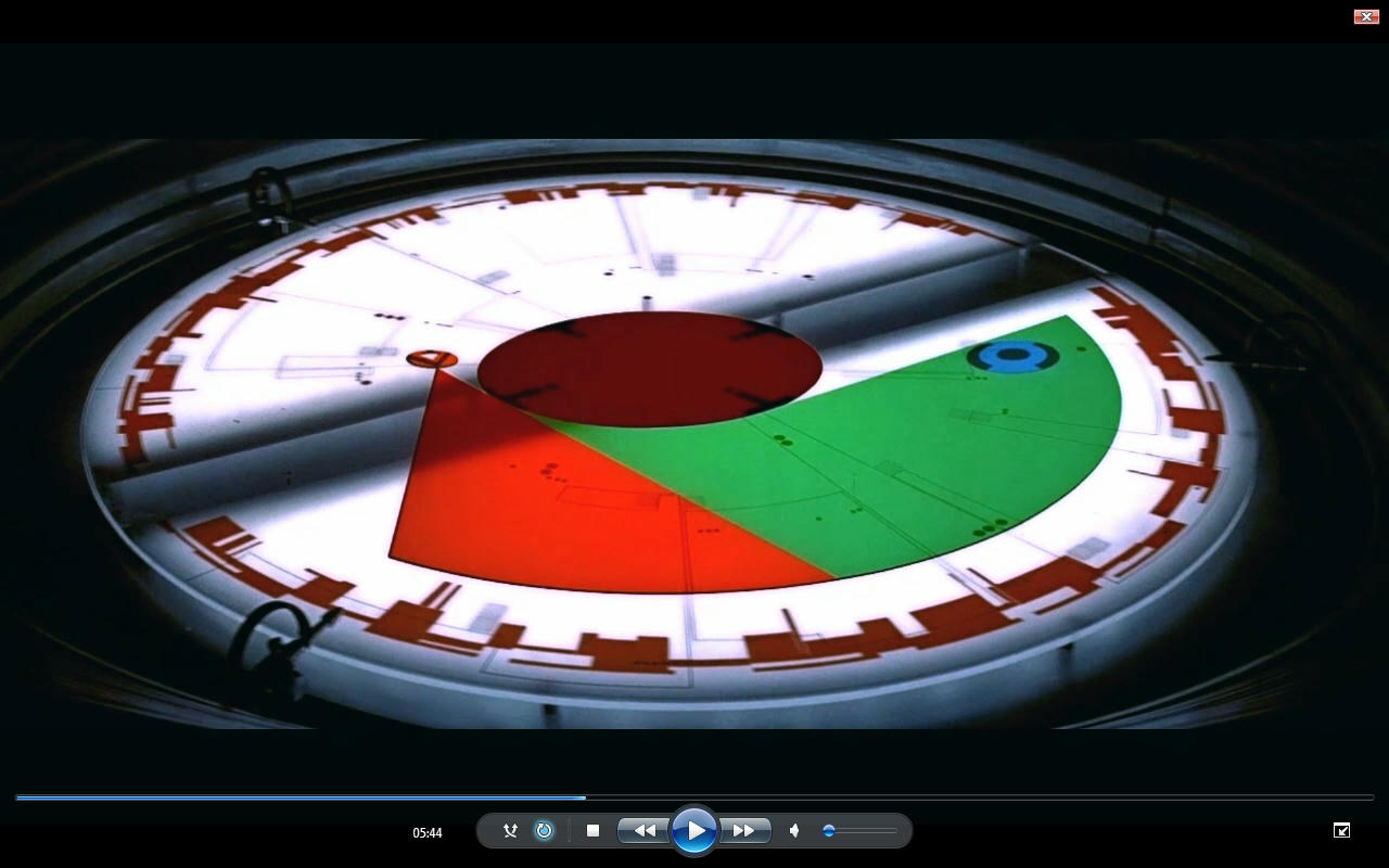
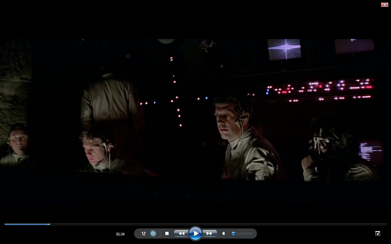
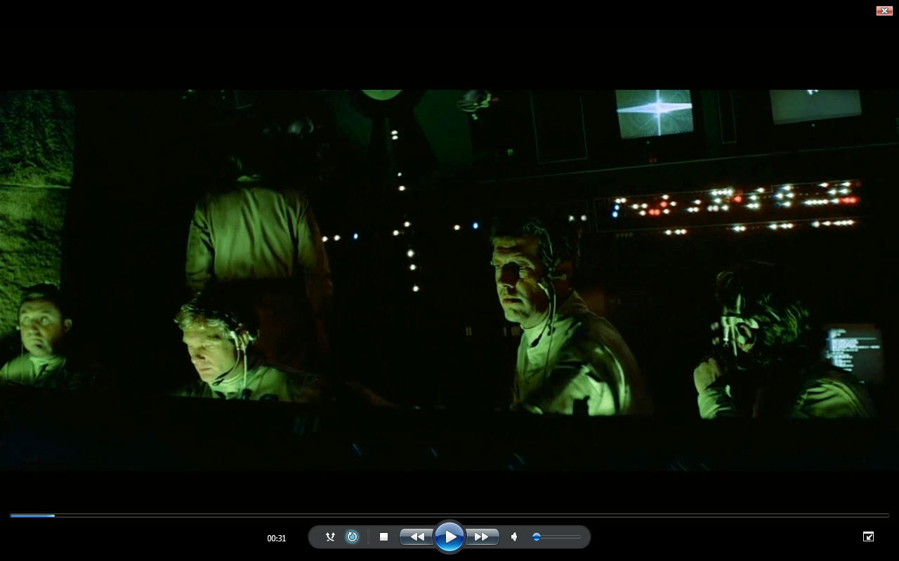
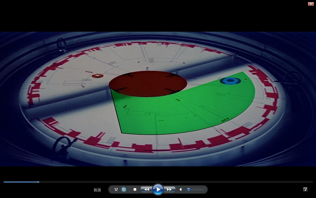
as you can see these need to align and need more work. The firs 2 images probably need color bleed? but you see what the purpose is. I think this explains the purpose quite clearly.

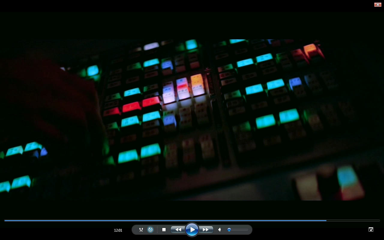
Also my editor does not have a red Hue alteration only Hue alteration so when I alter the hue I have to correct for the alteration. No Red Hue setting in the editor so It’s more work than you think. I think Selective correction just screws things up more often than not it best to avoid that route 99% of the time so I guess it does have the function but I have not used it in any of these.

Post
#1034914
Topic
Info: Battle Of Yavin - Color Corrections
Time

Well what it looks like in the editor looks exactly like WMP. other wise if it is actually outputting at a higher contrast then that makes the editor I am using totally defunct. Because what I am seeing is then not what is being output?

Basically I color corrected it to look like this in the editor. So this is what it look like when I did the color correction not what plays in VLC so this is the best I can do really.

http://www.mediafire.com/view/pv7c2680r2h36ki/Explosion.png

^ Note explosion not pink and no more Magenta walls

^ Revised Yavin Command Display now looks more illuminated in the sink hole applied same settings more or less as the rest of the command center shots

@Sougouk Yes it is exactly meant to be different. I have tried very hard to try and bring the jump suits as the measure to bring the Hue’s for the cockpits as close to being the same. I can’t tell you if it is exactly the same. Because you have different light conditions so it will never be 100% accurate.

This is where the Before and after screenshots have screwed things up. Look at all the after shots and tell me if the pilots Jumpsuits are the same color approximately. that was the intention not what it look like in any version because it’s a total mess of pink red and orange and even borderline yellow Jumpsuits.

Post
#1034894
Topic
Info: Battle Of Yavin - Color Corrections
Time

The reason I am not using VLC to take snapshots is because it DOES NOT display the correct contrast of a video it increases contrast for some unknown reason (only Slightly) and I have also known it to play audio with a very small delay also when it’s perfectly in synch when you open it in Windows Media Player. I do need to update VLC though but anyway it’s something I noticed.

I like VLC media player but I have noticed some issues with it. Free software like the video editing suite I need to upgrade and pay for the package to be able to export images basically. Whilst it’s all the tools are available just not all the export settings are available.

I am using Lightworks for the Video. It’s ok a bit glitchy and both user friendly and not very user friendly it has it quirks. But it is alright.

Lightworks is great and also stupid and a bit of a nightmare but I can’t complain because it’s got very good color correction features. Video Speed is a nightmare and things like that on it. And Audio in Lightworks is a bad joke. But it’s ok and it’s not horrible or anything but it is limited.

Post
#1034846
Topic
Info: Battle Of Yavin - Color Corrections
Time

The problem is I do not have a snapshot function. So you would not get the same frame also it requires a lot more work to do that due to not having a snapshot function.

Can you do without the before and after and cope with only the after?

You could simply watch it on YouTube or something or put the dvd on?

You noticed I took the snapshots as screen grabs.

Thanks for the interest.

If it is no good like this then I won’t bother posting the outcomes.

I posted some comparisons to current special edition version. It got a bit screwed up but there are there now.

Like I said there is no one particular setting you can put across these shots and magically make them all right. But the trend seems to be as follows.

Blue Contrast needs to be increased
Green Contrast Needs to be increased or lessened
Red contrast needs to be increased some of the time but it’s the most correct out of RGB

Hue alterations between 0.5% and 8%

most color Push is Push Blue spectrum and Green spectrum as a staple
Magenta and Red on frequent occasion
Yellow on rare occasion
Cyan on rare occasion

Gains / Value either lowering or pushing the bottom end
Lowering or pushing the Middle Values more frequently lowering
Highs are not to bad

Gamma and brightness only touched for around 15 - 20 shots

Saturation up and down like a Yo-Yo

Post
#1034808
Topic
Info: Battle Of Yavin - Color Corrections
Time

Ok well it’s a mixture of Sources so it is a bit tricky. I also went through and tweaked saturation levels because of Neverar greats comment. And I re-rendered the clip. But now I have to redo the saturation levels on some of the cockpits but the colors are the same. Anyway. I intend to keep moving forward.

Look at the Special edition for the cockpits and the original Film not sure which source it was for the Yavin Base. There is no Magic Lut it’s done shot by shot.

Before

After

^Needs more saturation

Before

After

Before

After

Before

After

^ Needs more Saturation

Before

After

Before

After

Before

After

Hope you enjoying it and finding it interesting. Some of the Cockpit shots require a Hue alteration anywhere between 0.5% to 8% most reside in the 0% to 4.5% only a couple of freaks shots go as far out of hue at the 8% range I think there was 1 shot that needed a -1.5% or something out of about the 50 odd that there are.

Edit I put up comparison with Special edition version.

Post
#1034605
Topic
Info: Battle Of Yavin - Color Corrections
Time

I have been messing around with the Battle of Yavin recently.

I wanted to share some of the Color Corrections I have done as I think some people may find them interesting. Just thought I would share some stills perhaps it can be a help or perhaps it can be an indicator of doing something wrong myself.

Anyway I plan to do a small series of posts showing some of what I found and what I did. Hope it helps. You will have to compare them yourself to what ever source you like. It’s still a WIP but mostly done so consider it more or less final (95%) but then never say final. Would be happy to see any comments or comparisons or discussion.

Before

After

Before

After

Before

After

Before

After

Before

After


This is all before flying to the deathstar

More to follow soon.

Edit having looked at the Yavin Graphic Display I just reverted it to my initial first Pass see below

This as well this is one of the most difficult. Still not decided on it but I think this is what I am settled with.

Before

After

I have been trying like mad to get rid of Leia’s Blotchy face. Anyone ever managed it? I definitely think it needs to be dark like this but can not seem to be able to get rid of the red and Yellow / green Blotch on her face. Unless I really darken it and that makes me think it meant to be even darker than this…

Post
#1032931
Topic
Rogue Zero - What was changed, reshot, etc in Rogue One?
Time

The Aluminum Falcon said:

Ronster said:

  1. Bor Gullet was originally conceived to delve in to Jyn’s past not to find out if Bodhi Rook was telling the truth. From Concept art book.

Didn’t know. Appended my post to fit.

I still don’t believe that tie fighter on the gantry was ever a marketing shot. It was like that before they developed the Tie-Strikers no doubt. I don’t see the point in lying about it. It’s actually a fairly small thing although it was visually superior in the trailer. My gut feeling tells me Jyn had a mexican stand off with that Tie Fighter and shot the pilot through the glass with her blaster. That’s my speculation on it.

Sorry, but there’s really nothing to substantiate that and the official word has been consistent about straight-up admitting that it was a marketing ploy. Also don’t believe there’s a conspiracy at play. If anything, the official line makes Disney look worse than your speculation.

The only possible lie I could buy would be that the happy ending was never filmed; if it were actually filmed then scrapped, the official line that Disney was steadfast in supporting their deaths does make the Mouse House seem better/more artistically supportive.

Ok but I don’t mean straight up lie. I don’t know what all the fuss is about the “Tie Fighter” it has nothing to do with a CGI Tie fighter being there. It has to do with Jyn limping along that gantry and why is she limping?

That has nothing to do with marketing anything. I want to know why she is limping? Let’s just get it straight.

What point is there of her limping towards a switch box and then a Tie Striker also from quite a distance zooming past real fast shoots at her?

In terms of the shot composition it makes more sense that the tie fighter or tie striker or what ever CGI creation you want to put there is right by what she is limping and struggling along to get to. or at least hovering watching for a brief moment close by. Not flying past really quickly and bang explosion. Never mind the Limp…

Marketing is better than the film then? The Marketing department should be making these films because they understand the aesthetics of film better than the director? They even manage to copy the directors distinct style but no the director decides I’ll change it to a quick fly by explosion with very little meaning to it that does not look as good because the marketing department have already used that idea?

It got changed and the marketing department seems to prefer the other cut. Hey ho.

The other question you have to ask is why did the Tie-Striker shoot at the end of the Gantry where the Tie fighter was going to crash?

Gareth Edwards is not a Whizz Bang Director.

Post
#1031982
Topic
Star Wars saga - Extra Extended Edition (1080p) (* unfinished project / WIP *)
Time

^…^ said:

Ronster said:>
I think all effort should be made to get that particular scene that is in Black and white done and done proper.

Han & Leia extended kiss Empire strikes back.

Not only that… even Han’s “girlfriend” and Chewie “nice muzzle” is a nice shot. I think this is the only piece worth of recolor in the whole cantina scene - not that because the rest in uninmportant, but because it will take SO LONG and SO MUCH WORK to restore colors, and result will be always not so good 😦

You’ll have to Rotoscope in a colored Cantina Lamp.

Not seen the nice Muzzle shot…

Don’t forget the missing Blaster Fire before Obi-wan chops off whomever’s arm get’s chopped off. I am pretty sure it’s meant to get deflected back at Dr Cornelius Evanzan. And Walrus Man’s arm was “Meant to get chopped off” As they both go down for some reason so one takes a deflected laser.

Post
#1031978
Topic
Rogue One * <em>Spoilers</em> * Thread
Time

FunkyDays said:

JawsTDS said:
I still didn’t hear a Wilhelm scream, though. 😉

When Jyn climbs onto the platform at Eadu, she pulls a stormtrooper over the edge; he gives the Wilhelm on his way down.

Yeah I thought it was on my first viewing but then it sounds different also.

I think the untouched Willheim scream is when Donnie Yen kicks the storm trooper in the Head on Jedha,(storm trooper on the floor) or is it sand in his face?

Not much point when a storm trooper has a helmet on kicking sand in his helmet 😃