logo Sign In

Ronster

User Group
Members
Join date
10-Dec-2011
Last activity
8-Jul-2025
Posts
3,142

Post History

Post
#1215438
Topic
Info: Star Wars - What is wrong and what is right... Goodbye Magenta
Time

So here is an interesting idea and perhaps a sort of peek in to the future, take a bit off a deep breath hear me out…

Ok so looking at the problems something like star wars faces being that there are so many different versions and sound mixes alternate footage and so on, and also the problem of trying to experience the film with new technology but wanting to still have say a crt quality a 35mm quality a home video quality or even say a 16mm quality.

I think I may have come up with a possible way to combine everything into a single release with an option to even make your own custom version.

I was looking at a game engine called unity3D and this game engine can handle video luts and shaders and i would imagine any form of programmed branching being an engine and I would also assume subtitle text.

So the premise of this radical idea is to have a default version perhaps say original Theatrical Technicolor Star Wars. This would be ported into a the game engine from here after it has been programmed You could simply check a box and this would apply a number of Luts to make it 16mm Star wars Check another box and it would be Star Wars Special edition. You might want to mix and match the theatrical version and the special edition by checking boxes for individual scenes that you wish included or removed You could chose a preffered sound mix subtitles and extra emulation effects such as CRT mode 35mm Projection Mode or standard modern LED/LCD.

Anyway Video ported and run in game engines could be an interesting way things could move forward and I don’t personally relish the old Laserdisc Arcade Games like firefox or dragons lair they were fun but pretty awful, but this is simply a way of giving more options and a better framework to some of the more absolute classic releases for which perhaps there could be a reasonable budget to produce such a thing.

Good concept? Let me know what you think of this possibility of the scope to running video in a game engine such as Unity3D and the flexibility and of such an release and also how much fun you could have with it?

The best delivery metod for something like this is either downloadable or solid state cartridges not discs as it is a more complex. Like sngular app for a multiple version film.

Post
#1215157
Topic
STAR WARS: EP IV 2004 <strong>REVISITED</strong> ADYWAN *<em>1080p HD VERSION NOW IN PRODUCTION</em>
Time

They get in through the side and it blasts out downward, so I reckon tunnel matte too now.

The Door is on the right of the ring.

On Joe Johnston art the left.

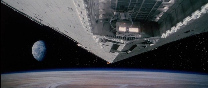
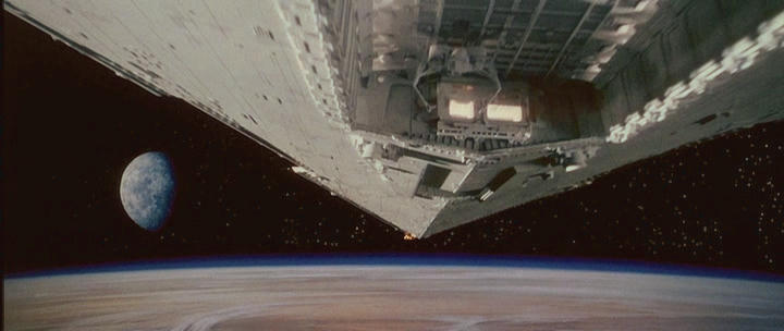
It would make more sense to see the moon pass by the window than that star destroyer spinning given their trajectory but yeah try to make sense of the escape pod a bit. I guess the window is not on the front of the Pod> The impossible escape pod!!!

Square Window…

Alternate dialogue?

Interestingly, the novelization doesn’t include this line “The damage does not look as bad from out here”. Instead, 3PO asks R2 if he’s sure he knows how to pilot the escape pod.

Anyway a bit of fun 😃

I Imagine we were meant to be treated to a window shot with the “that’s funny the damage does not looks as bad from out here” then Blast off escape pod.

EDIT MARK AS SOLVED.

The Tunnel Matte is Missing from the Blast Off.

The trailer features a still matte version of the shot with better detail and color and it would be the still version that the tunnel matte is missing from I imagine.

https://www.youtube.com/watch?v=vP_1T4ilm8M

This is a bit shorter and misses an animation on the ring part but nothing that could not be easily fixed.

The following Shot of Escape Pod flying on from the underbelly does not Belong in the sequence this was taken from the escape Pod that is destroyed sequence before the Tantive get’s clamped in.

The Round Window is correct the booster part of the Pod has separated / detached and is travelling to tattooine in a similar fashion to that of an Apollo Capsule cone up heat shield to the atmosphere,

The Blue Screen Hatch we see on the crashed escape Pod on Tattooine is missing the Matte for the Round window and circular frame port.

Post
#1215147
Topic
STAR WARS: EP IV 2004 <strong>REVISITED</strong> ADYWAN *<em>1080p HD VERSION NOW IN PRODUCTION</em>
Time

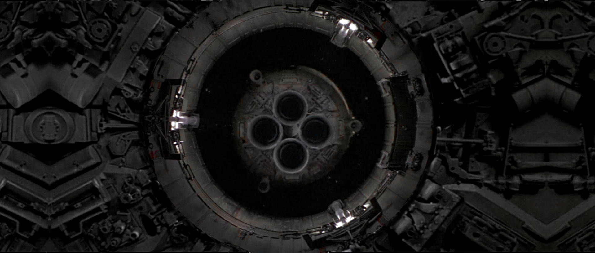
Yeah I kalidescoped the edges but I also not sure if it should be a tunnel type so yeah???

I would imagine this is a missing matte painting of some description though… It would be better to find out what it was meant to be and go from there… Perhaps a storyboard?

Same as film but in 4:3 although it does look more tunnel like in the Joe Johnston art.

The Pod is Back to front in the Joe Johnston Art…

Post
#1215131
Topic
STAR WARS: EP IV 2004 <strong>REVISITED</strong> ADYWAN *<em>1080p HD VERSION NOW IN PRODUCTION</em>
Time

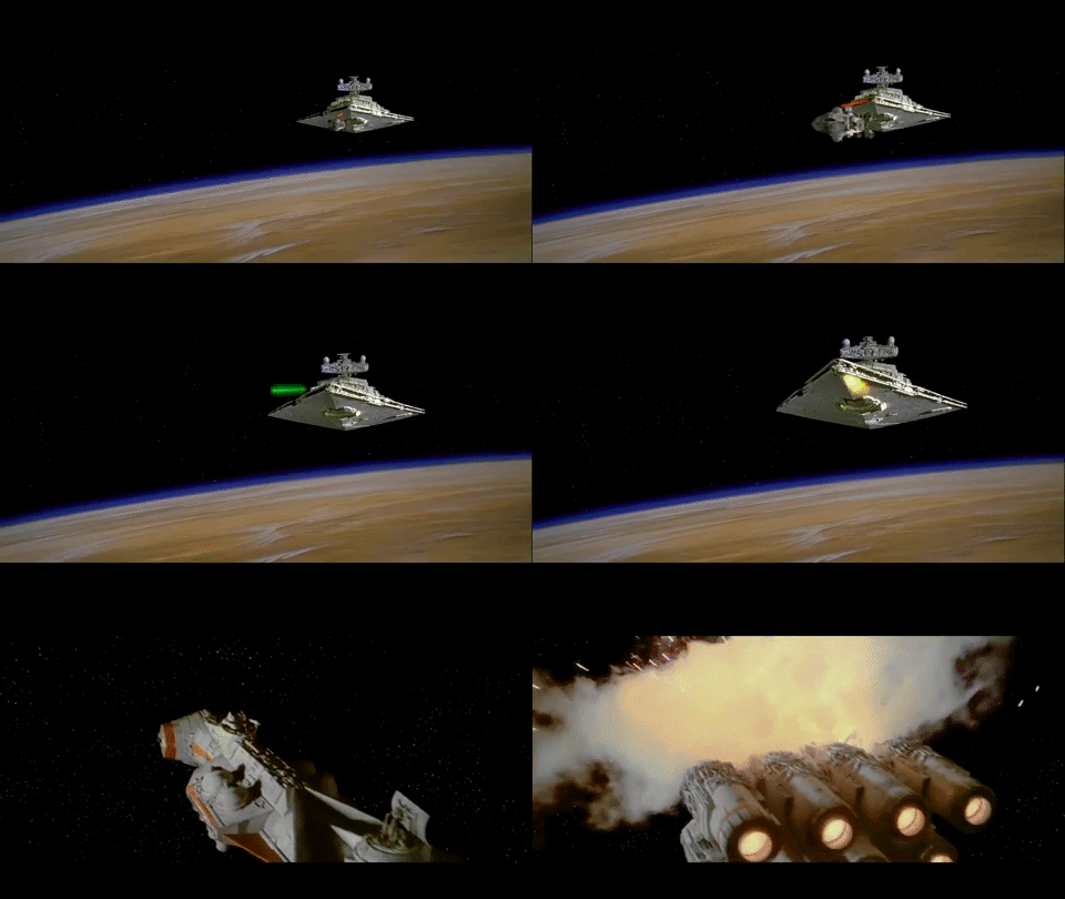
Been looking at the start of Star Wars and I had an idea…

Original

Idea

Not saying you should do this exactly and it’s only a rough mock up job, but I felt it was perhaps the sort of thing that might be up your street?

So anyway you get the idea, hope you like the premise of it, and well It does make one wonder if there was some sort of background or optical composite that was meant to fill in the black bit?

hope it’s all going well…

Whoops just read you not taking suggestions but anyway there it is… Wondering if something was meant to go there?

Post
#1215108
Topic
StarWarsLegacy.com - The Official Thread
Time

There seems to be an obvious answer in all this that is very sensible and also everyone wins in some way…

I think Mike may have finally found the solution to “I want”, “you want”, “we want” ok rip up the contracts let’s do this!

It’s a fair call on the cat and mouse play, well done!

Going back last year some conference, there was a guy from Sony going on about 4k and HDR and stuff and where things are headed for home video. I said to him “But like a lot of these films don’t look the same anymore…” He said “oh it’s just a bit of fun” so there you have it, a bit of fun. Well perhaps you can give them a better version of serious fun 😉

Post
#1214645
Topic
Info: Star Wars - What is wrong and what is right... Goodbye Magenta
Time

when the door explodes…

The Raw Footage is yellow like home video and the walls are colored by this.

It’s way off in the Blu-ray but it’s still more pink /white in the print.

So i then sort of assumed that I could lump the flash frames in also as the same sort of color difference is present or it’s equal.

The Yellow is within the white part. And also when the door initially sparks this is also yellow in bluray very magenta in the print white / pink.

This is why I was also asking for frames or screen caps from technidisc version as it resembles the technicolor print.

Post
#1214536
Topic
Info: Star Wars - What is wrong and what is right... Goodbye Magenta
Time

that clip is actually in the first post and that is kind of what sets my barometer needle swinging over to confirming 'it is" yellow in reality and the home video versions were more correct for these flash frames extreme highlights luminosity and explosions.

But they are not as accurate for the prints overall color that I think is correct.

Post
#1214430
Topic
Info: Star Wars - What is wrong and what is right... Goodbye Magenta
Time

wow that sounds promising…

Render the whole 1996 Bonis Dvd would be interesting indeed under those effects.

But I will check it out, I tried to get to grips with avisynth but failed miserably probably need a front end gui for it. Virtual dub was putting squigly lines on video clips but apparently there is a new virtualdubmod out so i might try it through that.

The appealing part to my mind in those features is the shadow masking and phosphor effects not so much the scan lines but thanks really cool idea or experiment.

Post
#1214136
Topic
Info: Star Wars - What is wrong and what is right... Goodbye Magenta
Time

Although I am only doing the first 5 minutes of the film…Here is a kind of description of what I am trying to achieve.

A CRT will look different from a 35mm Projector because it’s a different type of light source but it’s still more accurate than say an Back lit LED lit LCD panel which is what I have and I am sure most other people have.

So the dance of Light is totally different, it will probably never look the same on modern Technology but one has to try and capture the essence or the spirit of the dance of light with a new type of Light.

So If you simply just re-create a prints color without thinking about that dance of light it will always look wrong no matter what color it is. I am no expert on such things but perhaps I can come up with some sort of model that emulates the light on LED TV to look more like or similar to a CRT within the footage because at least that is what I remember and if you like try to prepare it better for an LED backlit panel. But either way the film lost it’s luminence so I try to put that back.

Post
#1214024
Topic
Info: Star Wars - What is wrong and what is right... Goodbye Magenta
Time

Yeah I hear what you saying about memory, and I know the print is correct or accurate but there is something I can’t quite put my finger on.

And my thoughts lie with perhaps if it is indeed a broadcast print then how would that handle with a CRT and how would that also change the information.

The Blu ray when it comes to R2-D2 panels they won’t go the same color as the technicolor print in fact there is one shot that even if I desaturate the whole image his front part round his eye is blue and everything else is black and white.

So yeah the Blu-ray has some serious issues…

I am just pondering these variations and It might only be small, but it is signifficant enough that it’s coming over like there is something not 100% correct but say 98% correct and that’s not to say I am calling it out as wrong but it does seem that there is evidence to support that is displayed at least a certain way and that perhaps should be taken into account.

I mean I’m not bonkers but I think action is very important part of the film and It should not be overlooked even though it is a small thing ultimately.

Basically they were yellow flashes until the DVD came out in 2004… And I still had a CRT so I am wondering if it has to do with this or that as you say it’s been prepared by design for CRT or the CRT simply misinterprets highlights… But since the new 2004 it has lost the luminence that it did have in my opinion.

Either way you can’t erase 20 years of something being a certain way even if it’s wrong…

Post
#1213887
Topic
Info: Star Wars - What is wrong and what is right... Goodbye Magenta
Time

poita said:

Ronster said:

No my screen is fine… Let me explain. Honestly I find it interesting no hijacking.

This is the version that was on TV I do remember it vividly. I recorded this on Betamax and I just used to watch it over and over again and If I could not watch it on Betamax then I used to have an old maxwell 90 audio tape with the audio of the film on It I used to take about with a Battery powered tape deck.

So I guess what I am trying to say is this is the version I remember vividly but it was prepared a little different but it’s for want of a better word the same thing.

But the levels on the clips look like they are different. and not the right contrast, contrast much higher.

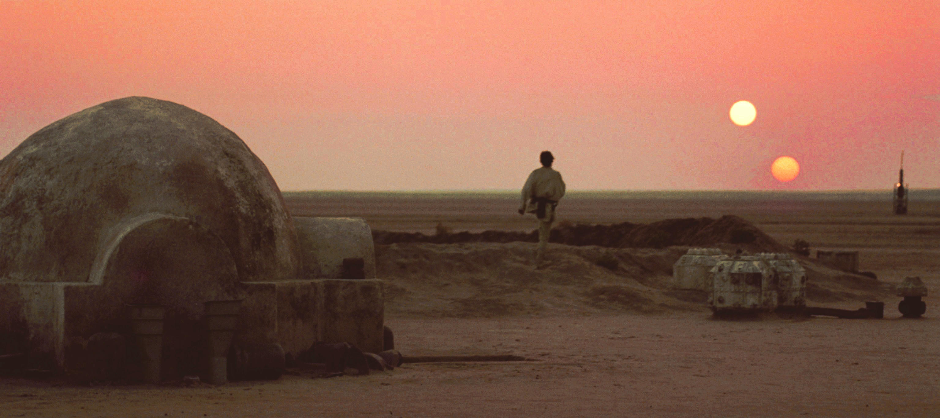
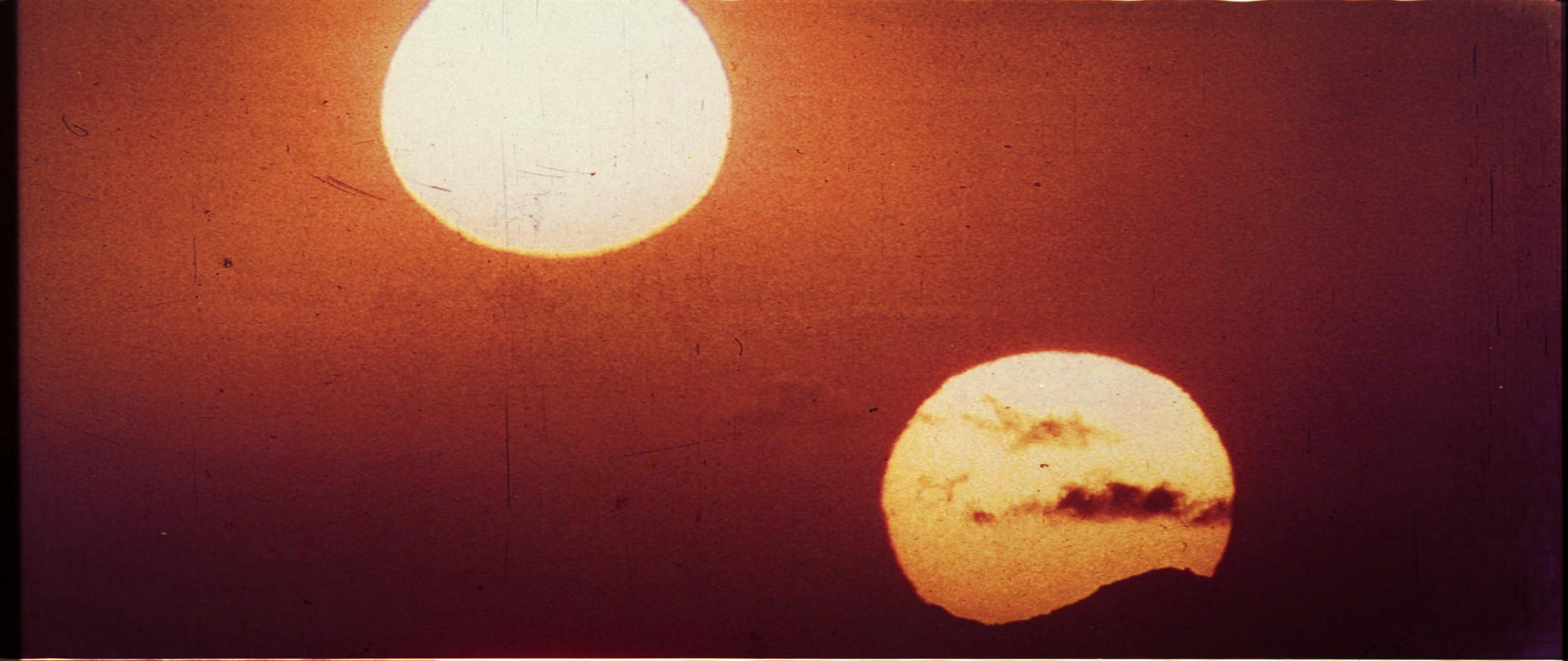
What I have been trying to do is re-create the look I remember off the TV, that version I remember. But I must admit The whole twin suns is an oddity and I am more and more sure there are 2 versions of the scene now.

Now I seen the next part where they are running this part looks fine… Seems like it has brightness issues, if you compare it to the bit where R2-D2 cross the corridor this part is perfect.

On dealing with that part in the Blu-ray was having to drop the high levels to near zero on one shot, it’s over accentuated the blu-ray or 2004. So it’s more of an inherrant problem for that part than a problem with your footage. Not your fault but it’s salvageable from what you have not in the Blu-ray though.

There is a version where the sparks around the Door are yellow and the flashes are yellow but it’s more de-saturated and this was what was on UK TV back in the day.

Ah, so a recording of the UK television broadcast that you recorded onto Betamax?
I have the U-Matic broadcast tapes here that the television stations used. I must get around to capturing them one day, it would be interesting to see what the colour is like on them.

Basically it’s like the clip here on the VHS cap

https://www.youtube.com/watch?v=z5qNMAM2dzg

But this is what I have been trying to describe, although it’s not the same and it’s not the right saturation it’s different for the flashes as you can see.

Basically what I am describing you will find something akin to what I am talking about on those tapes 😃

If those flashes were indeed purposefully done pink perhaps the UK TV uses a Raw take or un-touched.

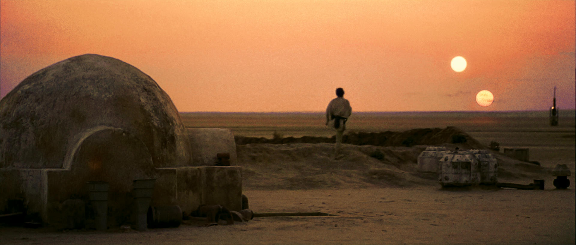
You could probably lump the sunset shot in the same category Raw take also. But I don’t think this was on the original Betamax Broadcast I had I think it was later on this one surface similar to the release date on the Technidisc so it could be a 1990’s thing but the technicolor print has no purple on the suns on there own and the Blu-ray is the same no purple it looks like it wants to be the Raw take more than the purple version. So it must have been a new print they struck perhaps?

I remember both purple and red versions.

Manually matched Laserschwertz image closer to Technidisc.

IMPORTANT INFORMATION

frank678 said:

msycamore said:

Baronlando said:

frank678 said:

Looking at the comparison shots between the GOUT and Technidisc, the GOUT looks almost like its been bleached. Is this a combination of fade and DVNR or are there other factors involved?

I was wondering if that source was turning yellow and then correcting that ended up making it kind of blah?

My DVD transfers poor white balance also contributes to making it look more yellow than the actual LD really is. I actually think the elements used was turning pink/red at this point, the telecine operator may have tried to counter this with a bit of yellow and green.

Here are a couple of frames from the 1992 VHS

http://i.imgur.com/cAYrX.png

http://i.imgur.com/GQZFw.png

If you scroll back to You_Too’s Technidisc/Gout comparisons of these two shots the VHS frames seems to fall exactly inbetween the two. It hasnt got the yellow saturation of the Technidisc (ignoring what the capture distorted for one second) but it hasnt turned as pink/red as Gout.

This is how the 1992 VHS looks on a TV screen (taken with the camera on a mobile phone) followed by how it looks from video to computer to give you an idea of the transfer change.

http://i.imgur.com/QCYO1.png

http://i.imgur.com/I8Pyj.png

Yellow & pink / red flashes in trailer for 1993 Release.

https://www.youtube.com/watch?v=Riipp7KLfO4

This is grade then for 1993 Master? Blue Gamma issues.

Post
#1213879
Topic
Info: Star Wars - What is wrong and what is right... Goodbye Magenta
Time

No my screen is fine… Let me explain. Honestly I find it interesting no hijacking.

This is the version that was on TV I do remember it vividly. I recorded this on Betamax and I just used to watch it over and over again and If I could not watch it on Betamax then I used to have an old maxwell 90 audio tape with the audio of the film on It I used to take about with a Battery powered tape deck.

So I guess what I am trying to say is this is the version I remember vividly but it was prepared a little different but it’s for want of a better word the same thing.

But the levels on the clips look like they are different. and not the right contrast, contrast much higher.

What I have been trying to do is re-create the look I remember off the TV, that version I remember. But I must admit The whole twin suns is an oddity and I am more and more sure there are 2 versions of the scene now.

Now I seen the next part where they are running this part looks fine… Seems like it has brightness issues, if you compare it to the bit where R2-D2 cross the corridor this part is perfect.

On dealing with that part in the Blu-ray was having to drop the high levels to near zero on one shot, it’s over accentuated the blu-ray or 2004. So it’s more of an inherrant problem for that part than a problem with your footage. Not your fault but it’s salvageable from what you have not in the Blu-ray though.

There is a version where the sparks around the Door are yellow and the flashes are yellow but it’s more de-saturated and this was what was on UK TV back in the day.

Post
#1213755
Topic
Info: Star Wars - What is wrong and what is right... Goodbye Magenta
Time

Thanks, first thing that struck me is how un-naturally over bright this is, I mean seriously I need to put sunglasses on.

The color is very good but there is no depth it looks flat as a pancake.

It looks like a series of really bright images. It does not have any step down like a levels curve it’s just all very bright as can be.

So if this was projected as I said it would drop in the mids then further in the shadow. But I seriously remember the yellow flashes not dreaming it up or anything it’s on the VHS 😃

Would you say it’s missing yellow?

The medium this has been prepared for is an old 35mm projector not a tv.

Should have called this thread hello yellow perhaps?

If I de-saturate that drop the brightness a bit up the contrast (Big jump) and add a bit yellow that is basically the VHS…

Post
#1213744
Topic
Info: Star Wars - What is wrong and what is right... Goodbye Magenta
Time

where are you from?

I am from uk never saw it in the cinema, earliest one i caught was ROTJ but like i said this whole tecnicolor look rings a bell but also the red suns and no pink full on magenta flashes. I suppose the version i cherish is the one i grew up with but honestly it’s fine by me. I just want this one back…

it was quite desaturated mind but had high exposure contrast.

Post
#1213737
Topic
Info: Star Wars - What is wrong and what is right... Goodbye Magenta
Time

ok but this is massively over bright…

But yeah that’s the red version… Which might also have the correct color for the explosions and the flashes and so on.

looks like there is 2 versions and i want this one.

the whole technicolor look rings a bell but I dunno I just remember this also probably from the TV as a kid?

Post
#1213627
Topic
Info: Star Wars - What is wrong and what is right... Goodbye Magenta
Time

Turisu said:

I always thought that moon was supposed to be blue as, when the camera pans down from the crawl, it momentarily looks like our earth and moon. Then suddenly the massive world of Tatooine rises into shot and we realise that we really are in another galaxy. Very effective if that was the original intent. 😃

https://www.youtube.com/watch?v=3Kun0Tnnu4o

😃

Yeah it’s just grey now but the matte sliding over it kind of is a bit distracting. Would have been nice if It could have retained it’s original color in the Special edition when we first see it.

Just theorizing about print scans and the levels set-up. So if you were trying to emulate what an image looked like projected you would leave highlights at 100% the mid’s you would drop to around 93% and the shadows around 85% or there abouts to take into account how something is not as bright will drop off quicker from the projector to the screen… This would be done for telecines I would imagine.

Post
#1213599
Topic
Info: Star Wars - What is wrong and what is right... Goodbye Magenta
Time

Ah ok interesting… So although a print may have all the detail it might not have the correct exposure?

Hence why a laserdisc has more detail than a print because of being over exposed? or blown in bright part…

So like what I am questioning here about although prints may have more detail over all… They may miss out on certain details depending on how it is handled during exposure?

So just out of curiosity what color you have in the prints for very bright moments pink / magenta or white / yellow?

I guess I am questioning the exposure and luminosity and what may have been lost or gained…

But as far as the sunset shot goes I think there is perhaps Red version and purple version…I think the red version match the Tecnicolor look. Bear in mind also the Technidisc very much resembles the technicolor print color… Could be in the name Techni?

Special effects shots have different exposure to live action due to being assembled from different film stock sources?

I think that moon is meant to be Blue but a large matte slides over it so it becomes more grey…

hue, Luminosity, gain, levels and saturation more correct?

Post
#1213420
Topic
Info: Star Wars - What is wrong and what is right... Goodbye Magenta
Time

Original

Tweaked

Came across an image of the opening and it looked quite filmic. I tweaked the color slightly.

Looks like it has a nice range between the highlights and the depths. This is only rough guess again.

But do you think this is right in terms of the range between the highlights and the shadow?

I think the star field needs to be darker / contrasty or more gain perhaps, but generally what do you think?

Grey moon or Blue moon? This one is more saturated…I think too much saturated…

Post
#1212961
Topic
Info: Star Wars - What is wrong and what is right... Goodbye Magenta
Time

UnitéD2 said:

Your pic is fine and makes me think about a photograph of this shot by Mike Verta during the screening of a tech print.

Is it more correct than the purple version ? That’s a good question.

My Brain is Ticking…

My opinion is Yes it is and here is why.

This shot and the space shots required special effects thus most of this stuff was made on different film stocks. The technicolor print is correct for all the live action. But in terms of anything that has special effects it needs to be adjusted to match the rest of the technicolor footage.

Let’s face it the technicolor print in mos-eisley does not need to be more yellow. This also explains the yellow faded opening and the lack of color in the explosions.

So I would say the special effects shots need to be matched to the rest of the print as they stick out like a sore thumb.

No more misleading blue / magenta stuff space ships. And don’t forget the yellow lights underneath the star destroyer…

I imagine the special effects vary quite a lot from the rest of the live action?

That yavin shot would be warmer also…

Ok I think the VHS is a good indication that a lot of the pink flashes are in fact meant to be yellow…

https://www.youtube.com/watch?v=z5qNMAM2dzg

Post
#1212929
Topic
Info: Star Wars - What is wrong and what is right... Goodbye Magenta
Time

Well I am guessing on this one… But the Tantive explosion looks better less washed out unless it was actually just white.

But because it’s red in the bluray tells me that the cyan and yellow are missing in action.

Just realised I had the saturation down on the first shot! so mistake but it’s about the explosion anyway.

As far as the sun’s on there own shot goes… The only thing that seems to make sense is that there is a lot of yellow missing.

I am guessing here but the red glow around the sun looks good to my eyes. And it seems that it feels like it’s somewhat reacting like a normal light source of a sunset would through a camera.

So it’s safe to assume there is a quite a bit missing to make it look like a normal shot of suns but to make it look like this you have to go through the whole range of settings… I have no idea what this shot looks like on the Technidisc?

Post
#1212927
Topic
Info: Star Wars - What is wrong and what is right... Goodbye Magenta
Time

UnitéD2 said:

Like the sky on Yavin ? http://www.framecompare.com/image-compare/screenshotcomparison/KDG7NNNX

The frame is from Dr Dre’s thread there : https://originaltrilogy.com/topic/Star-Wars-1977-Technicolor-IB-print-color-references-matched-to-print/id/55404. So the scan is accurate to the print

If I well understand you, a single correction could do the job, and it would be visible in the brightest shots only.

EDIT : For the sunset, the same correction is hardier noticeable http://www.framecompare.com/image-compare/screenshotcomparison/FJEFNNNU

Yavin shot The sheen on the side of the planet is correct. you notice that edge pop and a still from a thread I noticed a still from the Deraan print had that and it’s a nice detail. Again it’s a highlight.

I think if you look at the actual Technicolor Frame for the suns on there own shot it’s actually quite Red with little blue in but I would push between Green and Yellow on a color wheel not straight green.

Here’s a guess at how grey the models would have looked and also how yellow the explosions would have been.

But I’d like to see that technidisc to be sure or more sure.