- Post
- #1212927
- Topic
- Info: Star Wars - What is wrong and what is right... Goodbye Magenta
- Link
- https://originaltrilogy.com/post/id/1212927/action/topic#1212927
- Time
Like the sky on Yavin ? http://www.framecompare.com/image-compare/screenshotcomparison/KDG7NNNX
The frame is from Dr Dre’s thread there : https://originaltrilogy.com/topic/Star-Wars-1977-Technicolor-IB-print-color-references-matched-to-print/id/55404. So the scan is accurate to the print
If I well understand you, a single correction could do the job, and it would be visible in the brightest shots only.
EDIT : For the sunset, the same correction is hardier noticeable http://www.framecompare.com/image-compare/screenshotcomparison/FJEFNNNU
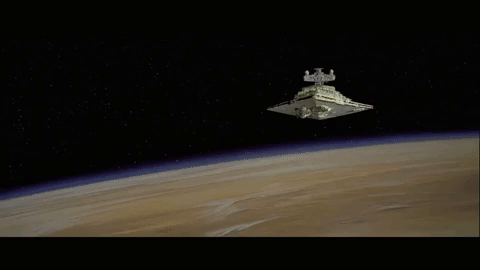
Yavin shot The sheen on the side of the planet is correct. you notice that edge pop and a still from a thread I noticed a still from the Deraan print had that and it’s a nice detail. Again it’s a highlight.
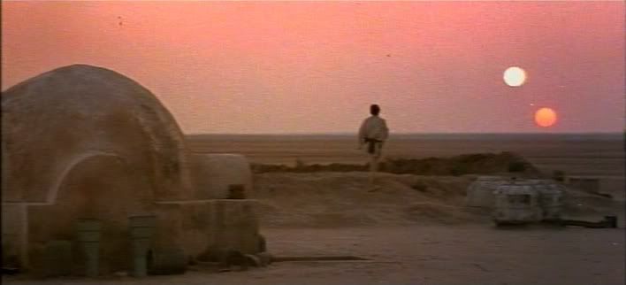
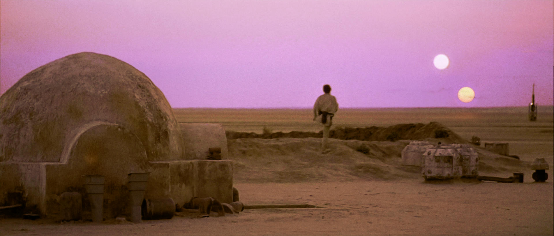
I think if you look at the actual Technicolor Frame for the suns on there own shot it’s actually quite Red with little blue in but I would push between Green and Yellow on a color wheel not straight green.
Here’s a guess at how grey the models would have looked and also how yellow the explosions would have been.
But I’d like to see that technidisc to be sure or more sure.