logo Sign In

Ronster

User Group
Members
Join date
10-Dec-2011
Last activity
7-Jul-2025
Posts
3,142

Post History

Post
#1242716
Topic
Info: Star Wars - What is wrong and what is right... Goodbye Magenta
Time

😃

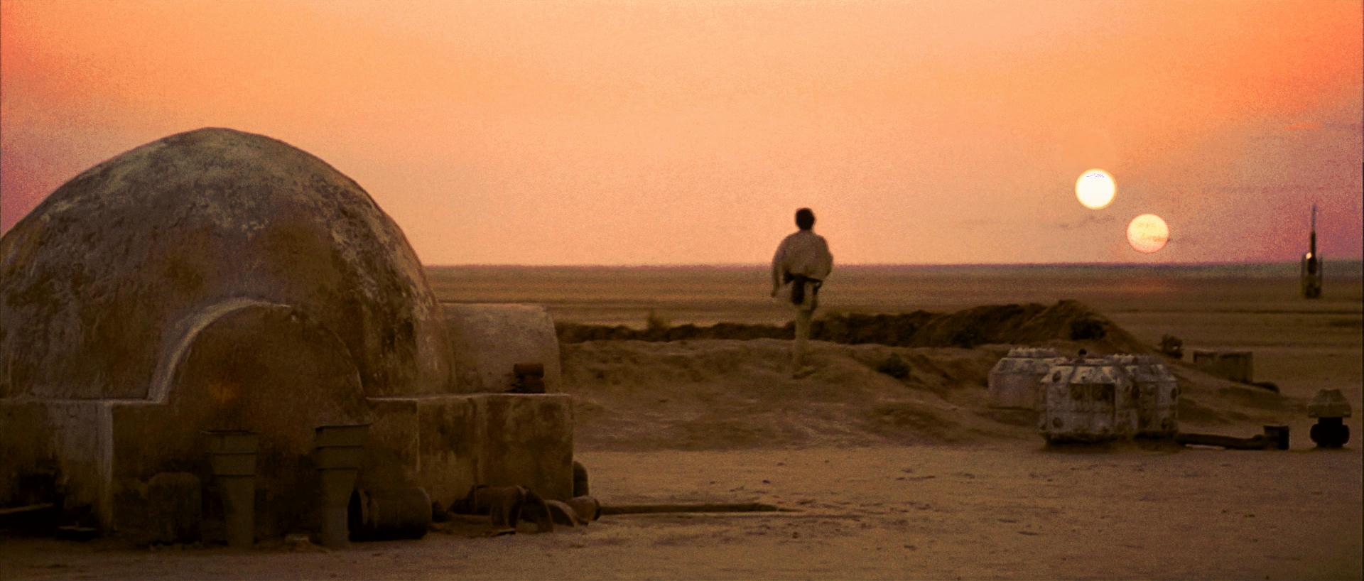
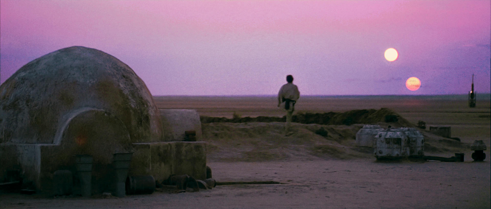
Ok Red Version then.

Should we trust in this image?

I think the red version wins between Purple and Red in terms of aesthetics and realism but it would seem if they color tinted it to make it say more alien like they forgot to do certain shots or in the process of adding the fake sun something went wrong and we have color issues.

I can not change the settings on my monitor unlesd it has 4k signal pumping in which i do not. It comes calibrated from Samsung and I can not adjust it with normal HD it has a default setting which you can choose different modes like dynamic cool and warm or natural. Unless you put 4k on HDMI 2.0 in.

Post
#1242536
Topic
Info: Star Wars - What is wrong and what is right... Goodbye Magenta
Time

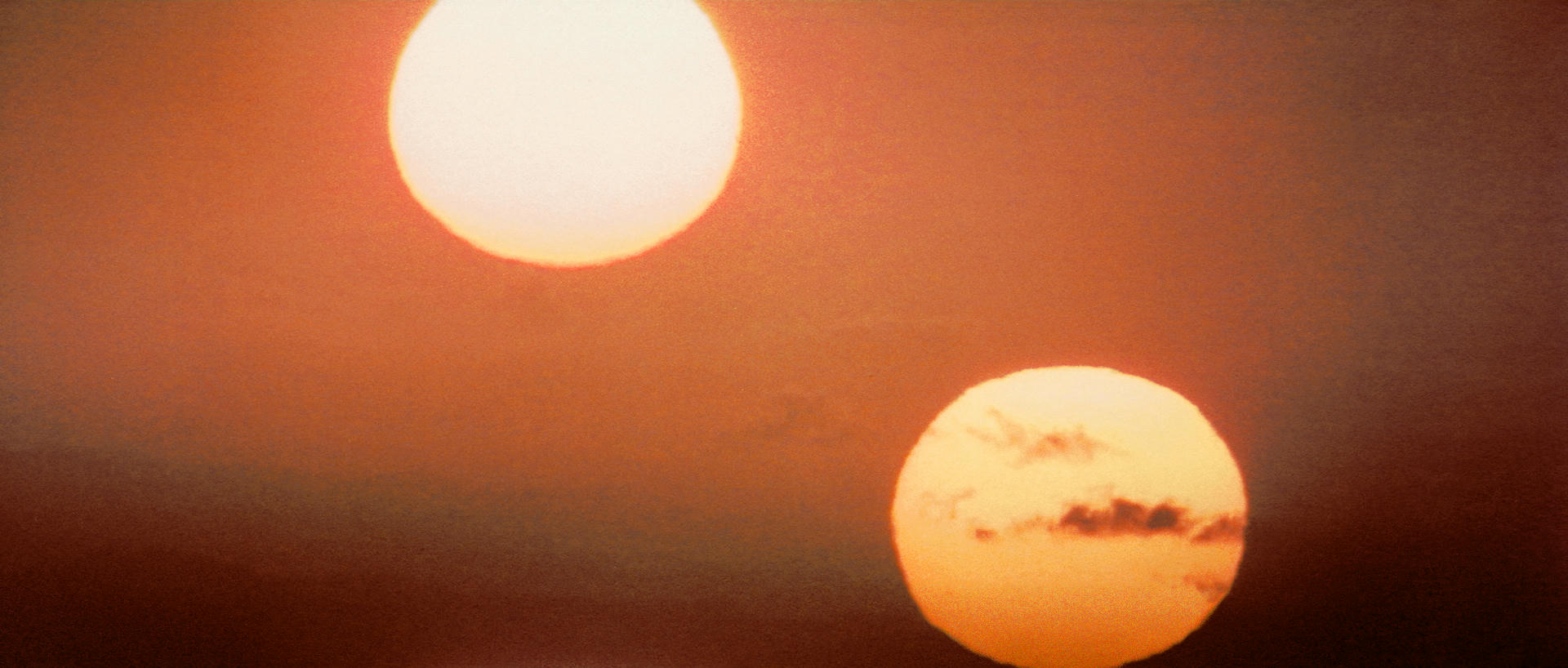
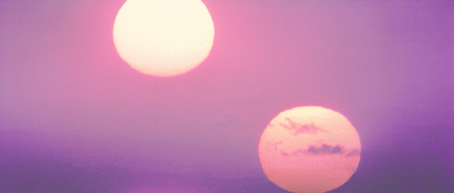
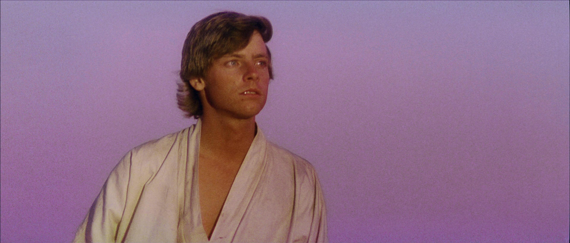
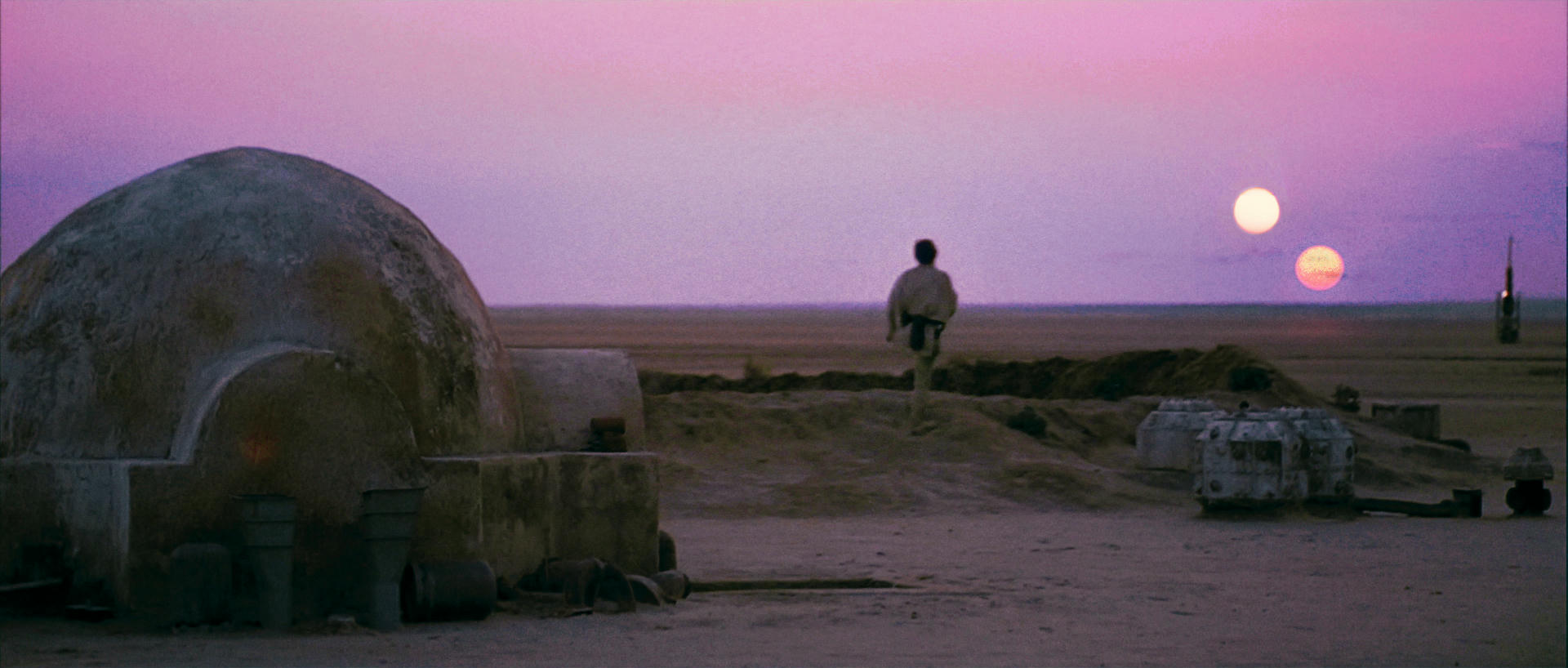
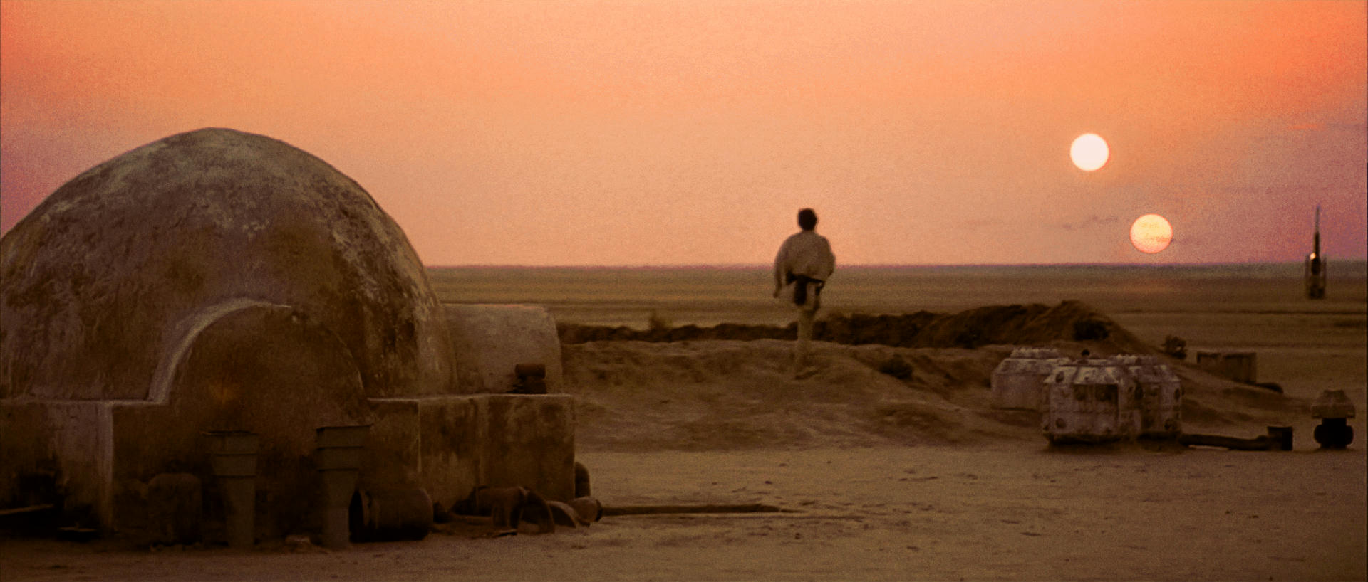
Been looking at the Binary sunset shot for quite a while and I could not make up my mind about it so anyway… Hello Magenta!

Here is my take on it. Although I did a small edit on the sun’s this is my color grade effort of what I think it was meant to look like in a perfect world 😃

Hope you like it as a guess at how it was supposed to look.

And this one for the shear fun of it 😉

you can call me a silly idiot for doing that 😃

Post
#1242216
Topic
4k77 - shot by shot color grading (a WIP)
Time

UnitéD2 said:

Ronster said:

Ok un-jaundice it at least it does more or less match now. The fist 2 better than the last 2.

I tried :

use this one instead

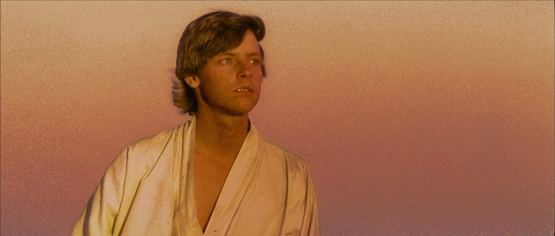
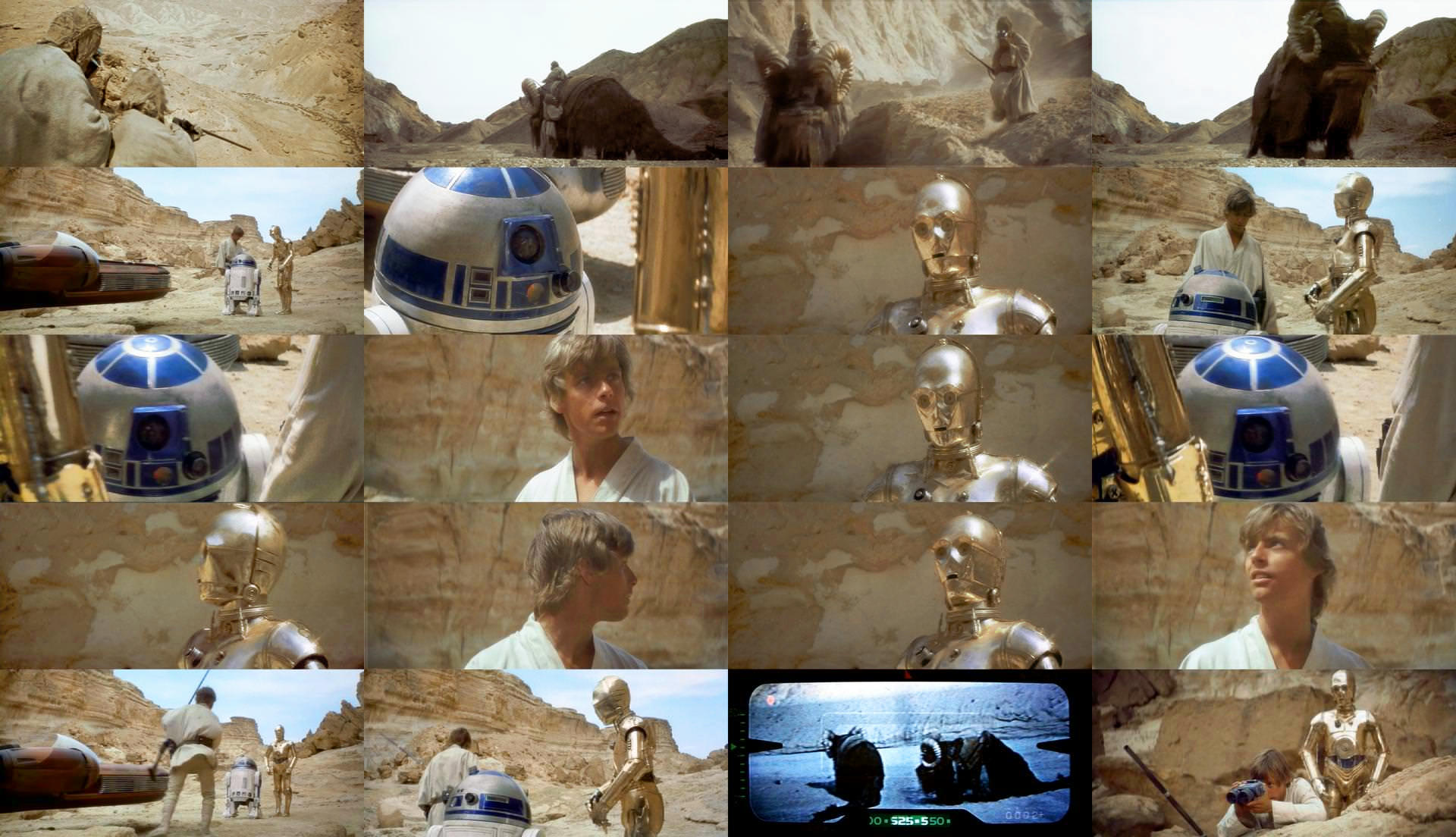
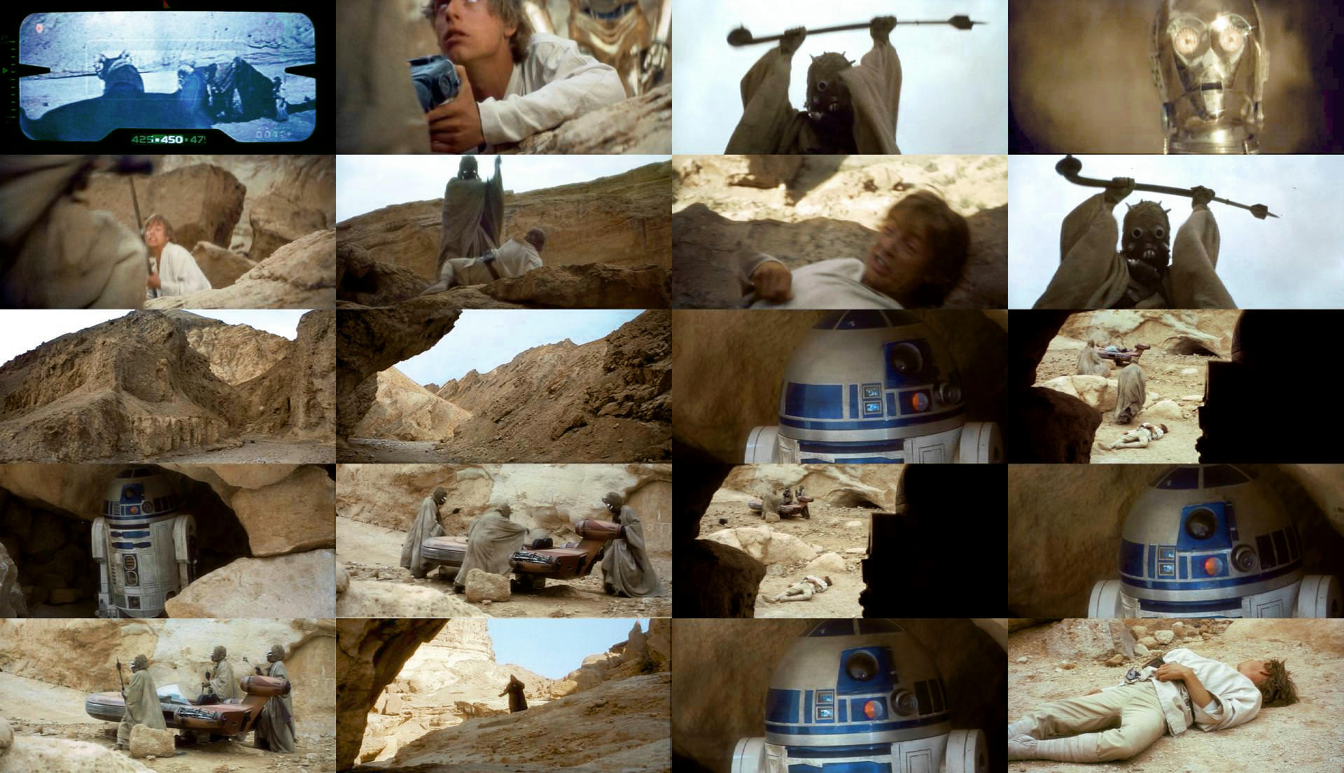
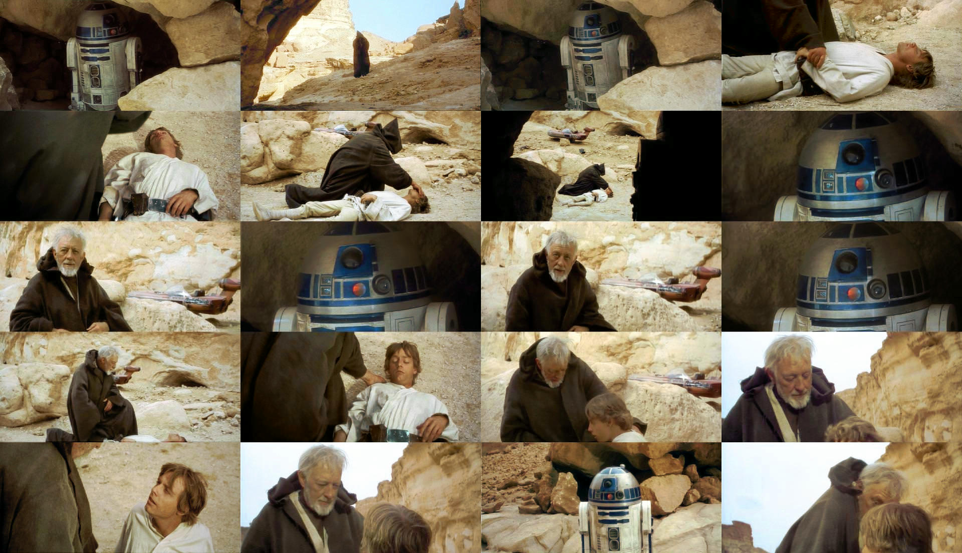
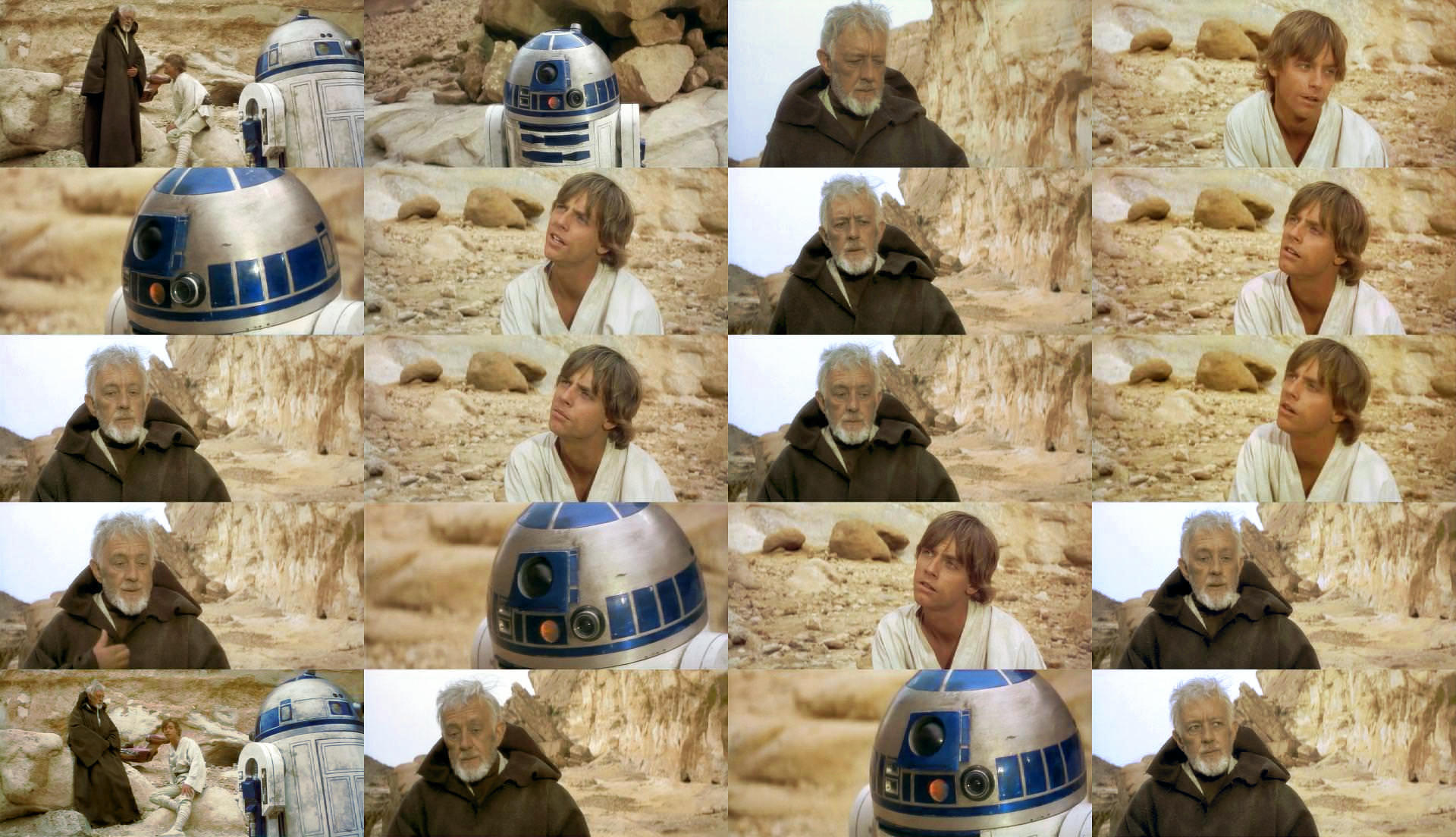
I think it’s already quite un-jaundiced but I look at the shots for the sandcrawler and stuff this is quite similar really there is not much in it. Perhaps optical illusion. Luke is not far off it’s the obi-wan shots that are the tougest of the lot. Try Blue and cyan Shadow cast leave red alone.

Saturation level altered

Post
#1241971
Topic
4k77 - shot by shot color grading (a WIP)
Time

yotsuya said:

Ronster said:

UnitéD2 said:

Imgur

Well, in this set you have made Luke and Ben jaundiced. Where is the red in their skin tones? Far too much yellow and not enough red.

Ok un-jaundice it at least it does more or less match now. The fist 2 better than the last 2.

You are right but it’s finding the magic amount between the red and the yellow.

Like the first Binocular shot set Dre did.

I had not fiished when you quoted me either. So the set is a bit different but still like you said magic amount of red / yellow.

Post
#1241767
Topic
4k77 - shot by shot color grading (a WIP)
Time

UnitéD2 said:

Imgur

I’m not sure it’s really better than what Dr Dre did. As Yotsuya said, it’s very difficult to find the balanced amount of red.

Hues and saturation messing with your perception… The others look good though well done 😃

Edited final set Done for my own self satisfaction. I won’t do any more. Honestly just want to see it look the best it can look. Good Luck with it you obviously disagree.

Post
#1241733
Topic
4k77 - shot by shot color grading (a WIP)
Time

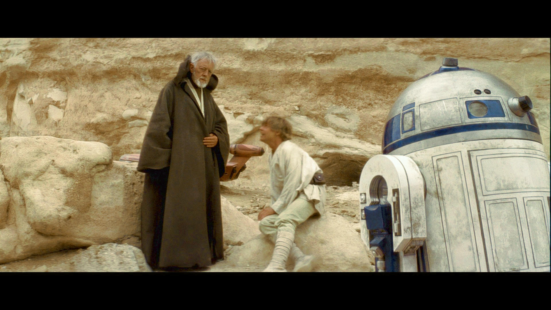
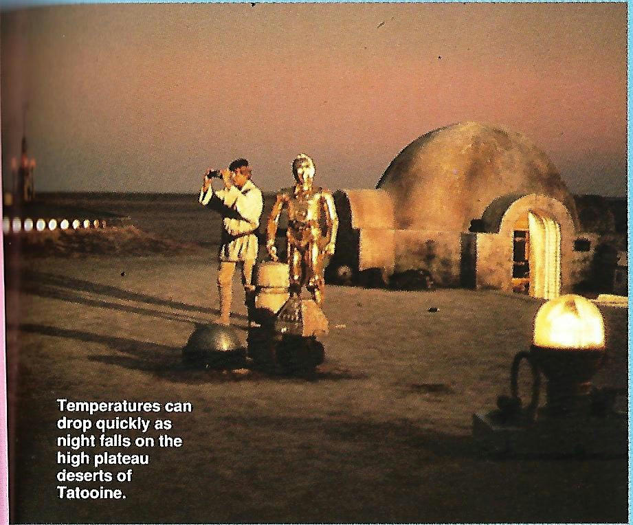
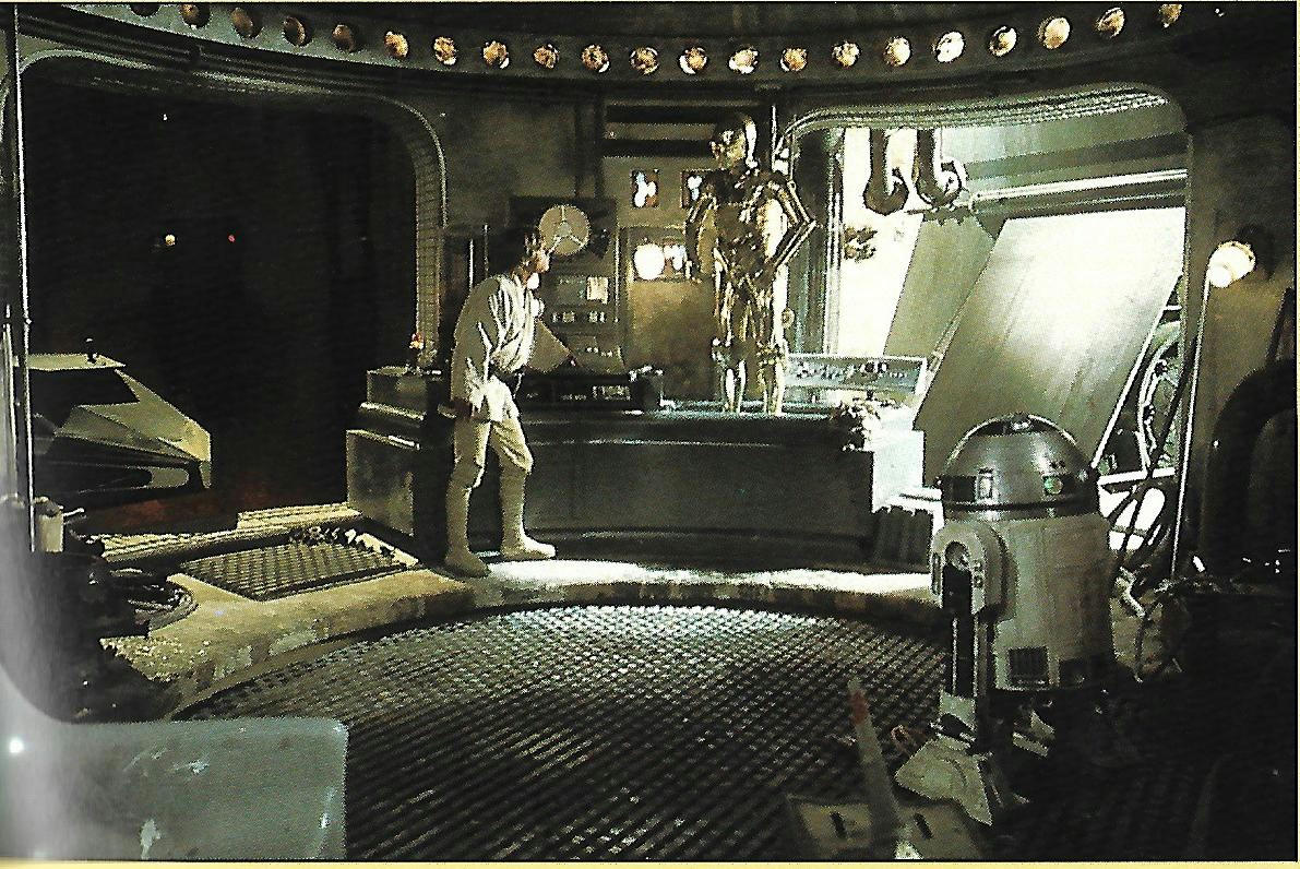
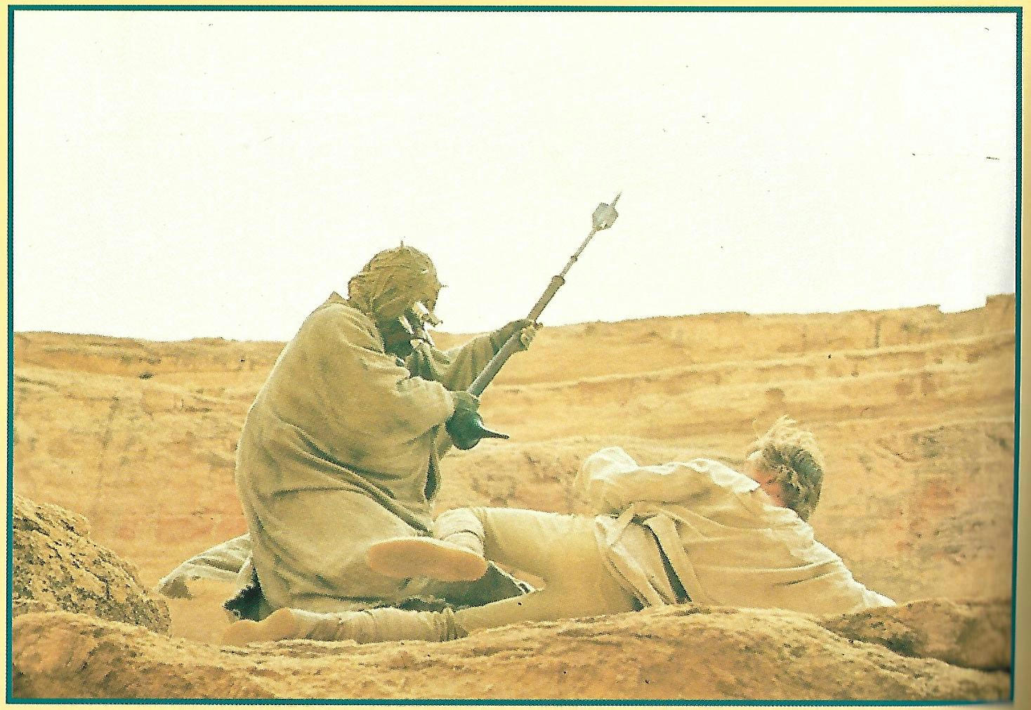
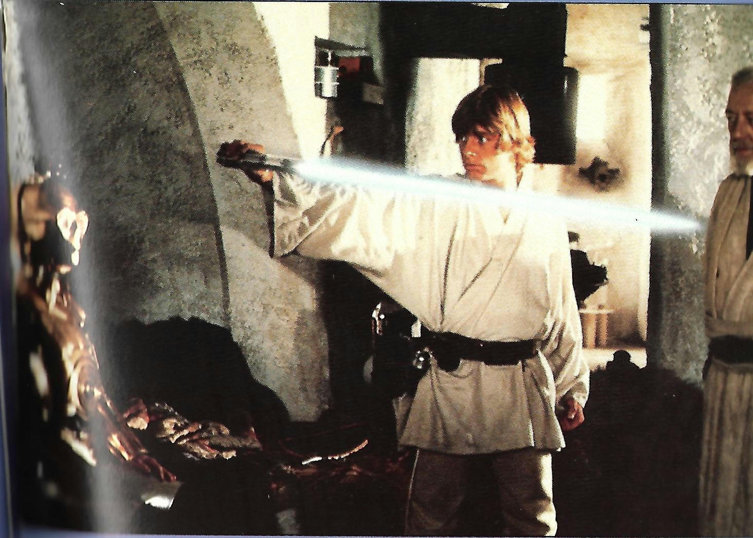
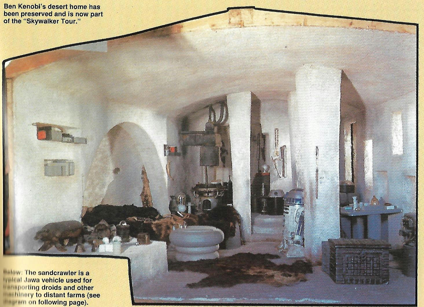
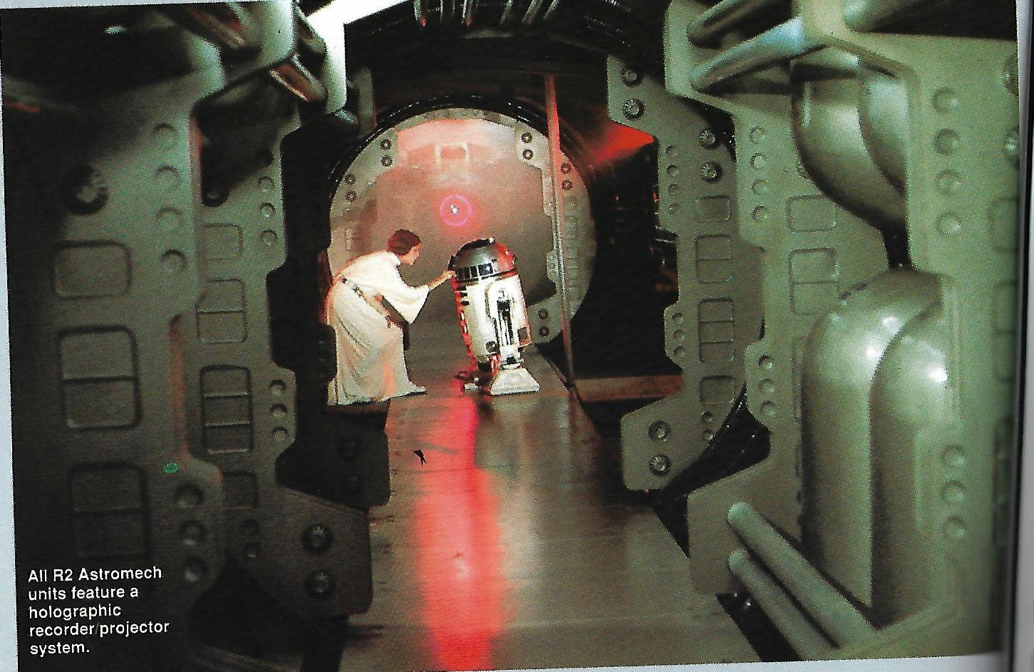
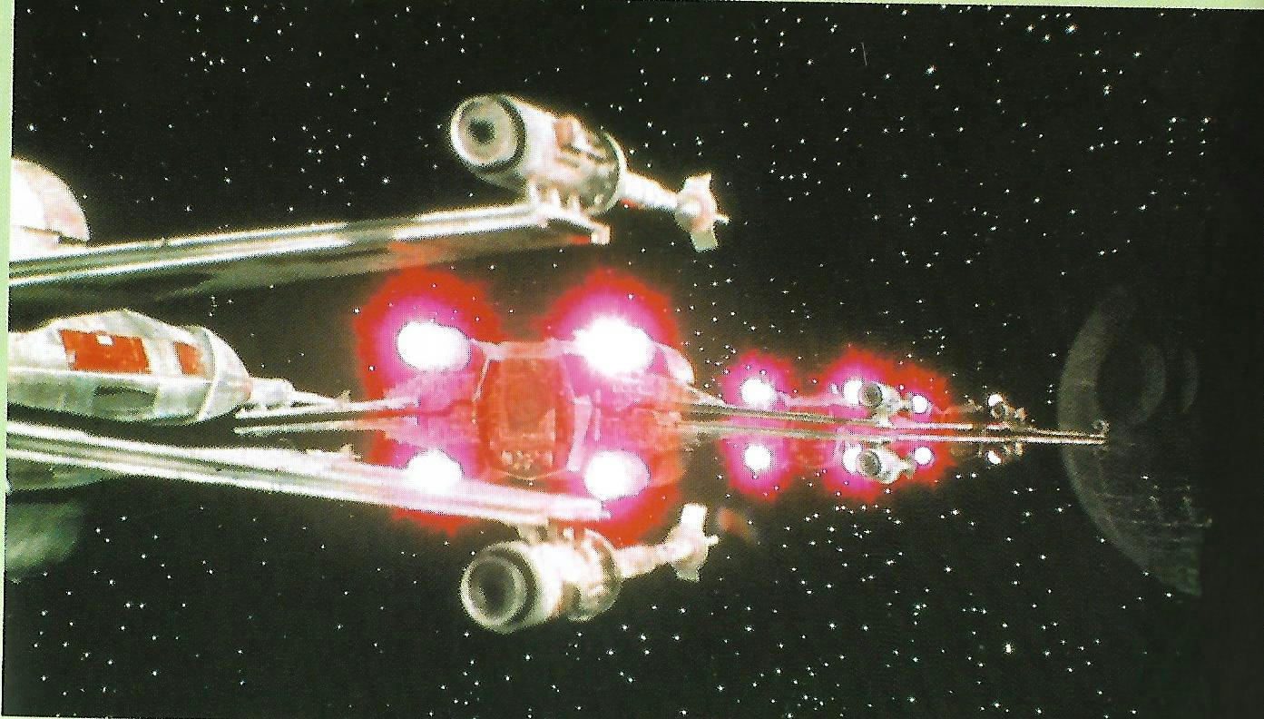
I stumbled on a copy of Star wars Technical Manual Magazine the other day… These may be of some use. I have simply scanned these in no changes were made.

This is the most astonishing one, very interesting indeed. It means that this part is totally botched!

bit green

Very Yellow

not bad a bit too red and desaturated

URGH!

YES YES YES YES YES YES That looks well good 😃 but red face again.

Good but red brightness off the charts

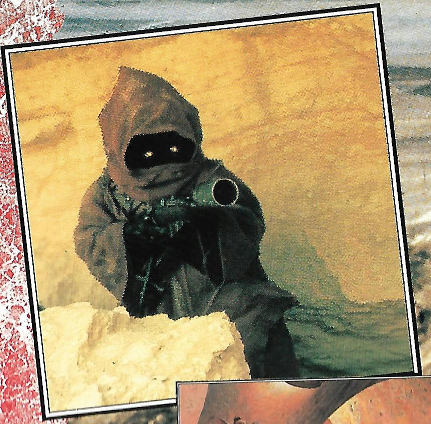
Jawa in yellow canyon… Green shadows

YES YES YES YES YES YES This also looks well good

Bit too green

too yellow / red

Like this one

ok

NO NO NO NO NO NO PINK LIGHT NO 😃

Alright 😃

So enjoy them for what it’s worth the first one blows a big hole in that night part in tattooine. It really can be that wrong remember that.

Post
#1241529
Topic
4k77 - shot by shot color grading (a WIP)
Time

DrDre said:

I personally feel some of your corrections look a little washed out, as if colors are missing. I also think you might elaborate a bit on the concept of “the wrong hue”. You have used this phrase more often in the past, and it makes it seem like there’s some clear definition of what is the “right hue”. In principle there can be any number of hues, and not one of them is wrong or right. However, I would say in the type of correction I’m going for the most important considerations are the colors of the original photography, and whatever effects may have been added to get to the original color timing was as seen in cinemas.

I am fine with your opinion on the “washed out” really what i am trying to figure out is what is causing the pink faces or deep red faces.

So i am not attempting to recreate the color of a print but try to understand what is causing say tarkin having pink rings around his eyes. This would come down to either being oversaturated or not enough level. But when I say in the wrong hue, I mean that the film or re-production print has shifted away from what it would have looked like in reality. You can see this happen on different scales througout the fim as in a certain thing might be red then pink or blue then purple. The shifting happens around red / yellow and then blue / purple which results in either stronger Green or Magenta on various scales. This means that the film is fluctuating and shifting and only because we say know that say an x-wing is painted red we know that when it’s pink or even a bit fluroscent at times something is up, and there is a very clear problem that you can choose to forget about because you know the x-wing has red paint but it’s pink or you can also say well if it is actually red paint and the film is imposing a problem because either an error it’s old and faded or it’s just messed up through perhaps a byproduct or bluescreen or what ever it may be, you can be fourthright and say well it’s meant to be red so let’s make sure it is red and not pink because it is in the “wrong hue”. But you can obviously also see in faces the Magenta byproduct of the blue shifting. Green bleed in the shadows from the red shifting. So I hope that explains what I mean. This byproduct does not carry any creative intention it’s just a byproduct mess with no artistic flavour I don’t really put much trust in film prints to be accurate from that era,

I don’t mind what people strive for but I kind of separate the wheat from the chaff on this and ignore the fluctuations and hue shifts and right them off as not intentional non artistic by products. Film Studios also fix older films on new transfers that display this problem on older transfers of hue shifting because “the film” is actually over righting the artistic intention and through the nature of film self imposing it’s byproduct and being askew for what ever reason against the director and crews will.

In short it came out looking wrong in a way it was not meant to.

Also bear in mind the master print that a re-production in those days may also be quite different to what was actually intended. It’s a byproduct or a sign of the times. Got quite a bit better by the 80’s though.

Post
#1241208
Topic
4k77 - shot by shot color grading (a WIP)
Time

yotsuya said:

This is where I have the color correction for the Blu-ray…

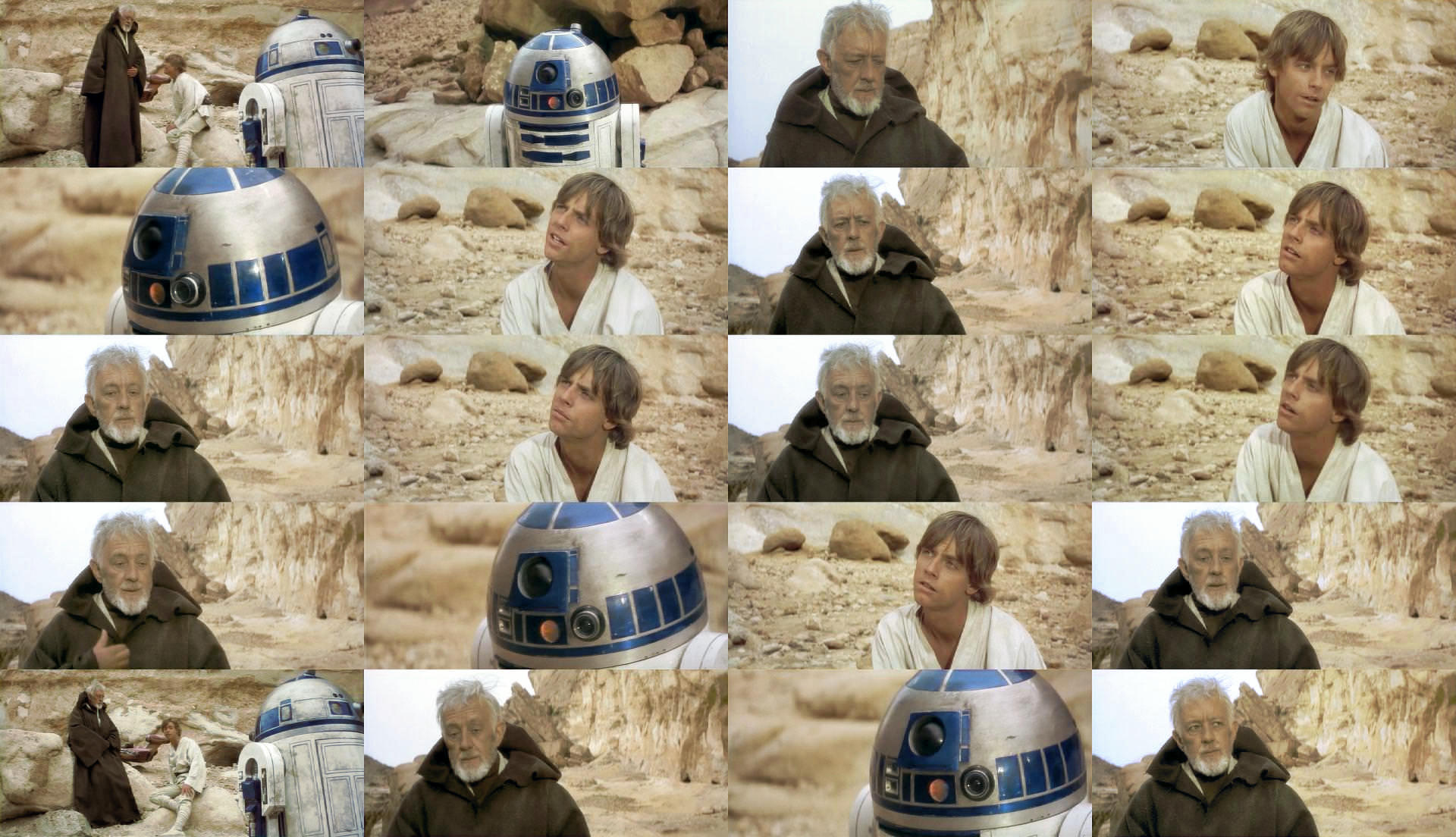
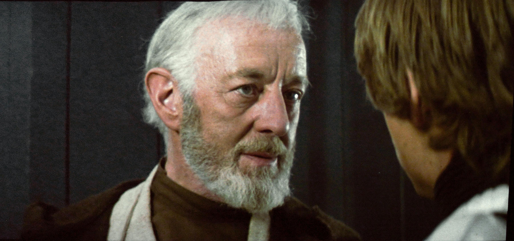
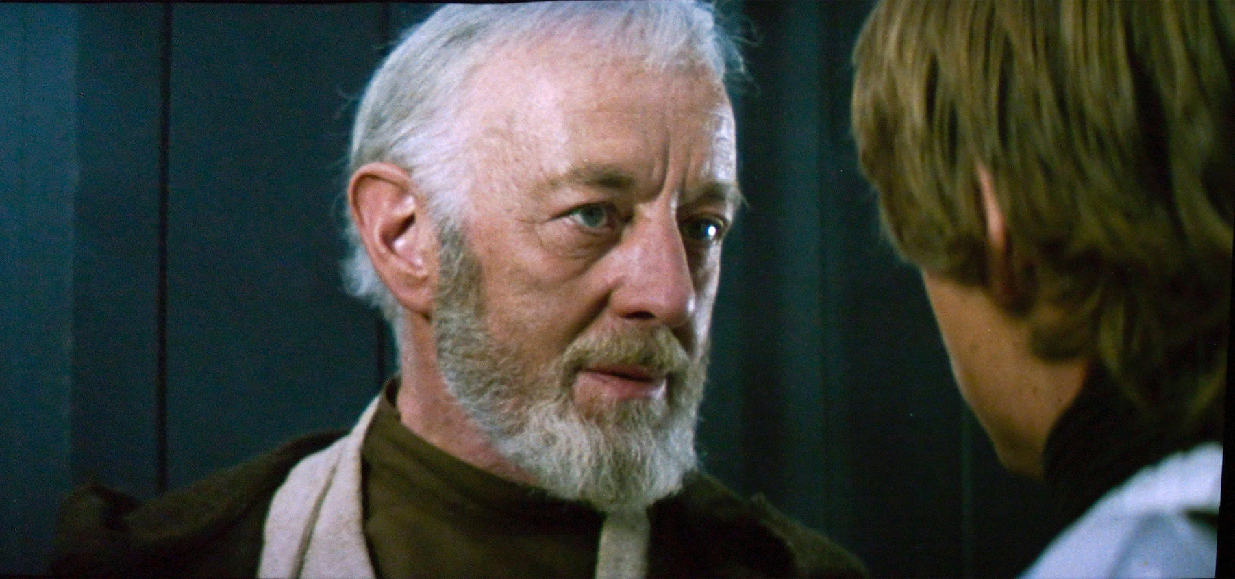
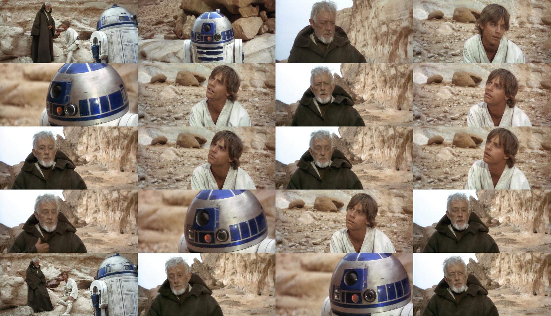
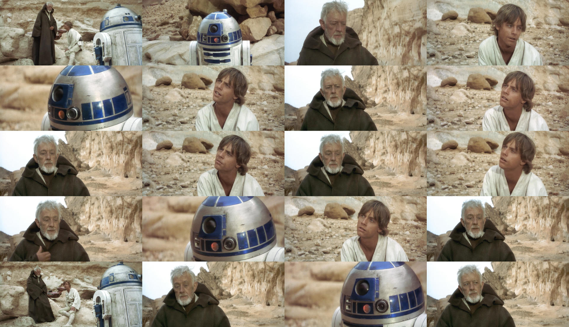
R2-D2 looks too purple but I like this too. Check the art of star wars the reference Pic clearly shows he is Blue darker parts look more blue purple not when light hit’s it. With that said I doubt it’s fixable with the Blu-ray source probably.

I do have a habit of over doing it you are right but let’s remember I am simply having a quick look, and It’s more the obi-wan shots facing camera that require the Hue shift this was the main concentration I was focusing on with red face. It’s difficult to grade an image of 16 images or what ever and none of them actually match.

Essentially I stick by the binoculars part Dre did looks the best this part does not quite match that part and I would like to see it match by any means neccessary 😃 Apologise for over doing it I am not going for precision.

I’ll leave this here for that Technicolor Still that looks weird also.

Technicolor

I know it’s not right but it’s an indicator. Sans psychedelic hair do 😃

Red hued one way yellow the other direction.

Open the technicolor in new tab first then the first attempt in new tab then the hue alteration in new tab and you have the process I did in sequential order, click between to see the differences to end result.

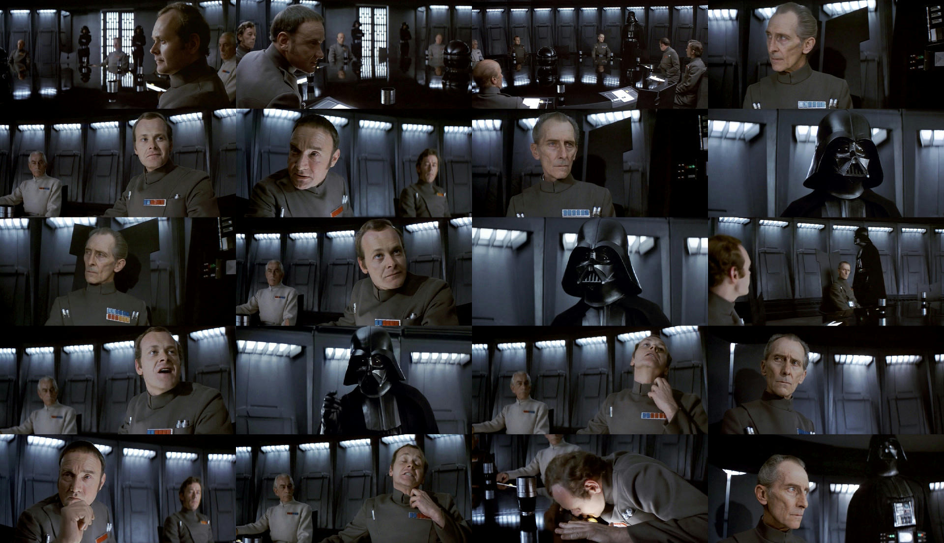
I think the stills for the conference look fantastic I did however experiment with red and blue shift reduce magenta and matched Vader as he is the odd one out by selecting him separately… It’s much of a muchness but it all depends what you are going for obviously the Technicolor has quite a bit green in it, but not in the canyon. I honestly think there is something in the Red and Blue shift though.

At the end of the day I don’t really care about this because what you did looks great but for an experiment, that is about it really.

Different Saturation level.

Post
#1240370
Topic
4k77 - shot by shot color grading (a WIP)
Time

it’s the same canyon from raiders of the lost ark. it does not look red in that film and it matters not what a set photo looks like it depends how the camera was set up that actually shot the footage. All I was doing was showing you the hues had shifted. Which you can clearly see the rocks are not pink which is how the hues are conforming towards pink. I have old photo’s at home from the 70’s that shall we say don’t reflect reality.

Also ask yourself why re-paint R2D2 probably because the paint had faded in that still it again pinkish compared to the still below. Both stills look like they are photographed in a different place because of the way things were back then.

Remember I said I am not saying it should look like this… It is merely showing how the hues shifted. Dre will need to decide if he agrees how much or how little the hues should change if at all. But i think otherwise he may aswelk make the whole canyon the sameish color and i think the binocular set is the best but perhaps he will want to make those pink.

Post
#1240209
Topic
4k77 - shot by shot color grading (a WIP)
Time

I turned the saturation down just saturate it (2nd attempt) apart from R2 facing camera. But I don’t mind what Dre has done at all but I don’t think it looks the same as the bunch of stills for the Binoculars part. It’s got quite a bit of Red and the Sand people on the cliff are a bit more pinkish. But I don’t think it’s something Dre is doing wrong… It’s the film shifting hues more than it has to do with his settings.

I dis-agree about R2 as purple though. Look at the first stills posted on this thread.

Yellow and Cyan shifted and increase saturation

This is now starting to look more normal. apart obi-wan skin caught a bit of red in the yellow shift.

ok I done a similar shift on the first attempt and I was wrong to add yellow in mid tones on 2nd attempt should be cyan… But that is pretty much a good demo of when the hues go wrong they go badly wrong and It’s not always easy to identify but this one because the big red face it gives itself away. This last one I think I am happy with but It’s not like disagreeing with what Dre is doing just pointing out it is shifting and it’s not fixable unless you change the hues. But that probably is not the purpose of the thread? Anyway I wish someone would go about fixing these moments. I can also see that some shift more than others but that is the way of things.

Post
#1240115
Topic
4k77 - shot by shot color grading (a WIP)
Time

DrDre said:

Darth Lucas said:

Bens cloak is looking a touch green in a few shots Dre. Otherwise phenomenal work as always.

Yeah, I noticed it too. Here’s an update for these shots (including a few more tiny tweeks):

I like the way this looks, but I thought about it and I noticed something is perhaps wrong and I admire you to sticking with things and trying to get it right.

This was a quick test… And it may prove that separation masters were actually used albeit in slightly different hues.

Red was Hued one way all the other colors were hued the opposite direction. I am not telling you it should be this way and this is how it should look or anything like that, but it’s interesting to think that different “parts” of the colors are in the wrong hue in the same direction.

I understand you are trying to recreate the print color but if indeed the different colors are in the wrong hue in the same direction it will never look like a new film but also laterally you may have to shift the colors out in the same direction slightly where they may have been adjusted if you were using say another source as the Blu-ray? I would say the film is on the wonk to put it mildly. It’s a bit of a headache and if you can understand that Red Shift perhaps more than the rest weather that is part of the print I doubt the camera shot it like that when filming… I myself don’t crave some old knackered print that is all skew whiff but I do like the look of film and a bit of dirt, although I do not understand how different parts of the color spectrum can decide to shift together in the same direction?

Anyway Keep at it, it’s a challenge and perhaps I have shed a tiny bit of light on it although it is not meant to look like a print it does perhaps help to understand a bit better what might be going on if colors are shifting together in this instance like a cuddle.

R2 in the cave seems to be having color cuddle… The Binoculars part looks spot on it’s not affected like these later parts.

The Saturation is varying also a bit.

2nd attempt further Blue Hue separation and hued red back over a bit yellow added for another test.

Work to match this if you can… It looks the best.

actually thinking if I am pulling the colors further apart does this mean that it is gradually mixing hues to become something more monochrome eventually as this is where it is heading.

So applying a hue tug o war on it if you like. I can see the sand people on the cliff is travelling a bit pink also.

Post
#1239738
Topic
STAR WARS: EP IV 2004 <strong>REVISITED</strong> ADYWAN *<em>1080p HD VERSION NOW IN PRODUCTION</em>
Time

RogueLeader said:

We never see where the Falcon lands, do we?

We do in the special edition as the falcon was completely missing from a shot.

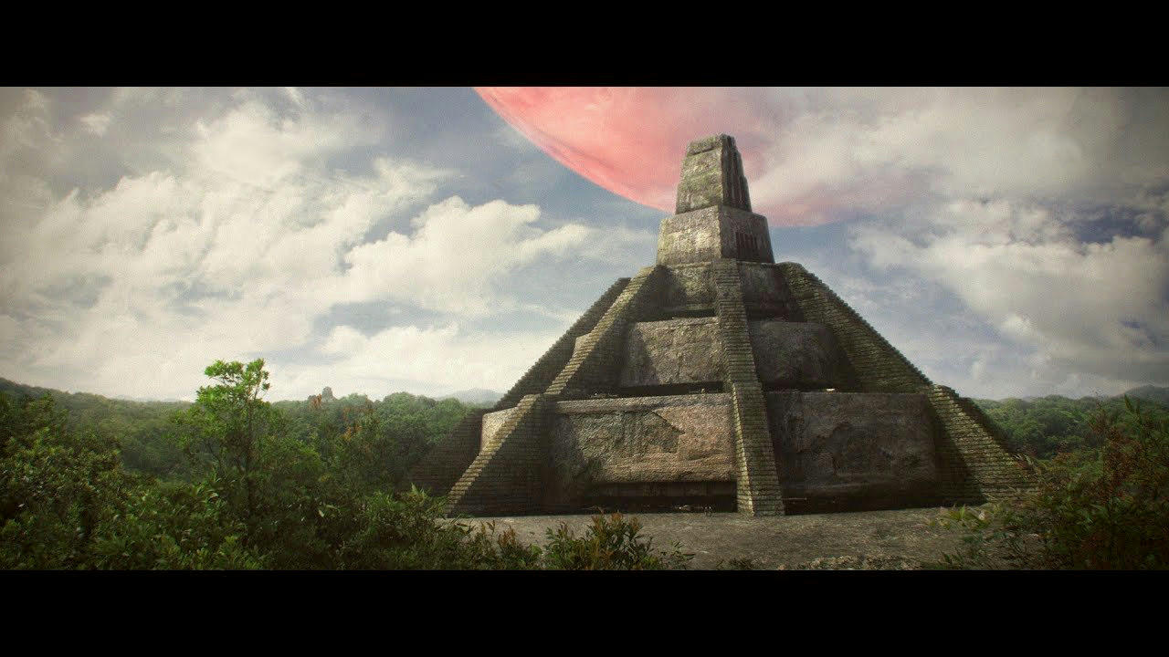
I always felt the guy with the scanner gun was on the main temple but I suppose it is open to interpretation being how it is a bit of a mess how Yavin extetior shots was done.

either way meaningless jungle shot with sandy path is the biggest sore thumb of the sequence and something else was probably meant to go there.

I removed the ships from this matte shot, the plan I had was to use this as the replacement shot for the Jungle fly over (also considering the sky is totally different). Obviously the Falcon fly’s around on the left and then joins the special edition shot of the falcon Landing or even on the right as It does not matter we never seen the structure before. I’m no special effects wizard so I could not execute this idea but if you like the idea there is a nice background for you 😃 save quite a bit of work?

Then obviously I was going to replace the meaningless Jungle shot with the Falcon Landed… that would be quite a bit of work.

So you have my idea of how to handle it you can have it if you like or chop and change it around as you see fit or do something totally different 😃 But the idea is to sell the idea that the Temple is really there.

It very much feels like the missing special edition Matte shot we never got and I can also think of another point it could be used again…

I hope that cheers you up a bit Ady 😃

Post
#1239556
Topic
STAR WARS: EP IV 2004 <strong>REVISITED</strong> ADYWAN *<em>1080p HD VERSION NOW IN PRODUCTION</em>
Time

doubleofive said:

Back on topic, I love this imagery. I wonder if Ady could add the Falcon to Revisited.

That would, of course, necessitate the building of an ANH Falcon model… 😉

https://deeplyobsessed.blogspot.com/2013/03/yavin-exterior-with-millennium-falcon.html

The only thing is it does not land in front of the main temple… It lands on one of the other ones. There is a random jungle shot (with a sandy pathway) that could perhaps be a good swap for the falcon at smaller temple / jungle. if you notice on the shot where the falcon is in yavin atmosphere the temples are flown over then in the next shot when the falcon come to land the temples are there again. It’s as if the falcon should be going the other direction or something on the jungle fly over.

The big problem is is that the main temple is never shown apart from the shot you have posted in any landscape or wide shot. the shot in question nothing ever flys towards or away from it because it is not there 😃

The sandy pathway jungle shot is like a cover shot for something or that shot is missing the falcon landed. It kind of is a bit ponderous what that shot is apart from “nothing”

Post
#1238442
Topic
Info: Star Wars - The Lost Cut is not exactly what you think it is....
Time

So the Biggs scenes were gone pretty early on… It’s very much part of the story but I can see the drag on it.

The first part of the biggs thread would work pretty well with the inclusion of the escape pod crashing. The problem is it’s not seen as the gag it was meant to be and taken on face value and not as toungue in cheek as it would have been.

The point was as luke ran up the Stairs he failed to see the escape pod in the sky coming down for crash landing. Then when he get’s his mates out of the bar they have all missed the action on their door step and comment how boring what he has spotted is. 😃.

The second part of the Biggs scene could have been cut down and truncated we will never know.

Either way most things I am finding are mostly remnants of another version a pre-release cut that carried over a few things and covered up numerous others but it’s all very much small stuff but the parts of it that hurt the film are simply moving a shot from where it is meant to go to cover what they did not have. This is really how it unfolds and when you spot a point at which this occurs you will most definitely find a discrepancy in the sound mix either for synch issues or some missing sound. The soundmix is a bit of a window in to the pre-release version that never was. But there does also seem to be a bit of video spices missing or splices that are in the wrong order also.

I am heading in to busy season so not much time to look at stuff now.

I have come to a complete solution for Escape from Mos eisley.

I have a rough cut for the opening up until Vader Strangles Antilles. I will share the rough cut if there is interest as I am running out of time to work on stuff but it is an eye opening even at the point I have it. So shout if you would like to see the conclusion.

Post
#1237913
Topic
The Original Trilogy restored from 35mm prints (a WIP)
Time

Does your 35mm Print of Star Wars 1997 look like this?

https://www.youtube.com/watch?v=auyJsWCxB3U

I think the Special effects shots in that trailer are much better than what is in the actual film… So If they rendered these out in much better quality then why not in later special edition versions render the rest out in better quality if they can add better light shading and so on.

What irks me about this is that I found that trying to replicate the look of the Special effects shots that actually would match the film footage… Can not be replicated because the light shading is not there or scrubbed out?. Levels are totally different for different elements. And also in general the shots have a totally different Level in the mid range and Highs. So they are unique to that trailer probably glossy show shots better than what is actually in the film…

The special edition CGI effects should look like this but they don’t go figure that one out 😃 (Starts headbutting wall in frustration.)

Does the 35mm 97 print have the explosion when Luke shoots down the tie fighter Battle of Yavin in good quality that is detail to it and not blown out and monochrome?


Here is my calculation of the recipe of Disaster the Blu-ray and 2004 dvd went through.

Footage was Color Graded (we are still ok at this point)

Special effects shots were added that matched the look of the film well done ILM!

Someone decided that it was a good Idea to ramp up the gain by 35% but in doing so understood that it would blow the hell out of it so dropped the High Levels by 50% and the Lows by about 13-15% then also added contrast crushing the blacks. And also making all the work that had been done pretty worthless because this ruined how everything looked or was prepared to look superceeding color grading and new fx shots.

Then a DNR scrubber was added that destroyed more detail in the Shadow and around elements such as the Lasers making them Blotches rather than transparent even on the brand new fx shots which is ridiculous.

Add a bit of salt and pepper if you like.

I managed to somewhat match the shots in that trailer and it speaks volumes about the process and how it went terribly wrong substituting the levels that were natural for the desire of increased gain and contrast and compromising the original brightness levels.

I might be a bit out but it’s more or less a good guess and what a shame. if you reverse engineer my description you will find something a bit better along these lines for the current release and guesstimation but the mid range does need to increase a lot for some new special effects shots also but for the film footage leave at around 100%. Grade to the special effects shots in the trailer it will also apply to the film footage. Colour Variance mostly in the lows.
Post
#1237895
Topic
<strong>4K77</strong> - Released
Time

When Luke shoots down the tie fighter in Battle of Yavin.

This explosion is blown out in all releases apart from the GOUT.

I noticed that when the explosion occurs the star field dims down a bit in the GOUT. In all the others the starfield maintains it’s brightness but the explosion looks awful and totally blown out.

The GOUT is superior to any other version in regards to detail that I have seen so far… Does the starfield dim in this version and explosion has proper detail?

It seems to be some kind of post processing error or brightness issue.

Would you consider Luma key the detail in from the GOUT for the explosion if the star field stays bright? or Luma key in the Stars around the Gout explosion?

you can briefly see a decent version of it also in Krieg de stern trailer although it’s keyed in through a Star Wars Logo. It come out with a red edge but i think it may be meant to be quite yellowish red. It basically has no color really in any version apart from the GOUT.

There is a chance the 35mm 97 version of star wars has detail to it.

Many cockpit shots require a bluescreen key and remove spill to fix the obvious spillages. Handy tip on what to decide on color for shots. It was something i found worked well to remove color that is not meant to be there.
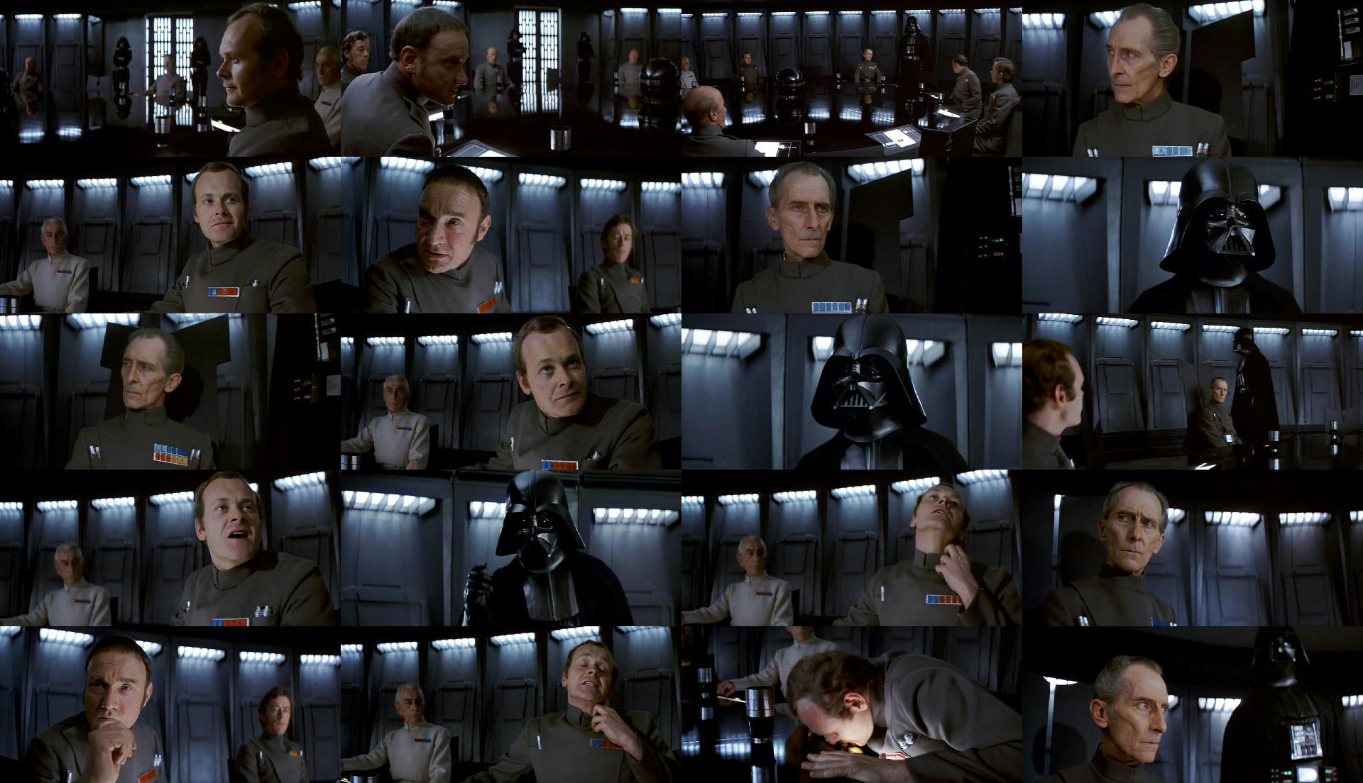
Post
#1237512
Topic
<em><strong>Star Wars: Galaxy's Edge</strong></em> (Disney Theme Park)
Time

Handman said:

As a big Disney fan, I’m a bit sad that the authenticity and original ideas behind DisneyLand and Disney World have not survived. But they’ve been dead a while now. This looks interesting.

I just wonder, how are they going to give clothes to every guest?? How are those going to be kept clean?? I don’t like it.

Who cares what joe public is wearing?

It’s more about seeing very authentic costumes and characters from star wars walking about…

I was just thinking the attack droids from the PT will be good to see real versions of them rather than cgi ones. It may actually go a way to kind of healing that fake plastic era and actually make real. At the end of the day the setting and the people in costume will be the real big sell.

I loved the shows and rides from mgm and universal studios in Florida and this will be in the same vein. I actually think this is the best star wars news for a very long time. I think sea world just happens to be my favourite by a small bit.

But it’s a good reason to have something there as Florida basically cleans up on the theme parks. Good bit of coast too heading up to san-francisco.

Post
#1237436
Topic
Info: Star Wars - The Lost Cut is not exactly what you think it is....
Time

Ok a small deviation from the plan I happened upon another discovery today, I’m not feeling too well and have a cold and I have been lounging about and a bit zoned out.

Anyway I just have been thinking recently about the explosion when Luke shoots the Tie Fighter down… So I though surely this is meant to look better. So I decided to Mix the Gout in Sharpen it and Color Correct it with this other source I think it’s an old upload of de-specialized put up on vimeo of the battle of Yavin. Anyway after I did this I realized Vader’s body actions were out of synch with his voice, so I decided to fix that as It meant that there was a missing shot of some kind. I filled the space to fit the music cue with a shot that I thought fit the scene well (I have no idea what is meant to go there). And I did some color testing on the small sequence.

I was only doing a quick test but It went a little bit further than testing the explosion from the gout could match which I think it can match 720p just about but it was worth sharing the Vader synch fix here because it does very much relate to the pre-release cut.

It’s small self contained and not too much to get excited about but enjoy the test and the small edit if you like.

https://vimeo.com/287535423

Post
#1237221
Topic
Info: Star Wars - The Lost Cut is not exactly what you think it is....
Time

I re-did Blasting out of Mos Eisley.

https://vimeo.com/286254115

I found adding flash frames meant I could actually merge the shot of the Storm trooper that falls over twice. Sound was added where needed. It was slightly re-arranged again.

I added the Special edition Take off but not the lift off as it’s too CGI. I would like to remove the other ships from this shot though because the space port is shut by the storm troopers.

I made a cockpit POV shot and spent quite a long time trying to get that right but the simplest thing to do was just cut obi-wan in the background. That is about it. I feel that it is the best I can do with this but glad it came out as well as it did.

You will notice a small glitch at the start that is the editor Glitching because the sound and the Video are combined and not separate files on separate drives and they have also been giggled about. It probably should not do it but if you wanted to use the clip it would not affect you as there are no changes in this part. It has been color graded in a reasonable way.

Explainatory note:

If you follow the new scene order what becomes clear is as Luke Ob-wan and the droids board the falcon when we cut to Chewbacca looking out the window this would have been Greedo’s entrance to the Hanger which was a re-shoot and moved to the cantina section of the film. The conversation would have played out pretty much the same way as in the cantina no doubt but instead of Han shooting Greedo, Greedo was killed by the Storm troopers. The scenes of Chewie being moved in to the battle we’re to cover the 2 shots of Greedo shooting and dying most probably.

Study on this part complete… Escape Pod Part 1 next.

Post
#1236974
Topic
STAR WARS: EP IV 2004 <strong>REVISITED</strong> ADYWAN *<em>1080p HD VERSION NOW IN PRODUCTION</em>
Time

I don’t have any reservations about what Ady would like to do but get this, I just went into my local charity shop and aquired star wars the complete illustrated script. It’s the same as the van ling dvd menu the binary sunset still in that book. Also the command center displays are very blue. It has been a bit of a surprise upon talking about that shot and then seeing it in a book the same as the dvd menu. It is possible that this book may also hold some answers about certain shots. Anyway it’s a nice little heads up and if you trust that then fine but looking at some shots I would actually trust Ady’s grading than what is in the book.

I think the problem is some shots have gotten a little confused color wise and it’s impossible to say with 100% certainty anything like this is correct but if it is good which it is in Ady’s stills then brilliant.

The illustrated script is based on the Special Edition Version.

I have no trust of any film print entirely because the film is all over the shop for color.

Post
#1236954
Topic
STAR WARS: EP IV 2004 <strong>REVISITED</strong> ADYWAN *<em>1080p HD VERSION NOW IN PRODUCTION</em>
Time

I think it looks good… The only one I am a bit iffy on is the binary sunset.

Have it how you want it but after looking at the original theatrical footage and then the techni-disc and then when I saw the van-ling Dvd menu colors I decided the Dvd menu color was the best reference. You might not feel the same way but I think it’s the best reference for that shot an as is the massasi temple also.

Post
#1236034
Topic
Info: Star Wars - The Lost Cut is not exactly what you think it is....
Time

yotsuya said:

I see what you are doing, but the audio mix doesn’t completely match that either. Interesting that the clip you have include a shot that bugs the hell out of me - after the Falcon takes off and after Ben straps in, you see Ben leaving the cockpit behind Han.

Thanks yeah it was getting a bit late but i think the start is all good and the ending part is good as Han shouting chewie get us outta here is out of synch in the original it’s a bit early the button push and the door closing.

some parts might need extra sound or remixing but Chewie and Hans scenes are handled a bit better and it flows a bit better. it’s not something that will ever be perfect but still some room for improvement perhaps.

Chewie clicking the button is correct i think.best bit.

mayhem in the middle is unfixable… Unless there was some sort of cut away to chewie during the battle with flash frames to cover the obvious repeated footage of the stormtrooper falling over. this would sort the footage side of thingd but the shots of chewie are not for the battle part.

Ben kenobi walking off in cockpit background must be from the tractor beam sequence…

My conclusion on this is that this shot from the tractor beam part was used to cover a missing cockpit POV of leaving the atmospere of tattooine. Narratively this put’s us going on that journey with them.or the shot was meant to only replace the part where we see Ben Kenobi cutting to only Han after Ben has left. i.e the shot was extended beyond what was originally earmarked to feature because they did not have the POV shot.