- Post
- #1246728
- Topic
- Info: Star Wars - What is wrong and what is right... Goodbye Magenta
- Link
- https://originaltrilogy.com/post/id/1246728/action/topic#1246728
- Time
Gout Hue Shifting Correction Reveals the true look of the Gout. It’s actually a doddle to fix this film using the GOUT. This was Loaded in VLC Media PLayer > Tools > Effects and Filters > Image Adjust.
This Yielded Better results than Loading it in to an non linear editor for MPEG decoding issues. Possibly womble DVD editor is probably the best thing to use to fix this and export for reference (free 30 day trial)
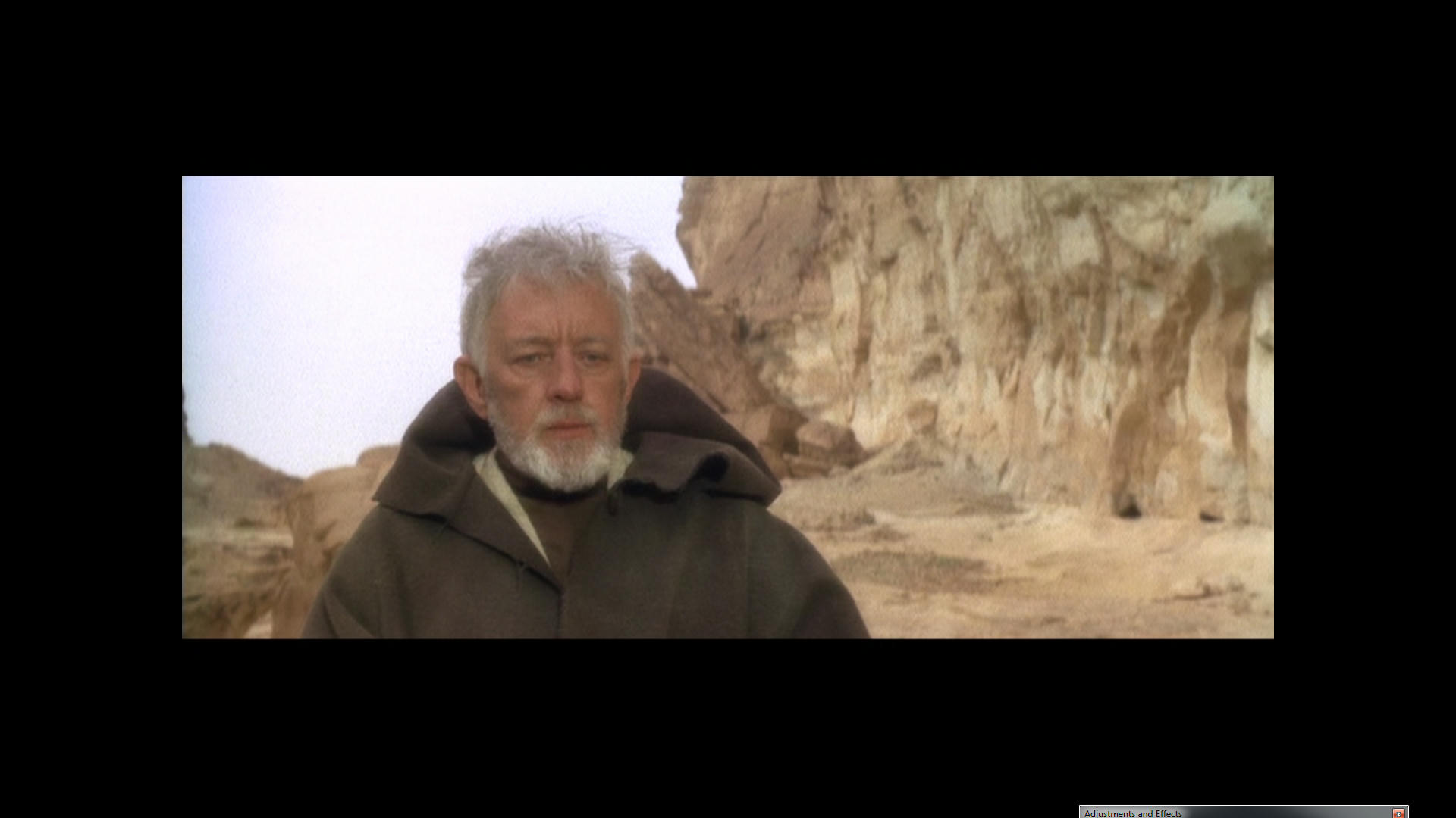
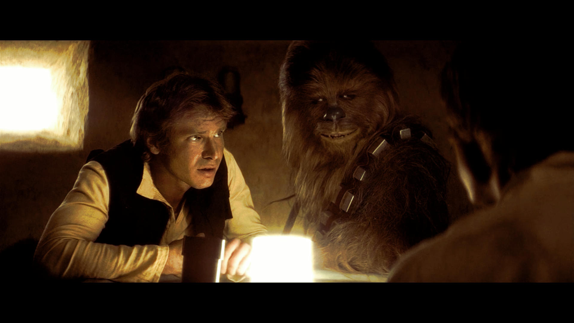
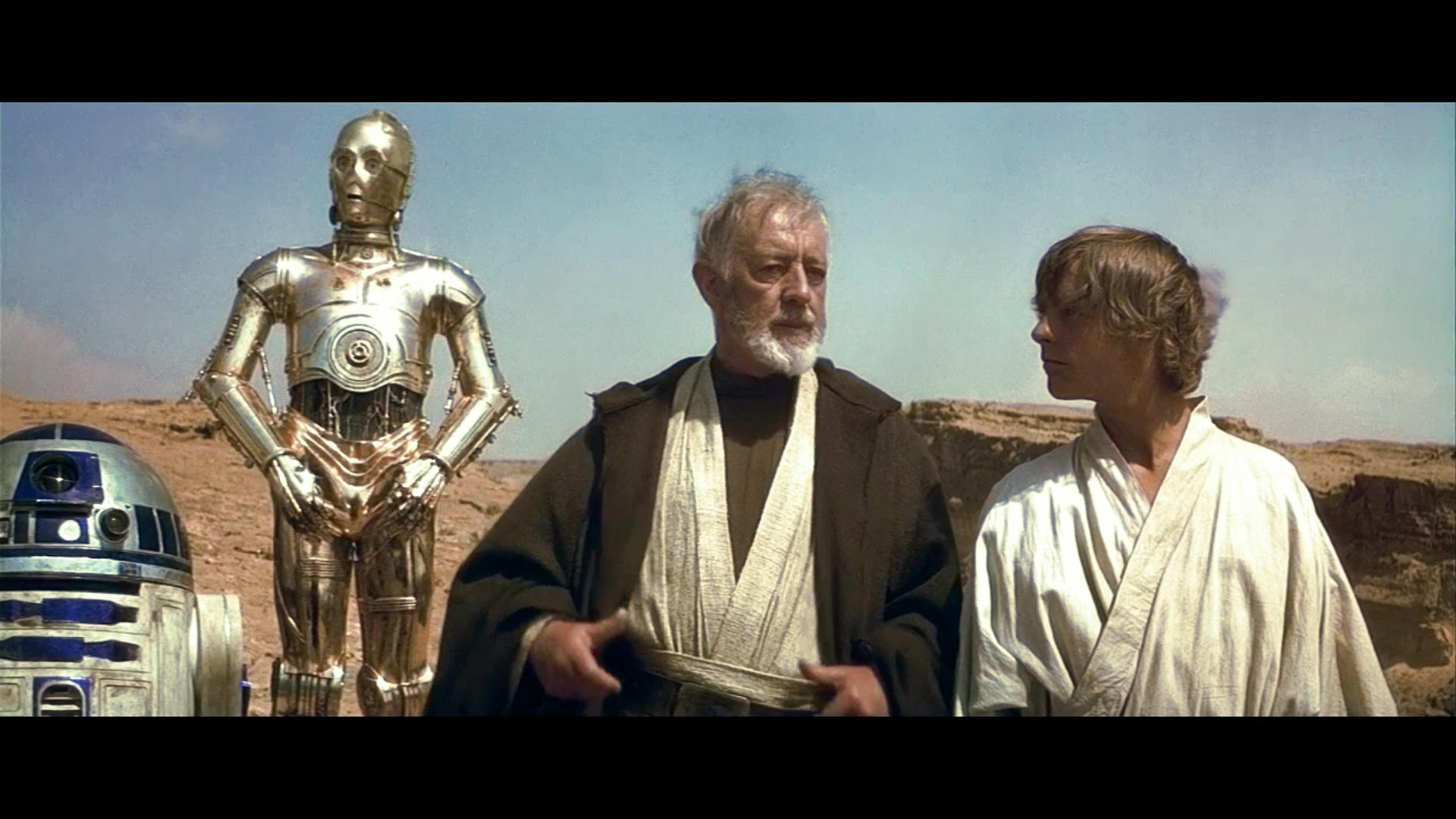
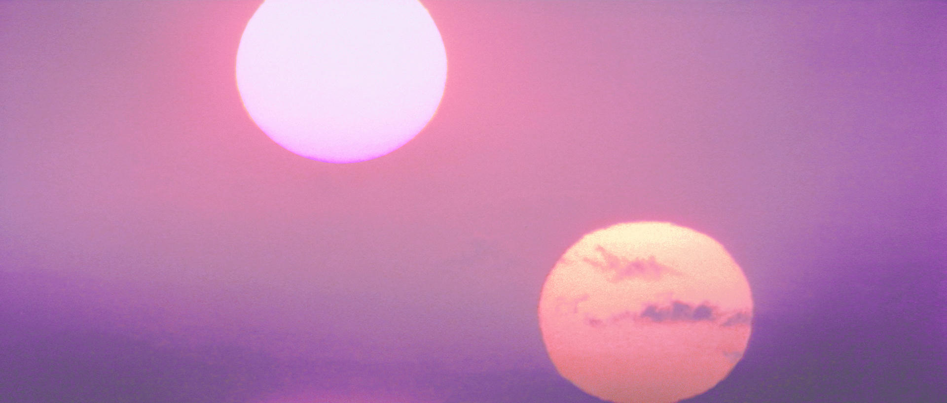
Perhaps still a bit pink on Tarkin.
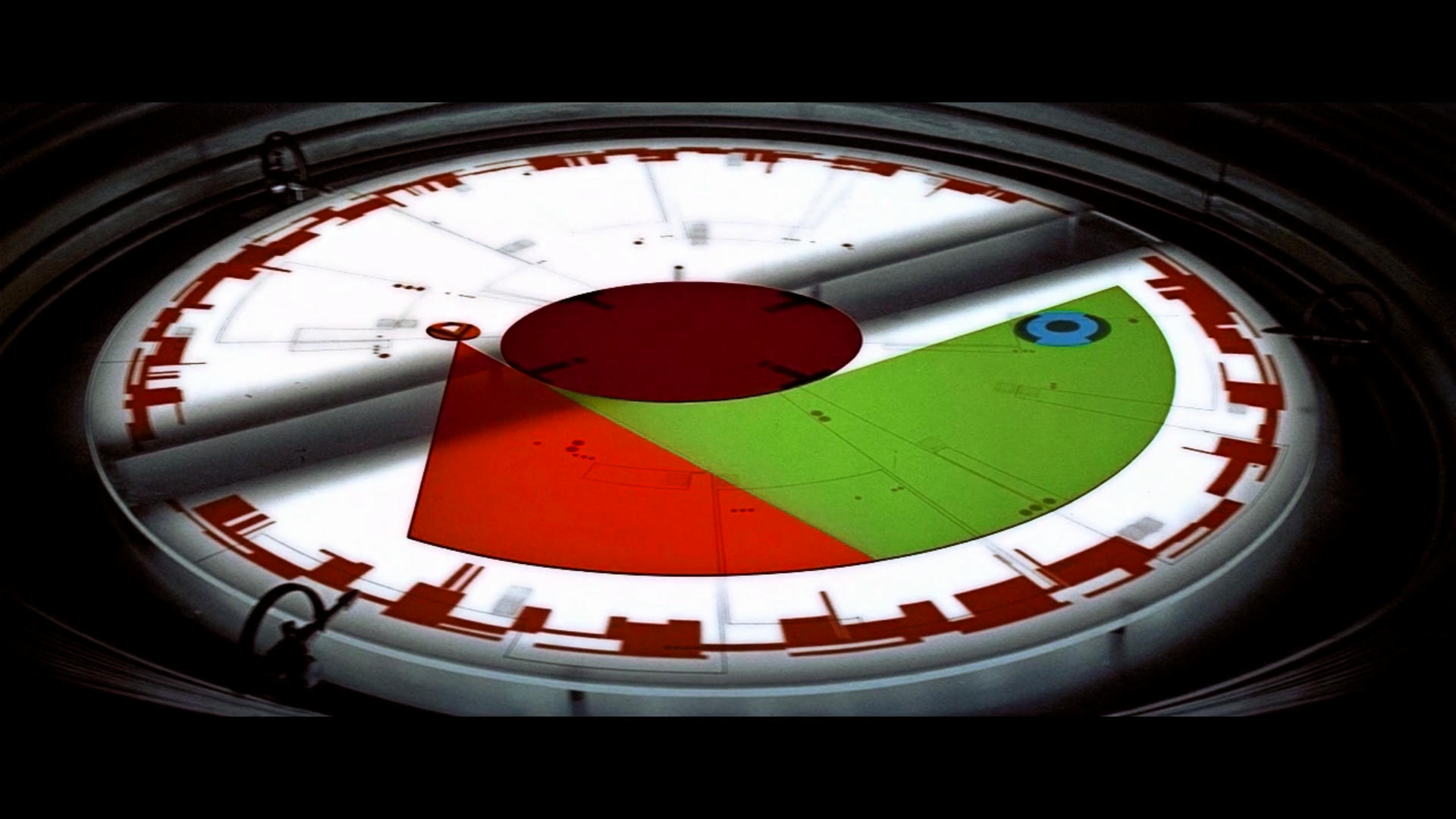
The amount of Shift Changed
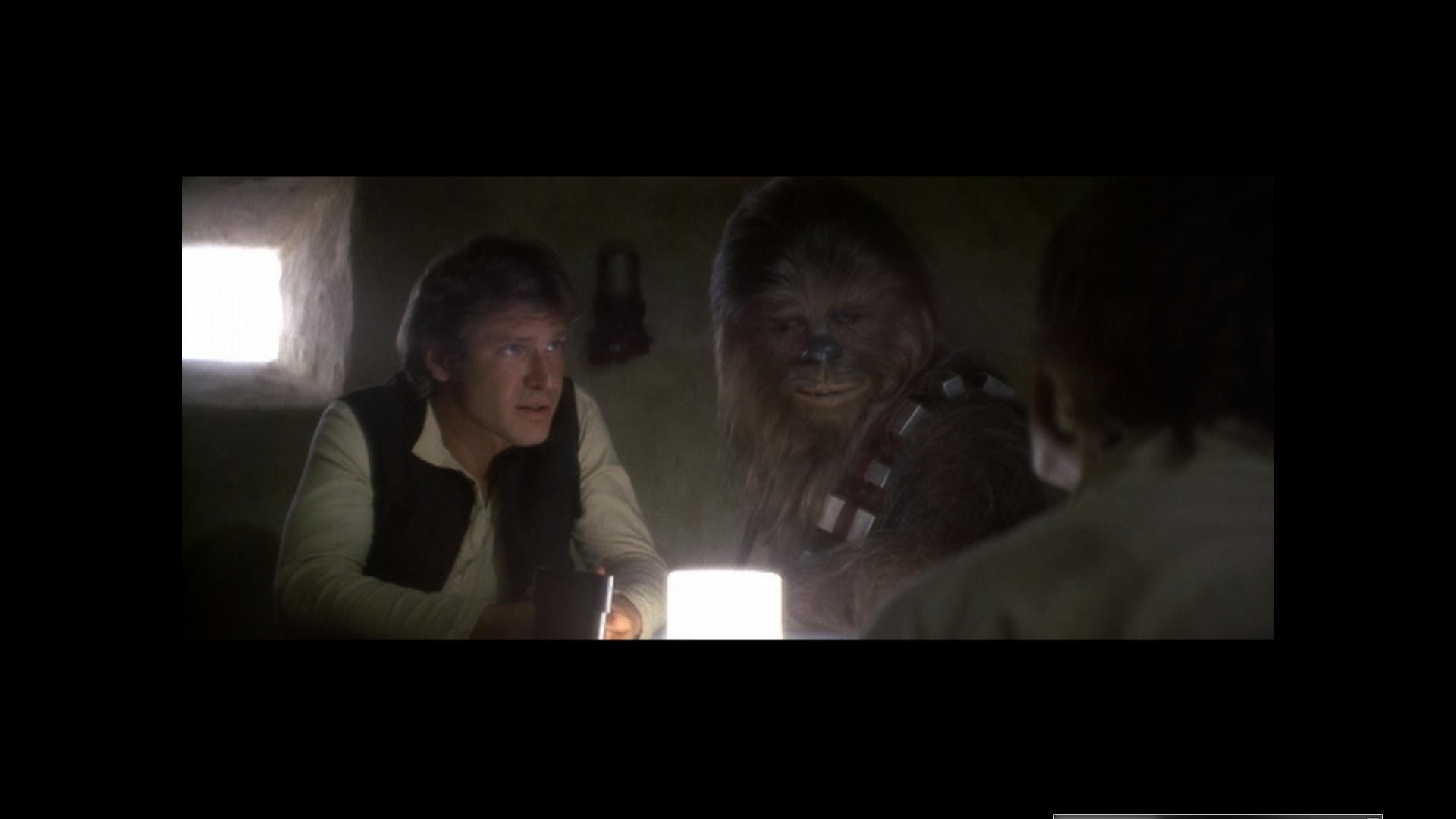
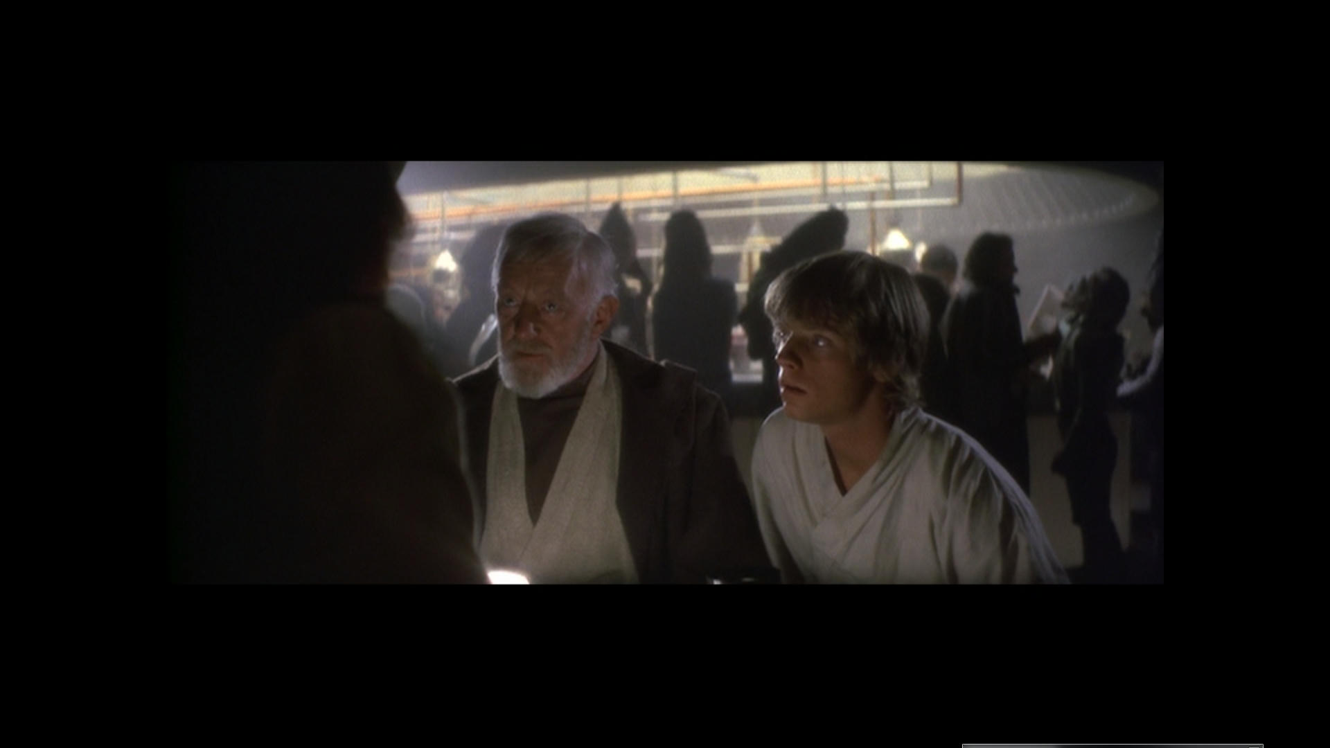
I think this is a fairly conclusive experiment and I now feel like I can see what the film is supposed to look like. I think it looks really really nice like this and it’s so simple and easy to get it where it needs to be.

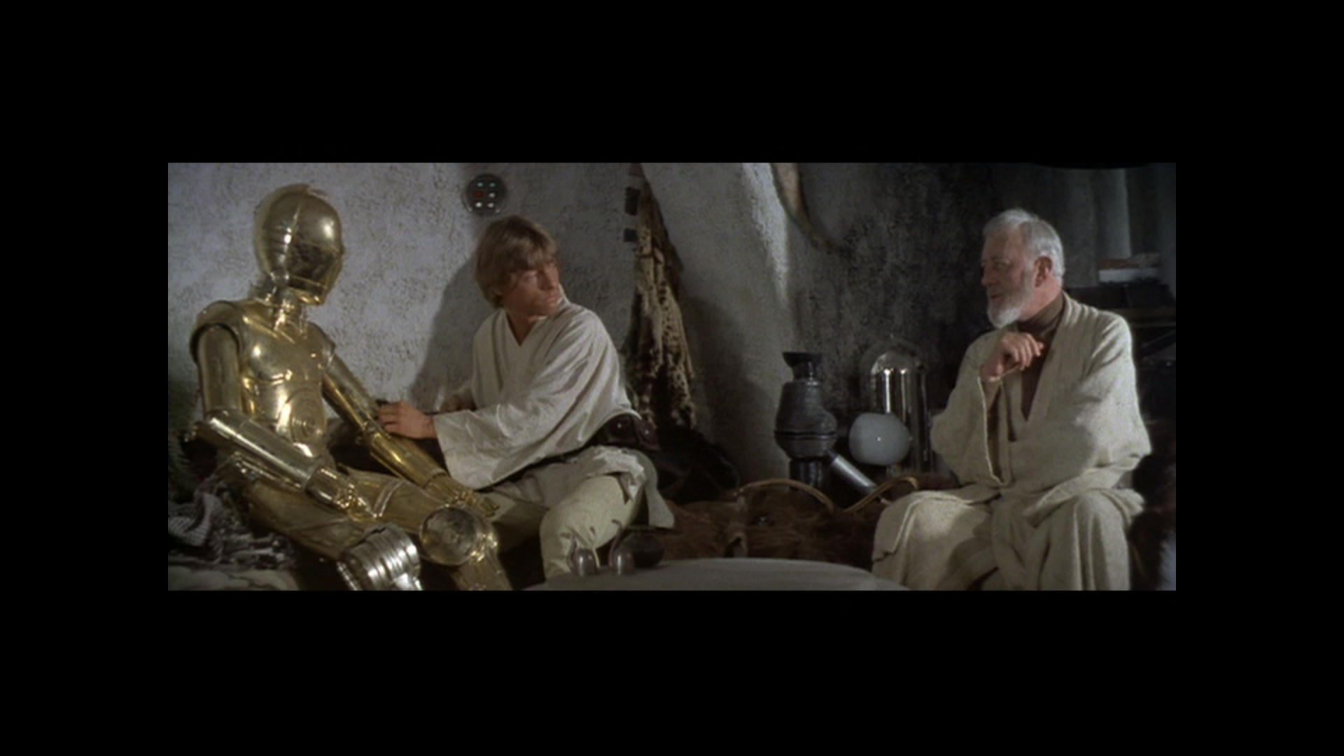
To me it’s perfect like this… So to create a reference from a hue shifted GOUT would be the way to go, this could then be easily color matched to say the Blu-Ray and fix that pile of crap.
This is the best solution I feel to what is happening and the confusion over what the film should look like. Some sequences have shots that require different amounts of Shift but eventually after going through it piece by piece you will get to a conclusive answer on the Normal film footage.
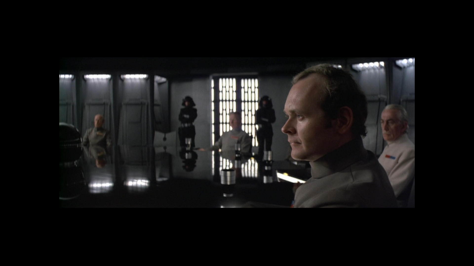
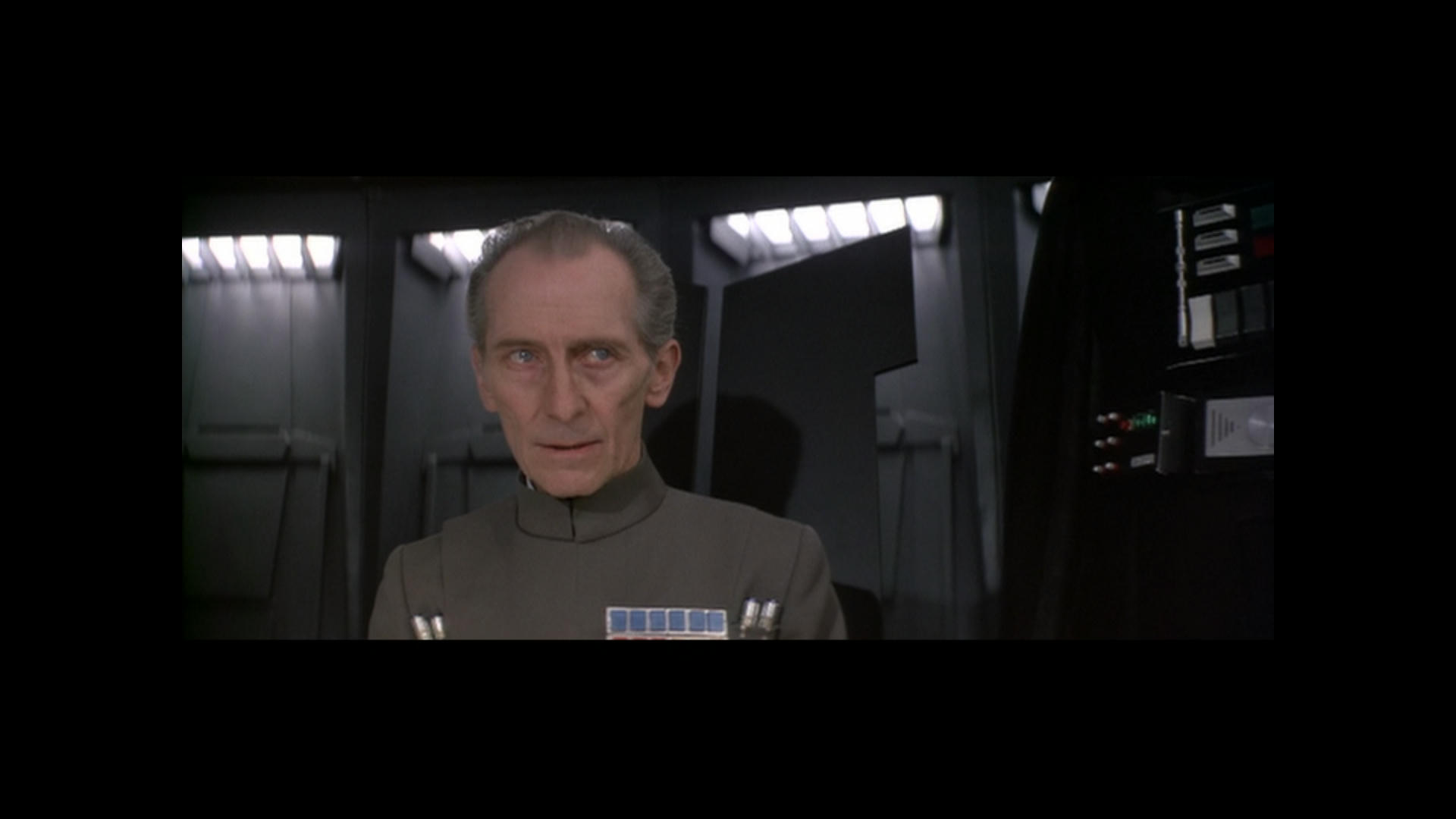
The Special Effects as I said requires different Handling.
The reason I suggest using Womble is because it will handle the MPEG without having to decipher it as when I put this in NLE the results were slightly different and not as good. You xould also just use VLC for snapshots Like I have done and Color match.
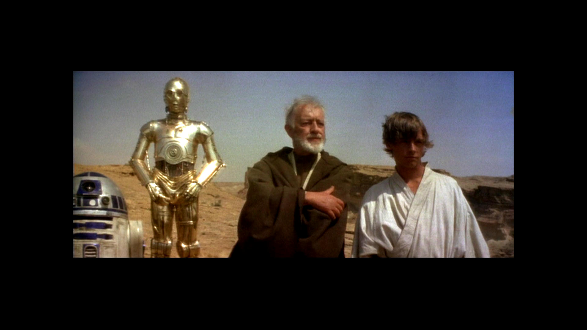
This won’t give good reference for absolutely everything but I reckon about 80% some parts require no shift at all like R2 and 3P0 on the sandcrawler for instance. It only needs to shift when you see red face and so on.
I would probably trust the brightness and levels of the JSC to get a slightly brighter and less dark but overall I think I have found a good soloution.
Go and see what it is meant to look like 😃 It looks lovely…
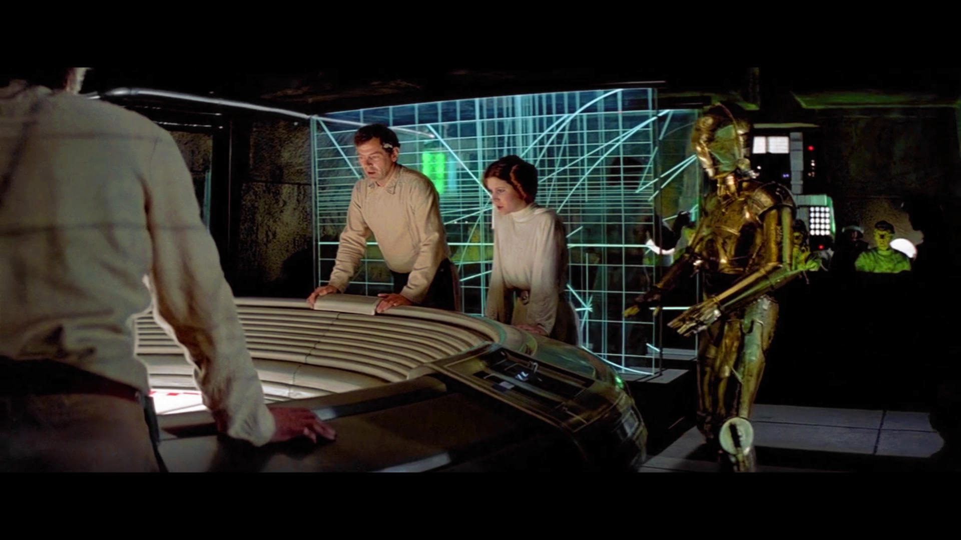
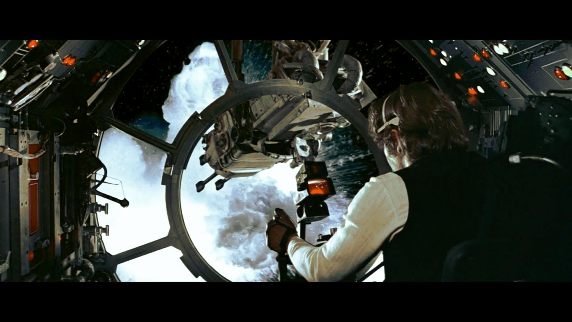
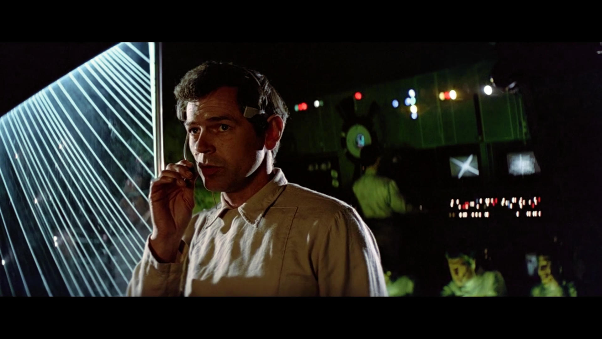
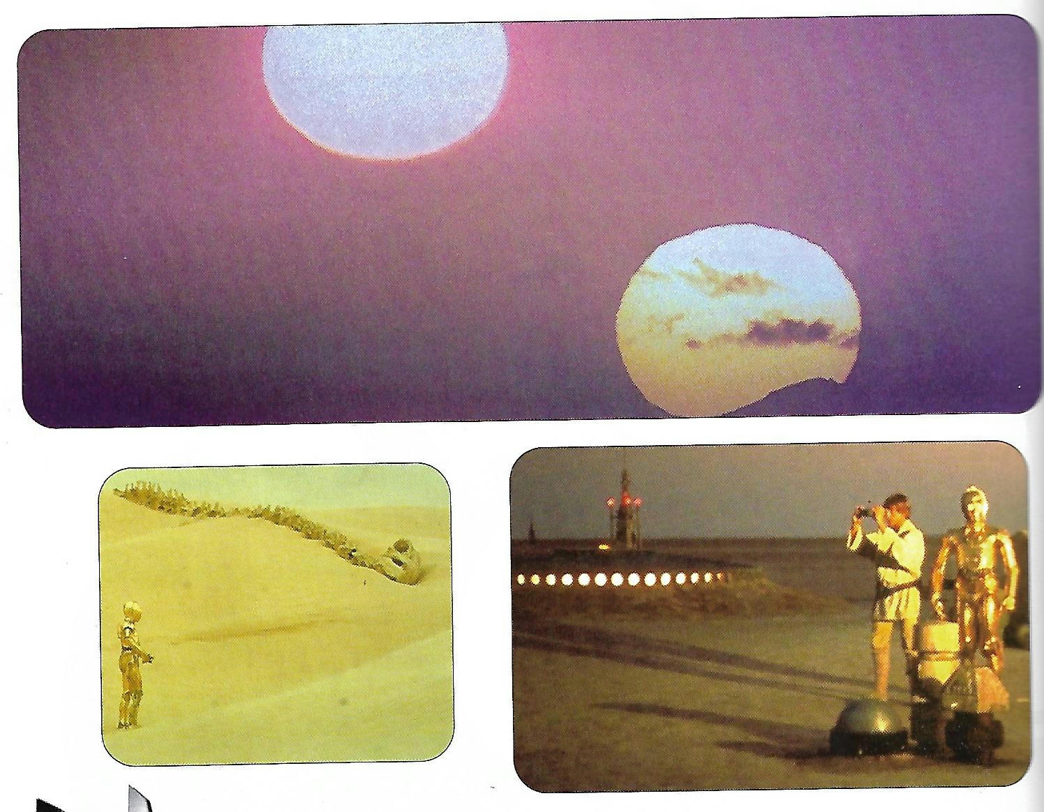
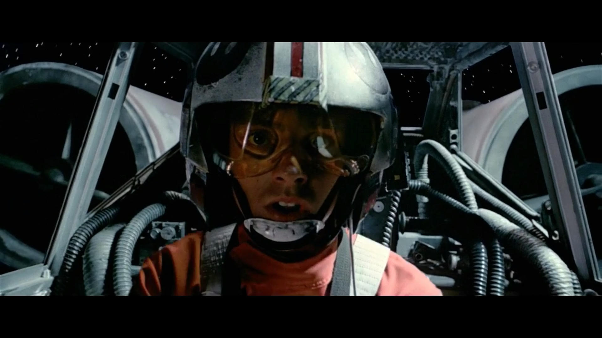
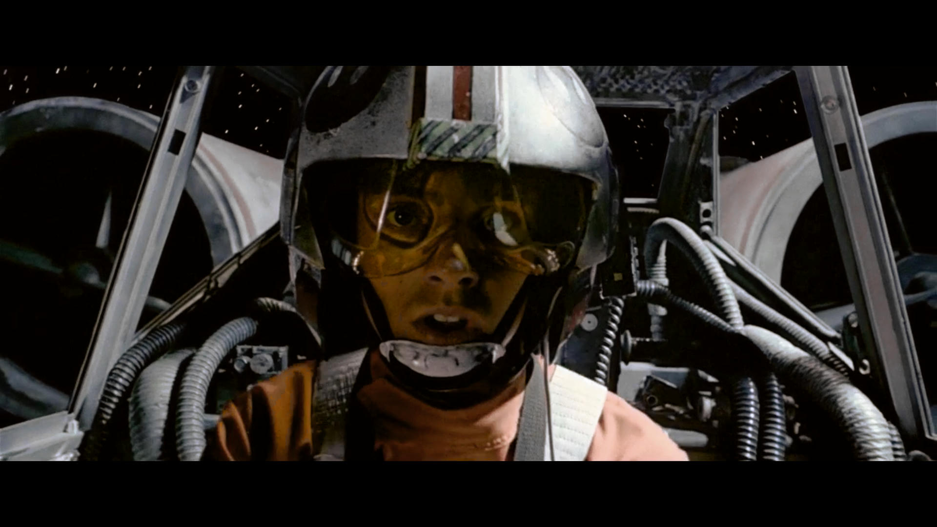
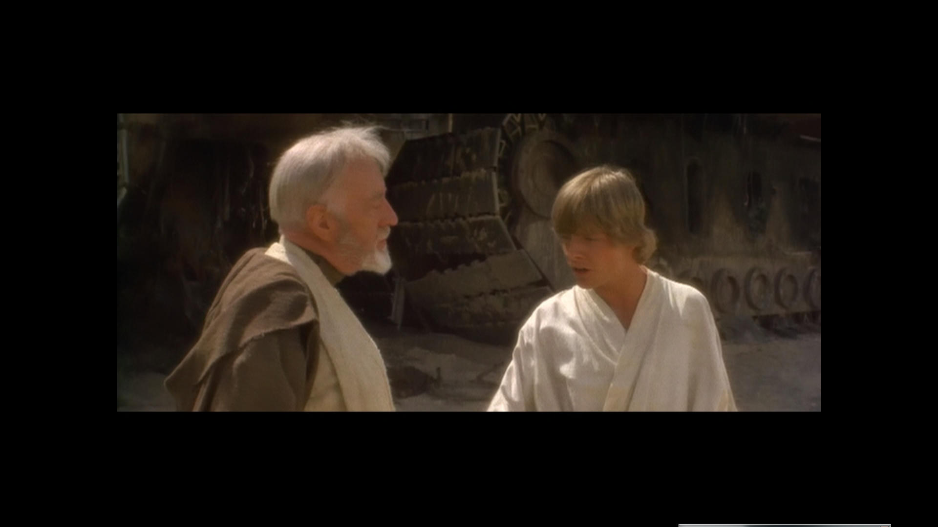
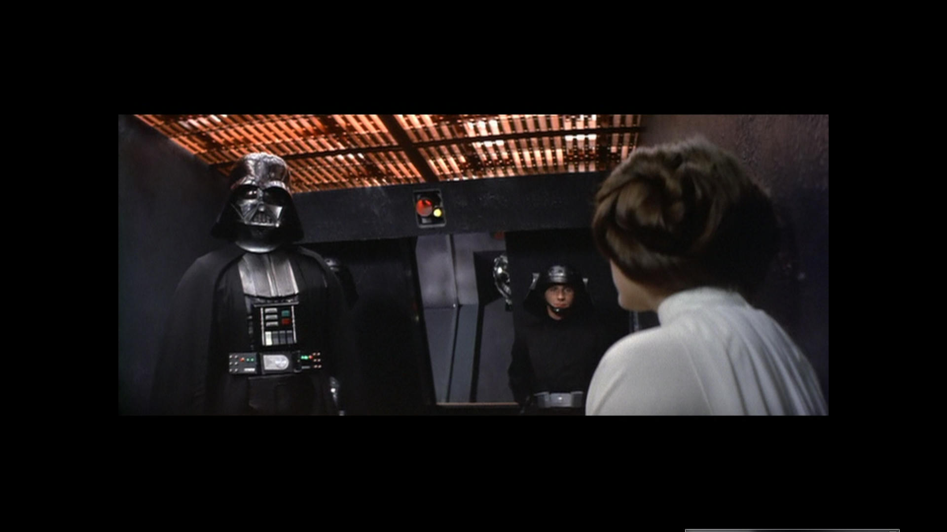
The Gout has unfaded Highlights and the Door flash should look like this, Although I think there is a bit of a question over the light on the right hand side of the door is either Blue or Purple? I think it is Blue and we have an issue there. Not sure about the deep Blue that suddenly appear either before the explosion. Also note Soldier with purple shirt. It is all obvious evidence of Hue Shifting and the whole lot is swinging about like a windsock in a hurricane here.
The color is right but just shifting Hues so it needs to be conformed so that it maintains the correct Hue or the same Hue.