logo Sign In

Ronster

User Group
Members
Join date
10-Dec-2011
Last activity
6-Jul-2025
Posts
3,142

Post History

Post
#1263764
Topic
Star Wars: deleted and extended scenes * database *
Time

ZigZig said:

Ronster said:

Ok so an unsuspecting Deleted Scene… Actually this scrolling Planet Surface is Used for Approaching the Death Star in the Film but the Planet has been inverted in Color and Rotated 180 degrees…

If you look at the planet scrolling Surface once we See the X-wings Heading Towards Camera the Correct Scrolling Surface is Used for the Orange Planet Yavin. Instead of Reversing the Scrolling Texture they Decided to use this Scroll instead perhaps because it was rotating in the right direction for the effect of passing the planet.

It was Actually created for the Alderaan part of the film.

So How does it Work?

Ok the orierntation is correct in the Image the Planet Scrolls toward the Horizon… The Star Field Moves left to Right and the Death Star can Move and pivot as a footage Matte or 2D image element.

This would create a 3D effect using 2D elements so as to simulate the Death Star in Orbit.

This would Mean that That when seeing Alderaan out the Viewscreen on The Death Star it would have been either Stationary (Most Likely) or come in from the left to the center of the screen.

Isn’t that totally off topic? A picture from a story book is not a deleted scene…
(and why the hell is the thumb blue? Is the book hold by a Smurf?)

The elements were Re-Purposed Yavin Does not Have Clouds…

The Color Was inverted

If you were doing an edition that used the Special Edition Yavin Approach you could effectively re-create the original Purpose of the element that is Alderaan and re-create the scene… Or Alternatively you could take the correct scrolling Matte of Yavin in the Next shot and Reverse it so you had Only Correct Yavin scrolling Matte and Use the Alderaan one where it is Meant to go.

Post
#1263758
Topic
Star Wars: deleted and extended scenes * database *
Time

Ok so an unsuspecting Deleted Scene… Actually this scrolling Planet Surface is Used for Approaching the Death Star in the Film but the Planet has been inverted in Color and Rotated 180 degrees…

If you look at the planet scrolling Surface once we See the X-wings Heading Towards Camera the Correct Scrolling Surface is Used for the Orange Planet Yavin. Instead of Reversing the Scrolling Texture they Decided to use this Scroll instead perhaps because it was rotating in the right direction for the effect of passing the planet.

It was Actually created for the Alderaan part of the film.

So How does it Work?

Ok the orierntation is correct in the Image the Planet Scrolls toward the Horizon… The Star Field Moves left to Right and the Death Star can Move and pivot as a footage Matte or 2D image element.

This would create a 3D effect using 2D elements so as to simulate the Death Star in Orbit.

This would Mean that That when seeing Alderaan out the View screen on The Death Star it would have been either Stationary (Most Likely) or come in from the left to the center of the screen. Had this scene been included Alderaan would have been stationary on the Death Star Viewscreen is my Gut feeling.

Post
#1263438
Topic
Info: The 1978 Star Wars Storybook and Color Grading reference
Time

DrDre said:

I think the issue here is, that even if film stills were used in the book, there’s no reason to assume the colors are accurate. For one both the scanning and printing would introduce inaccuracies. Then there’s the fact that the colors were likely adjusted to look appealing in the book, and not so much match the film. Just look at the Topps cards, which often contain many film stills, but none of them look like the real thing, with colors often balanced, or altered. The reality is that these photos are likely no more accurate than any of the telecines, where the colors can be in the ballpark, if the operator was going for accuracy, but usually are not .

The Books are useful for Spotting when something is Inverted in Special effects… If We take Alderaan for example it is Blue then in the Next shot where Tarkin is Looking at it out the viewscreen it is Cyan. So What Color is it?

The Answer for you is most probably it is both Blue and Cyan… I would not expect any less I don’t mean that in a nasty way or anything but your conclusion is probably oh well that is what the film says it should be and not question the fact that it changes between the first time we see it to the second time we see it.

I however do not look at things like this if the same Object changes Color between shots, as in noticeably quite different and it is an effects shot… It causes me to ponder to answer such a question… And I wish people here would discuss why the Planet is Blue then Cyan in the next shot…Never mind the Pink Console Lights which a red Console Lights Later… Anyway The Deleted scene is very cool I think and it is what makes the books good but it also can give up some Answers too especially for Color Inversions and so on Like in the Tractor Beam Matte Painting is much Worse now than it looked on TV because it has reverted to the Theatrical Scan Version and not the Fixed Matte in the 4:3 Version. But the Fact that this was prepared for Broadcast in this fashion without error should tell you something, it went out on TV Fixed and it is also in a storybook from 1978 😉

^ This I think looks pretty Good though from that Book, I would go as far to say it is the best still in the book for what Reality was on set, I would say yeah best still in the book.

Found this one just now and it Adds up… Looks good to my Eyes.

Post
#1263370
Topic
Info: The 1978 Star Wars Storybook and Color Grading reference
Time

Yeah it is how I remember it also! 😃

I actually only have the revised edition of the Story Book it was never released in the UK the Book you have…

But Anyway I took a look through a youtube clip and I found something very Interesting!!!

Planet Yavin is 100% correct in this image… Death Star suffering from Color Inversion (ForeGround Object Inverted)

UNused IMage of Death Star but unmatted and 100% Correct

Unused Image of Death Star Approaching a Planet… (Foreground Object Inverted)

Ah ok Deathstar Approaching Alderaan well I never 😃 !!! So Alderaan is not Blue more sort of Cyan or they decided to make it more blue or it is just unused concept either way I love it 😃.

Look a bit Better now… THIS MUST BE RESTORED TO THE FILM DAMN IT!

I actually think it has merit that it is more Cyan than Blue…Halfway Cyan push

Full Cyan Coloration

I think I would settle on about Halfway though for what it “Should look like” I dunno? I can’t make up my mind I might change it?

Post
#1263200
Topic
Info: The 1978 Star Wars Storybook and Color Grading reference
Time

Ok sorry not wanting to derail… But would you say this is comparable to the Storybook and how it looks?

I think the Mos Eisley Shot Does seem comparable and I also think this looks comparable also. Like of the same type of look and feel to it?

You know trying to build a picture…

Same Picture Different Hue Variant (I trust this more than the scan I did)

Film

Old 4:3 Composite without the Inversion color Issues…

https://www.youtube.com/watch?v=yPS9FlBLh5o

Post
#1263119
Topic
Info: The 1978 Star Wars Storybook and Color Grading reference
Time

screams in the void said:

ok , I am a little confused here …we are talking about the 1977 film and the 78 storybook with what says "full color photographs " on the cover . It is the comparison of those two things which is the subject of this topic .speaking to the special edition vhs cover you posted and the youtube screengrab …you are right , there was too much pink in the 97 and 2004 special editions which was fixed on the 2011 bluray , and George may have meant for Mos Eisley to look like a cgi crapfest ,but I prefer the original film . That , however is a different topic .

I wish somone would get a Lut for that Cover on the VHS and apply that to say 1997 Version.

The Blu-ray is still bad in my opinion.

My Theory is before the CGI was added to the film and it was Raw like on the Back of the VHS Straight out the PC it was matched to how a Master Print Looked which ILM would have had access to. Taking the difference there on the Special Edition shot RAW and applying it to the Film Footage I think will yield interesting results.

What ever they were creating the new shots to go with looked different to what any print in circulation looks like and Many Shots in 1997 Star Wars at the Battle of Yavin look more like the GOUT than the 2004 version or any subsequent iteration.

ILM Created the shots to Match something and then they were altered quite a bit from their Raw State. Why would you bother specifically creating new shots at the pinnacle of the Special Effects in the world only for it not to blend and translate without any further interference? Why make them look worse? Why Make them Pink and overtly red? These CGI shots are not compromised by Bluescreen or optical printing.

There is one still of this Master in the Back of the Making of Star Wars Revised Special Edition (Titan) to show before and After Comparison of R2 & 3P0 looking at the informant from the Cantina talking to Storm Trooper. Looks pretty Good to my eyes also.

This is the Master. Does any other Version have that Scratch?

I would say the Story Book Does Have similarities with this Image but it is Overtly more Red.

For Comparison the Blu Ray

Post
#1263080
Topic
Info: The 1978 Star Wars Storybook and Color Grading reference
Time

screams in the void said:

interesting but I am not sure this makes the case as to whether or not ALL of the storybook photos are production photos or film stills .One thought I had about print media is that everything that is reproduced on the page to make multiple copies requires printers ink and after multiple copies are made , the saturation of the ink may become less , or in older books , there may be an issue or error with the printing plates . I am guessing they have quality control control for these things but would imagine with a high volume print run , some would slip through the cracks .The second youtube screenshot you posted looks a lot like the Gout ( 2006 Bonus dvd disc of the original film ) to me .Other than desaturated color, I see no difference between the two images , and why does the youtube clip say Luke leaving Dagobah ? Is he flying backwards ? I see the lights of four engines which are on the back of the ship . He is flying towards the planet , not away from it 😃 and after re reading your post , it does seem that you do see some value in images in pre digital print media as a valid guide to being used as color reference for editors

To Be honest I think really the only thing you can take away from that story Book is that Green might be a bit out on all media.

Vader’s Chest plate and Hexagon Lights are not as green as they appear in the Film.

I found looking at Star Wars Special Edition the Illustrated script interesting more so… But at the end of the day Look at the cover of A New Hope… Mos Eisley is meant to look like this,

That is exported straight from A PC it’s pink and overly red on film. This is how I judge that it is not looking correct once on film.

But it seems to be with Lucusfilm and you can’t say all films change like this well I don’t think so.

I looked at this today… I think this is the most accurate shot for this scene.

So what if the Special Edition looked more Like that?

This was only rough but I find Yavin is more Orange than Red in Space at leaset I don’t agree with the Pink and the trees are the Wrong Shade of Green it is Guatamala Jungle not a forest. I feel like I can feel the mist rising a bit off the Jungle now also.

Looks Wrong?

Post
#1263021
Topic
Info: The 1978 Star Wars Storybook and Color Grading reference
Time

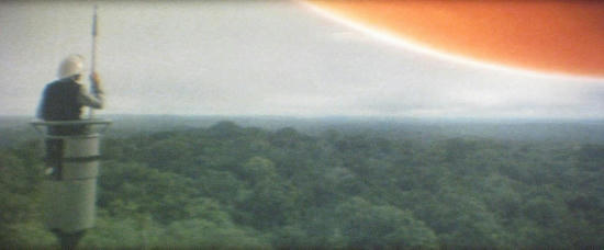
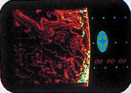
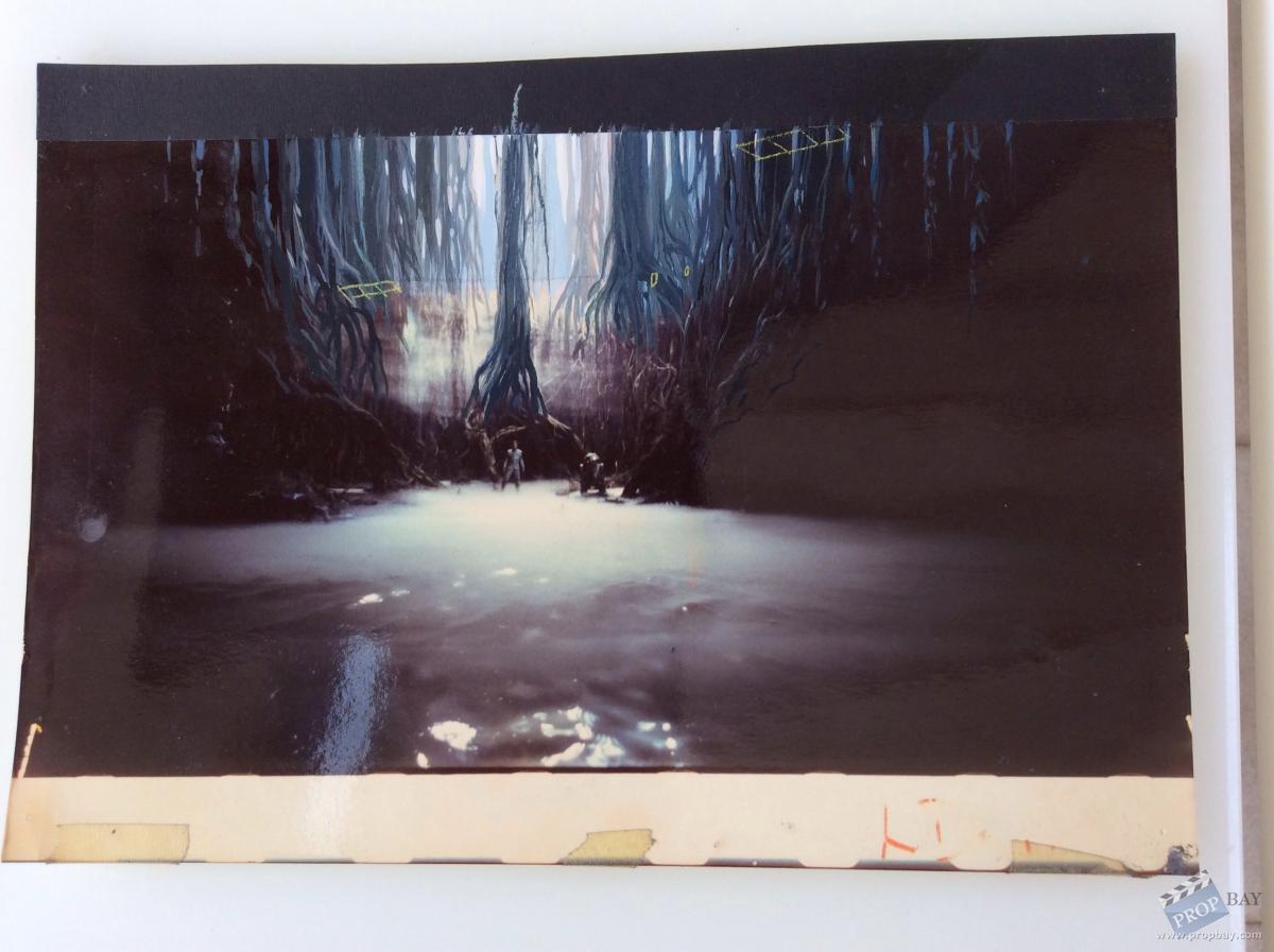
In Empire Strikes Back Making of there is a double page spread of the Dagobah Planet Matte… It looks nothing like the film.
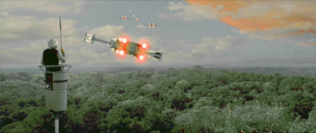
Original

Book Version (Attempt at capturing what the Book Looks Like)

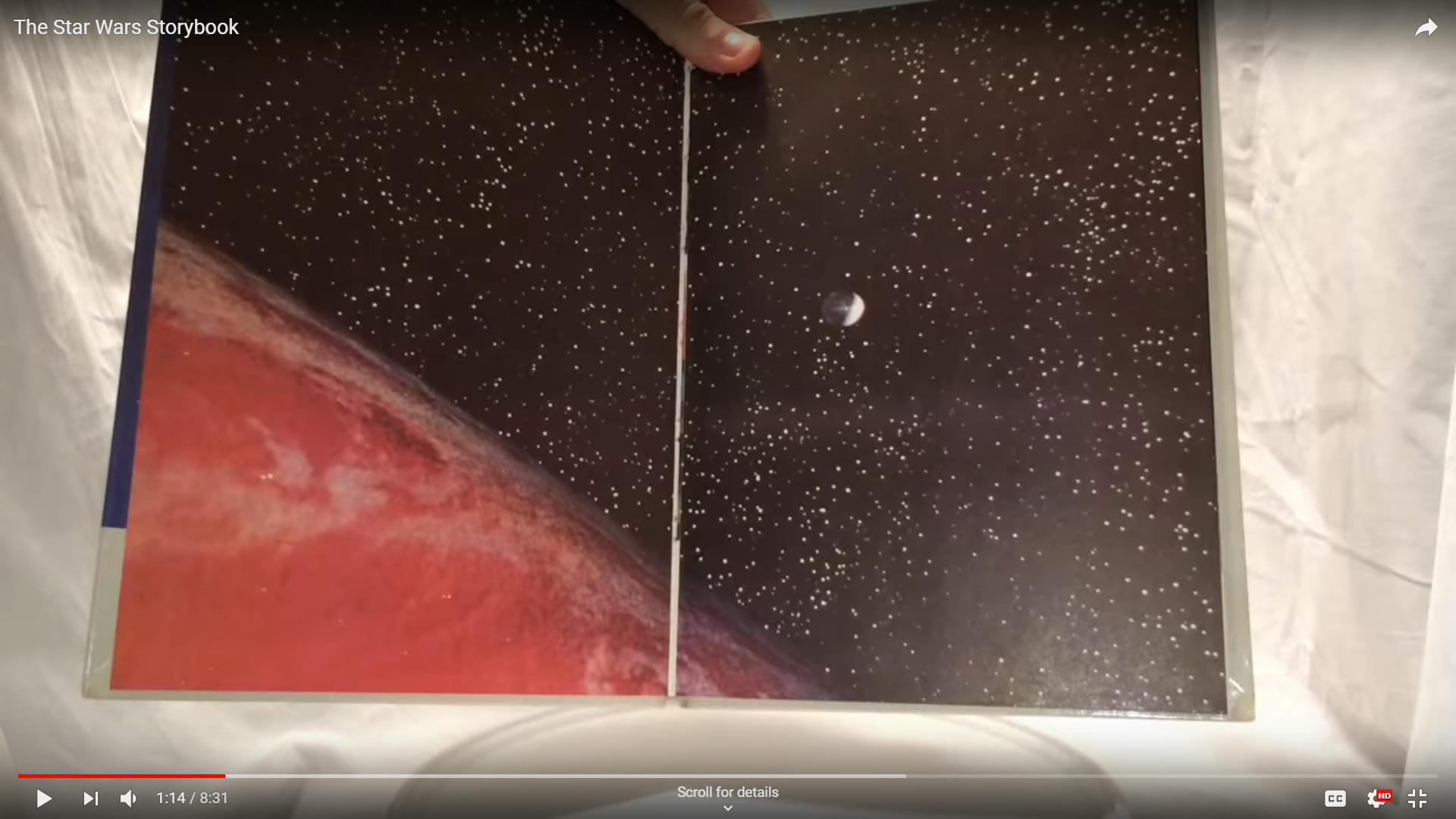
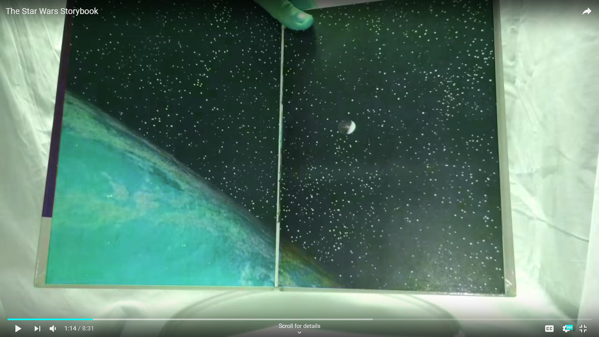
As you can see Dagobah should be green but it is very washed out in the film but the matte painting it is very lush green. More Green than my attempt to match the Book.

Problem is it’s a double page spread so can’t really scan the image.

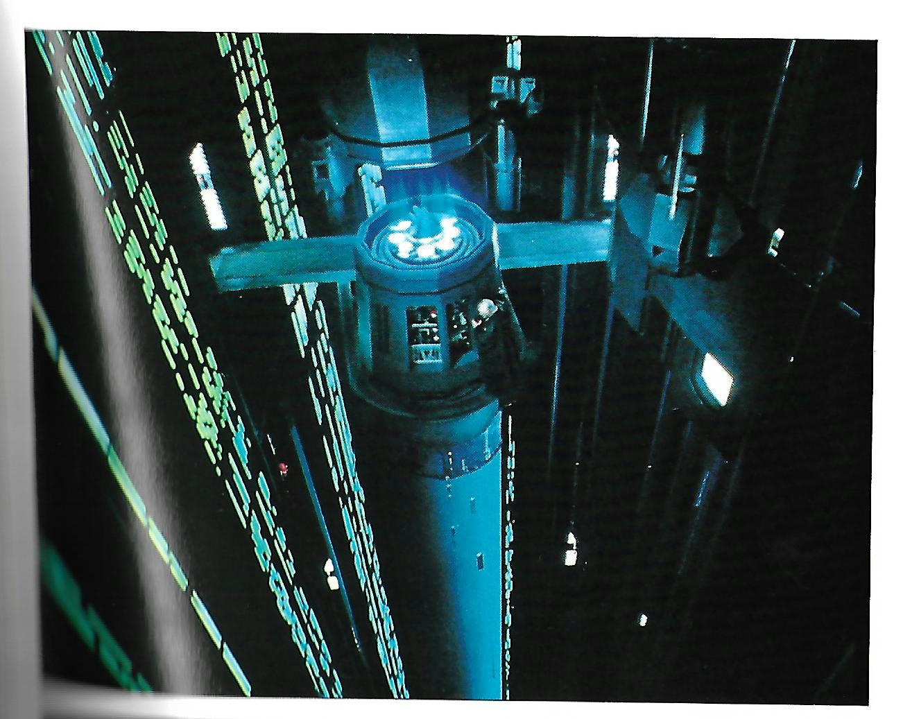
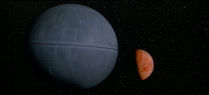
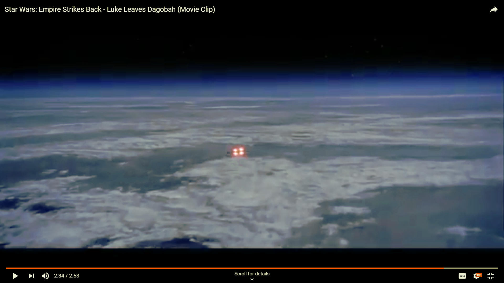
Also within the making of Empire Strikes Back you can also see that Bespin (Planet Matte) should be a brownish color and The X-wing Yoda Raises from the Swamp the Trees Matte is actually meant to be blue not yellow.

So The Book tells us that there is a problem with the Optical Printing and the Color has a problem and generally tends to lose vital information of what something is meant to look like vs the end result after Optical Printing. But the other thing that perplexes me if it is actually a blue screen shot how come it is so horrendously blue? Not Possible so something is being done after the Optical Print to make it that Blue as it’s more than spill.

This is not perhaps what you were looking for, but the books are best for looking at Special Effects Issues rather than the Normal Film Footage.

But to say sometimes things did not come off as intended, is the truth and I personally like the idea of exploring how much better things could look by going back to original elements and so on with today’s technology. Either way I will say the Empire Strikes Back Making of Book (Titan) is a good resource for a few of the effects shots that came out
wrong.

So anyway there is the proof that what it looks like raw vs after Optical printing can be very different.

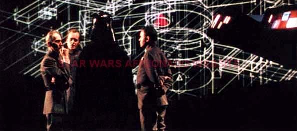
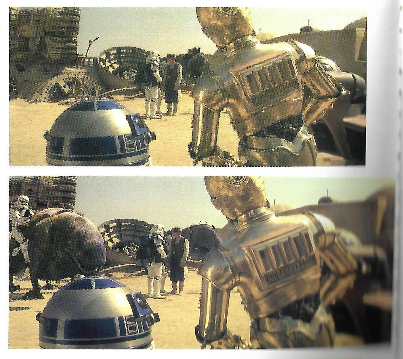
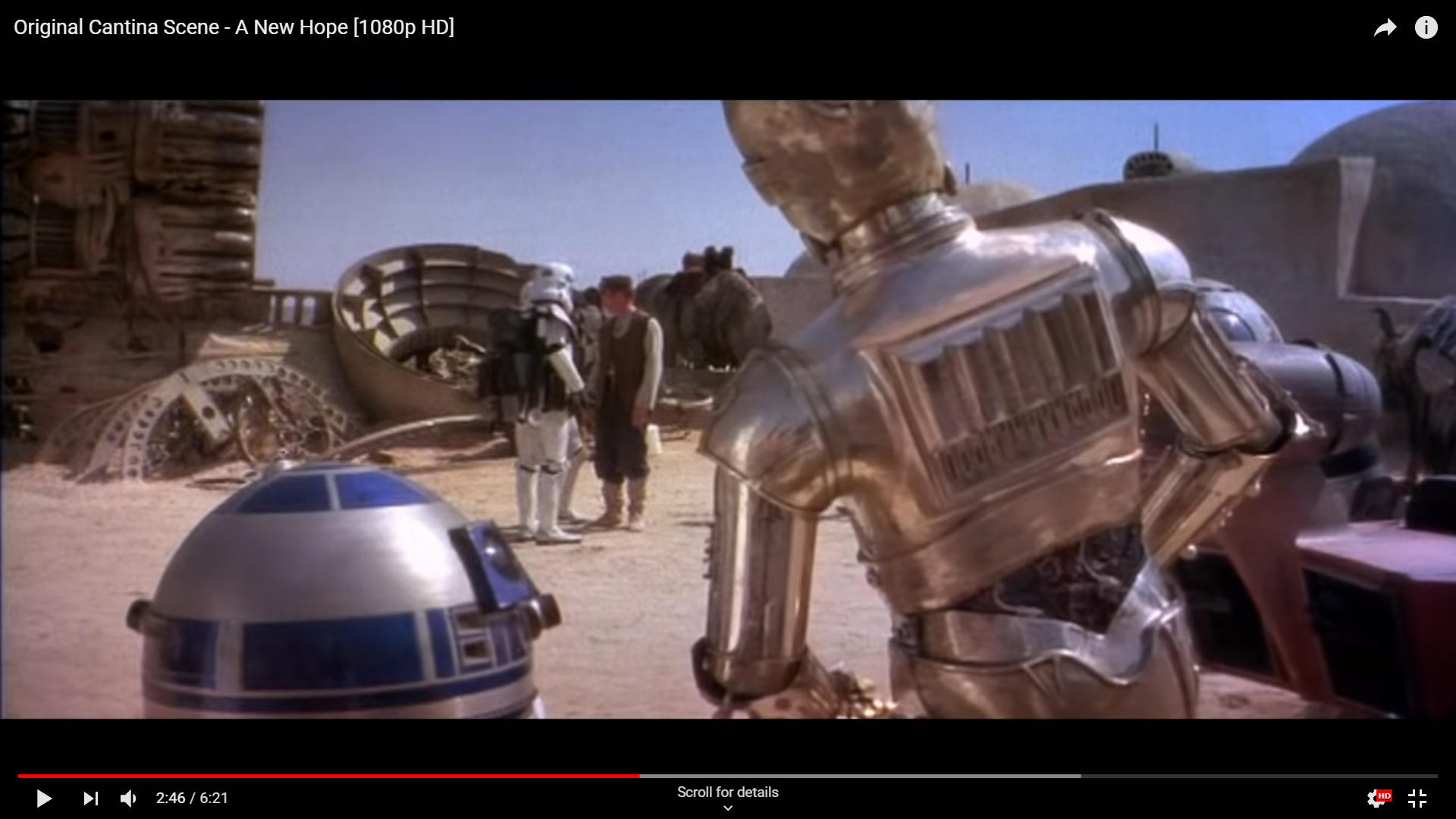
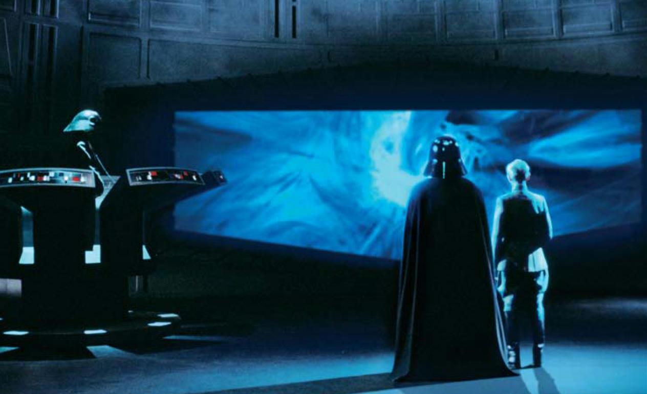
As far as the Storybook goes the most interesting thing about the Vader Photo is he has Blue Button on his Chest Plate not Green 😃. I have suspected that there could be a Blue and a green version of the Chest plate and I think it was used occasionally or It is a just that cyan is the Wrong Shade and it is more a Turquoise Blue not green. But in this scene we also have in the Gout Vader with Pink Lights on his Belt! Not Green so there tends to be a case for questioning how some Colors become Inverted for ??? Strange reasons… It Happens occasionally in the Highlights this inversion and it has been by and Large addressed now with current iterations. But It causes a distrust for what you see of some form of tinkering that can cause color inversion or perhaps a Skewed effect. But I don’t know how his Belt Lights are pink… That is 100% inverted.

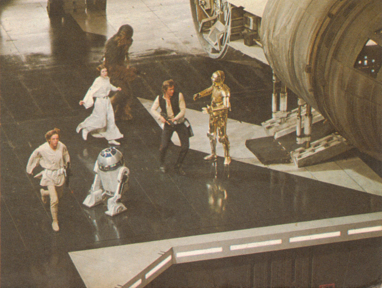
The Other thing from the Story Book is the Hexagon Lights in Lukes Garage Green or Cyan? This is equal and comparable to Vaders Chest Plate Green or Cyanish Blue?

It is also worth noting in the Garage there are also Weird Color Changes present in the Gout and Odd Hue Shifts to the Highlights at one point a Cyan Light becomes all of a sudden Red… Again we are seeing an inversion Occur but this time it is an Optical Effects shot.

But to touch on Optical Effects again Inversion does Occur when Making the Matte so I would assume the Cyan Light turning Red is to do with the fact that it is indeed an Optical Wipe this shot.

So if we think of the Dagobah Trees Matte Painting being Yellow if we Inverted it Correctly it would look how it was meant to look Blue.

If we Look at Bespin if it was that Brown Yellow Color if we inverted that it would be Blueish… After the Blue screen process it was probably in it’s inverted state and got all the Blue Removed and when inverted back there was only a white looking planet left when Composited.

Anyway this may mean that the scene where Vader Senses Obi-wan may have had a wipe at some point to explain the 100% Inversion from Green to Pink… The Same as when Vader first Steps on to the Tantive we have again Green in Inverted Pink so it is more evidence that it once was a Wipe to or from this scene via optical because the inversion.

But Skewing is something different it is not related to the Optical effects.

Unless of Course Vader was to have a Hand Animated Chest Plate via a Matte or Something like this which would probably explain why his Chest Button is Green and not Blue if indeed every shot of Vader is Run through Optical or Prepared for Such.

Post
#1263018
Topic
Star Wars: deleted and extended scenes * database *
Time

darkspire17 said:

Ronster said:

I had already started working on the Cantina Ponda Baba Decapitation and alternate content.
In this Version we have a close up on Dr Evanzan as he approaches Luke before tapping him on the shoulder you can hear his shuffle in the sound mix so it’s actually a legit take.

The whole Lightsaber fight has been tightened removing extraneous material so everything happens in real time and there is nothing happening twice.

Ponda Baba Decapitated off screen with sound effects, his head replaces the Wolfman arm and gun as his hands are different but his head sure is not apart from it’s come off his shoulders.

Greedo Takes an interest in Han Solo Bargaining with Luke and Obi-wan again I think this scene was moved so again legit and better.

Luke and Ben Leave earlier I think it makes more sense.

Han Get’s held up by Greedo all in the same scene unbroken quick cut away to cantina weirdo.

There is no doubt about Han shooting first

Here it is.

https://vimeo.com/284592564

Feedback as It’s in rough form if there are no suggestions for anything then I will do it in better quality.

Enjoy and Thanks

Fantastic work! especialy nice to see han firing his D-LL, where the hell is that shot from?

Some you tube video, A person built a fire-able replica so I altered it to make it blend… But I actually need to flip it because is the wrong way around!

Pause it and you will see what I mean 😃

Post
#1262943
Topic
Blade Runner: The Complete Music Collection (work-in-progress)
Time

TheInfiniteIconZ. said:

Ronster said:

I read up about some of the sound cues that were missing… Found this might be of use I am not sure.

http://bladerunnermusic.blogspot.co.uk/

Happy 2019! I was the one who started that blog, and I’ve updated it with original cue titles from the BMI repertoire

Happy New Year!

Well is there any chance this project can be completed by you?, or are you in the team with the OP or original project?

Post
#1262931
Topic
The ‘Custom Special Edition’ That Almost Wasn’t, But Then Was (Released)
Time

Hal 9000 said:

Well, it probably won’t exist for some time, if at all. And even then, the DTS 1997 SE audio will likely be my primary source, which would rule out any alternate language tracks.

I actually think the Broadcast version is better although only stereo it is just better IMO… Might be slight parts missing due to adverts and so on but you can get it off archive at the mo.

Post
#1262921
Topic
4k77 - shot by shot color grading (a WIP)
Time

DrDre said:

towne32 said:

screams in the void said:

fair enough , would the moderators object to me starting a thread about this topic so as not to further derail this thread ? also , my apologies to the op .I have not heard any thing regarding this issue from him . maybe he is on vacation ? and I am open to topic name suggestions

The OP has a new baby (or one on the way)! So the exact opposite of a vacation. 😛

I can’t imagine the mods would object to a new topic, though.

Yes, my little boy has been born. 😃 The discussion is interesting though, so a new topic would be great!

At least you have now Released something 😉

Well done congratulations!

Post
#1262879
Topic
The ANH:SE Redux Ideas thread (Radical Ideas Welcome).
Time

“I grow tired of asking, so this will be the last time…Where is the Rebel Base?”

Thought about adding a target overlay for the final time we see Alderaan out the view screen just to build more tension and clearly up the stakes.

Also updating Alderaan to a better looking Planet as well as it seems to look discolored in it’s current form in the film compared to other planets we see.

If only…

Janskeet said:

We never see the Death Star go into or come out of hyperspace. It doesn’t look like it has the capability to do that, but it must if it travels that quickly. I was thinking that maybe the Star Destroyers pull it, but that would have to be some pretty strong chains/rope to pull something that big at lightspeed.

Like the Death Star Target Screen (Gunner Target) This is also from the Haines Death Star Technical manual and I like it… It feels like it should be in the film somewhere.

probably before this shot showing exiting hyperspace on the view screen…

Post
#1262807
Topic
4k77 - shot by shot color grading (a WIP)
Time

Turisu said:

You need to properly calibrate your story book.

Seriously I still find it amusing if the picture of the back Special edition Laserdisc of Mos Eisley Special Edition added shots looks nothing like the film but if you shift it hey it looks like the picture…

Something wrong is a dead cert with Lucus film kit perhaps more the profit from the preparation for them but the film looks like… ok I will not say it but…Not like Still images it looks hue shifted compared to many still images.

Post
#1262799
Topic
4k77 - shot by shot color grading (a WIP)
Time

I think it’s safe to trust things like this but not safe to trust images of skin if that makes any sense.

This would be say an example where I would say correct in the book but wrong on film but when it comes to normal footage it has a different problem.

I optioned to hue shift to get to a similar result… But that was met with anger and also ridicule that it should have shifted in hue in either some natural chemical form or deliberate but quite frankly it is plain to see.

I opted for trusting printed materials over film for Star Wars in general and the Laserdisc TV versions being better representations of what it should look like but the hang up is between the Print and the Blu Ray and not any tele-cine… Seriously no fucks given anymore from me.

Generally what I tended to find was that the normal footage was hue shifted to positive meaning that a shift negative to correct was needed for standard film. But effects shots were generally shifted in a negative fashion you needed to shift positive a certain % to correct for those.

All in all you can only blame this on Lucusfilm ltd and nobody else because films from the same era and even prior other 20th Century fox titles do not suffer like star wars does. So it is a Lucusfilm issue and you cannot put the blame elsewhere it lives and dies with their tech and their stuff not being as good as 20th Century Fox capable Kit. Or possibly Director Arrogance that it has an issue that it looks bad compared to other films.

It’s more towards the end actually where the Negative shift and correcting with positive shift happens but like I said it seems the film got improved for TV Versions and so on then they sort of started again in 2004 and using the crappy print look will always look bad as it did when first released.

But I should Add that I don’t think what Dre does is bad… It is a film still up for grabs and good luck to him.

Post
#1255315
Topic
Info: Star Wars - What is wrong and what is right... Goodbye Magenta
Time

fair enough but I bought the disc already it is apparently fairly decent bootleg version…

I don’t havd to use that apart from perhaps a few shots in the battle of yavin. I could use the 2004 Dvd for most things basically I hope it is the same as the broadcast version at the end as there are a few shots that look pretty good or much better in the 97 version.

I will use it for the stereo mix on there mainly. that is really about it.

Just thinking now about putting CBS fox home video fanfare at the begining make it like a VHS experience but better for fun 😉

What frames are missing from uk Gout?

Post
#1255181
Topic
Info: Star Wars - What is wrong and what is right... Goodbye Magenta
Time

Thanks, I remember it looking like this when it was on TV probably early 80’s.

once the five star collection 97 version shows up I hope to blend the Gout and the 97 version in places actually really looking forward to seeing that material.

I hope then I will have a more analogue looking version than the 2004 and subsequent releases. I want to feel some of the grime and dirt but clean out the weird color interference.

At the end of the day I want a easy on the eyes special edition without the bad parts which we all know those parts. An Analogue Special edition with only CGI space ships sandcrawler yavin temple and so on. But I am also planning on intergrating some excised material and something I have wanted to do for ages is restore the tie fighter pyrotechnic blue screen shots. So there will be some small extras and fixed matte paintings and so on. So it will be a nice version I hope. quite a bit of work but not that bad. Been planning this for quite a bit of time on and off.

Post
#1255065
Topic
Info: Star Wars - What is wrong and what is right... Goodbye Magenta
Time

yotsuya said:

I’d be interested in seeing a different sewuence with these settings. C-3PO is too green and the blue lights are too purple. Chewy is also too yellow. That was the problem I ran into when I tried this. Yes, it corrected a lot of things, but it caused other issues. There are sections impacted by fading that just can’t be fixed and have to be patched. But overall, the skin tones were not bad.

Whats a sewuence?

you mean sequence…What one?

Basically I can adjust 3P0 looks like it’s the darker area of yellow with too much green.

It depends what Band the color is in and cleaning out the rubbish is quite a pain.

Problems in

Shadow either Green or Magenta

Mids pretty good

Highs magenta and Blue issues.

It is the Gout not Blu Ray I am trying to recreate the way it was on TV when I was a kid. Not Possible with Blu ray I don’t think the contrast is any good on the Blu ray. Not changing Chewie or Blue lights. The Saturation Level is good also in my opinion.

Post
#1255055
Topic
Info: Star Wars - What is wrong and what is right... Goodbye Magenta
Time

So I present the Hue Shifted Gout Color Correction Sample.

https://vimeo.com/300024250

Hope you like it but if you don’t I am not bothered either 😃

I purchased a copy of the 97 five star collection dvd of the 1997 version so I will be pairing that with this in places, only having the 97 broadcast version available to myself (4:3) , it would seem that some of the Millennium falcon cockpit shots are much better in the 97 version (Looking out in to Space) and also to pair Some Special edition elements for a semi-specialised edition but I really like the 97 audio mix a lot I have to say.

I am also planning on using a couple of shots from the Silver Screen edition (2gb mp4) for the hexagon lights issue and the Landspeeder shot (after storm trooper check point) in Mos eisley.

Anyway this is where I am at and this will match the 97 version come the end the two sources are of similar quality I would imagine so this will be a good blend and also good color match.

Using Star Wars the Illustrated script as a bit of a guide on the 1997 version and also a reason for doing the Hue shifts for which the 1997 version was shifted and corrected in places.

If you are going to critique fine just don’t go overboard, but I am showing the process to you now in finished form apart from one shot which I noticed has purple problem.

This basically looks good to my eyes, although it’s a bit different, I am awaiting the onslaught of negativity and flogging / bashing.

Edit: Having watched it a few times I noticed that Chewie in the Matte shot by the elevators is in wrong color so will fix that and a few highlights need de-saturating.

Post
#1254729
Topic
Info: Star Wars - What is wrong and what is right... Goodbye Magenta
Time

ZigZig said:

yotsuya said:

They are green in every single transfer that I included. No cyan

That depends on how you calibrated your monitor 😉

How about Calibrate your brain before you open your mouth.

😃

They are cyan after the shift I have performed and there are many that are close to cyan in those shots rather than totally green hexagons.

Post
#1254549
Topic
Info: Star Wars - What is wrong and what is right... Goodbye Magenta
Time

how about the lasers choose weather or not they are green more lime green or strong cyan green.

there really is no consistancy but I personally find that Lime green looks good and the rest look no good with blobby color surrounding them so no brainer as far as I am concerned any laser not Lime green is not the right shade of green.