logo Sign In

NeverarGreat

User Group
Members
Join date
11-Sep-2012
Last activity
16-Sep-2025
Posts
7,706

Post History

Post
#1086079
Topic
TFA: A Gentle Restructure (Released)
Time

It was part of V1. The attack on the Oscillator in V1 occurs where it did in the original movie - in the middle of the lightsaber battle. It probably needs to stay there because of the environmental destruction that happens as a result.

This scene juggling really highlights how there are tradeoffs and islands of stability in fanediting. There simply is no one best place to put this ‘damaged but still functional’ scene, since you’re breaking up the musical continuity of the film one way or another.

Post
#1086071
Topic
TFA: A Gentle Restructure (Released)
Time

It’s really good!

The only issue I sense is with the music cutting from the space battle to Finn and Rey, since there are two similar chords right next to each other. Even though the music overlaying the distant shot of the Oscillator is correct, it feels off in this short scene and the transition just makes it worse. Would it work to use the music from the Ackbar shot and simply extend that through the rest of the scene? The ‘weapon will fire in 2 minutes’ dialogue is of similar length to what replaces it.

Post
#1085953
Topic
Last movie seen
Time

dahmage said:

NeverarGreat said:

The Last Unicorn (1982)

Wonderful fantasy. I didn’t care for most of the songs - they didn’t fit the tone of the movie very well - but the dialogue is exceptionally well written and the visuals are often beautiful.

One out of one unicorn.

I have been told, on two wholly separate occasions, that I remind people of Prince Lir.

I try to not be insulted by this.

Haggard
At least you don’t remind them of King Haggard 😉

Post
#1085602
Topic
Automated color grading and color matching with a Machine Learning Algorithm
Time

Looks very promising. The Death Star walls still vary in color, but that is expected since my regrade didn’t go for strict adherence to a standard color, opting for a location-by-location color shift instead. The only other significant change I see is that the bot has less saturated skin tones, which makes sense since the bot probably doesn’t prioritize skin tones.

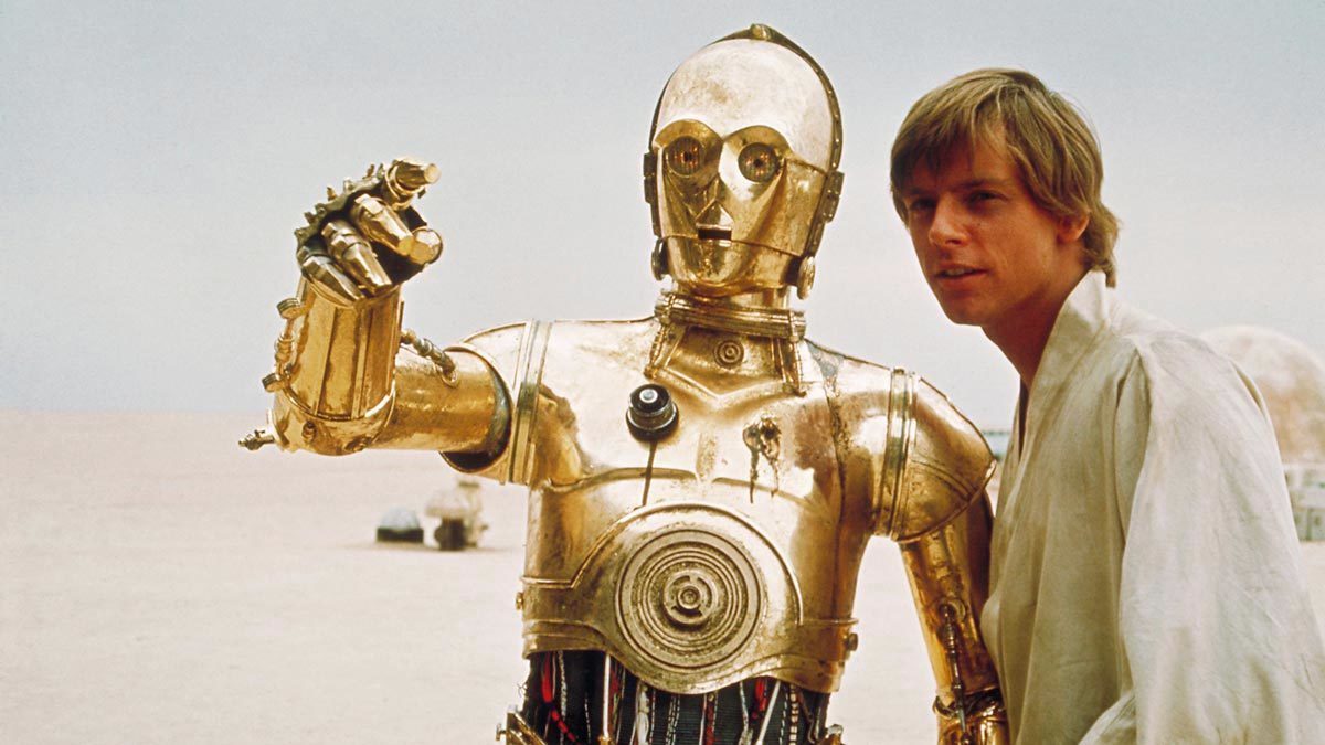
I should note that 5 or 6 of the test frames are from shots that I altered with color from another source, so the bot probably wouldn’t have been able to replicate that look anyway (see the R2 and 3PO shot and the trash compactor shot).

Post
#1084888
Topic
The Phantom Menace HD Theatrical Reconstruction (rough draft uploaded) (a WIP)
Time

I really like the filmic contrast, and most of the shots look wonderful in terms of color. There’s only one real issue for me, and that is in the blues. The holograms and Obi-wan’s saber have too little luminosity, leading to strange gradients with the surrounding colors. The Federation ship interior also takes on a strange blueish green tint. Here’s an example of a shot that doesn’t benefit from this grading in my opinion:
DarkSabers
It also seems like the reds are unnaturally dark.

Some shots look phenomenal though, such as this one:
Droideekas
The soft pinkish gray walls with blue panels really works.

Post
#1084798
Topic
Info: Recommended Editions of Disney Animated (and Partially Animated) Features
Time

AntcuFaalb said:

Guys, we have a new winner for The Sword in the Stone!

The Amazon WEB-DL is 1080p, has no logo, and fewer artifacts than the best HDTVrips around; better bitrate too.

And, of course… no terrible DNR like the BD.

WEB-DL: https://i.imgbox.com/98T7RJPa.png
HDTV: https://i.imgbox.com/VtAhDHRS.png

WEB-DL: https://i.imgbox.com/dCUK2Hza.png
HDTV: https://i.imgbox.com/1MDlTE0O.png

Excellent!
I don’t know how the color looks on 35mm, but I have my suspicions about both of these transfers. To my eyes there is a lot of hue shifting, resulting in unnatural colors. I looked at some lobby cards to get an idea of what this could have looked like, and came up with a single correction for both images:
http://screenshotcomparison.com/comparison/213210/picture:0
Medieval Muddle
Medieval Muddle
This one is rather red, but at least the chair and the bone aren’t green.
Sir Ector
Sir Ector

Post
#1084630
Topic
Automated color grading and color matching with a Machine Learning Algorithm
Time

^Tisk tisk, Neverarbot. You clearly don’t know me as well as you think you do. Those examples are much too blue.
😉

Here’s the final color with contrast altered to match the bot:
Non-Dusty
http://screenshotcomparison.com/comparison/213084
The colors are very similar to your TechBot in most respects.
This is also one of the shots that has blown out highlights on the Blu-ray, which I have fixed for this project.