- Post
- #1084974
- Topic
- Han - Solo Movie ** Spoilers **
- Link
- https://originaltrilogy.com/post/id/1084974/action/topic#1084974
- Time
One does not simply re-post the top rated comment of the BirthMoviesDeath article reporting this news.

One does not simply re-post the top rated comment of the BirthMoviesDeath article reporting this news.

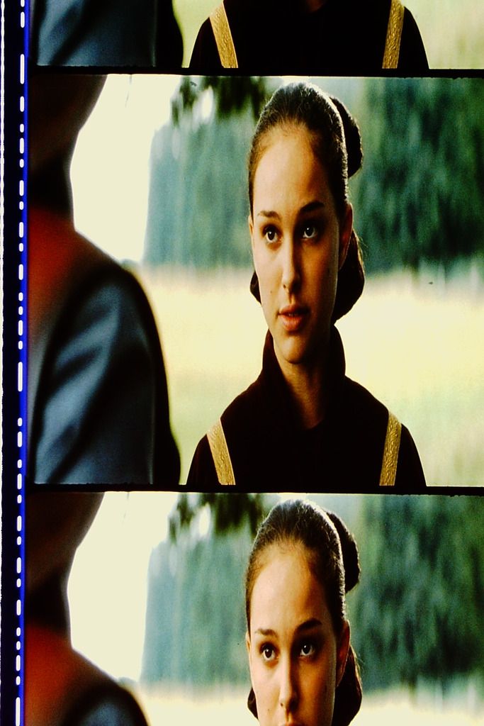
I really like the filmic contrast, and most of the shots look wonderful in terms of color. There’s only one real issue for me, and that is in the blues. The holograms and Obi-wan’s saber have too little luminosity, leading to strange gradients with the surrounding colors. The Federation ship interior also takes on a strange blueish green tint. Here’s an example of a shot that doesn’t benefit from this grading in my opinion:

It also seems like the reds are unnaturally dark.
Some shots look phenomenal though, such as this one:
The soft pinkish gray walls with blue panels really works.
Here’s a comparison shot, to hold over until this video preview finishes rendering.
http://screenshotcomparison.com/comparison/213242
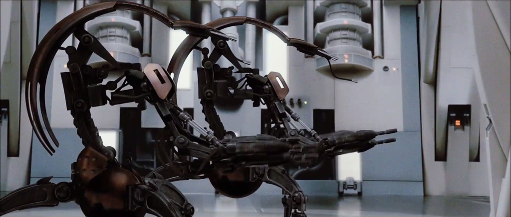
Tangential, but it’s amazing how much detail went into a set that was only seen in a few shots.
Guys, we have a new winner for The Sword in the Stone!
The Amazon WEB-DL is 1080p, has no logo, and fewer artifacts than the best HDTVrips around; better bitrate too.
And, of course… no terrible DNR like the BD.
WEB-DL: https://i.imgbox.com/98T7RJPa.png
HDTV: https://i.imgbox.com/VtAhDHRS.pngWEB-DL: https://i.imgbox.com/dCUK2Hza.png
HDTV: https://i.imgbox.com/1MDlTE0O.png
Excellent!
I don’t know how the color looks on 35mm, but I have my suspicions about both of these transfers. To my eyes there is a lot of hue shifting, resulting in unnatural colors. I looked at some lobby cards to get an idea of what this could have looked like, and came up with a single correction for both images:
http://screenshotcomparison.com/comparison/213210/picture:0

This one is rather red, but at least the chair and the bone aren’t green.

I like the sky blue and olive green look of the lightsabers. The warmer tones truly sell it.
I bet that the 3rd reference (Death Star Hallway) is working at cross purposes to the other Verta frames, due to the amount of blue in the frame. I wonder, what would happen if that was removed from the algorithm?
^Tisk tisk, Neverarbot. You clearly don’t know me as well as you think you do. Those examples are much too blue.
😉
Here’s the final color with contrast altered to match the bot:

http://screenshotcomparison.com/comparison/213084
The colors are very similar to your TechBot in most respects.
This is also one of the shots that has blown out highlights on the Blu-ray, which I have fixed for this project.
Abrams tends toward a more saturated look, and your approach is subtle but effective. I think you could go further in reducing the pink skin tones though. That’s one of the big issues that reminds me this is a recent film.
The first Jurassic Park movie since 2001 was always going to put a lot of butts in seats. If it was bad, people would have seen it out of morbid curiosity. If it was middling, they would have seen it because [insert any reason people see nostalgic sequels]. And of course if it was great, people would have seen it because obviously.
It’s almost like a certain Star Wars movie that came out in the last few years.
The reasoning behind Abrams for TFA is clear. He directed one of the best Mission: Impossible movies and successfully re-booted the Star Trek films for a general audience. I believe his deficiencies as a writer lead him to botch the endings of his shows and movies, but when he’s not writing, his movies are quite good. Super8 is a lovely film up until the end.
Rian Johnson is a great choice of course. Brick is wonderful, Looper is clever and interesting. Enough said.
Trevorrow is much less reliable in this regard, since although his films have been decent in terms of broad audience appeal, he seems incapable of writing certain types of characters. Romance in both of his previous feature films has been an issue for me, and if the reviews for his latest are any indication, he hasn’t improved in the portrayal of female characters in general. If TFA taught us anything about the director’s tendencies, it is that the movie is very much a mirror of the instincts of the director for good or bad. I have no faith in Trevorrow to create a worthy third installment of this trilogy.
As a coda to this Book of Henry thing, here’s an excerpt from an interview he gave about the film:
I think what this movie is, it’s the movies I would be making if no one had asked me to go and do these giant versions of things that we loved growing up. Which I also love doing. But it was important to me to make something that at least shares with people my identity as a filmmaker, what I believe in and where I stand. And the kind of movies that I would continue to make if they were to fire me tomorrow and say I can never do a big budget movie again. I would make movies like this.
It sounds like you would be happy doing that, too.
Absolutely. I’m not suggesting they fire me. In case they’re listening.
I hope they’re listening.
Hayden is definitely the most noticeable change in the long term (so far!) since all it takes to recognize the incongruity is the fact that the Original films are much older than the Prequels. Perhaps going forward with petitions and awareness-raising messages, it would be good to highlight this change above others as an example of pointless revisionism.
The DVD’s were released in 2004, two years after AOTC and a year before ROTS. So perhaps a new release will happen between Episodes 8 and 9, and this also almost fulfills the 7 year pattern.
Or something.
The recent pattern has already been somewhat broken by the 2015 digital release, so this means that the OOT will absolutely arrive in 4K in 2022. Yay!
I think it has more to do with generational differences than anything else. Since the last VHS release of the OT films was in 1995, many people born after 1990 probably haven’t grown up watching the originals. So the vast majority of people 17 years old or younger have no nostalgic connection with these films, and even most people under 30 have had their memory ‘replaced’ with memories of the Special Editions (I was one of these people for a time).
They haven’t been implemented (yet?).
Part of why I tried to extend the Starkiller firing to fit the full cue was in an attempt to make room for a government transmission offering belated assistance. Of course that idea would use some different shots, but in either case the Resistance scene would need to be manufactured. After doing the basic montage, people seemed to like that on its own so I didn’t go further in the idea of the transmission.
Perhaps the transmission could be added by removing the pilot reactions and instead inserting the ‘are you seeing this’ line. I just really like the wordless nature of the montage as it is, and the transmission would have to be quite good to be worth it.
But don’t let that stop anyone from trying this out - the attitude of the Republic is still the most problematic aspect of this edit in my mind, and something should be done to make it more helpful to the Resistance.
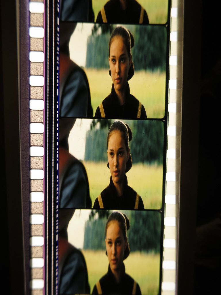
For comparison with the scanner, here’s a photo of the filmstrip taken against a florescent light with a camera which has been white balanced for florescent light:
Scanner:
So it appears that despite some slight differences between them, such as more contrast and vivid primaries with the scanner, they are both quite yellow compared to the Blu-ray.
More fuel to the fire, so soon after the horrendous shooting.
http://www.cnn.com/2017/06/15/politics/karen-handel-threatening-letters/index.htmlSuspicious envelopes were sent to the homes of Georgia politician Karen Handel and her neighbors as well as two Atlanta-area news stations, law enforcement said.
Law enforcement responded to the suburban Atlanta neighborhood Thursday afternoon after a resident reported receiving an envelope, Roswell Police spokeswoman Lisa Holland said. The envelopes contained threatening letters and white powder.
Later Thursday, news stations WAGA Fox 5 and WXIA 11Alive received similar envelopes, the FBI said. An investigation is underway to see if they are related.
Preliminary field tests on the substance mailed to WAGA suggest the powder consisted mostly of baking soda, the FBI said.
Handel is a candidate in Georgia’s closely watched, tightening 6th Congressional District special election against newcomer Jon Ossoff.
“This afternoon we had some suspicious packages delivered to our house and to our neighbors. The packages contained threatening letters and a suspicious substance. The police were quickly notified and street is now being blocked off. We will continue to coordinate with law enforcement as necessary,” she said on Facebook.
Why on earth would such packages also be sent to her neighbors and local news? Are they really this desperate for attention?
Where are my Random Pictures and Gifs? Three pages of basically no actual images.
A thread was proposed, written, and forgotten.
http://originaltrilogy.com/topic/Zero-or-Hero-A-Discussion-about-Objectivism-vs-Subjectivism/id/55592
Safety Not Guaranteed was one of the worst movies I’ve ever seen, so I’ve been on edge about this from day one. That review excerpt that Alderaan posted for Book of Henry honestly made me morbidly curious, though.
Yeah, quite a few people liked it but I just couldn’t stand the interminable romance or the ending.
The third film in a trilogy is always the hardest to get right, so why Disney seems intent on shooting themselves in the kidney before they even start is beyond me.
After he finishes Ready Player One, Spielberg should just do Episode IX before going into Indiana Jones 5. Or since that franchise is already toast, just skip that and go right into Robopocalypse.
I think the contrast has a lot to do with how much green is apparent in the final image. The first scanned image ‘pops’ in terms of color, though it has crushed highlights and shadows. This makes her skin tone appear red in the shadows. Also, in all of the scans Panaka’s shirt never looks as green as in your averaged image.
The version where Hux says ‘The Resistance…it is wreckage’ was the result of taking it into Audacity and manipulating the pitch. It’s a weird sentence structure but it’s the best I can think of using Hux’s limited lines. The problem is that he almost never says anything in the past tense, always ‘we’ll soon have it’, ‘We will destroy the government that supports’, etc. Perhaps this is something that will have to wait until V3 of this project, after The Last Jedi gives us more to work with.
Not having access to my calibrated monitor is killing me right now.
Based on my crappy laptop screen, these look great. It can’t fix the image errors that plague the Blu-ray, but if someone attempts a project like this in the future, it hopefully won’t take them years. 😃
Quality Post.
Clever content here.
I hate to say it but
No
Quality contribution.
Twas the height of folly to press the ‘create thread’ button before at least summarizing my position. Thirty lashes for the accused!
But now you’ve edited the OP with actual content, thus rendering my statement incoherent.
Ruling:
Zero!
Ah, but I have immortalized it in a previous post, rendering it coherent again!
Ruling:
Hero!
