Handman said:
Dek Rollins said:
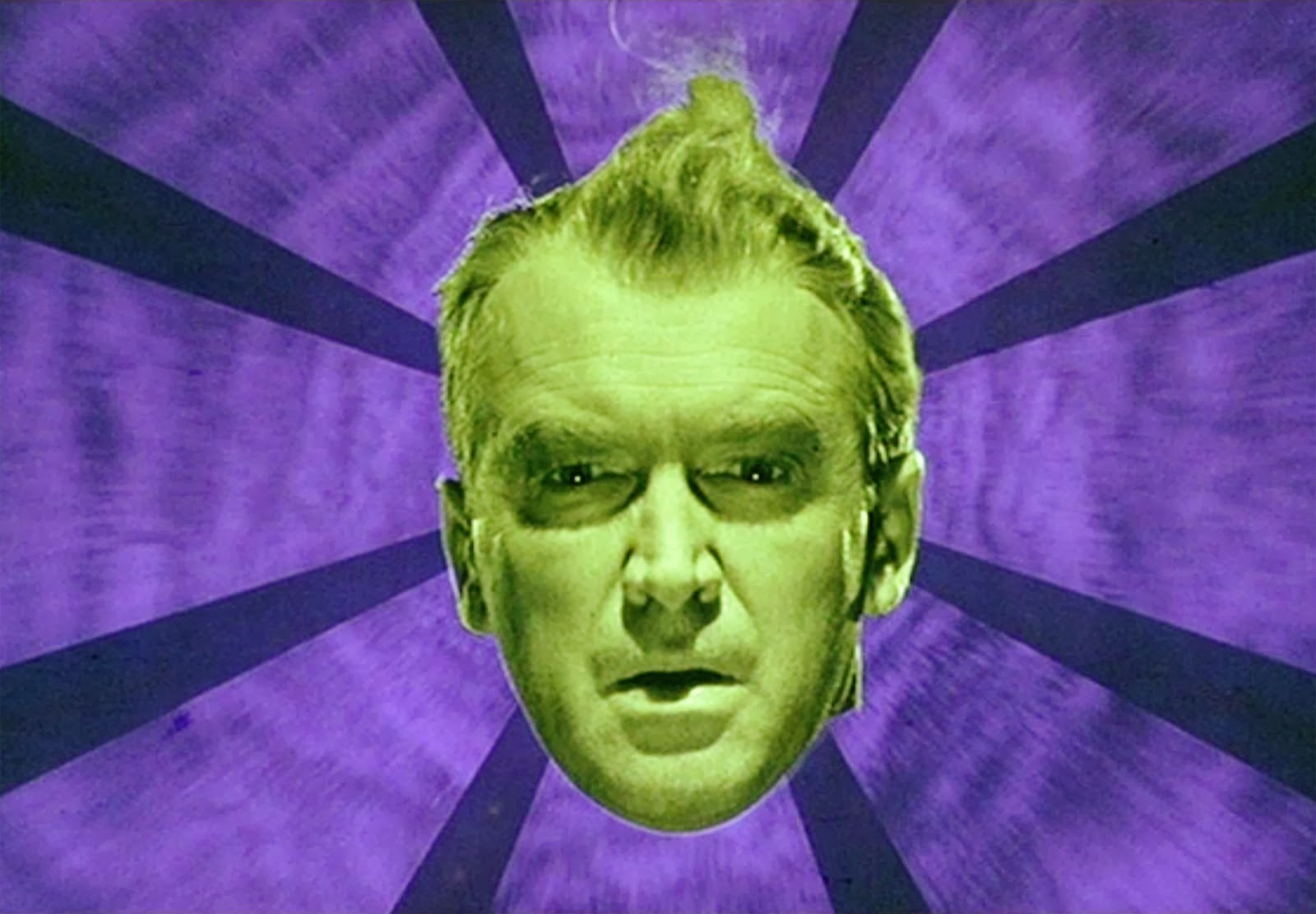
His face flashes a greenish yellow but it’s never actually green, and the flowers don’t appear over his face. I find the intensity of the colors and the placement of the objects unpleasant to look at. Putting just his face over a colored and striped background from the sequence and putting the flower bit on the back without that staircase would be a better look.
They chose red and green because the entire film revolves around red and green.
I guess different tranfers make it look different. I went and rewatched the dream sequence to make sure I didn’t forget something and his face looked yellow, not grannysmith green.
The cover is just an amalgamation of everything that appears in that dream sequence, which I would argue is the most memorable scene of the film. Definitely the most surreal. However, I can’t argue your personal taste.
As I said before, the use of that sequence isn’t the problem. I described what I considered a better idea for portraying the imagery in a way that is pleasing to the eye. I don’t find the choices they made for that cover pleasing to the eye. But, as you say, personal taste.