
- Time
- Post link

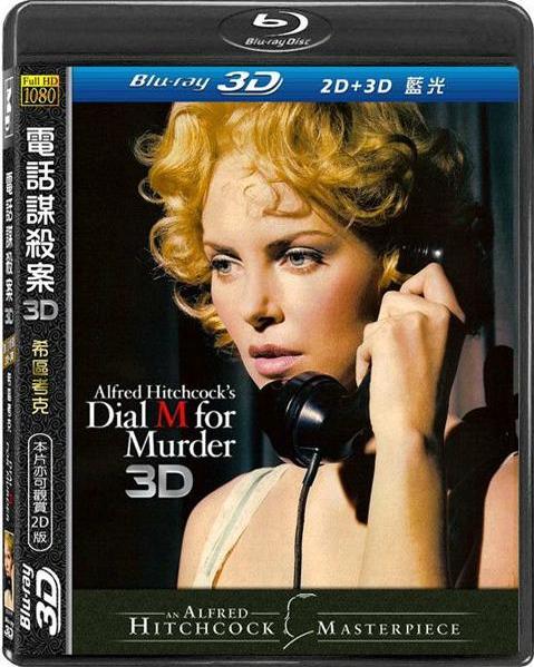
This is real? oh gosh…
This is real? oh gosh…

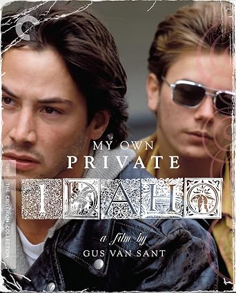
While I get what Criterion was going for here, it’s disappointingly bland. The digipak release had a much better “inner cover (a bit of photoshopping work to add Phoenix and Reeves would help):”


While I get what Criterion was going for here, it’s disappointingly bland.
Much like Keanu, no?


Terrible cover art aside, is the Director’s Cut any better?
Army of Darkness: The Medieval Deadit | The Terminator - Color Regrade | The Wrong Trousers - Audio Preservation
SONIC RACES THROUGH THE GREEN FIELDS.
THE SUN RACES THROUGH A BLUE SKY FILLED WITH WHITE CLOUDS.
THE WAYS OF HIS HEART ARE MUCH LIKE THE SUN. SONIC RUNS AND RESTS; THE SUN RISES AND SETS.
DON’T GIVE UP ON THE SUN. DON’T MAKE THE SUN LAUGH AT YOU.
Terrible cover art aside, is the Director’s Cut any better?
The director’s cut has reinserted deleted scenes, one bit of alternate dialogue, and different colour grading for the “story of Ra” flashbacks. I prefer the director’s cut for the most part, but objectively it isn’t any better or worse than the theatrical version. I’d recommend checking it out only if you liked the theatrical version. If you didn’t, then don’t bother.

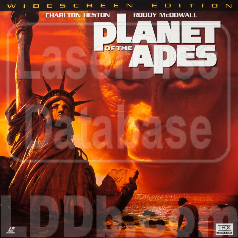
I got the older CBS/FOX Special Widescreen Edition just so that the cover doesn’t spoil the twist like this late release does.

I’m torn because is a gorgeous shot and super iconic, but yeah, it does spoil the twist.
Do not DM me for edits. Whatever you’re looking for I don’t have it.

I’m torn because is a gorgeous shot and super iconic, but yeah, it does spoil the twist.
It’s even more than that it ruins the awesome twist ending, though. It’s also got a horribly ugly gradient map applied & Cornelius looming in the sky is dumb & the whole affair is terribly photoshopy.
But ruining the end is the greatest sin any media can commit. And this cover is going to Hell.
Big time.
This Blu-Ray of Pinocchio is one of the worst covers I’ve ever seen.
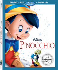
It’s certainly bland as fuck, but there’s far worse out there.

Here’s one for one of my favorite films:
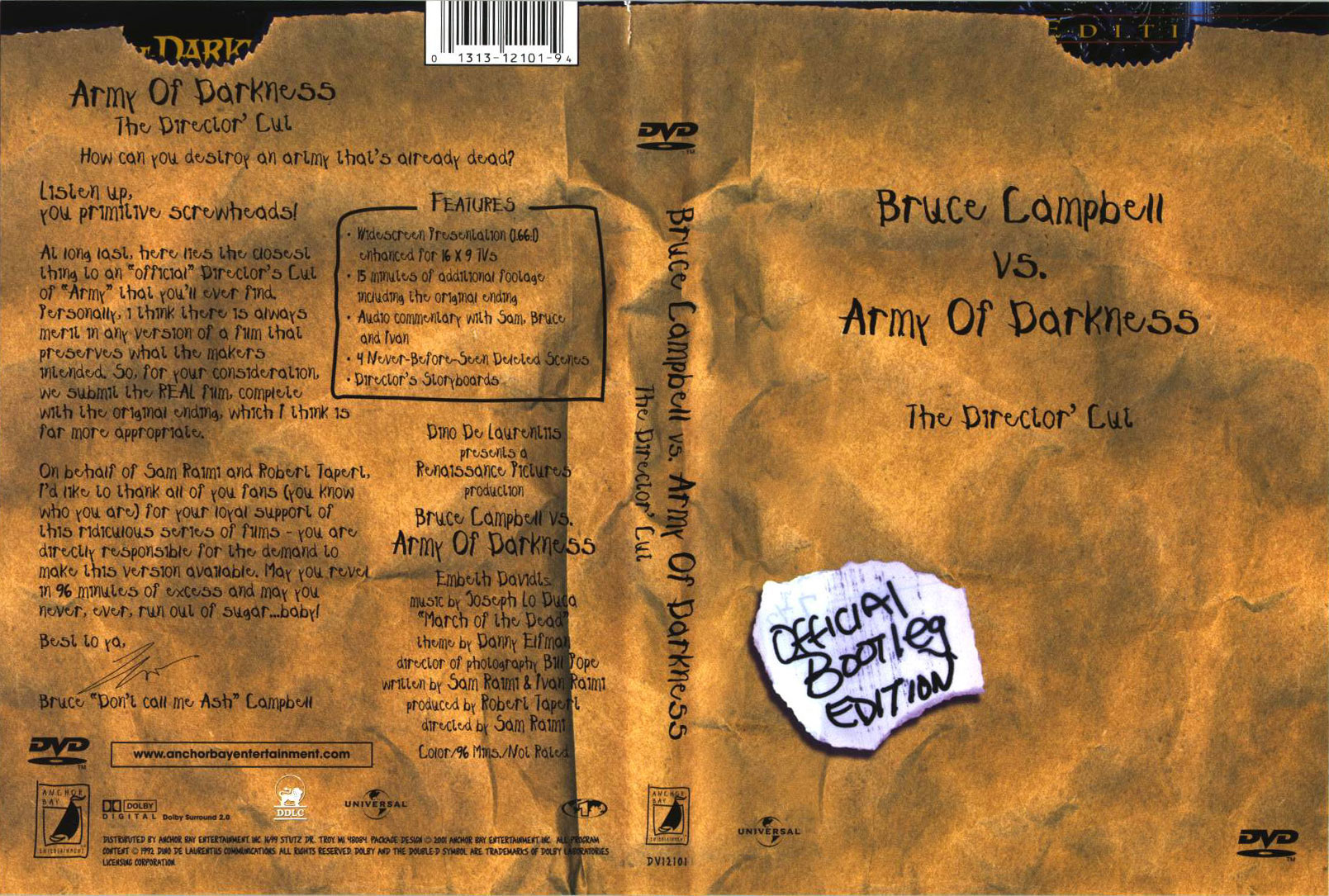
Not sure why this exists. The cover is a reference to the character Ash’s job as a supermarket employee, so it looks like it was packaged into a brown paper bag. This DVD is essentially a re-release of the limited Director’s Cut edition of the film and THAT DVD looks like this:
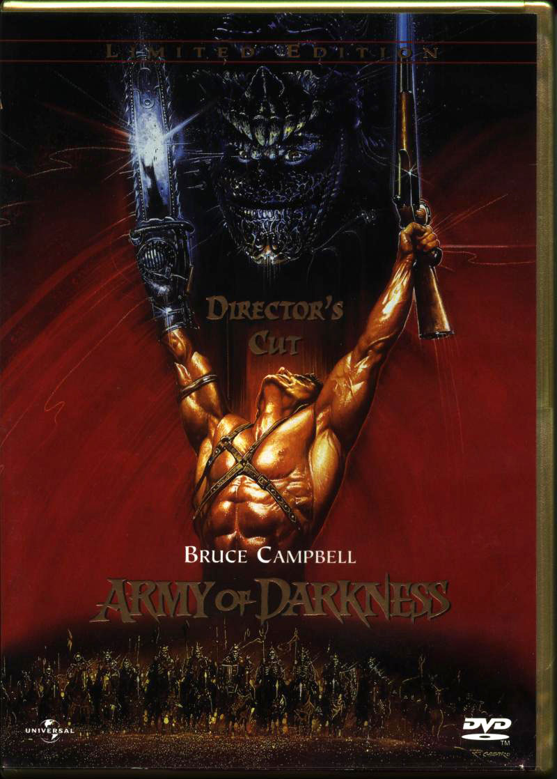
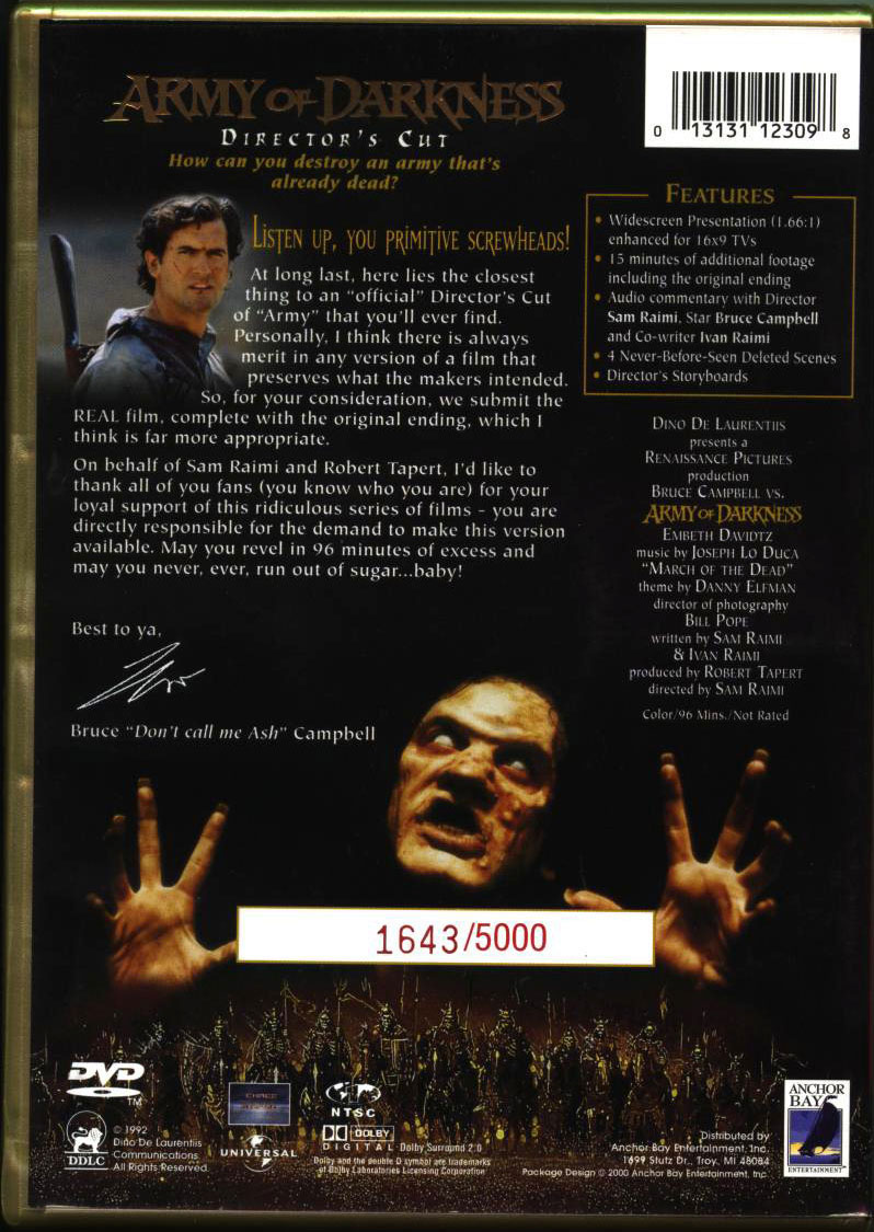
As far as I can tell, the DVD image of the Official Bootleg edition is identical to the original Director’s Cut. Same features, same DVD menu and the film starts up right away skipping the menu, although the DVD label is designed to resemble a DVD-R. You can observe that the “hardwritten” back cover is replicating the back of the original Director’s Cut release, and you can even see at the top of of the OB edition where the top parts of the DC DVD are showing. As well, the chapter titles DVD insert resembles a handwritten shopping list torn from a note pad, whereas the DC insert is more traditional.
It’s clear that this was re-released because the DC DVD were a limited run (the image above shows 5,000 copies, but my copy shows that there were at least 40,000 made), but I don’t understand why change the packaging design. On one hand, it’s a neat little novelty release. On the other, as a kid (and today) I always thought the original DC DVD looked way cooler than the OB edition and it was EXTRA cool that the plastic case itself was gold coloured as opposed to the standard black, so my perception was that the copy we had was low rent, which I guess was what they were going for by making a bootleg aesthetic part of it’s design.
But, as an adult I possess both versions, so I have no reason to complain anymore.


#Pro-Life

I already posted that on page 25, but yes, that is awful.
And in the time of greatest despair, there shall come a savior, and he shall be known as the Son of the Suns.
^Ah, my apologizes.
Anyway, more from the same people who did that Captain America cover:


#Pro-Life

They look like indy comic book covers from the 1980’s. I could see a legal reason for avoiding art that looks too much like Cap or Shazam, (even if those old serials are public domain) but the others are a head scratcher.
Where were you in '77?

Thanks, I hate it.

What the hell is that?
How did that cover get through so many levels of production without one person thinking “Wait, it looks like shit”?
And that “artist’s” other covers are just as bad, if not worse.
My preferred Skywalker Saga experience:
I II III IV V VI VII VIII IX
I kinda like 'em, for this reason:
They look like indy comic book covers from the 1980’s.
It doesn’t even look like that though. At least those covers had decent shading, coloring, and art style. These just look like someone drew them in 2 minutes on MS Paint.
My preferred Skywalker Saga experience:
I II III IV V VI VII VIII IX

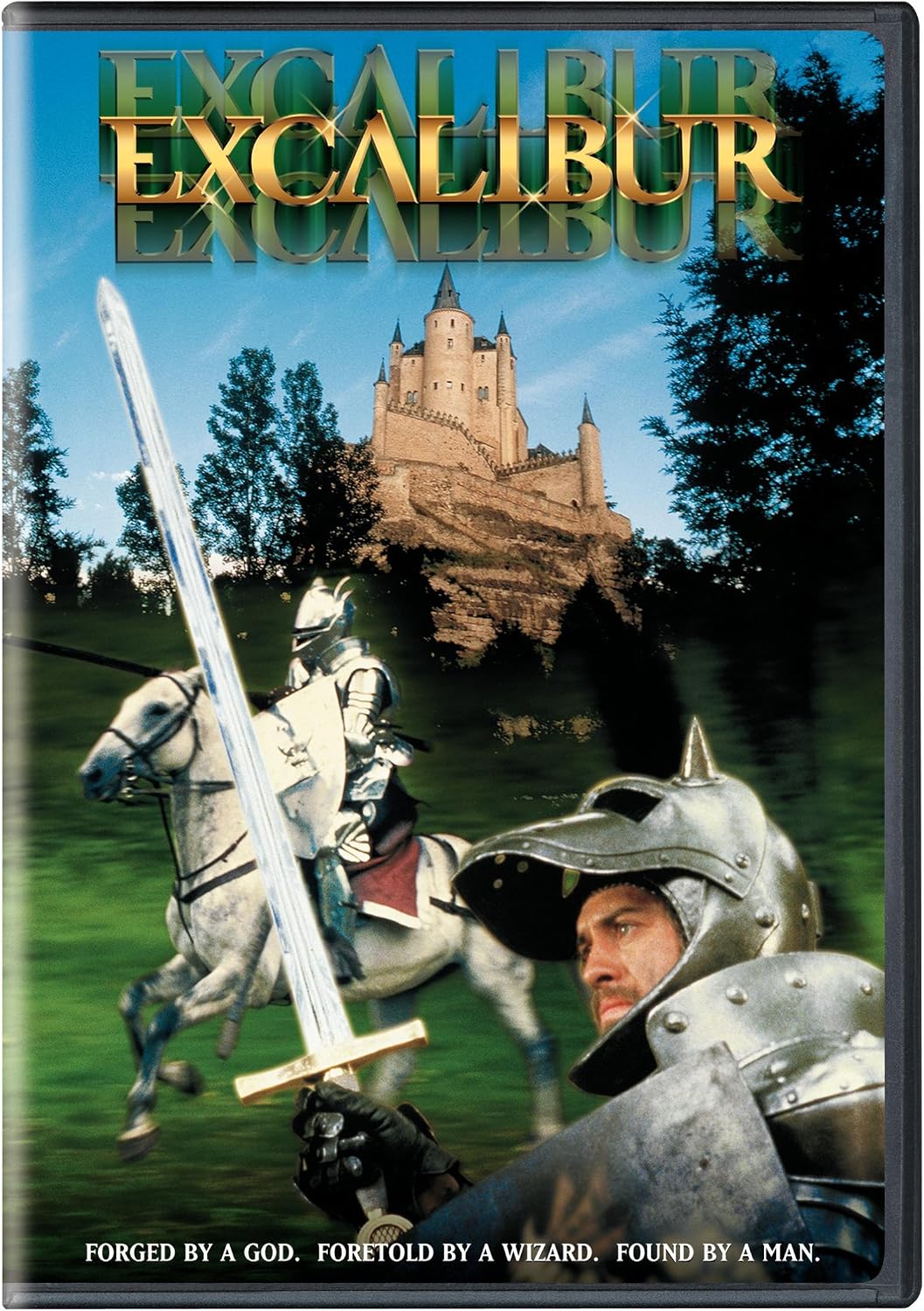


Even the text on the bottom would work better in a different order:
FORETOLD BY A WIZARD. FORGED BY A GOD. FOUND BY A MAN.
You probably don’t recognize me because of the red arm.
Episode 9 Rewrite, The Starlight Project (Released!) and Terminator Ultimatum,
The Blu-Ray cover attempts to polish a turd. 😉

Where were you in '77?