logo Sign In

That guy with no name

User Group
Members
Join date
28-Dec-2020
Last activity
18-Jun-2025
Posts
1,015
Web Site
https://www.youtube.com/@TGWNN.

Post History

Post
#1523683
Topic
Star Wars: A New Hope DEVASTATOR EDITION (V.2 a WIP)
Time

darthrush said:

Hey, I looked through V1 and LOVED it. I’ll be using this as the main base of my private custom SE edit, it’s wonderful work 😃

Just a few technical notes for the upcoming V2:

  • the Greedo subtitle at 49:47 has the word “sign” misspelled to “sighn”

  • the shot of Luke running down the prisoner hallway at 1:13:27 is frozen on one frame

good catch.

Post
#1523641
Topic
Star Wars: A New Hope DEVASTATOR EDITION (V.2 a WIP)
Time

StarkillerAG said:

That guy with no name said:

Death star explosion final.
should I keep the camera shake or leave it out?
https://drive.google.com/file/d/10AQ9f32QcPWHY4TyeDdHmMx8P_n3Gcvt/view?usp=sharing

No camera shake, please. No offense, but it feels sort of “amateurish”. Big explosions being accompanied by camera shaking has never really been a part of Star Wars’s visual language.

The’re very apparent in the prequels though.

Post
#1523001
Topic
TGWNN's The Cloak of deception: revisited (WIP)
Time

Hello everyone.
The hal9000 trilogy are the definitive versions when it comes to the prequels, (story wise at least.)
and the effects hold up pretty well, except for one film… Episode 1.

Hal’s ProRes cloak of deception will be the main master, and i’ll build my effects on there.

It has always bothered me that the effects in phantom menace are so out of place in the prequels.
I want to have a definitive version of the trilogy to watch, but Episode 1 always sticks out like a sore thumb.

here are the main issues that I’ve noticed and how to fix them.

  1. Lightsabers too dark/colorless. Fix: replace using dazman’s phantom edit.

  2. too many stars in starfields . Fix: replace starfields (maybe)

  3. Laser’s ugly dull colors. Fix: repaint all lasers. (maybe)

  4. naboo’s scenery in some areas especially in the hangar bay shots look fake. Fix: replace with better environments.

  5. deepfake/paste Darth maul’s face onto the CGI puppet seen falling down the tunnel thingy in the final battle.

  6. replace added spark hits that look fake and bad.

  7. Restore/Clean up films issues.

This edit won’t officially begin until DevEd v.2 is finished.

Post
#1522128
Topic
STAR WARS: EP IV 2004 <strong>REVISITED</strong> ADYWAN *<em>1080p HD VERSION NOW IN PRODUCTION</em>
Time

StarkillerAG said:

Am I the only one who thought the replies sounded a bit sarcastic before actually watching the video? Like, I thought Ady added a ronto walking across the screen or something like that. 😉

But anyways, amazing work! You are truly a VFX god, Ady.

I also thought that at first, 😂

Post
#1522007
Topic
The ‘Custom Special Edition’ That Almost Wasn’t, But Then Was (Released)
Time

Ronster said:

That guy with no name said:

I pasted the officer in white’s footsteps onto the motti shot like you said,
it doesn’t match at all:
https://drive.google.com/file/d/1iHnnR_QJNAA5S3tXwY4oRa93EtbvWs65/view?usp=sharing

https://vimeo.com/manage/videos/250641294

The first footstep is off camera

Those footsteps don’t match at all, he backs up one step and we hear like 4.

Post
#1521583
Topic
The ‘Custom Special Edition’ That Almost Wasn’t, But Then Was (Released)
Time

Hal 9000 said:

  • Make R2’s blinking red/blue light work, as the original prop was broken. Adywan has done this but his will be the 2011 source. TMWNN has done a lot of this, but not the trickier shots where there’s a lot of motion.

For v2 and your edit all of the blinking lights will be completed.

Post
#1521497
Topic
The ‘Custom Special Edition’ That Almost Wasn’t, But Then Was (Released)
Time

Hal 9000 said:

ROTJ has been updated and is available now in the usual places. DrDre’s color matching tool has allowed me to make the Lapti Nek, Death Star II explosion, and ‘Yub Nub’ scenes closer to blending in seamlessly. I remain open to revising it down the road if superior source material becomes available. If Adywan presents a color-corrected ROTJ I’d be glad to update this with it.

ANH will come in time. I await TMWNN’s forthcoming project to fix up the 19SE and color correct it to be close to Adywan’s work on the 2011 BluRay. I plan to publish an update before then, with only minimal color tweaks from the OTD-19SE primary source, and redo it whenever that is ready. I’ll post updates here as I go, as there may be a few things yet that I could use some help with.

what else do you needs help with?

Post
#1521441
Topic
Star Wars: A New Hope DEVASTATOR EDITION (V.2 a WIP)
Time

Ronster said:

Hal 9000 said:

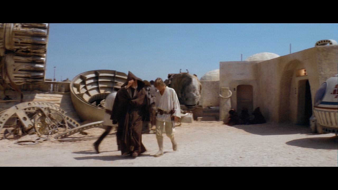
FWIW I agree. If the original shot of some speeders and people going by that originally opened the scene didn’t have so many foreground antics added in, I’d like to use a version of it without the silliness but with the SE backdrop so it fits in a bit better. I’m not unhappy with what’s in my current version, but it’s an area ripe for improving upon.

I think guy with No name has done a good job and I don’t want him to feel people are asking too much of him… But yeah good what he did here, but also we can pick fault with the original film… Why is the top of the moisture vaporator missing?

That could mean that the shot should be cropped?.. I know I saw an alternate angle more from above that did not have to deal with the landspeeder shadow animation and probably not the missing top of the moisture vaporator but they went with that angle probably to see what could be achieved and perhaps fell out of their depth a bit in 1977 but you know I guess innovation whilst having mistakes included, is better than no innovation without mistakes and playing safe. Pushing the envelope was what it was all about and that rings true for Special Edition also, but in a bad way. The CGI was put center stage over the film especially here in this part.

If this shot was commissioned today it would be more about the top of the moisture vaporator probably more than anything else I reckon.

As time as gone by CGI although a very essential and useful tool in the box of tricks It’s maintained it’s big front and center accolades but also slid into the background and kept itself subtle. The big wow factor is now gone…

The telegraph poles and wires in the background are a good thing too they don’t detract from the shanty town Mos Eisley…

It’s not missing its top, that’s just a type of evaporator: