[Narrator with Star Wars music in background, clips should play silently in the background or low volume. Video should be formatted 16:9, with the URL of the petition in the black area under the 2.35:1 clips.]
[2004 ANH: "A long time ago" to the receding logo]
Since the format debuted, Star Wars fans had wanted the original trilogy on DVD. Finally in 2004, Lucas released a new version of his 1997 Special Edition exclusively on DVD.
However, something was missing.
[Lowlights from the 2004. Bad colors in general during the first part, further changes in second part, ex. 2004 ANH: Greedo shoots at the same time as Han, then again in slow motion showing Han actually shooting twice. 2004 RotJ: Ghost Hayden]
While the 2004 edition was very high quality, the colors were (messed up) and some of the changes brought even further debates on the merits of the Special Editions in general. Fans asked for a choice.
[Screenshots of the original petition and signatures, the DVD cases, etc. ending with the "Long Time Ago" to the GOUT ANH logo]
Originaltrilogy.com led the charge with a petition to release the unaltered theatrical versions on DVD alongside the 2004 Special Edition, even after Lucas claimed this wouldn't happen, that the Special Editions were the way it was always meant to be. Fans still wanted a choice between Lucas' "final" vision and his original vision they fell in love with. After (so many) signatures, the theatrical versions were released in 2006 as a bonus disc with the 2004 version.
Still, something was missing.
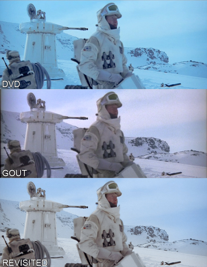
[Scenes from the GOUT unaltered (i.e. with black bars all the way around the 16:9 image, showing what you get if you just put it in your DVD player), leading to the example images showing the flaws.]
The version released was a non-anamorphic copy scanned in 1993 for the last laserdisc release. As fans zoomed in to fill their wide screens, more flaws presented themselves. (Gate weave, compression artifacts, and general blur) plagued the copy. The fans were not pleased.
[Screenshots of the new petition, followed by pictures/examples of the Blade Runner and Close Encounters releases]
Starting in late 2009, a year after the Blu-ray format won the high definition war, Originaltrilogy.com is trying again. Since the release of the 2006 versions, multiple films have come to the Blu-ray format in all possible versions. Ridley Scott had all possible versions of Blade Runner rescanned and released in one set, even ones he didn't care for. Lucas' friend Spielberg released all three versions of Close Encounters of the Third Kind in high definition around the same time. However the rumored 2011 Star Wars Blu-rays are still looking to be only the 2004 version, if not an even further enhanced version.
Fans still want a choice.
[Shots from fan edits / restorations showing how some people have tried to fix the SEs, Darth Editous, Adywan's AVCHD, etc.]
Lucas should feel free to release as many enhanced versions of his films as he wants. However, he should also take a cue from his director friends and release all of the versions or at least the original ones along with it. The theatrical versions of the original Star Wars trilogy should be rescanned from the original film, if not all from the original negative that Lucas claims was destroyed to make the Special Editions, than from a print. Fans want the versions they saw in theaters, that they grew up remembering. They want the colors to be restored, (more stuff)
[Grow the URL to fill the screen as it finishes]
Don't let fans continue to do the work Lucas should have done already. Sign the petition to let Lucas know that we want the original theatrical versions in a high definition format that we can show our children. Let us have a choice.
Please, please, this is a first draft and needs a lot of work. Help me tweak it and someone needs to make it happen.