logo Sign In

Monroville

User Group
Members
Join date
20-Oct-2008
Last activity
18-Oct-2015
Posts
1,217

Post History

Post
#389786
Topic
STAR WARS: EP V &quot;REVISITED EDITION&quot;<strong>ADYWAN</strong> - <strong>12GB 1080p MP4 VERSION AVAILABLE NOW</strong>
Time

Ripplin said:

I sure was surprised when version 2.0 of Deleted Magic was released with the "Revisited" title. Surely they could have thought of something else! It just looks like they're piggybacking on your success. And now look what has happened. I sincerely hope OCP itself hasn't done this. It's probably just some clueless moron.

The fur looks nice. Just keep the grape juice away from it. :)

I kinda agree.. OCP put out that fantastic THIEF AND THE COBBLER edit.. even so, I can't say it would surprise me if it was the same guy, just that I doubt it, since a lot of OCP's stuff can be downloaded for free, albeit from other sites.

Post
#389277
Topic
STAR WARS: EP V &quot;REVISITED EDITION&quot;<strong>ADYWAN</strong> - <strong>12GB 1080p MP4 VERSION AVAILABLE NOW</strong>
Time

Tobar said:

Hey Ady, I know you're probably already done with the Tauntauns but I just had to share this neat video I just found:
http://www.youtube.com/watch?v=E6lQ5GG6bnI

Your work on the Tauntauns looks great, are you doing it manually? 

To add to this, the same guy did some motion blur work on some EMPIRE clips too (it's at the 1 minute mark).

Post
#389210
Topic
STAR WARS: EP V &quot;REVISITED EDITION&quot;<strong>ADYWAN</strong> - <strong>12GB 1080p MP4 VERSION AVAILABLE NOW</strong>
Time

vaderios said:

see this:

And tell me


-Angel

That's probably more realistic, though the blue on the outer cave area (the entire area of the cave left of the door and Chewie) would have to be de-blued and darkened.  I wonder if some hi-def footage from some of those nature blu-rays would work to put in the cave exit area...

I would imagine it would be dark (as it is stated that nightfall is approaching) but that you may not be able to see too much detail, as there would be a lot of wind and snowstorm type activity outside.  I would also say that the Han outside shots need to be darkened (or at least how in some 80's films the upper half would be darkened - something to indicate that it is nearing nightfall).

Post
#389209
Topic
Info &amp; Ideas: ESB and ROTJ Wishlist
Time

Bingo: how do you feel about the "giant imperial logo palace ship" thing?  That would at least allow for a similarly shaped ship that would correspond with the existing top of the tower in JEDI. 

Here are some more sketches:


The need to show Coruscant is completely redundant, as we do not need to see the Emperor leave, only arrive.  One would need to replace the brief outside shot of the Emperor's shuttle, as well as change the Emperor's shuttle to an elevator IF THIS IS TO BE DONE.  I can also see the Emperor's shuttle being colored red (or some similar slight change) or his shuttle being replaced with a unique ship to keep changes to a minimum as well.

The above storyboard is a suggestion of what could be done visually
(ala a "2001"ish appearance, with the sun behind, making the ship somewhat silhoutteted by the sun):

(1) palace ship arrives - lowers down as pylon lifts up to meet
(2) as palace ship lowers almost to docking, pylon docking claws seperate and spread out to attach to underbelly
(3) palace docks
(4) outer palace ring lifts off, leaving the center section still attached, which resembles the current tower top design (but with six branches as opposed to 4).


Post
#389205
Topic
STAR WARS: EP V &quot;REVISITED EDITION&quot;<strong>ADYWAN</strong> - <strong>12GB 1080p MP4 VERSION AVAILABLE NOW</strong>
Time

vaderios said:

heh it seems ady forgot to subtract the mask from the pylon. the blu remains in front of the entrance too :D


-Angel

The blue above the cave exit/entrance would remain as the blue from outside would reflect on the cave surface (light refraction).  Not sure what you mean about the pylon mask though.

BTW, anyone else think the hanger scenes are too bright and maybe a bit "set-ish" looking because of it?

Post
#389051
Topic
STAR WARS: EP V &quot;REVISITED EDITION&quot;<strong>ADYWAN</strong> - <strong>12GB 1080p MP4 VERSION AVAILABLE NOW</strong>
Time


hmm... would it be conceivable to make the area from the edge of the cave to the door either darker or a gradual shift from a darker look to the lighter area of the inside hanger cave?  Compare to this shot:


Also, maybe the open area we see past Chewie could be tweaked to be darker and show storm clouds/winds going by (nothing far off in the distance, but something to account for the high-pitched wind noise when the outside area looks calm and open.

Also also, would it help get rid of the "set look" if it was either a little darker in all of the hanger scenes or some form of gradual lighting/darkening techniques were used (such as on the hanger wall where the X-wings are getting a shade darker as it went back to the Falcon, as well as maybe making the sides of the various hanger openings darker to help them stand out)?  I just know that uniform bright light always gives a set away and it would be interesting to see what kind of lighting technique mock-ups ("cough" Vaderios "cough") would look like...

Subtle, as opposed to J.J. lens flare stuff.. >:)

______________________________


Also also also, not that anything should be done much less can be done, but what exactly IS Chewie leaning up against?  Is that a landing leg for a ship or a support structure?  If the latter, how can anything (like the Falcon or the X-wings) get out of the entrance?  Also, is it me or is the entrance here much smaller than the one the Falcon escapes from?

You know, here's an idea... as someone suggested a while back, there could be multiple entrances.  Being that it looks like it is a catwalk/support beam (during the clip, you can see 2 rebels climbing down the side of the support leg/ladder), I suggest putting the larger opening the Falcon escapes from BEHIND the Falcon in some of the scenes, indicating that this opening is a smaller one for the Taun-Taun patrol, as well as give the larger ships a larger opening to leave out of WITHOUT running into that catwalk thing.

I would also like to go back and watch other clips of the entrance scenes to see if that catwalk structure is in it to see if there is any continuity.

EDIT: okay, I think I see what it is: it looks like a moveable platform that can be moved overtop any of the vehicles for maintenance or R2 removal/placement.  Even so, should some part of the X-wing (like the wings at least) be seen when C-3PO comes into the hanger, being that the portable catwalk is over the X-wing Leia and Chewie are by (as seen at 1:44)?

EDIT 2: at scene 2:08 you can see how wide the doors/opening is; should it be much bigger/wider?  maybe if at the least the area on the left is pushed off and the center point of the doors closing is put much further to the left side of the screen (which would be enough to account for a larger opening that would allow the Falcon a way out).  Or the door behind Chewie could be pushed to the right... anything to make the doors/ cave entrance big enough for the Falcon escape scene.

Post
#389038
Topic
Info &amp; Ideas: ESB and ROTJ Wishlist
Time

Let's not also forget that the Rebel leader woman even says "...and the Emperor himself will be there."

Soooo, space palace or not, Palps has to be there, since that is their motivation to going all-out... you know, other than ANOTHER Death Star being built and all.

Also keep in mind that the whole thing was a trap set up by Palpatine and he wanted a front row seat... this is not something he wants to Tivo and watch on his crappy 20" hologram projector.

You know, maybe one could create a scene where Palpatine has a bag of popcorn and a soda, enjoying the mayhem...

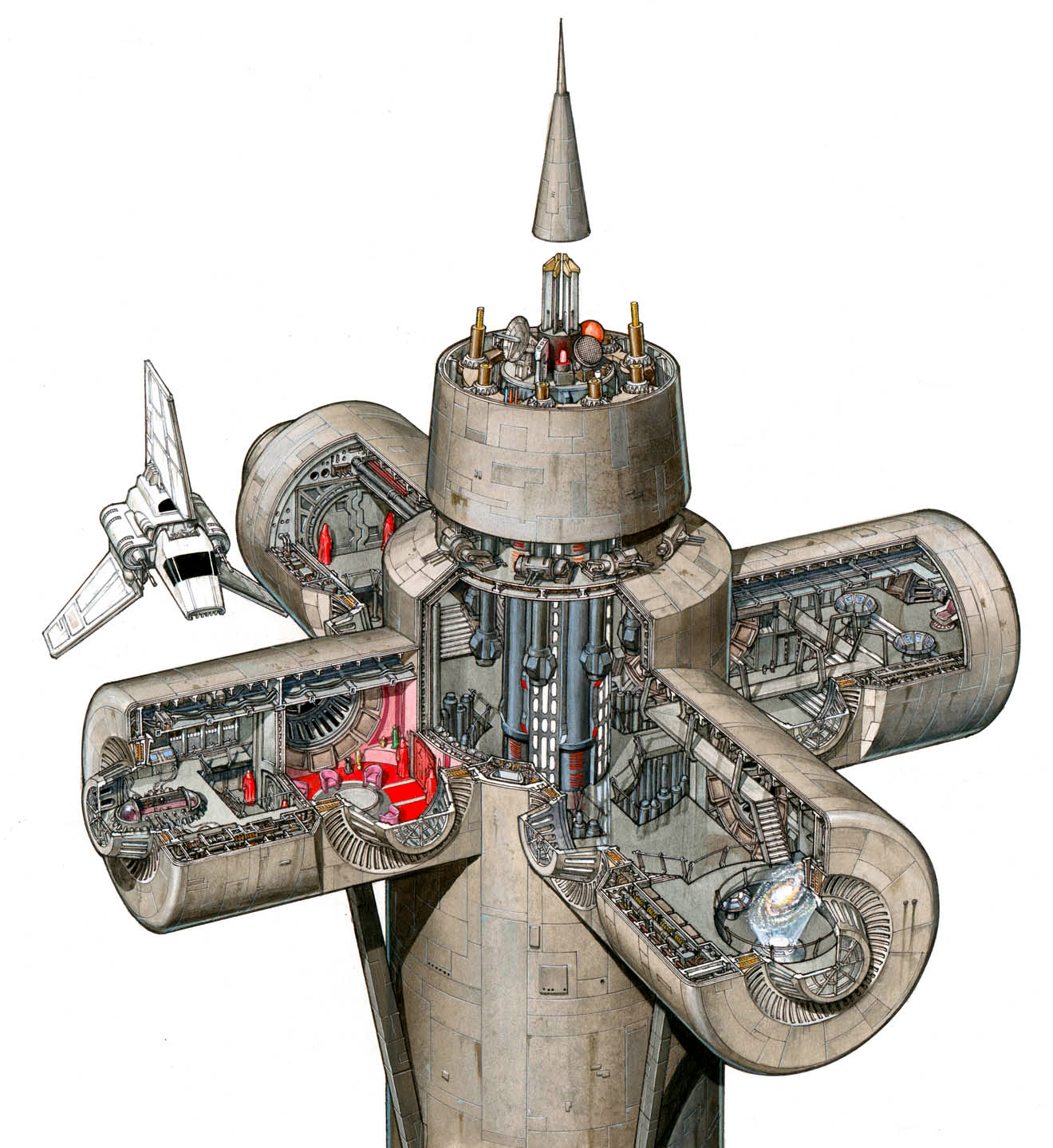
On a more serious note, maybe the Emperor's ship could look like this:


with the "palace" fitting within the black area in the middle (when the ship arrives, the center piece comes out and attaches to the spire).

And just to be different, it could fly vertically (ie this would not be a top view, but a front view)

This would give some further significance to the Imperial symbol, as it would literally represent the symbol of the Emperor and his control of all six (?) corners of the galaxy (with the Grand Moffs signified as the outer spokes on the wheel, extending his power).

Also (Bingo), this could make up for the second Death Star idea.   Rather than having 2 Death Stars, maybe the above Emperor ship could have a similar (but smaller version) of the Death Star laser array set up in the six points on the outer circle (that the entire outer circle is the weapon).  While the rebels find out about the new Death Star, it could be explained that no one knows anything about this ship, so when it arrives everyone is completely shocked (including the imperial soldiers and officers, who never knew about it either).

It could be taken out by the Executor by Piett, who then drives it and the Executor down into the Death Star, opening a hole in the Death Star's shields (at least the ones that the "fully operational battlestation would have"), so when the rebels destroy the back-up on Endor, not only are all shield considerations taken care of, but the Executor/Emp ship crater would provide the opening for said attack force to go down into.

Post
#388897
Topic
Info &amp; Ideas: ESB and ROTJ Wishlist
Time

For one thing, the design would have to retain the overall appearance of the throne room at the top of the spire:


It would be interesting to see an actual ship with this as the "command tower", and then see the command tower detach, fly to the DS2 with the armada of TIEs and the like.  The Spire rises out of the DS surface (be it the center of the laser dish or at one of the poles), whereupon the upper "jack" part docks with the top of the spire, giving us what we see in the original movie.

One could redesign the above structure to simply reduce the size of the side windows (to about 1/2 their current size) to account for it being a more substantial "palace" as well as command tower for an actual ship built personally for the emperor.


this could also incorporate Bingo's idea of the elevator shaft (instead of being directly over the DS reactor) having a window (either glass or force field) above and below the elevator shaft, thus when Vader throws him down, he bursts through the glass causing the wind and chaos (vacuum of space sucking out air and the like until shielding shuts the hole) or the Emperor still "explodes" as his body hits the force field glass, causing the energy wave going up the shaft as we originally see.  Either way, if the idea is used, the bottom of the shaft would have to show the DS surface far below the window.

Also, the design above would account for multiple ramps coming from the elevator shaft, as they would go to different levels within the palace ship.

All images above are linked to their larger size originals.

Or you could just make it look like this:

Post
#388242
Topic
New forum look
Time

Also, I REALLY think the white outline around linked pics needs to be brought back.  Much like what TV's Frink was saying about being able to visually see what you need to know what is up, without the white box around the pics nobody will ever know if a pic is linked without having to actually write a statement telling everyone that it is.

Post
#388241
Topic
New forum look
Time

What is weird is that a few months ago (6+ I think), when bigger pics were posted (such as Vaderios' side-by-side comparisons), there was a horizontal scroll bar - if the pic went outside the forum frame, you could scroll to see the rest of it.  Now the pics get chopped off and the only way to see them whole is to right click on the pic and choose "view image". 

I understand the complaint about posting images that are damn near DVD cover art sized - people here need to realize they can resize their pics when creating their messages - or for that matter simply post the linkable thumbnails that places like ImageShack provide for their users.

I say widen the walls of the forum HTML pages to roughly an inch from the browser edge.  Don't know what you can do about larger than normal pics being posted, other than making the strong suggestion to start using linked thumbnails.  Users click on the thumbs, which open a new window with the image, as opposed to replacing the window you were on, which can result in the problem of going back and having to scroll all the way down to the message you were originally at.

Post
#387728
Topic
STAR WARS: EP V &quot;REVISITED EDITION&quot;<strong>ADYWAN</strong> - <strong>12GB 1080p MP4 VERSION AVAILABLE NOW</strong>
Time

Ripplin said:

I 101% agree with the issue of people quoting pictures to say something inane like "that's cool" or whatever. If there is something constructive behind it, fine, but how often does that happen?

Sorry. This post had nothing to do with ESB:R. Heh heh. ;)

On an added note, remember folks that you can click on the picture and use your mouse to downsize the pictures too... that way if you quote a previous message and kinda need the photo (since most comments wouldn't make a lick of sense without a source) you won't fill up the forum with a ton of huge pics.

for example:


the original was 3 times the size...

Post
#387344
Topic
STAR WARS: EP V &quot;REVISITED EDITION&quot;<strong>ADYWAN</strong> - <strong>12GB 1080p MP4 VERSION AVAILABLE NOW</strong>
Time

ImperialFighter said:

Monroville said:

I still wished Ady would add more vehicles.. even if it was more Scout Walkers just to show that the Empire has an actual army.  Even if there still has to be only 5 AT-ATs, to see a good 12 AT-STs around them would be impressive.

12 of the devils? 

I agree that more would be impressive, but given Adywan's previous comments here on all that, I'll just be glad if Adywan decides to keep even that one in the AT-AT shot at all....

6 to 12 (or 2 for every AT-AT: one to cover each side) ... the idea is to show an actual task force.  5 AT-ATs alone could get taken out easily by ground troops; having a good squad of AT-STs would be akin to blitzkrieg tactics used by the Nazis, as well as account for taking out any troops trying to get underneath. 

If the Empire is sending in a small group to rush the rebels, I can understand only 5 AT-ATs being there, with said group of fast moving vehicles to cover said AT-ATs ... even so, it would be nice to see a more realistic depiction of military behavior.

Post
#387333
Topic
STAR WARS: EP V &quot;REVISITED EDITION&quot;<strong>ADYWAN</strong> - <strong>12GB 1080p MP4 VERSION AVAILABLE NOW</strong>
Time

Also, here is what I meant about enhancing the AT-AT cockpits minus the red lights:


(both are mods of Vaderios' mods - tried to keep the pilot brighter than Veers and the background to help dimensionality)

the idea is to keep the concept of the cockpit being a little darker, which would match the darker windows from the exterior shots.  Some added lights and enhanced viewscreens, along with a darker cockpit to contrast with the brighter window image would look just as good.

Post
#387323
Topic
STAR WARS: EP V &quot;REVISITED EDITION&quot;<strong>ADYWAN</strong> - <strong>12GB 1080p MP4 VERSION AVAILABLE NOW</strong>
Time

I still wished Ady would add more vehicles.. even if it was more Scout Walkers just to show that the Empire has an actual army.  Even if there still has to be only 5 AT-ATs, to see a good 12 AT-STs around them would be impressive.


 Example: in the above shot, the one AT-ST could be shrunk down to half the size and moved back on the snow plain, and 2 more could be added so you would have a squad of AT-STs moving into a flanking position.  I would also consider speeding them up to emphazise their ability to outflank an opponent.

Here is a sketch to emphasize what I'm referring to:


The snow plain behind the AT-AT could have a gradual incline, which would allow for one or more AT-STs (at about 1/2 to 1/3 the original shot size) to be inserted further back.  This would allow the AT-STs to remain in the shot while maintaining proper perspective.

Also, as an added idea or alternate one for this shot, how would it look to show a snowspeeder move from the left background and zoom towards us underneath the AT-ATs chin (to help break the horizontal viewing plane)?  In fact, that is something I would consider for the overall "battle of Hoth" sequence in general - a lot of the shots are things moving from the left and right.  How would it look (or would it be conceivable) to add things moving from background- to- foreground (or vice versa) in some of the right- to- left shots?