logo Sign In

Design failures (and successes) of the PT — Page 2

Author
Time
 (Edited)

DuracellEnergizer said:

Ryan McAvoy said:

If other things in the PT had the same echoes of real world stuff it would have been better IMO (e.g. Han was a cowboy).

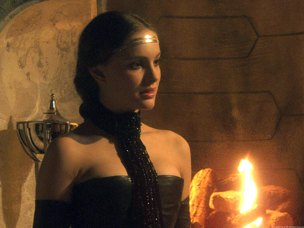
But wasn't Padme a brothel madam?

 Well she must have come to Jesus between 2 and 3, and becomes a Mennonite or something.

http://upload.wikimedia.org/wikipedia/en/e/ee/Amidala.png

https://s-media-cache-ak0.pinimg.com/736x/a6/fb/03/a6fb03c8d83ba618e2cd9ec084c1311d.jpg

Author
Time

Oh, prequel designs discussion! How I've longed thee! ...

Honestly, the prequels were very hit-and-miss design wise. I loved some things, I hated others. Apparently I'm in the minority for liking The Phantom Menace the most out of the three and I also believe that it had the best designs. Particularly the Naboo fighters. 

Doug Chiang initially designed them with a widened tail boom to accommodate the astromech droid but Lucas revised the design as it wasn't streamlined enough. Here's Doug's original concept:

I am not sure if true but I've also read that the two renditions of the Jedi starfighters underwent a similar treatment so as to be sleeker (and the full scale AOTC prop cheaper), hence why Artoo doesn't fit inside.

I liked the blasters, the Naboo soldier uniforms, most of the Trade Federation vehicles and ships. The battle droids are not a bad design and if they weren't total idiots as characters I'm sure more people would appreciate it.

I also loved the (briefly seen) Separatist capital ships in Revenge of the Sith. I know they're based on unused Rebel cruiser designs for Return of the Jedi, which might explain why I though the fitted great with the OT design aesthetic (minus the bright coloration). Loved the Invisible Hand. Stupid name for a warship but great design. I only wish it was featured more prominently, as well as the other Separatist ships, in ... well, pretty much everything prequel related.

What bothered me was the lack of design cohesion. I didn't mind that TPM looked sleek and polished unlike the rusty OT but I hated how there wasn't an overarching design aesthetic within the prequel trilogy and within the various organizations. I would have preferred for the entire prequel trilogy to be different visually rather than "evolving" toward the OT. Which didn't even work out fine.

Say, the Separatists - why didn't they keep those awesome AAT tanks from the first movie (aside from LFL selling toys)? Instead, we got increasingly boring "tank" droid designs. Many of the existing designs deteriorated by Revenge of the Sith. Droid control ships, which became like donuts not only in shape but in their colored toppings, and the droid starfighters.

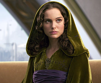
What I honestly hated were the Jedi robes. Okay, wasn't Ben Kenobi wearing just some tattered robes suitable for a desert hermit? Like pretty much everyone on Tatooine, aside from the hooded cape?

Nope, they're now the standard Jedi uniform. Which looks silly, pretentious and out of place.  
Author
Time

The Jedi robes thing infuriates me.

As a kid, the single most iconic image that said "Return of the Jedi" to me was Luke dressed in what we were clearly meant to believe was a Jedi "uniform" - black, militaristic, but with a distinctly priestly touch. The film's title referred in large part to the return of the Jedi Order, as well as the return of Luke himself as a Jedi, both of which were represented visually by Luke's bold decision to dress in the distinctive uniform of a Jedi, first seen in the hologram where he introduces himself as "Luke Skywalker, Jedi Knight."

But if the Jedi uniform is just the generic brown robes worn by Tatooinian men, then what the hell was Luke weaking in ROTJ? And why was he wearing it? It's been reduced to a one-note visual metaphor for Luke's potential fall to the Dark Side and has no sensible in-universe explanation (apart, perhaps, from being an attempt by Luke to cosplay as his own father).

I always wanted the PT to give us the image of legions of black-clad Jedi fighting armies of white-armored Mandalorians. Instead we got... well, we all know what we got, don't we?

"These deadly rays will be your death..."

Author
Time

DuracellEnergizer said:

Voss Caltrez said:

I didn't even get the reference to chariots for the pod-racers. I just didn't like the design. They didn't seem like something that would be in the SW universe.

No offense, but that doesn't make a lick of sense. The podracers are basically just souped-up landspeeders.

 Landspeeders aren't being led by cables connected to engines, at least none of the ones I saw in the OT. The design of the pod racers look superfluous to me and now I know why, because the designers were trying to emulate chariots being led by horses like in Ben Hur.

Author
Time

Yeah, I didn't get the chariot angle of the podracers until recently, and it lessens them. Why not just have the engines connected by something less dangerous than an energy beam that will immediately fail when the power is cut and cause them to rocket off in all directions?

Looking at the Naboo starfighter, it ALMOST makes sense to have the astromech installed sideways, so that the legs don't add bulk to the ship. But for that to work without the telescoping head weirdness it would need to sit somewhat lower in the socket.

Agreed that the Droidekas were an excellent design, as well as most of the Phantom Menace machines, simply because they didn't look horribly CGed.

One of the weirdest ships from a design standpoint was Dooku's solar sailer. How exactly is that supposed to work? It seems to use conventional methods to exit a planet's atmosphere, but then it deploys a solar sail and....what? Goes to Hyperspace? Accelerates by the use of solar energy to FASTER than the speed of light? To make the trip from the outer rim to the core of the galaxy, I'd expect that it would need to make use of hyperspace, so the sails are rather useless in that regard. Eh, at that point in AOTC I simply didn't care what was onscreen as my eyes were already bleeding from seeing Yoda bounce around like a cartoon.

You probably don’t recognize me because of the red arm.
Episode 9 Rewrite, The Starlight Project (Released!) and ANH Technicolor Project (Released!)

Author
Time

I think I mind the Jedi robes least of everyone on this forum. Yeah, the reason for them is wrong. But having such modest monk-like clothing for a group that is (supposed to be) divorcing themselves from their emotions is not the worst.

Mainly, I'd be concerned of what they would come up with if they decided to go all out designing Jedi uniforms. It could be much worse if they went for something like an 80's Who Gallifreyan aesthetic.

Author
Time

NeverarGreat said:

Eh, at that point in AOTC I simply didn't care what was onscreen as my eyes were already bleeding from seeing Yoda bounce around as a cartoon.

 KFTFY

Author
Time

For me, most of the design failures in the PT are because Lucas or whoever was in charge of story and design wanted to continuously do homages to other things, maybe hoping that duplicating that approach would make the newer films as successful as the older ones. For example, having a Hammer Films actor appear in the AOTC, Commander Cody being based off of a 50s character Commando Cody.

So visually, the 1950s USA reference with Dex's Diner took me right out of the film instantly. That had no place in the SW universe. 

Then there's the big lumbering, 1950s styled robot/alien in robot armor Wat Tambor who represents the Techno Union. It seemed more like the producers were being cute then trying to actually insert characters who seem like they would exist in this universe.

Author
Time

towne32 said:

I think I mind the Jedi robes least of everyone on this forum. Yeah, the reason for them is wrong. But having such modest monk-like clothing for a group that is (supposed to be) divorcing themselves from their emotions is not the worst.

Mainly, I'd be concerned of what they would come up with if they decided to go all out designing Jedi uniforms. It could be much worse if they went for something like an 80's Who Gallifreyan aesthetic.

 They could've just gone with what they'd already established in 1983. That's what's so irksome to me - their work was already done. All they needed to do afterward was just give a crap about continuity with the OT. In fact, that's pretty much the problem with the PT in a nutshell.

"These deadly rays will be your death..."

Author
Time

Voss Caltrez said:

So visually, the 1950s USA reference with Dex's Diner took me right out of the film instantly. That had no place in the SW universe. 

 Couldn't agree more - that was hatefully inappropriate.

"These deadly rays will be your death..."

Author
Time

Akton said:

towne32 said:

I think I mind the Jedi robes least of everyone on this forum. Yeah, the reason for them is wrong. But having such modest monk-like clothing for a group that is (supposed to be) divorcing themselves from their emotions is not the worst.

Mainly, I'd be concerned of what they would come up with if they decided to go all out designing Jedi uniforms. It could be much worse if they went for something like an 80's Who Gallifreyan aesthetic.

They could've just gone with what they'd already established in 1983. 

After all, that's what Chiang did. Chiang's concept art had the Jedi wear what Luke wears in ROTJ.

Author
Time

To be honest, the issue with Jedis all wearing Obi Wan's desert hermit garb goes all the way back to '83.

Forum Moderator

Where were you in '77?

Author
Time

Yoda isn't wearing the same garb, and if Anakin's also from Tatooine...

Author
Time

I never said Yoda was wearing it.

Forum Moderator

Where were you in '77?

Author
Time

darklordoftech said:

Akton said:

towne32 said:

I think I mind the Jedi robes least of everyone on this forum. Yeah, the reason for them is wrong. But having such modest monk-like clothing for a group that is (supposed to be) divorcing themselves from their emotions is not the worst.

Mainly, I'd be concerned of what they would come up with if they decided to go all out designing Jedi uniforms. It could be much worse if they went for something like an 80's Who Gallifreyan aesthetic.

They could've just gone with what they'd already established in 1983. 

After all, that's what Chiang did. Chiang's concept art had the Jedi wear what Luke wears in ROTJ.

 I hadn't realized that. Bully for Chiang - he just went up a few notches in my book.

It sucks to have an idiot for a boss.

"These deadly rays will be your death..."

Author
Time

darklordoftech said:

Yoda isn't wearing the same garb, and if Anakin's also from Tatooine...

 Yeah, I never saw that as "Jedi" garb either. To me, Anakin and Obi-Wan were just dressed like common Tatooine folk (as alluded to by Obi-Wan in SW: "He felt he should have stayed here and not gotten involved.")

"These deadly rays will be your death..."

Author
Time

Is this just some ploy to have us watch the PT again, darth_ender (aka George Lucas!!)?

Going from my memory...

I didn't think Darth Maul looked bad at all. In fact, Iain McCaig was the only designer I really like. They should have followed his stuff more closely.

Maybe if Coruscant wasn't too CGI-looking I would like it better.

I, too, think the podracer designs were pretty cool, as was the look of the incomplete C3PO (though, of course, what is he doing being created by a 6-year old boy?)

And... I remember absolutely nothing but the ending from ROTS. For better or for worse.

Author
Time
 (Edited)

Akton said:

darklordoftech said:

Yoda isn't wearing the same garb, and if Anakin's also from Tatooine...

 Yeah, I never saw that as "Jedi" garb either. To me, Anakin and Obi-Wan were just dressed like common Tatooine folk (as alluded to by Obi-Wan in SW: "He felt he should have stayed here and not gotten involved.")

I agree about the robe. We also know (http://web.archive.org/web/20141101101007/http://secrethistoryofstarwars.com/thebeginning.html ) that George wanted the Jedi to wear a different samurai-like outfit (you can still see them wearing it in KOTOR)

Wasn't Obi-wan's quote referred to Owen, though?

The Original Trilogy’s Timeline Reconstruction: http://originaltrilogy.com/forum/topic.cfm/Implied-starting-date-of-the-Empire-from-OT-dialogue/post/786201/#TopicPost786201

Author
Time

Success: The Republic symbol. Since the Republic becomes the Empire, the Republic symbol resembling the Imperial symbol makes perfect sense.

Author
Time

I like the design of the Republic Gunships.

Author
Time

Some of the environments during the scenes of Order 66 are amazing, especially the planet where Aayla Secura was gunned down. What I noticed in TPM during the scenes where Qui Gon, Jar Jar, and Padme are walking around Mos Espa was how poorly layered and how much the textures clashed with the spacers. They look like they stick out so much, and the when the Neimodian's speak how their words don't correspond to their mouths. 

Author
Time
 (Edited)

I've always felt that Naboo was one of the "good parts" of TPM. Not only is Theed a very pretty-looking location, but it was one of the few PT locations that felt like it could belong in the SW-universe, while at the same time being different from anything we had previously seen. 
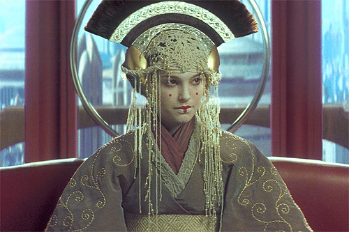
And although I realize there are people who really despise queen Amidala's wardrobe, I can't quite shake that feeling that had TPM not been as poorly written (and had no Jar Jar to ruin everyone's mood) I think people would have remembered her strange look much more fondly.

  
Amidala's design being inspired by Mongolian royalty kind of fits into the SW's general style, which was originally heavily influenced by Japanese culture. If Vader's design was based on samurai generals, why not Mongolian rayalty in the PT?

And maybe this is a somewhat controversial opinion, but I actually kind of like the design of the Gungans. Of course their silly behavior, not to mention their speech, leave much to be desired. But again, had the characters been written differently, but the design kept exactly the same, I think we would have liked them a whole lot more.


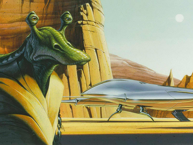
Heck, even Jar Jar looked kind of cool in some of the early concept art ideas.


I really like this painting. Jar Jar actually looks like a dignified character, rather than being the complete goof he turned out to be. I'm curious as to who actually made this as it shows a very different version of Jar Jar than all the other concept art that was made.

All in all I think that the design of TPM is it's strong side. It may be a bit strange some times but it wasn't as out of place in the SW-universe as many of the Ep. II and III design choices were. The real sinner in TPM was George's mediocre writing, retconning and terrible attempts at humour.

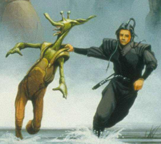
However since this thread is mostly about bad designs I'll finish by showing what is possibly the ugliest concept art for Jar Jar I have yet to see. Seriously this design is so ugly it actually makes me appreciate the current design to some degree.

Star Wars is Surrealism, not Science Fiction (essay)
Original Trilogy Documentaries/Making-Ofs (YouTube, Vimeo, etc. finds)
Beyond the OT Documentaries/Making-Ofs (YouTube, Vimeo, etc. finds)
Amazon link to my novel; Dawn of the Karabu.