logo Sign In

STAR WARS: EP V "REVISITED EDITION"ADYWAN - 12GB 1080p MP4 VERSION AVAILABLE NOW — Page 1111

Author
Time

if the vadar hologram on the top is the new one then i like it.if it's the bottom one thats the new one then i don't.i think the top one looks better.also the guy who said makes no sense for luke to say i'll cover you when he is in the lead.it makes perfect sense.since he is in the front he is covering him.

"you make a living by what you get,but you make a life by what you give"           winston churchill

Author
Time

lastjedi said:


if the vadar hologram on the top is the new one then i like it.if it's the bottom one thats the new one then i don't.i think the top one looks better.
I believe you will be alone in your preference of the wrong angle, helmet-missing Vader hologram. There's a modified screenshot on FB. You should be able to find it on the link in my sig.

Star Wars Revisited Wordpress

Star Wars Visual Comparisons WordPress

Author
Time

doubleofive said:


lastjedi said:


if the vadar hologram on the top is the new one then i like it.if it's the bottom one thats the new one then i don't.i think the top one looks better.
I believe you will be alone in your preference of the wrong angle, helmet-missing Vader hologram. There's a modified screenshot on FB. You should be able to find it on the link in my sig.


Here is the slightly modified version:

ANH:REVISITED
ESB:REVISITED

DONATIONS TOWARDS MATERIALS FOR THE REVISITED SAGA

Author
Time

Thanks Ady. In case you can't tell, Vader is slightly larger. Any other changes are because it's a different frame.

Star Wars Revisited Wordpress

Star Wars Visual Comparisons WordPress

Author
Time
 (Edited)

I like the new hologram. The only thing that I know that would stand out to me as it being a new hologram is the shade of blue being so different. Is the darker shade of blue how it was originally or is it to match the same coloring of other holograms that we see in different scenes?

Author
Time

Excellent work.  Well done and thank you to all involved.  This is exactly the sort of sensible, logical and skillfully applied improvement that the Revisited project is all about for me.

Author
Time
 (Edited)


muddyknees2000 said:
I shot this at a higher angle to match with the angle of the background....the angle causes him to look "shorter".


Good work Muddy! and all the team from the Charcter Actor and Ady and anyone else for bringing it all together.

Best fan edit in town!

Please keep the stills formula I like looking at this stuff but I really don't want to see videos and have the eventual whole experience ruined (by that I mean new footage and miniatures and all of that stuff)

Author
Time
 (Edited)

It might enhance the effect to add small dots of light under where the holograph is 'standing' (like an old monochrome telly on it's side).

Pretty much every holo-projection has a projection source of some kind (R2 unit, holo-table etc).

This one is unique as it just seems to stand there on that little bed thing (is that some kind of gutted printer or something?). Even the captains on the Executor have light cones around them.

If you added a little matrix of light coming from the bed it would suggest that the machine is generating the image rather than it coming from nowhere.

Just my five pence worth... definitely an improvement.

Author
Time
 (Edited)

Good idea Bingo quite like that...

If anyone is just plain curious 3-D projection is possible but star wars projection is pure sci-fi and still not possible.

The leading cutting edge 3-D projection is done by a company called musion
http://www.musion.co.uk/

and is based on an old theater trick called pepper's ghost.

http://en.wikipedia.org/wiki/Pepper's_ghost

I was lucky enough to see it in action on demo and it looks great but it's not quite star wars yet... We have a long way to go as we are just re-using old theater tricks but it still looks cool :)

I don't want to derail the thread but perhaps people might be interested so it seemed relevant to ground in reality of the techniques used today to try and accomplish an illusion of 3-D projection without mapping onto an object face with multiple projectors (curved wall or sphere for instance).

Light coming from underneath=pure sci-fi

But to ground it in some kind of reality to be totally believable as a projection it is missing a sense of light source or where the projection is coming from even though it is pure sci-fi which I think Bingo has rightly pointed out.

Author
Time

I think - along the lines of Bingowings - we should probably see some kind of glow from the machine itself. It hardly needs to be a radical effect. Even just a blue glow or something. Like this:

Author
Time
 (Edited)

Sorry for the slight ot.com off-topic meme detour, but...

Bingowings said:

Not porn?

Author
Time

fishmanlee said:

Vader kind of looks like he is trick or treating in that hologram shot ;)

ALLOL...that shot is ruined now.

Author
Time

.Mac. said:

After seeing that new and improved Vader holo, now I'm curious what the plan is for these 3 holo captains. 

I hope we can still keep the original footage (and not have to re-shoot any of them), just enhanced in areas to better match the other enhanced holos in the edit. But their holos shouldn't be clear either, since they should still look "hazy"/choppy from the asteroids interrupting their transmission.

 I too would like to know if there was some effect to enhance these holograms. 

Author
Time
 (Edited)

@Alanfae

I really like what you did there the base looks like a rear projection with most of the light being at the center... And gives the impression of light source that has temperature

Nice retro fit anyhow. without taking away from the core improvements that have been made

Author
Time

Ady that modified one looks perfecto. I prefer the transmission scan lines (or whatever they are called) to the old one. It enhances the hologram and just overall looks better.

Author
Time
 (Edited)

aalenfae said:

I think - along the lines of Bingowings - we should probably see some kind of glow from the machine itself. It hardly needs to be a radical effect. Even just a blue glow or something. Like this:

If Ady goes with this idea or something similar one other thing to note is that the metal curved plate seen off to the left (actually it's a base plate) is the same texture as the four squares so the plate underneath should be differentiated in texture if this idea or something based on this is done.

as this also is an illusion breaker

or vice versa on texture... Basically the four squares need to feel unique.

Author
Time

Gotta agree on the glow effect. I was kinda meh on the shot until then. Not to say its not brilliant work muddy and ady. Aalenfae just brought it home :)

Preferred Saga:
1/2: Hal9000
3: L8wrtr
4/5: Adywan
6-9: Hal9000

Author
Time

Ronster said:

...one other thing to note is that the metal curved plate seen off to the left (actually it's a base plate) is the same texture as the four squares...

The easiest solution would be to make it darker in color...so that it almost blends in to the background (and is thereby differentiated from what we see of it within the "printer tray". But I would definitely agree that it looks odd. It always stood out to me as just a bunch of crap that was thrown down to achieve the look of the gadget they needed for the shot. Either that or the props guy hadn't finished working on the piece and they asked for it on set.

Author
Time

yeah darker.. but paint out the slits perhaps and make the base plate solid?

Author
Time

The original prop does look a lot like a clamp bed for securing large photographic negatives.


Author
Time

Ronster said:

yeah darker.. but paint out the slits perhaps and make the base plate solid?

No need.....darkening it takes the attention away from it, and its obvious unfinished quality. It's a 2 second shot...no reason to bother re-texturing when something this simple does the trick.

Author
Time
 (Edited)

@muddy good point!

The R2-D2 scene on cloud city really perplexed me after ryan pointed it out....

I had a proper look at it tonight and it's not pretty... But actually no shots need flipping at all but to fix it so that it makes sense here is what I come up with...

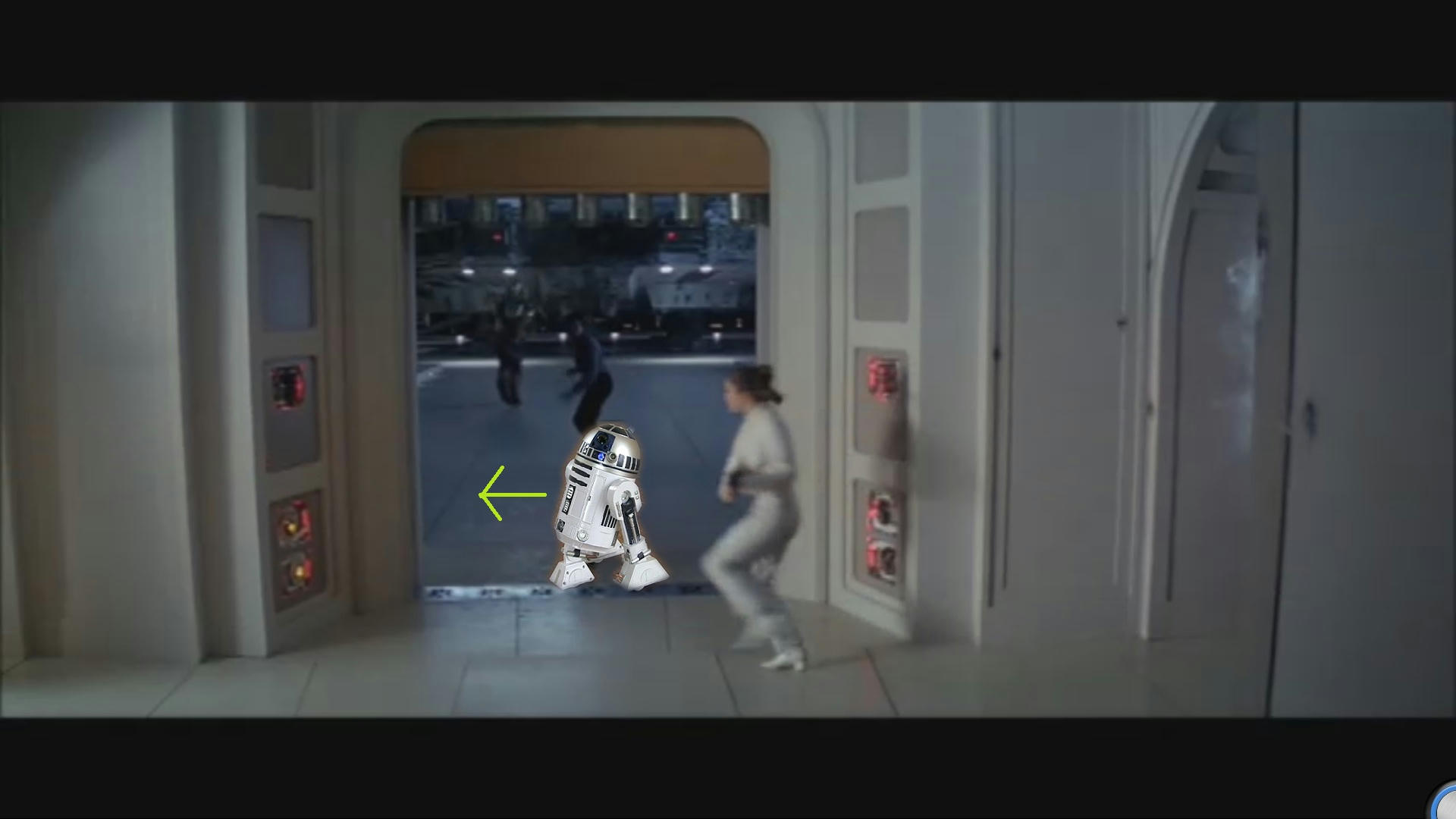
Yep I am terrible at art but you could treat it as if R2 moves while Lando is tugging leia so this happens off screen... But in my mind he should be in this shot to show R2 already there or moving across and in to the room again in that shot would help fix it but that is perhaps where it gets ugly or difficult to do.

Although the way I presented it is funny it is a serious idea for a fix... My art is appalling have a laugh I don't mind I accepted it a long time ago.

But the trajectory of R2 should be coming more inside the door as Leia shoots and runs.