logo Sign In

kk650

User Group
Members
Join date
19-Oct-2013
Last activity
16-Apr-2018
Posts
878

Post History

Post
#684564
Topic
kk650's Star Wars Saga: Regraded and Semi-Specialized (Released)
Time

Okay, here are the two preview clips regraded with the latest settings:

-

Preview Clip 1 using old settings:

https://mega.co.nz/#!u8whlTBT!etypokJ6EoWe11FJyb3DeSKeUVEZ8Ars8KJuCtbwToU

-

Preview Clip 1 using new settings:

https://mega.co.nz/#!K5ZVGZIK!MNDaORCIVcc-ymnF6OWH5DivXccun0D_Fbq0_a6bdWo

-

Preview Clip 2 using old settings:

https://mega.co.nz/#!P5AnXZBa!HoiprRML4uFI1dRLuKpvTVPgPVU_uZOsEHKhcohanqQ

-

Preview Clip 2 using new settings:

https://mega.co.nz/#!WlIFTb7K!MEBs_Vt2FVd-N2OoumtFum3iBdoipKXXbVK-eMgVZ6g

-

I'd appreciate it if everybody could check these clips and let me know whether you think the clips using the new settings look better than the clips using the old settings.

Post
#684561
Topic
kk650's Star Wars Saga: Regraded and Semi-Specialized (Released)
Time

emanswfan said:

My personal preference is the first one, since I like slightly underexposed.

However, the second one seems more like Star Wars is supposed to look like.

I agree with you 100%.

I have to go with the second one even if part of me prefers the first one, the second just feels more 'right' for star wars based on the film print shots i've seen.

Post
#684559
Topic
Star Wars Prequels 35mm 4K Filmized Editions by Emanswfan (a WIP)
Time

emanswfan said:

Slave I with miniature effect:

http://screenshotcomparison.com/comparison/58475

Wow, great stuff! Loving the new colour grading, lighting and especially the ship's texture, it actually looks real now, big improvement on the blu-ray.

What i'm not such a big fan of is the bokeh effect you've added, wide shots don't normally have such selective focus, also it doesn't seem quite right because its not going out of focus as the depth increases, its more like a circular blur filter that increases the blur as you go away from the center, which is the ship in this case, which is not how bokeh works in photography (unless you use special filters but then its not really bokeh in the normal sense anymore) and the mind subconciously picks up on that. Also I think that adding bokeh in general is probably going too far IMHO.

Apart from the bokeh issue though, fantastic stuff!

Post
#684497
Topic
Neverar's A New Hope Technicolor Recreation <strong>(Final Version Released!)</strong>
Time

Yes, your shot looks much better now, the exposure is much better and you're keeping control of the blacks better. Funnily enough i've had to change my settings to accomodate the underexposed look of the trench run by modifying the brightness and contrast and my exposure in that homestead shot is pretty much identical to yours now. You reduced your exposure, I increased mine and we met in the middle, a pretty good sign that we're both on the right track. :)

Here's a very short clip of the homestead with my new settings in case you're interested:

https://mega.co.nz/#!7oh3gYhb!aH_cKlZOvJ1XXcufY0vgJzfX5yMKGdf7VnVwmmlQSdU

Post
#684489
Topic
kk650's Star Wars Saga: Regraded and Semi-Specialized (Released)
Time

Hmm, I just tried my latest settings on the death star run and was not satisfied with the results, I was just getting a feeling of underexposure, even though the rest of the film felt correctly exposed.

I've adjusted the settings to get a exposure that feels right on the death star run but of course the exposure has increased in the rest of the film. Now i'm beginning to understand why the film prints always seemed so bright and borderline overexposed to me, perhaps that's the way star wars has always looked.

Guys, please have a look at these two very short clips from the control room, the first using my old settings and the second using my latest settings and tell me, which do you prefer and does the second clip seem overexposed to you? I'm so used to seeing the underexposed star wars blu-ray footage that I find it difficult to tell.

Clip 1 (old settings):

https://mega.co.nz/#!PhBETSzS!ab11kx2FXYXCylEMP_J6HjDagVBWCyOj6zs7QnU6rLQ

Clip 2 (new settings)

https://mega.co.nz/#!PxoBwZZb!R9KBKARtJDxeM55jhqSetkbjY5oxpaxdPJBquILWqno

Post
#684486
Topic
Star Wars 1977 releases on 35mm
Time

poita said:

Brooks said:

poita said:

Yep, film is grainy. You can see how much detail the noise removal, well, removed, in the GOUT image. Look at Obi-Wan's face.

 I was just about to say that!  It's surprising to see how blurry his face looks in that gout shot.  Did you do this with your new scanner?  Can you post a pic in full resolution somewhere?

 I can post a full resolution scan, it will be about 100MB, what is the best place to host the image?

Probably a free mega.co.nz account, i've been using it to host stuff recently and the download speed is very quick. I also use uploaded and netload free accounts but their download speeds for free users are much slower.

Could you PM me the link when you upload this? I'd love to see it in full resolution as well.

Post
#684412
Topic
Star Wars Prequels 35mm 4K Filmized Editions by Emanswfan (a WIP)
Time

emanswfan said:

kk650 said:

In case you're interested, here's a quick regrade of your shot I did just now, reducing the reds in the fleshtones and desaturating the whole image, just to show you what i mean about getting fleshtones more similar to the OT film print fleshtones. The only problem is the reds in the lights get affected by the change in fleshtones as well, turning orange, so you have to be careful not to go too far. Regrading from my experience is all a balancing act, it feels like juggling numerous balls a lot of the time, trying your best to strike the best balance between all the different colours. Great fun but also real pain in the arse. :)

Thanks for that quick regrade.  I love to have thorough comments and suggestions on my color work, so I can make it better.

Ditto. I'm going to enjoy seeing how this project develops and hopefully be able to help you make it even better. :)

Post
#684406
Topic
Star Wars Prequels 35mm 4K Filmized Editions by Emanswfan (a WIP)
Time

emanswfan said:

kk650 said:

Hey, that's really cool, great stuff! Certainly does look more like the OT to me. Two things that jump out at me though is that it's too saturated (you can really see it in the fleshtones, especially tarkin's) and the fleshtones are too red. Knock down the saturation and reds in the fleshtones and you should be cooking with gas.

 Yes, I already noticed that, I hadn't applied any color specific or skintone specfic filters.

Yes I imagined it was something like that.

In case you're interested, here's a quick regrade of your shot I did just now, reducing the reds in the fleshtones and desaturating the whole image, just to show you what i mean about getting fleshtones more similar to the OT film print fleshtones. The only problem is the reds in the lights get affected by the change in fleshtones as well, turning orange, so you have to be careful not to go too far. Regrading from my experience is all a balancing act, it feels like juggling numerous balls a lot of the time, trying your best to strike the best balance between all the different colours. Great fun but also real pain in the arse. :)

Post
#684402
Topic
Star Wars Prequels 35mm 4K Filmized Editions by Emanswfan (a WIP)
Time

emanswfan said:

Still unfinished (mostly stuff to do with skin tones and still trying to retain fine detail), but does THIS look more OT to you?

http://screenshotcomparison.com/comparison/58324

Hey, that's really cool, great stuff! Certainly does look more like the OT to me. Two things that jump out at me though is that it's too saturated (you can really see it in the fleshtones, especially tarkin's) and the fleshtones are too red. Knock down the saturation and reds in the fleshtones and you should be cooking with gas.

Fantastic work you've done with the prequels in this thread, love what you've done with the colours and film grain, making them far more filmic. Keep it up! I'll be keeping a close eye on this project. :)

Post
#684361
Topic
Neverar's A New Hope Technicolor Recreation <strong>(Final Version Released!)</strong>
Time

Don't know if this will help at all but at the end of the 2nd preview clip i've just put up is that homestead shot you're regrading.

Here's a screencap taken from the preview clip of the shot in question:

I personally think that the colours in your comparison look really good, much better than the bluray but in terms of brightness it looks overexposed IMHO. Have you checked out these settings in space with a starfield in the background, seen how the blacks are affected by that brightness level?

Like msycamore I would really like to see how the transition to the Death Star and Tie Fighters looks with these settings.

Post
#684313
Topic
Star Wars 1977 releases on 35mm
Time

poita said:

This print is cropped slightly tighter than the other print I have, and a bit more tightly than the neg-1 print appears to be from their screenshots.

fight-small

I'd be interested if someone could upload a GOUT image to compare the framing.

You caught me just as i was about to put this back into my dvd pile. Here's the same frame from the star wars limited edition bonus dvd:

Lovely print btw, nice colours.

I would love to see more of these prints taken from the original trilogy films if at all possible, they would be really helpful in nailing down the look of the film prints for the latest versions of my original trilogy semi-specialised releases.

Post
#684274
Topic
kk650's Star Wars Saga: Regraded and Semi-Specialized (Released)
Time

NeverarGreat said:

Looking good!

There's still a lot of purple in the flashes however.

GOUT comparison:

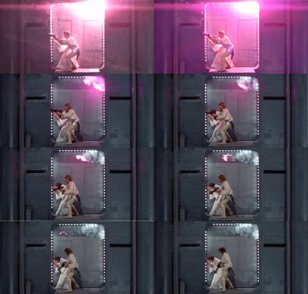
I included the other frames because I saw something kind of cool; the squib in this shot seems to go nuts, flying right off the wall over the actors! I watched the movie a hundred times and never noticed this.

Thanks, glad you liked it! :)

Hmm, thanks for pointing that flash out. You got me rummaging through all my stuff to find my limited edition star wars bonus dvd haha.

I've never really considered the bonus dvd to be all that useful as a colour/brightness/contrast/saturation reference and having a look at the disc again after more than a year really reminds me why.  That whole shot on the gout dvd is really desaturated, hence why the flash looks more white than in my clip. The different hue on the flash on the dvd is also most likely connected to the overly red fleshtones of luke and leia and so is also most likely incorrect if one wants to recreate the look of the film prints.

You can actually see that the fleshtones of luke and leia on the gout dvd are wrong in that whole section and indeed in the whole film IMHO, WAY too much red, only its not so obvious because everything is so desaturated that the fleshtones almost look normal. Only problem with that approach is, all the other colours are desaturated as well, not just the reds in the fleshtones, so everything else just looks so grey, dull and lifeless, totally unlike those shots taken from film prints and screenings that have lovely rich colours.

If this section on the gout dvd was at the same level of saturation and contrast as my clip, luke and leia would look like sunburnt lobster men.

No, i'm happy with the flash in the screencap you posted from my preview clip, the gout isn't at all reliable as a source colourwise IMHO when trying to recreate the look of the film prints, its totally desaturated and the fleshtones are off due to being way too red, so most likely the rest of the colours can't be trusted either. A film print pic of that flash or indeed any frame in that shot though would certainly be far more useful in ascertaining what the colour of that flash should be.

As for the squib, haha I never noticed that before! Very cool indeed. :)
 

Post
#684247
Topic
kk650's Star Wars Saga: Regraded and Semi-Specialized (Released)
Time

Cheers emanswfan and frank678 for checking out the preview clip! :)

You both liked it so i've probably got the amount of green about right.

I can put up another 3 minute preview clip if you want, just post the timecode you want me to start from and i'll create a preview clip (of course let me know which version of star wars you're taking the timecode from, whether the blu-ray or the gout).

Post
#684184
Topic
kk650's Star Wars Saga: Regraded and Semi-Specialized (Released)
Time

frank678 said:

I like the result you've got here kk650 and will be looking out for the clip. On my screen and for my tastes I like the 3rd grading best.

Thanks frank678, glad you like the regraded shots. The 3rd grading has a lot more green than the original screencaps I posted, too much IMHO. The 1st grading is the same as the regraded shots I posted first and the 2nd grading has a bit of green added. I think a setting around the 2nd grading is the way to go.

Post
#684183
Topic
kk650's Star Wars Saga: Regraded and Semi-Specialized (Released)
Time

NeverarGreat said:

First of all, those screenshots show a big improvement, good job!

As for the three images of the control room, I'd be careful about directly adding green to the red, as seems to have happened there, because the red lights have turned a bit orange. I like shots like that because you can play with the colors while directly seeing the effect on the primary reds, blues, and yellows, such as the lights in that room.

Thanks NeverarGreat, i'm glad you like what i've done here! :)

Yes I agree with you 100%, that's the problem with adding too much green, it starts messing with the reds like the red lights turning orange which you definately don't want, its all a bit of a balancing act. Definately the 3rd grading is too much for that reason alone.

It is pretty cool seeing how all the primary colours change in the control room screencaps as you apply more green, I purposely matched the exact frame from the senator image you've got in your thread to be able to use that senator shot as a guide for the colours, so thats really why I selected that control room shot but you're right, its a great shot for seeing how all the different colours are being affected when you change settings.

Post
#684180
Topic
kk650's Star Wars Saga: Regraded and Semi-Specialized (Released)
Time

ElectricTriangle said:

kk650 said:

Joel said:

On my monitor here, there's too much green in the second shots, and WAY too much green in the the third.

RE: the screen caps above, still too much green IMO. At least on my monitor.

Thanks for the feedback Joel! :)

I agree that the second and third shots have too much green in the fleshtones. On my professionally colour calibrated monitor though the first shots have a little too much red in the fleshtones IMHO, like all the first screencaps I posted. I think i'll be going with something between the first and second shots.

I'll be posting a preview video very soon so hopefully you and others here can give their thoughts on how it looks in motion.

 2nd or 3rd one looks best. Star Wars seems to have greenish skin tones in the technicolor prints, so I'd lean on the side of green. The sample shots look good. Some of the shots look too dark, but that's one of the many, many flaws of the 2004 master. Maybe try brightening the highlights a little?

 I definately agree that there has to be green in the fleshtones, that can be clearly seen in the technicolor prints, but not too much and the 3rd is definately too much IMHO, at least to my eyes, the green is pretty overwhelming across the whole film with that setting, drowning out the other colours and changing the reds too much. I'm leaning towards the second right now.

Post
#684084
Topic
kk650's Star Wars Saga: Regraded and Semi-Specialized (Released)
Time

Joel said:

On my monitor here, there's too much green in the second shots, and WAY too much green in the the third.

RE: the screen caps above, still too much green IMO. At least on my monitor.

Thanks for the feedback Joel! :)

I agree that the second and third shots have too much green in the fleshtones. On my professionally colour calibrated monitor though the first shots have a little too much red in the fleshtones IMHO, like all the first screencaps I posted. I think i'll be going with something between the first and second shots.

I'll be posting a preview video very soon so hopefully you and others here can give their thoughts on how it looks in motion.

Post
#683937
Topic
kk650's Star Wars Saga: Regraded and Semi-Specialized (Released)
Time

haha am I the only one that can see the difference between those three shots!? Certainly seems that way from the lack of replies. In case anybody is interested, the first shot has the least green in the fleshtones and as you go down the green increases. The first shot probably has perhaps too much red in the fleshtones and the third has perhaps too much green so probably the best option is to strike a balance between the two and go with the fleshtones from the second shots IMHO.

How about the first set of screencaps I posted though, what does everybody think? Feel free to criticise all you want. You guys on originaltrilogy.com know a lot more about how star wars is meant to look than I do so that's why I'm looking to you guys for advice on how to regrade this. Please help me out here.

Post
#683816
Topic
Movies with wrong color grading *** UPDATED ***
Time

_,,,^..^,,,_ said:

Movies that deserve a restoration:

  • A.I. Artificial Intelligence
  • Big Trouble In Little China
  • The Fog
  • Minority Report - just doing a [spoRv] project right now
  • Mission: Impossible

Movies with few differences between the DVD and BD editions (sometimes are barely noticeable, other times limited only to some scenes):

  • The Day After Tomorrow
  • Daylight
  • E.T.: The Extra-Terrestrial
  • The Fifth Element
  • Gladiator
  • Godzilla
  • Hellboy
  • Pirates of the Caribbean: At World's End
  • Stargate
  • Titanic
  • Waterworld

Actually a blanket teal tint has been added to the whole of the titanic blu-ray that was not on the dvd and its pretty noticable IMHO. Not sure if its worthy of a 'restoration' per say but definately of colour correction to remove the teal tint which I have already done. Those that want to see what I mean can go to tehparadox and search for 'kk650 titanic', I put up screencap comparisons clearly showing the teal tint across the whole film. You can also see the difference between the blu-ray and dvd on the capaholic website here: http://www.caps-a-holic.com/hd_vergleiche/multi_comparison.php?disc1=1493&disc2=1492&cap1=14061&cap2=14045&art=full&image=1&hd_multiID=114&action=1&lossless=#vergleich .

The Gladiator dvd looks totally different to the remastered blu-ray as well, so much so that I actually went ahead and recreated the dvd look of gladiator in HD by using a high quality open matte hdtv release and reframing it shot by shot to match the dvd framing as closely as possible. Never got round to releasing it though, wasn't sure whether people would be interested.