logo Sign In

kk650

User Group
Members
Join date
19-Oct-2013
Last activity
16-Apr-2018
Posts
878

Post History

Post
#686177
Topic
kk650's Star Wars Saga: Regraded and Semi-Specialized (Released)
Time

poita said:

I really like the last images you posted a lot. I'd probably rework the highlights just slightly to breath a bit more life into it

What do you mean when you say rework the highlights? Are you talking about a slight contrast boost, that'd brighten the highlights but also push down the blacks? Or are you talking about just brightening the highlights slightly while leaving the blacks alone?

I'd really appreciate it if you could modify the last screencap I posted to show me what you mean.

Post
#685995
Topic
kk650's Star Wars Saga: Regraded and Semi-Specialized (Released)
Time

poita said:

To me R2 is far too blue, 3PO too yellowy-gold, and too much yellow in the entire scene. (The method is also bit backwards, if you get the skintone right, then the other colours usually fall into place, but, if the other colours are in place, it often doesn't automatically equate that the skintones are okay. See youtube link at the end for a demo).

The colour looks too saturated in the leia scene on the Blurays, we shouldn't be able to make out her rouge so clearly. Working on films from that time, we used to have to overdo the makeup as it was done *knowing* that the saturation would be lost by the time you went from Negative to IP to print and projection. The idea was that by the time a print was struck, the clownish makeup would tone down to a natural look. The official BD hasn't taken that into account.

But anyway, that is the thing really, everyone has their own opinion.

Just as a general thing (not specific to this project), when I was a wee lad being schooled by the senior colourist, the rule of thumb, regardless of the scene,  is to get the skintones right, unless they are specifically lit not to be (under-water, standing under a red light etc.). It will rarely be the director's or colourist's intent to have the skintones not look right, without a pretty clear reason (sickness, zombie etc.) . Skintones always lie in pretty much the same point on the scopes, whether you are black, white, yellow or anything inbetween, there is only a small amount of variation. So the I-Bar on the scope is a good guide when in doubt.

There is a great talk on this here: https://www.youtube.com/watch?v=jX45Yi1spY4 for anyone interested. Now I'll stop clogging up this thread and get back to work.

(skintone section of talk starts at 23:40, and is worth watching, the rest is too, but that part is invaluable. Plus Larry Jordan looks a bit like Obi-Wan). Also good chapters in Hurkman's books on this.

Oh I see where you're coming from. I've been going for a technicolour look for this film so the grading and therefore fleshtones are more saturated and reflect that. That's why you've been finding the fleshtones too saturated.

If I was going for a more natural look for star wars I would use different settings to grade the whole film, something like what I have below:

I think I might have to release these new semi-specialised releases as two versions for each film, a natural version and a technicolor version, the technicolor versions might be too much for a lot of people haha

Post
#685894
Topic
kk650's Star Wars Saga: Regraded and Semi-Specialized (Released)
Time

Of course I would never use a shot like that to judge correct fleshtones because they are too many unknown factors in play like lighting and the grading GL and co chose to apply to that scene. That said, to my eyes the second shot, that uses my current settings, look fairly accurate to me. C3PO looks gold, R2D2 looks blue, the sky looks the correct shade of blue, so it would follow that the fleshtones should be fairly accurate as well.

It was these shots between leia and darth vader on tantive IV though where I really decided what settings I would most likely use for overall fleshtones. These screencaps below are using my current settings, just like the second screencap you posted above:

Post
#685889
Topic
kk650's Star Wars Saga: Regraded and Semi-Specialized (Released)
Time

frank678 said:

NeverarGreat said: Good luck to you, but I would warn against examining the movie too much if you're not planning a shot-by-shot correction, or it will suck you in as it did me. ;)

lol :)

yes and whatever you do don't start looking at multiple sets of references because you will start to lose a firm grip on the cherished star wars in your mind and then start posting those references in other peoples threads in a desperate hope they can rebuild what you've taken apart 

http://tinypic.com/view.php?pic=23th9uf&s=5#.UuWFyLTFLIV

haha yeah I think I know what you both mean. Obsessing about getting every single shot 'right' in this film really would drive even the most sane person mad.

Post
#685885
Topic
kk650's Star Wars Saga: Regraded and Semi-Specialized (Released)
Time

NeverarGreat said:

kk650 said:

Correct me if I'm wrong but as far as I'm aware that is how light works.

Ouch.

haha it wasn't my intention to be catty there, I remember reading somewhere that the cinematographer is usually the best paid job on a set, even above the director, because it requires the most qualifications, painting with light and all that. I'm just an amateur, my profesion has nothing to do with grading or cinematography or filmmaking at all so there's a hell of a lot I don't know about light, that comment was simply acknowledging that, so any sarcastic tone was completely unintentional.

Here's the shot you posted:

And here's the same frame with my current settings:

If you changed the fleshtones of your shot to match the fleshtones in my shot, I expect that the colour of the clothes would be fairly consistent with the colour of the clothes in my later shot that you refered to. That said, with this film, you have to be willing to accept a certain degree of inconsistency in what I like to call 'rogue shots' compared to the overall colour scheme if you want to regrade the majority of it using only one setting to maintain some sort of colour consistency across the film without having to very carefully regrade it shot by shot with a very specific colour scheme in mind.

With my first release I only really stepped in to selectively regrade shot by shot with the Tantive IV sequence at the beginning when all the rebel soldiers are running to their positions, waiting for the stormtroopers to break through. The colour grading is so inconsistent there between shots that it was totally unacceptable IMHO, amazing that they released the blu-ray like that. The lightsabers has to be selectively regraded of course to fix the colours and a lot of the tarkin shots were way too saturated on the blu-ray so they had to be selectively regraded to reduce saturation and bring them to acceptable limits.

Apart for that though I felt the colour grading on the blu-ray was fairly consistent across the whole film (not good colourwise but consistent as least), give or take a few 'rogue shots' here or there that I personally felt didn't deviate enough from the overall colour scheme to warrant selective regrading of those shots.

Post
#685837
Topic
kk650's Star Wars Saga: Regraded and Semi-Specialized (Released)
Time

StarThoughts said:

I think that it's undeniable that different lighting situation will give different values to each of the colors in the shot. If you keep giving us more shots, I think the same thing will happen; there will be some cases where setting A just happens to look better, whilst in others setting B does. Unless you're going to regrade the film on a shot-by-shot basis, you're going to get some variation in responses.

Yeah indeed and this is doubly true for star wars because it is a particularly inconsistent film when it comes to colour grading, certainly by far the most inconsistent film i've ever graded. Getting the colour grading 100% consistent would require a very slow and thorough shot by shot regrading of the film, knowing what the lighting conditions were for each scene and what intentions GL and co had in terms of colour grading each scene. Only the original cinematographer most likely would have the knowledge and skill to be able to achieve such a feat accurately.

As things stand, we have to make do doing the best we can with what we've got. My main priority is that its appealing to watch rather than it being 100% 'accurate' colorwise.

Post
#685829
Topic
kk650's Star Wars Saga: Regraded and Semi-Specialized (Released)
Time

Cheers guys!

Unfortunately you guys have put me in two minds again because the second screencap that you both prefered from the third comparison uses my current settings while the second screencap you liked in the second comparison with R2D2 uses the same modified settings as the first screencap in the third comparison, the one that has slightly more green fleshtones that you didn't like so much.

I was kinda hoping you'd choose the first screencap from the third comparison and make my life easier haha. Getting the fleshtones right are the most important thing of all so it looks like i'm staying with my current settings.

NeverarGreat, sounds like you're using a far more complex program than I am, i'm not able to target deep shadows, shadows, midtones, mid-highlights, highlights seperately and change their respective colours.

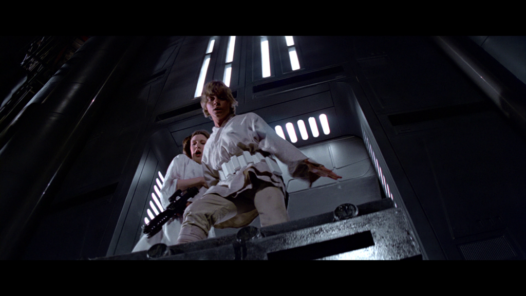
As for white balance, I'm happy as far as that is concerned, all the light sources that are meant to be white are white with my settings throughout the whole film, I used when leia and darth vader are talking on tantive IV to get that just right, at least to my eye.

The colour of clothes will change throughout the film according to the colour of the different light sources, so leia is not always going to look whiter than white, she will only look totally white when she is being hit by a white light source like on tantive IV, which has the white lights on the corridor ceiling, otherwise the white of her robes will be tinted by the colour of the light source that's hitting her in that scene. Correct me if I'm wrong but as far as i'm aware that is how light works. And this is of course not taking into account any colour grading that GL and co may have applied for specific locations that will make the colours of the clothes vary even more. 

In my experience white light sources are a far more reliable way to get the correct white balance of a film than clothes.

Post
#685798
Topic
kk650's Star Wars Saga: Regraded and Semi-Specialized (Released)
Time

Cheers for the prompt replies! I once again agree with you two that in the second screencap R2D2 looks more 'natural' to me so that's the one to go with.

One last question. Taking into account the fleshtones of luke and uncle owen, getting the colour of C3P0 and R2D2 right and everything else, which of these two screencaps do you prefer, the first or the second?

Post
#685772
Topic
kk650's Star Wars Saga: Regraded and Semi-Specialized (Released)
Time

Cheers for the feedback guys! I agree that the more neutral death star interior looks better so that's what i'm going to go with.

R2D2's colour is also something that i'm not certain about, his colour tends to change a fair bit throughout the film due to differing lighting i'd imagine so i'm trying to get them looking as accurate as possible. Can you guys here tell me which one of these two screencaps look more accurate in terms of R2D2's colours, the first or the second?

Again you can see the difference better by opening them up in seperate windows and switching between them.

Post
#685710
Topic
kk650's Star Wars Saga: Regraded and Semi-Specialized (Released)
Time

Fleshtones are yellow in that last clip but within perfectly acceptable limits IMHO, with the exception of perhaps one or two shots of biggs than can be selectively regraded and course tarkin that definately has to be selectively regraded like I did in my first release.

I've been reading up about on the debate about what the death star interior should look like, some say it should be as neutral grey as possible, while some say it should look blueish green, much like poita's 35mm frame he posted here that he says is close to the print themselves in terms of colour:

http://originaltrilogy.com/forum/topic.cfm/Star-Wars-1977-releases-on-35mm/post/684304/#TopicPost684304

I've been experimenting to try and get that blueish green colour in the death star. Here are two screencaps, one using my current settings with a more neutral looking deathstar interior, the other with a bit of blueish green added to better match the Death Star walls of the frame poita posted:

More neutral Death Star Interior:

More blueish green Death Star interior:

-

Which do people prefer, the more neutral Death Star interior shot or the one where the Death Star interior od more blueish green and more closely matches the interior colours of poita's frame?

You can see the difference better by opening them up in seperate windows and switching between them.

Post
#685077
Topic
kk650's Star Wars Saga: Regraded and Semi-Specialized (Released)
Time

Okay, here's a final clip, the final 4 minutes of the Death Star trench run. Overly yellow shots of Tarkin will have to be selectively regraded to reduce the amount of yellow like I had to with the first release. These are the overall settings i'll most likely use for this film, please let me know whether you like how the clip looks:

https://mega.co.nz/#!rhRSFAQZ!UgNRrkZmCxW0lEBGV69UXhn3FDVr_AEw5xNvpmdkXxw

I'm moving on to Empire Strikes Back, need to take a break from Star Wars.  I should have some regraded screencaps of Empire Strikes Back up real soon.

Post
#685071
Topic
Star Wars Prequels 35mm 4K Filmized Editions by Emanswfan (a WIP)
Time

There is no chromatic abberation anywhere near that strong in the OT, or indeed in any film that I can think of. Perhaps the chromatic abberation would look better if it was way more subtle but as it is there it's not a good look IMHO, it looks way too artificial, not at all like any film i've even seen. It's your project of course so whatever you want goes but I would certainly do something about it if I were in your shoes.

Apart from the chromatic abberation that shot looks great.

Post
#684931
Topic
Info: Our projects released thread
Time

Yeah, i've had a careful look between the different editions on capaholic and it really comes down to a faceoff between the german extended blu-ray and the japanese extended blu-ray, which the japanese blu-ray clearly wins with more retained detail, grain and better flesh tones than the german blu-ray. All the others are just totally overcooked or in the case of the dutch blu-ray has unappealing fleshtones and strange colour grading in general.

Yeah, there is definately detail there on the japanese extended blu-ray waiting to be brought out, I can see how you could make this work. Have you done any tests to see how it looks with grain added?

Post
#684930
Topic
kk650's Star Wars Saga: Regraded and Semi-Specialized (Released)
Time

poita said:


haha I imagine Han telling Jabba to keep cool about the money he owes him and offering him a drink of Solo. Jabba's such a pussy in this scene that he'd probably accept too, take a sip and wipe away the debt in the bargain.

How awful was that bit where Han stepped on Jabba's tail and Jabba let him get away with it?! Of all the special edition changes, GL really outdid himself with this one, making one of the main villains of the OT into a laughing stock right from the moment he's first introduced. *shakes head*

This was the very first scene I removed from the semi-specialised edition.

Post
#684929
Topic
kk650's Star Wars Saga: Regraded and Semi-Specialized (Released)
Time

BenK said:

kk650 said:

Can I ask which of the clips did you take those screencaps from, the new settings or the old settings?

 The new settings. I like the new settings better overall, I just thought the highlight clipping was distracting on some of the Tatooine shots.

Hmm. Did you also find the highlight clipping distracting as well with the clips using the old settings or were they within acceptable limits?

Post
#684874
Topic
kk650's Star Wars Saga: Regraded and Semi-Specialized (Released)
Time

poita said:

Jetrell Fo said:

I always found the lack of pink on this card to be telling.  Thanks to stsw2112 for the pic.

 Prints on paper are unfortunatley completely useless as a colour reference. The person responsible for the printing process will colour balance the image themselves to suit their own aesthetic and for technical reasons in the CMYK printing process. It will have no relation at all to what is on the film itself.

Cool image though.

 It is a cool image, one of numerous reasons why I like keeping the good things from the special editions in the films, hence these semi-specialised releases. The colour grading of that card though really is very poor though, doesn't look right at all for a warm desert planet. How there could release the card looking so wrong I don't know... Here's the same shot regraded using my settings (looking warm and yellow like it should):

Post
#684871
Topic
kk650's Star Wars Saga: Regraded and Semi-Specialized (Released)
Time

poita said:

The grade is all over the place on the original film, I agree. As you said though, the saturation is a bit off in your sample, turning him into Lemon Solo.

lol, you posting this made me imagine han solo advertising this drink in a commercial, a missed opportunity for the holiday special. That would have been kinda funny, itchy switching on the tv and Han Solo's ad appearing advertising his drink to keep you ice cool like him hehe

Post
#684869
Topic
kk650's Star Wars Saga: Regraded and Semi-Specialized (Released)
Time

BenK said:

I like the direction of the color overall, but noticed the highlights are being pushed to the point of clipping in bright scenes. For example look at these shots (Bluray on top, your grade on the bottom).

What's lost in the Bluray can't be brought back but there is a natural fall-off to the highlights that becomes a hard clip in your grades. Are you doing shot-by-shot color adjustment or trying to come up with one setting that works for a whole scene or the whole film?

Can I ask which of the clips did you take those screencaps from, the new settings or the old settings?

As for whether i'm using one setting or doing a shot by shot colour correction, the answers both. Basically a lot of the early tantive IV shots have to be colour corrected shot by shot, the grading is totally inconsistent on the blu-ray. Also all the lightsabers have to be selectively colour corrected. Apart from that though and the scenes taken from the german hdtv transport streams that require different grading to fit with the regraded blu-ray footage, the rest uses a single setting because I feel that it makes for a more consistent film in terms of overall grading. I was very happy with the results I got with my first semi-specialised releases doing it this way so i'll be doing it the same this time.

Post
#684863
Topic
kk650's Star Wars Saga: Regraded and Semi-Specialized (Released)
Time

poita said:

kk650 said:

No replies yet? Maybe I should have said 'I'd appreciate it if ANYBODY could check these two clips and let me know whether you think they look overexposed' haha.

Come on guys, please help me out here. Let me know what you think. Did my old settings look better or do the clips look better with my latest settings? Is it the 500mb video files making people reluctant to check these clips out even though the download speed is very quick? I can regrade them at a lower bitrate no problem to make the files smaller if that's the issue.

 I think the newer settings are a bit better, but the blacks are a bit too low, (too far under 16,16,16) and the colour saturation seems a bit too high for me. Also there is a bit of inconsistency shot to shot. Han's shirt is almost lemon yellow in that opening sequence and the faces are too orange. The highlights have been clipped, so the faces have gone a little leathery. Contrast it to the next shot from your same clip, where Han's shirt is closer to the correct hue.

BTW, what colour are the walls in the room your are doing the correcting in? If they are not neutral, then hang an off-white sheet on the wall behind your monitor, it helps keep your colour perception accurate.

Yes, I agree about the saturation. I boosted it a little bit in the new settings compared to the old settings and went overboard. I'm going to knock the saturation back down to the same level as the old settings.

As for slight changes in hue between shots, thats happening all over the place in star wars so it doesn't really concern me too much. With my first semi-specialised release I did selective colour grading only for some of the shots on the tantive IV that I felt were changing their overall colour grading too much between shots and all the scenes with lightsabers, where I selectively colour graded only the lightsabers themselves after grading the scenes to match the rest of the film. Everything else I used one overall colour grading setting and I feel that it worked in keeping the colour grading consistent throughout the film. That's what I'm planning to do this time as well.

As for the colour of my walls, they are light grey.

Post
#684712
Topic
kk650's Star Wars Saga: Regraded and Semi-Specialized (Released)
Time

poita said:

Nope, the prints don't have really lush colour, (but the GOUT colour pallete is way off in places) it is the camera taking the photos that is punching up the vibrancy at the Senator screening etc. I have a technicolour print in front of me right now, and the colour is nowhere near as vibrant. I have seen another Tech print, and prints taken from the french negative, and in all cases, the images aren't washed out, but aren't 'punchy' either.

Also, if you read interviews with the DOPs and others that worked on the film, they were going for a softer, more gauzy look, which fits in with how the prints look.

below is an example, Aussie Tech-IB on the top, grab from your front page on the bottom.

As I said, I like the look you are creating, but it is much more in line with a late 90s to early 2000s look, rather than how the originals looked in the 1970s.

Film just doesn't do those deep deep blacks, (negatives do of course, but the prints we saw in the cinema didn't).

The push towards deep (crushed sometimes) blacks and pushed whites is a more contemporary taste, it wasn't popular in 70s cinema.

Thanks for explaining all that, very fascinating indeed!

My new settings does actually make that screencap from the first page look more similar to the Aussie Tech-IB, with brighter blacks. I look forward to hearing your thoughts on the clips and which of the settings you prefer.

Post
#684698
Topic
kk650's Star Wars Saga: Regraded and Semi-Specialized (Released)
Time

poita said:

Just going back to the screengrabs on page one, I like the look, but it is more like how Star Wars would look if graded for today's audience, and is way more contrasty and way more saturated than any of the prints.

That isn't necessarily a bad thing, people expect that look now, but the 70s prints are much less saturated, which was common in films of that era.

Those screencaps were taken using the old settings that has a higher contrast setting and look more saturated than they should because they were taken directly from the preview of the program I use to regrade, that always has more saturated colours than the resulting encodes. You'll be able to judge more accurately the image dynamics from the videos themselves.

As for being more saturated than the prints though, i've seen a lot of shots taken from prints than have punchy colours with rich technicolour fleshtones, like the senator shots. Surely the colours are meant to have that richness to them rather than being desaturated like the GOUT? I'm trying to reproduce a technicolour film print feel with these settings.

Post
#684691
Topic
kk650's Star Wars Saga: Regraded and Semi-Specialized (Released)
Time

No replies yet? Maybe I should have said 'I'd appreciate it if ANYBODY could check these two clips and let me know whether you think they look overexposed' haha.

Come on guys, please help me out here. Let me know what you think. Did my old settings look better or do the clips look better with my latest settings? Is it the 500mb video files making people reluctant to check these clips out even though the download speed is very quick? I can regrade them at a lower bitrate no problem to make the files smaller if that's the issue.