logo Sign In

ImperialFighter

User Group
Members
Join date
4-Mar-2008
Last activity
15-Jan-2026
Posts
2,112

Post History

Post
#351368
Topic
STAR WARS: EP V &quot;REVISITED EDITION&quot;<strong>ADYWAN</strong> - <strong>12GB 1080p MP4 VERSION AVAILABLE NOW</strong>
Time

Some very interesting future plans revealed there Adywan!

Awesome news about what you've decided to show us of your new Wampa.  When I watch it, I'm just going to imagine it as if it's the first time I've ever seen it.  I'll compare the differences to myself analytically afterwards....  ;)


Post
#351344
Topic
STAR WARS: EP V &quot;REVISITED EDITION&quot;<strong>ADYWAN</strong> - <strong>12GB 1080p MP4 VERSION AVAILABLE NOW</strong>
Time
Sluggo said:

One last gripe and then I am done.  No disrespect to our pal Adywan, but he is too well liked, if you take my meaning.  All we see on these threads is "Ady should do this and Ady should do that".  I would love to see some other members on this board step up and learn some of the skills Ady is famous for.  Imagine what could be done if three or four people had his talent.  So it isn't a complaint about Ady, but about pretty much everyone else.  ;)  Not sure why it bugs me, but it does.


I agree with you on that Sluggo, it would be great if there were several 'Adywan types' out there who could work on other different movies that are also well-loved, but in need of a nice fix or two. 

However, it's not just a case of lots of us learning how to use certain software.  What Adywan has in abundance is an artistic skill.  He has a gift for 'composition' and 'layout', and has a clinical eye for detail on top of this.  As far as the technical side of things, it also seems that he is very, very advanced in his knowhow of software in general.  Sure he might need help with certain things, but I believe he's quite exceptional in general. 

Software knowledge without the 'artistry' is not going to give the same results as what we are getting here.  I think that's why quite a few people are keen to add their 2 cents for his consideration, as there is unlikely to be such an enhanced Star Wars project as his particular 'revisited saga' project again.  So we hope it has as many of the little things added to it, that we individually always wished to see.

Who'd have originally thought there was so many potential fixes and changes that could be done on 'Empire:Revisited' when this project started.  There's already been a multitude that we know about, and I'm sure there'll be quite a few yet, that we won't see until the eventual release.

As Sevb32 alluded to, it's just a shame that this level of commitment and thought (and er....obsession) wasn't done in the first place in so many instances to do with the eventual SE of the OT....considering the resources, technical staff, and years of planning that there was at the time....  


Post
#351292
Topic
STAR WARS: EP V &quot;REVISITED EDITION&quot;<strong>ADYWAN</strong> - <strong>12GB 1080p MP4 VERSION AVAILABLE NOW</strong>
Time

Without wishing to further continue any 'prequel:REVISITED' speculation, I'd just like to concur with a lot of what professa just posted.  I sure hope that everyone NOW waits until Adywan's first 'PREQUEL' thread appears before anymore lengthy discussions / speculation continue on....

Stick it on the RADICAL PREQUEL IDEAS thread at the moment if you can't wait, or create a seperate one for early speculation / niggles.

I'll look forward to that as much as the next person here, but in the meantime, the NEXT member to bring up something about ANY prequel-related issue whatever, that DOESN'T have a bearing on this 'Empire' thread....is officially a pain in the ass! (excepting anything Adywan brings up about them here, and wishes feedback on, of course)  ;)

Oh, and also excepting any new members that come in after this post, that don't know any better.

Now where are my 'Meds'? 


Post
#351278
Topic
STAR WARS: EP V &quot;REVISITED EDITION&quot;<strong>ADYWAN</strong> - <strong>12GB 1080p MP4 VERSION AVAILABLE NOW</strong>
Time
adywan said:

i'm going to maybe add a faint saber glow on lukes face only in a couple of closeups. the whole glow issue seems to have been overdone a bit in the PT but the bit where they swing the sabers around their heads in AOTC is going anyway so the other glows are so quick you hardly notice them anyway


REPLY -  Excellent. That will be a good compromise for the 'Empire:R' shots, without having to worry about every possible surface reflection throughout.  These couple of 'close-ups' of Luke's face alone, will be a welcome, subtle touch.


R2's jets are also going in the PT so they won't be added in the OT. I hate all the bloody EU explanations for everything which is why all that crap is staying out of Revisited.


REPLY -  At last!  I never did like their addition to R2 in the 'prequels', despite ANY of the 'official' suggestions given for their lack of inclusion in the 'Original Trilogy'.  I'm really pleased that R2 is going to remain grounded in these future edits.  


The rotating room is an interesting idea but just wouldn't work. i've been looking over that scene again and the scale of things is all messed up. the cloud car is too big when it reaches the building. either that or the lift on the side of the building is for midgets only. maybe it was the ugnaught only lift. lol. it does need a new matte. i was thinking about shrinking the window a bit but leia needs to be the focal point of that shot so that may not work. plus the window needs to be higher up on the building because the interior ceiling is too low down. Is it worth all the extra work to try and sort out the continuity mess though? i'm not so sure at the moment.

REPLY -  Thanks for the update on this one.  As I recently described, even a little tweaking to the 'interior' detail of the 'apartment window', and the removal of the uppermost 'roof framework' would make a big difference to the existing continuity.  However, if you DO decide to go further, then that's even more than I could have hoped for.

(Oh and Sevb32, regarding your recent request for a 'flipped into reverse' clip of the 'city fly-through' to be put up - just get a mirror out to watch it in, I tells ya, and have those 'pause' / 'reverse' remote buttons at hand)


By the way, has anyone else had any problems with page 300 freezing up half-way through the 13th post down by Dangerous Incorporated?  I seem to remember this happened a while ago, but can't remember what caused it.  Anyway, It's still frozen at my end, and if anyone else can see the whole page, did I miss anything of interest? 

Post
#350726
Topic
STAR WARS: EP V &quot;REVISITED EDITION&quot;<strong>ADYWAN</strong> - <strong>12GB 1080p MP4 VERSION AVAILABLE NOW</strong>
Time

Image Hosted by ImageShack.us


4th post

Adywan, having looked at everyone's comments on this now (although there's been just enough confusion with this one to make my brain hurt again, lol), there's still a couple of things that haven't been brought up yet, if you're aiming to keep the overall existing look of the current SE 'apartment' exterior structure.... 

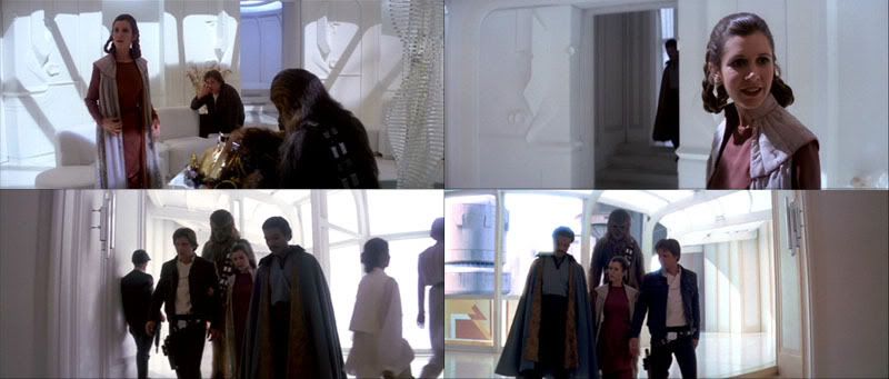
Firstly, just to clarify -  I agree that Han enters the doorway beside the 'plant in the red vase', and that Chewbacca and Lando BOTH end up entering the SAME doorway which has the 'seashell' beside it, a good distance away from Han's one. (You can just briefly see the'seashell' on the alcove shelf on the LEFT of Chewbacca, when he enters into the apartment with the pieces of C3PO, and it's to the LEFT of Lando when he enters too)

And I also agree that BOTH the 'whole building' seen at the end of the new SE 'Cloud-car city fly-through' (seen in 3rd post above), and the new SE 'apartment' corner-section of the top of that building (seen in the top shot shown here), seem the wrong shape and size to allow for ALL the various corridors seen, and the following walkthrough to Vader's room.  It's a poorly thought-out 'upgrade' from the equally problematic original GOUT version unfortunately....  The SE 'fly-through' scene is a good addition in the main though, and I personally quite like the look of the new 'apartment' exterior, and the bit of movement in the shot compared to the static GOUT version. 


Once again, screeenshots unfortunately don't tell the whole story, and the scenes need to be watched in motion, but both the 'whole building' shot and the 'apartment' corner-section shot, as well as the shots looking up at the interior 'ceiling' pattern, ALL have some 'camera-movements' during them, and would all be quite difficult to amend very much I'd imagine.  I agree with those that suggest getting rid of the uppermost 'framework' on top of the apartment (seen in the top shot shown here) would at least tie-in better with the view seen through the 'apartment ceiling' in other shots, although I'd quite like to see that extra 'framework' detail added above the flat 'ceiling view' instead!  Probably too difficult I know, as there's a lot of movement in those shots, and absolutely no biggie in the scheme of things at the end of the day.

(On the other hand, removing it will make the 'apartment' section more closely resemble that original Ralph McQuarrie artwork that doubleofive linked to recently, AND it seems that the uppermost 'framework' isn't clearly defined on the 'whole building' CGI seen at the end of the previous shot anyway (seen in 3rd post above), so removing it will tie-in with this preceding shot better too!)

Having said that, if you compare the positioning of the tall, fat building (with the 'Cloud-car' platform beside it) in BOTH the shot seen in the 3rd post above, and the top shot shown here, it can be argued that the 'end-section' at the top (and the whole building in general) where Leia's 'apartment' is situated, is quite WIDE, and that the somewhat ROUNDED 'windowed' section we see her pacing in, is actually at the far-corner of this 'wide' top end-section, where we wouldn't necessarily see the uppermost 'framework' in the angle of the preceding shot, anyway.... 

And that leads onto something else -  if you choose to look on the 'apartment window' shot as being the WHOLE 'rounded end' of the top section of the building seen in the preceding shot....then the top section is only as wide as the 'apartment' is (very narrow in other words), and the position of the tall, fat building and platform is SIDE-onwards to the whole of Leia's building....

but if you look on the 'apartment window' shot as being positioned at the far edge of a WIDE top section, then the position of the tall, fat building and platform is facing DIRECTLY towards the end of Leia's building, and matches the positioning seen at the end of the preceding 'fly-by' shot too.  (I REALLY like the idea of something along the lines of the rough mock-up that Davnes007 came up with at the end of the previous page by the way, but again it's tricky because of the 'camera-movement' I suppose) 

Also, shouldn't the single 'wine'-coloured stripe either side of the 'apartment window' area be covering the strips just above and below it as well, to better tie-in with the fatter 'wine'-coloured stripe seen in the preceding shot?  Especially since it was seemingly intended to represent the same structure?  It's just another example of sloppy continuity it seems.

Either way, the fact remains that the various corridors seen, and the following walkthrough to Vader's room still don't match, although slightly less so if you choose to look on the end of the top-section (and the building in general) as being quite WIDE....

Speaking of corridors, check out the various shots of the corridor seen through the opening that Han entered through, during the scene from the point when Chewbacca enters too -  in the top shots seen in the 2nd post above, you can see that the corridor behind Han is 'bluish' and 'rounded' compared to the more 'angular' detail seen when Lando enters where Chewbacca previously did.  Well, it seems that the one that Han came through (and is now sitting beside) is similarly 'angular' in a couple of shots too!  Look at the shot where Han says "Found him in a junk pile?...." for instance, where the stair area is located.  If I'm right and had a choice, I'd prefer to amend the shots of the 'bluish, rounded' ones to be 'angular' too....

At the end of the day Adywan, if it's a case of the bare minimum being achievable here overall, then these would be the 2 MAIN things I'd personally be more than happy to see with the current footage, which would go some way to tying things together a little better -

1.  The removal of the uppermost 'framework' (seen in the top shot shown here), to tie-in more with the 'ceiling view' (seen in the bottom shot shown here), if possible.

2.  Some alteration to the interior of the 'apartment window' shot, if possible -  

Firstly, you'll notice that I've shown your recent layout in my 1st post above.  It's because the top shot showing the 'apartment window' is the one shot that I'd MOST like to see amended out of everything around this scene....but I just happen to see a slightly different layout of it to you....  Not that it matters who is right in this by the way, when you see what I have in mind, because either way, the current layout of 'doors' seen through the 'window' lead to nowhere! 

Okay, here's what's always been my own take on this 'interior' layout, as seen through the 'window' -  while you have certainly correctly indicated the 'door' and 'alcove' positions in the middle and bottom shots, in relation to each other, the line that you have also pointed to as being the corresponding 'door' in the top 'window' shot, is not the same door to my mind, but is instead the door that Han is supposed to have come out of....  Where we seem to differ is that I think you see the tiny detail on show as being the 'objects on the shelves', whereas I see it as being intended to indicate a hint of the top of the 'plant in the red vase' which is roughly the same height, and beside the door that Han entered through.  

(Of course, this makes the current 'window interior' even MORE off-kilter in the scheme of things, as Chewbacca and Lando would have had to come into the apartment using their doorway somewhere around where Leia is facing in the shot, lol!  Again, pretty sloppy the angle it was put into the shot)

However, although the spacing of the shadows are not perfect between the 2 shots shown here, going by the 'angle' of their direction, they seem to suggest that it is meant to be the top of the 'plant' beside Han's doorway that is being indicated in the top 'apartment window' shot.

Also, I happen to believe that the bottom shot shown here, which shows a 'close-up' of Leia 'looking out of a supposed window' is intended to show us an almost DIRECT-on view of the back of the apartment's layout, with Han's doorway on the RIGHT of the shot, and Chewbacca's and Lando's doorway on the FURTHEST FAR LEFT of the shot here.  (Note:  looking at Jambe' unused behind-the-scenes footage of the interior set where Han says "You look beautiful, you should wear girls clothes all the time" (sure glad THAT got cut!), I think that if that particular shot of the set had been used, that we SHOULD have probably had to see a little of the 'imaginary window' at that point (the set didn't seem to have one at all in that clip).  However, I don't think we are quite able to see the edge of it in ANY of the actual footage that was used in the movie, as the camera doesn't pan around enough for us to be able to see it.  I'm content that all's well on that front.

So finally, the ways I'd like to see the existing 'window interior' adjusted would be these -  I reckon the SE hint of 'twisting, glass ornament' that we can make out behind Leia, that is currently on the left-hand side of the interior, should be moved over to the farthest RIGHT of the window, to give it a better 'centrally-placed' look in the overall structure.  This would better match the actual set positioning of it behind Leia in the next shot, to reinforce that the back of the apartment is more to the RIGHT inside this structure....OR just REMOVE it totally out of the shot, and out of our viewpoint, if that's not achievable during this moving shot. (the little figure of Leia herself would just be kept pacing in her current position)

REMOVE the SE hint of the top of the 'plant' (or 'objects on shelf') altogether, as they should be further back to the right of the structure, unseen by us, again reinforcing that the back of the apartment is further to the RIGHT of the current structure.  (There seems to be something sticking out now on the inside on the left-hand side that passes in front of Leia close to the window's interior.  This is not really a problem, as the camera-angle of Leia's 'close-up' supposedly 'looking out of the window' in the next shot doesn't show exactly how close she is to the window, and isn't at an angle to see this 'protrusion', even if it had been included in the actual set.  It's just an extra detail that could EITHER be left OR removed)

If possible, perhaps the current direction of the interior shadows can be tweaked a little, and a slight adjustment made to the 'curve' of the ceiling seen in the window.  However, it's a moving shot, so this may not be achievable.  It's certainly no biggie personally speaking, as I reckon the removal of the currently distracting 'plants' / 'objects on shelf', and shifting the hint of 'twisting, glass ornament' over to the RIGHT-hand side of the window (or TOTAL removal) will alone make a huge difference to the percieved layout of the interior in the shot.  Certainly, anything is better than it is currently laid out.


Just as a final thought on this one from me, there is ALSO the possibility of giving the impression that the building seen in the 3rd post above has totally nothing to do with Leia's 'apartment' whatsoever!  That's right, the 'ol 'flipped shot' routine....  (Although it took me a little while to get onboard with the idea of this with a couple of shots in ANH:R, I really like idea now that this can freshen things up in certain places)

Anyway, using my tried and tested 'mirror' trick, I've had a look at the new SE 'fly-by' shot that cuts to Leia in the window, and it seems that if you take that tall, fat building with the 'Cloud-car' platform as a focal point, that you can get away with flipping EITHER the 'fly-by' (there's nothing that looks out of place as the Cloud-cars are symmetrical, as is the tall, fat building) shot OR the 'apartment window' shot (my points for tweaking it would still be relevent though), but the 'Cloud-car' platform and the Cloud-car taking off above it, would need to be REMOVED from the end of the 'fly-by' shot.  Apart from that, I think if you compare the shots in the 3rd post, and at the top here, you can just about get away with it seeming to be a cut from somewhere behind the tall, fat building, to somewhere in front of the tall, fat building, because of the angle that the tall, fat building seems to be positioned during the 2 shots! 

It was just another thought, and I look forward to whatever extra is done in these scenes.   


Post
#350984
Topic
STAR WARS: EP V &quot;REVISITED EDITION&quot;<strong>ADYWAN</strong> - <strong>12GB 1080p MP4 VERSION AVAILABLE NOW</strong>
Time
Sevb32 said:

The still above is just before the switch to the other side view of the building on the left and we see Leia walking in the window, this is a moving shot so could we assume Leia's new building design is on the the other side of the left building which was originally supposed to be hers. It's all with keeping this shot of the fly thru, would hate to see it gone.

In short, this new more accurate building could be put next to the old one here, without changing the moving fly thru shots, I believe.


3rd post

I like the 'fly-through', and it's just a pity that the final designs of the buildings in the SE between the 2 shots made a bit of a hash of things overall.  More on that in my 4th post below though.

Post
#350809
Topic
STAR WARS: EP V &quot;REVISITED EDITION&quot;<strong>ADYWAN</strong> - <strong>12GB 1080p MP4 VERSION AVAILABLE NOW</strong>
Time
adywan said:

yeh its the outdoor matte that is throwing everything out.  I've checked all the interior layout and have been able to map where the door that chewie and lando is in each shot. as you can see there is no way such a vast corridor , in fact no corridor at all, could be outside the second door that lando & chewie enters based on the exterior views. another nightmare. lol

Image Hosted by ImageShack.us


1st post

Well this was a real coincidence....  Although I'm still very busy in general unfortunately (which is annoying for me, as I want to go into quite a few more potential fixes to 'Empire', that haven't been mentioned yet), I got a chance to come on here today with the intention of suggesting a couple of possible little improvements to smooth the 'continuity' horrors with this particular scene in the movie.....  And it turned out that a few of you were already deep in scrutiny of it, lol!

(That's lucky for me, as I hadn't yet had the time to ask doubleofive for the screenshots he normally helps me with, but can just about use what's been shown already, instead) 

As this one is as potentially tricky as the 'Duel in the Vane' layout (which I still reckon Luke followed Vader along inside the long 'extending arm' from the Carbon Chamber inside the 'surrounding wall', and that the 'broken window' should have been on the OTHER side of the exterior Vane shots....  ;) ), I think it will be helpful to have all the relevant shots in close proximity on the SAME page for reference, so forgive the fact that I'm going to have to make 4 seperate posts here, one after the other, since I haven't mastered the 'multiple posts into one' thing yet!  (My own 2 cents will be in the 4th post, by the way) 

Post
#349858
Topic
STAR WARS: EP V &quot;REVISITED EDITION&quot;<strong>ADYWAN</strong> - <strong>12GB 1080p MP4 VERSION AVAILABLE NOW</strong>
Time
Dangerous Incorporated said:

Thanx for that but the scene Im talking about is a shot inside the command centre and focusses on the white C-3PO using a penlight on a glass map. Then, the movie continues as normal and Han is shown entering the command centre. This scene was not present on the video release.


Interesting.  I wasn't aware of this. 

Post
#349850
Topic
STAR WARS: EP V &quot;REVISITED EDITION&quot;<strong>ADYWAN</strong> - <strong>12GB 1080p MP4 VERSION AVAILABLE NOW</strong>
Time
Dangerous Incorporated said:

On the Canadian theatrical version SE there was a shot in the Hoth command center of a white C3-PO which was later removed. Ive never seen this. Is it available online or anywhere for that matter and if it is, is it worth considering adding it?


Just to clarify DI, the white droid is there behind the female Rebel operator, in a couple of shots before the ION Cannon fires, and is featured in the GOUT as well as the SE versions.

It's even whiter now thanks to Adywan -  http://www.youtube.com/watch?v=UN8YIR60Ij0&feature=channel


Post
#349837
Topic
STAR WARS: EP V &quot;REVISITED EDITION&quot;<strong>ADYWAN</strong> - <strong>12GB 1080p MP4 VERSION AVAILABLE NOW</strong>
Time
adywan said:
vaderios said:

Ady, Where this building/Wall is in the next shots?


-Angel

oops. thats one of the old shots. I've updated the screenshots on page 1with the correct image


Been busy for a few days Adywan, but I've just seen your updated first page, and wanted to say a big thanks for amending the 'duel on the gantry' shot to show the 'rocket-shaped' section / 'circular' piece at the end of the gantry matching the full-size prop positioning now!  Very nice work indeed.  :)

And putting aside how splendid your Bespin City backdrops have turned out, I also wanted to say that your new Millennium Falcon 'panel detailing' in general, and 'cockpit windows' in particular (seen in the top shot above), are terrific, compared to the SE comparison shot on page 1.  I'm looking forward to seeing your skies / lighting on the later platform shot where Lando and co. run towards the Falcon, which has pools of 'underlighting' shining down beneath it. 

Going back to the Falcon's 'cockpit windows'....I hope that the equally suspect original cockpit area shown in the other Falcon shot on page 1 (seen in the bottom shot above), will be amended to match your new one too, though.   

Post
#348947
Topic
STAR WARS: EP V &quot;REVISITED EDITION&quot;<strong>ADYWAN</strong> - <strong>12GB 1080p MP4 VERSION AVAILABLE NOW</strong>
Time
adywan said:
adywan said:

I don't think the two entrances need to be made to look the same. Don't forget there is a north and south entrance to the base. although the mattes need enhancing they don't need to be exactly the same

i have things planned for the sequence where the shield generator is destroyed but i'm keeping this one secret until the edit is released.

as for vaders chamber, i do like the corridor idea abut not an airlock or lift. he wouldn't need a sterile environment so his wounds wouldn't get infected because they would have healed after all this time. i've always thought that the actual  meditation unit had some sort of inbuilt force field protecting Vader when he has his mask off and that his breathing apparatus was linked into its systems which would allow him to have his mask off for short periods of time. i won't be doing any changes to that apart from the entrance.


I've just noticed that this original post has disappeared. very strange. hmm


Thanks for mentioning this 'missing' post.  I wondered why I couldn't see it!

I'm really looking forward to your eventual outcome for the Shield Generator's destruction....

Your preview of that incomplete Bespin platform shot looked a terrific improvement over the original version.  Going by what's been shown so far, these Bespin sequences are going to be wonderful.

Post
#348742
Topic
STAR WARS: EP V &quot;REVISITED EDITION&quot;<strong>ADYWAN</strong> - <strong>12GB 1080p MP4 VERSION AVAILABLE NOW</strong>
Time
DarthBo said:
ImperialFighter said:

All the other shots are looking magnificent too, and I am SO glad you decided to add my hint of Hoth's 'circumference' atmosphere into the LEFT window, AND that subtle bit of RED lighting to the panel too!  It makes all the difference, and the shot is looking terrific.

Will you also consider making the 'edging' of the LEFT and MIDDLE windows the same thinkness all the way up, where we see it in front of the officer on the left, and behind Captain Lennox's back though?

There's just no pleasing you is there? :P


Deathcrow, there's still a little something I'd like to see tweaked a little....  ;)

DarthBo, I'm way beyond being pleased about this thing already, but Adywan seems to have such an astonishing workrate on the different parts he's going through, that it is quite possible that even his amazing talent is prone to not catching 100% of everything.  I've already mentioned the words 'Genius' and 'Adywan' in the same sentance before, and I firmly believe that, where most of his work has been concerned on these edits so far.

Someone else agreed that this 'edging' thing seems slightly amiss, and I may be wrong about it, but it still caught my eye as being not quite right.  It's the only thing now, as everything else seems so perfect in this amazing new shot now.  No slight to him intended whatsover.  If Adywan agrees, he'll be happy to look at it again, as he has proven in the past.  If I'm wrong about it, then I'm wrong about it, and happily accept that.  I've certainly been wrong about some things in the past, that I also thought worth bringing up at the time. 


Post
#348739
Topic
STAR WARS: EP V &quot;REVISITED EDITION&quot;<strong>ADYWAN</strong> - <strong>12GB 1080p MP4 VERSION AVAILABLE NOW</strong>
Time

executor elavator


Just wanted to add my 2 cents on this one, before Adywan makes his own final choice.

To be honest, most of the previous comments on this could work out fine, I reckon.  There have been good points about how a 'lift' or 'longer, different corridor' in the background could give a different sense of 'isolation' for the 'meditation chamber' room being an unknown distance away from the Bridge.

If Adywan chooses either of these routes, then okay, but I think the existing shot also works fine as it is....if this 'meditation chamber' room is looked on as being supposed to be close to the Bridge, for the purposes of being easily and quickly-accessed by his High-Ranking officers, to discuss any potential activities going on, in person

I agree with what a lot of Bingowings suggested about Vader's attitude of possibly being seen 'helmet-less' by these underlings, and have no problem believing that at this elderly, corrupted stage in his life, he is not in the slightest bit bothered by whoever sees his actual visage now, and that it does indeed increase the aura of fear around those that do....  (so either all the existing figures can still be left in the existing shot, OR just the 'guard' could be left (and Piett), for a slightly more 'private area' feel)

Post
#348375
Topic
STAR WARS: EP V &quot;REVISITED EDITION&quot;<strong>ADYWAN</strong> - <strong>12GB 1080p MP4 VERSION AVAILABLE NOW</strong>
Time
BarBar Jinkx said:

OK whats the diff between the Luke vader fight? they look exactly the same to me.


 It must be your monitor or it's settings.  On both shots of the 'duel', Vader's sabre is noticeably more RED, and the background colours of the 'gantry' shot now 'pop out' vibrantly on mine.


sgdelta1771, you'll be glad to know that Adywan has indeed mentioned in the past, that he is going to improve on the Millennium Falcon's Bespin landing in those 'flattened' shots of it.

Sevb32, the squid on the Stormtrooper is going to be sorted also.

By the way, as well as the list of amendments on page one of this thread, Monroville has quite a comprehensive list on the thread that is linked in his signature (which GoodMusician started), and is being updated by him.

Post
#348372
Topic
STAR WARS: EP V &quot;REVISITED EDITION&quot;<strong>ADYWAN</strong> - <strong>12GB 1080p MP4 VERSION AVAILABLE NOW</strong>
Time
adywan said:
Bingowings said:

This is a lovely motorised model, it might have saved so much time doing certain shots.

http://www.youtube.com/watch?v=34tgu7ULkeM&feature=related

If i could get hold of that there is so much i could do with it for this edit.


We need this guy to lend this wonderful item to Adywan....NOW!  Nice link Bingowings.  :)

Looking through just some of the comments under the clip, someone said this AdrianoAT-AT guy is from Brazil.  We could do with a translator to some of these comments, pronto, lol.   Having said that, Adriano makes a comment in English a few pages in....


Adywan, the latest screenshots are a great addition to your first page.  The 'Rebel Trench' shot has turned out wonderful!  It now gives an extra sense of additional scale, with the additional Rebels in the distance.  Well worth the effort you put into this recently.

All the other shots are looking magnificent too, and I am SO glad you decided to add my hint of Hoth's 'circumference' atmosphere into the LEFT window, AND that subtle bit of RED lighting to the panel too!  It makes all the difference, and the shot is looking terrific.

Will you also consider making the 'edging' of the LEFT and MIDDLE windows the same thinkness all the way up, where we see it in front of the officer on the left, and behind Captain Lennox's back though?

Thanks for these latest previews.


Post
#348075
Topic
STAR WARS: EP V &quot;REVISITED EDITION&quot;<strong>ADYWAN</strong> - <strong>12GB 1080p MP4 VERSION AVAILABLE NOW</strong>
Time

adywan said:

the red lights aren't visible on the section that is showing in new clip as they are just out of shot. if i move the windows upward so you can see the lights then it throws the scale out. Plus the red lights only blink in that one shot when the stardestroyer is on alert. if you look at the other shots of the stardestroyer bridge (including the executor because its the same set) the lights never blink.


Adywan, I know the 'vertical' RED-lit areas are 'out of shot' in your new Bridge shot, but what I was meaning was perhaps it might be good to have just one or two of the tiny 'circular' WHITE lights that are now seen in your shot, be RED instead, just as a subtle detail.  

I think the ones in the 'Avenger' interior shot just 'switch-on' rather than 'blink', come to think of it, and any REDDENED ones in your new shot could just be made to be 'static', like the rest of the WHITE ones are. 

It's just that I thought I could make out the odd RED light amongst the WHITE ones, on that narrow 'upper ledge' in some of the other Bridge shots, that's all.  

Post
#348071
Topic
STAR WARS: EP V &quot;REVISITED EDITION&quot;<strong>ADYWAN</strong> - <strong>12GB 1080p MP4 VERSION AVAILABLE NOW</strong>
Time

adywan said:

at the moment i'm working on removing the background in the shot where we see the troopers in the trench get ready for action but the background has the turret already destroyed before the Imperials even fire a shot. so far its taken me 4 days to mask out about half of the troopers


I'm so glad you're putting the effort into sorting this particular shot, even though it's time-consuming.  It's one that I'm really going to appreciate seeing improved.  :) 

Post
#347996
Topic
STAR WARS: EP V &quot;REVISITED EDITION&quot;<strong>ADYWAN</strong> - <strong>12GB 1080p MP4 VERSION AVAILABLE NOW</strong>
Time

http://i10.photobucket.com/albums/a115/doubleofive/IF-SD/SD2-009.jpg


RED lights 'blink-on', on the 'Avenger's' upper Bridge panel during this shot....


Monroville, thanks for your instructions on how to link muliple quotes / photos!  I hope to play around with that sometime.  :)


ladyferry, I know you've a soft-spot for that 'cave' Wampa face, but I'd really prefer a bad-ass Wampa in there!  ;)

By the way, can you add a link for Adywan's latest preview, to your collection?  Thanks.