- Post
- #734684
- Topic
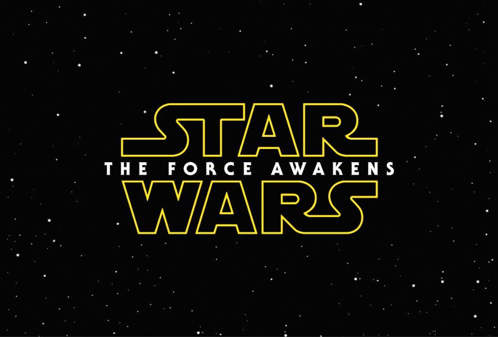
- Who like The Force Awakens as a title?
- Link
- https://originaltrilogy.com/post/id/734684/action/topic#734684
- Time
I made some mockups for the new title in a more traditional style. Note that all I did was resize stuff from the existing title treatment - nothing in these mockups was taken from the title treatment for any of the other films, and I tried to keep the title as much like the officially-released one as possible.
First up, we have the title on one line, exactly as Disney/LFL released it, but with the more traditional bars on top and bottom:

I think it's too wide myself, but it works.
Next up is possibly my favorite. It's stacked instead of all on one line, but I did no resizing of the letters at all. This may work better with an Empire-style border all the way around instead of simple bars on top and bottom. I may mess with that later on. But for now, I like this a lot:

And finally, the same as the second, but with Awakens resized to match the width of The Force (that sounds weird). Less a huge fan of this, but it works with the top-and-bottom bars a little better:

What do you guys think? I might try and make more mockups after work tonight (maybe resizing The, maybe with an all-around border instead of just bars, maybe recoloring the bars to white or the title text to yellow), but with these three I was just trying to "classic-ize" the logo as given to us as much as I could while changing very little.
