logo Sign In

DrDre

User Group
Members
Join date
16-Mar-2015
Last activity
6-Sep-2024
Posts
3,989

Post History

Post
#1062576
Topic
The theatrical colors of the Star Wars trilogy
Time

Darth Lucas said:

That’s… umm… that’s very green. Not saying it’s not correct, just wow, didn’t think it’d be so green.

Yeah, it’s green:

It’s probably a little less saturated and contrasty in reality, but the hues are pretty close, although I prefer the photograph to the regrade, as it’s pretty hard to reproduce those colors with the missing gradients of the bluray.

The 1977 bootleg shows similar hues:

The Senator print photos are actually pretty consistent with the frames I have for the conference room shots:

Post
#1062290
Topic
Color matching and prediction: color correction tool v1.3 released!
Time

TylerDurden389 said:

Will this work if I’m trying to take the color timing of a non-anamorphic dvd and make an anamorphic dvd match it’s color timing? Basically, I have a non-anamorphic dvd of Terminator 2 that has more neutral color timing (less blue) and I wanna use a better qualitty dvd source that has the same (or close to it) color timing.

Yes, you can use a non-anamorphic dvd to match a bluray if you like.

Post
#1062201
Topic
Ranking the Star Wars films
Time

Alderaan said:

DrDre, thanks for your post. It’s nice to -discuss- Star Wars with Star Wars fans, even if we have differing opinions.

DrDre said:

Really? ROTJ has a pretty weak story structure, primeraly preoccupied with tying up plot points of it’s superior predecessors.

I think it does that quite well. I know you were comparing it with TFA, but look at R1 for an example of what NOT to do during the first act of a movie. Side characters there were given very little depth, and the camera keeps moving from planet to planet at breakneck speed. Even though none of those places were important, they all got undeserved superimposed titles, like we were watching the travel channel or something.

Return of the Jedi’s first act (like TFA’s I might add), was competently conceived. They have to assemble the cast, rescue Han, and go on to bigger and better things. Tight. Smartly done. And it all takes place in one setting. That’s unity of composition.

DrDre said:

The resolution of the final conflict to a significant degree rests on one of the weakest reveals (both in terms of story and execution) in the the saga, that of Leia being Luke’s sister.

I can’t really comment on this because I think it has to do with expectations. I don’t remember watching ROTJ without knowing the story–my first hundred viewings coming by the age of five. But I know some people who watched it in suspense and were fine with this plot point, and some who hate it, like you do. My guess is that people’s perception depended on what their expectation was, and it’s just not something I feel I can comment on any further.

DrDre said:

Aside from a few impressive set peaces, it’s also visually rather uninspiring (not unlike TFA).

I have to disagree with you here. Before I get into some shots that I love, I just want to comment on the visual flow of the film. Small things like transitions are so important to making a film flow this good. Right after the sail barge explodes, skiff is flying across the desert, and then there is a wipe to another shot of the Falcon and Luke’s X-wing flying into outer space. That’s flow, but then there’s more. The two ships are in the same shot, one goes one way, and the other veers off in another direction, and that’s just a great shot. Then after some dialogue, Luke’s ship is flying across the screen…more flow…and we finally end up on a spectacular shot of the TIE fighters falling into formation in front of The Emperor’s grand arrival. These few minutes are basically forgettable as far as the storyline is concerned, but wow, are they wonderfully conceived and executed, and they significantly enhance the flow of the film.

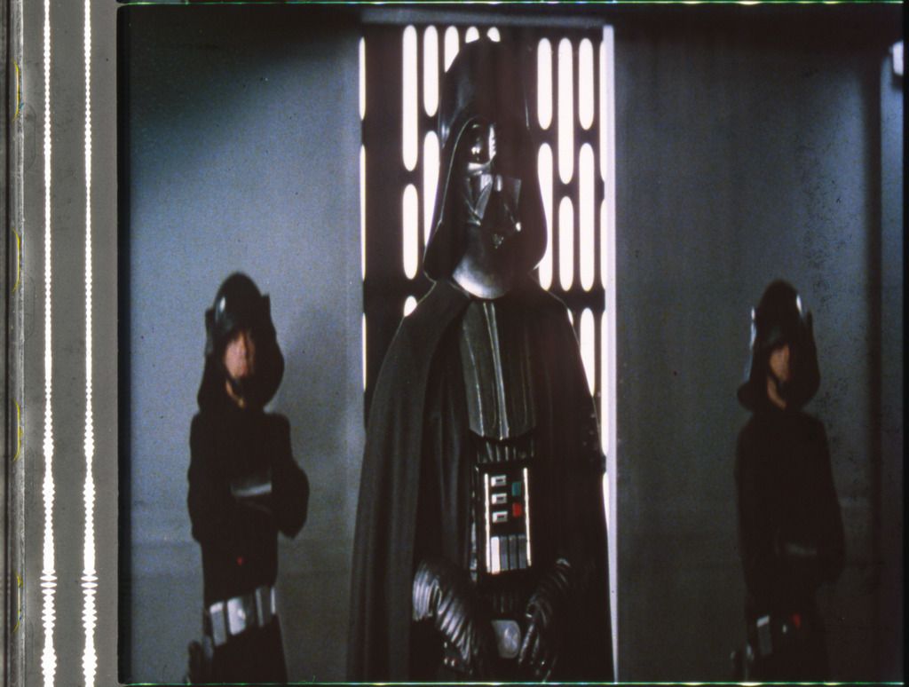
Anyway, onto some shots: how about the wide shots between Luke and Yoda in the hut? Such good filmmaking to have them side by side with no cuts back and forth, for so long. What about the camera angle on Vader when Luke passes by on his way to Endor? Even after the scene is basically finished, there is that one last shot of Vader staring out the window. Not a word is said, no action is taken, and yet the inclusion of that brief shot demonstrates Vader’s longing for a reunion and reconciliation (or reckoning) with his son. Again, the same idea is repeated after Luke’s surrender on Endor. After the confrontation, and after Luke is escorted away, and the scene is over, there is again that last lingering pan on Vader, as he wanders over to the window and stares out into his own thoughts.

So from those two examples, and the way Vader’s part was written and directed in the movie, and the way JEJ voice-acted him, I would very much disagree with you that Vader’s climactic action came out of nowhere. He spent the whole second movie looking for his son, carrying an entire armada into an asteroid field in pursuit of his friends. As I demonstrated, his thoughts were on Luke at every turn in ROTJ, and his glances back and forth between Luke and the Emperor during the lightning attack scene, tells the audience everything they need to know.

DrDre said:

The entire Darth Vader redemption angle, while well executed, also is just pulled out of thin air, as there’s literally nothing to indicate in any of the previous films, that Vader is anything but an evil monster.

Yes, it’s indeed very nice to discuss with other Star Wars fans. I would say, especially if we disagree with each other, because I think new perspectives generally are created more easily from disagreement, than agreement. So, thanks for your perspective 😃.

Let me first say, that despite some of my criticisms, I believe ROTJ contains some of the best scenes in the entire saga. My favourite being the brilliant silent contemplation of Vader as he watches his son being murdered by his master. The mood, camera angle, music all work wonders together.

My criticism of the first act of ROTJ is, that it doesn’t really advance the plot. It sort of plays as it’s own mini adventure. It’s entertaining as hell, and Jabba the Hutt to this day is movie making magic. The most disgusting peace of plastic put to film. However, as a part of the whole, it feels sort of disjointed. Here’s where I think TFA does better, as it manages to advance the plot, while successfully introducing a host of new characters. I personally feel TFA’s strongest part is the first act, and it’s final act, excluding the Starkiller Base, which is the movie’s Achilles heel.

I’m actually not arguing Vader’s action came out of nowhere. I think it worked very well in the context of the film. However, ROTJ for me is the first Star Wars film in the OT, that takes dramatic short cuts, and relies on the actor’s performances, and the individual scenes to compensate for this shortcoming. Two other examples:

  1. Yoda dies very conveniently as Luke delivers on his promise. While it is a dramatic short cut, the execution of the scene is so great, that it still works.

  2. It is revealed Luke and Leia are siblings. It is an another covenient twist, that diminishes the scope of the saga, a sort of precursor to Anakin building C-3PO, but the scene between Luke and Leia that follows is very well executed, and so it works in the end, allowing for a satisfactory conclusion to the Luke/Leia/Han love triangle.

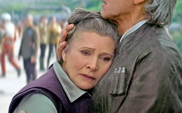
I would argue, that the Han/Leia/Kylo story in TFA works in the same way. Their relationship is swiftly set up, and while it certainly isn’t as effective as the Luke/Vader interaction in ROTJ, it works for me, because of a strong performance by Harrison Ford and Adam Driver in their final meeting. To me it is a strong piece of film making, because aside from it’s visual splendor, that scene manages to convey a history between the characters, that’s nowhere to be seen in the rest of the film. Conversly, I felt the Leia/Han reunion felt forced, and didn’t really work, mostly because I felt Carrie Fisher was a little rusty and some weak dialogue, but was saved for me by the scene where the two characters embrace for the last time:

Post
#1062198
Topic
Ranking the Star Wars films
Time

Alderaan said:

DrDre said:

I just don’t understand how anyone can hate TFA and call ROTJ an extraordinary film.

If we take George Lucas out of the picture, the other people who made Return of the Jedi were more talented and crafty at the various things they did compared to the people who made TFA. I can admire the pacing, the framing or blocking, the editing, the emotional conflict, the attention to detail, all of it, which I find nowhere present or nearly nowhere present in TFA. ROTJ’s script is also not a Frankenstein’s monster, amalgamated from the disparate ideas of creator, writer, director, several producers, a couple people in marketing, some other corporate suits at The Mouse, and that smelly guy over there. ROTJ tells a story, whereas TFA attempts to be an amusement park ride that whisks you by this and whisks you by that, a few moments at a time.

Really? ROTJ has a pretty weak story structure, primaraly preoccupied with tying up plot points of it’s superior predecessors. The resolution of the final conflict to a significant degree rests on one of the weakest reveals (both in terms of story and execution) in the the saga, that of Leia being Luke’s sister. Aside from a few impressive set peaces, it’s also visually rather uninspiring (not unlike TFA). The entire Darth Vader redemption angle, while well executed, also is just pulled out of thin air, as there’s literally nothing to indicate in any of the previous films, that Vader is anything but an evil monster. How about the fact that the rebels victory for a large part depends on a bunch of teddy bears defeating the Emperor’s “best troops”. ROTJ is crammed with dramatic short cuts, that stop it from being a great film.

Yes, ROTJ is not as good a film as Star Wars or Empire Strikes Back–that I agree with. It’s main drawback is occasional tackiness and silliness. The quality of the production at Jabba’s palace was extremely uneven, to be kind–almost like a B-movie. And while I have no problem with many of the Ewok scenes, silly nonsense like the Ewok spinning around on the bike speeder, or cute teddy bears taking out elite soldiers with rocks and sticks … yeah, those are blemishes on an otherwise well conceived and well made movie.

I would argue, that ROTJ manages to be more than the sum of it’s parts, which are decidedly uneven, and often uninspired mostly because of the great setup provided by it’s predecessors. The fact that it rises above it’s many issues, is mostly due to a well executed last act (specifically Luke/Vader/Emperor and the space battle).

But if George’s occasional nonsense and bad taste is what turns you off, how about I suggest going back and looking at the scenes that are a true work of art? Can you not watch Yoda’s death scene and admire how it was filmed? The craftsmanship that went into the puppet and its acting, the use of wide shots and very few cuts? What about the appropriate humor–which is pure Star Wars humor-that makes you chuckle in a wry and fond way? And then there is the mood: something the OT always got right was mood and atmosphere. Those films were allowed to breathe!

Sure, but at the same time the Yoda death (one of the most conviently timed deaths in movie history) is followed by the worst expository scenes in the OT, and one of the biggest cop outs in the saga. Also, while I appreciate how Yoda’s death scene was filmed (the Yoda sequence itself is another dramatic short-cut though, a case of ticking all the boxes provided by TESB), for me it pales in comparison to the visual splendor of Han Solo’s death scene in TFA. The sun that extinguishes at the exact moment, that Kylo Ren decides to murder his father.

None of these things were present in TFA. At a conceptual level, the film was a disgrace. It had no story to tell, and it had no vision, and it lacked unity of composition. At an execution level, the craftsmanship was sometimes good, usually not good, but not really incompetent. I think perfunctory would be an apt description, which seems par for the course for something that was just a safe and derivative cash grab.

I disagree. There were plenty of moments of great craftmanship in TFA, and simulateously there are plenty of examples of poor craftmanship (probably due to time constraints) in ROTJ. It always surprised me, that while ROTJ has some of the greatest visual effects in the OT, it also has some of the worst. The shot of the guy walking on Jabba’s sail barge, the matte painting when Han and Lando meet for the last time, the fake looking ewoks, the Emperor’s slugs, Darth Vader’s weird bended cut off hand, clearly showing the actor’s wrist.

IMO ROTJ is a very entertaining film with moments of greatness, as is TFA. However, ranking ROTJ far above TFA in my view can only be achieved by viewing ROTJ’s flaws through very rose tinted glasses. I would emotionally rank ROTJ above TFA for nostalgic reasons, not because I rationally believe it to be the better film.

TFA is derivative for sure. It is a soft reboot afterall. I can understand many disliking the concept. Personally, I can get behind it, and simply view it as this generation’s ANH. It repeats many of the OT’s story beats, while adding some new perspectives, and introducting a number of likable new characters.

Post
#1062194
Topic
Ranking the Star Wars films
Time

Alderaan said:

Anyone who uses the word “Palpatine” on an OT forum is already treading dangerous waters. 😉

There are things to criticize in the OT. They are not perfect films. I could list many things. However, they are exceptional and extraordinary films, so there’s not much use spending time criticizing movies that are overwhelmingly good and of historic value.

There are also things to criticize in the prequels and the Disney movies. None of them are perfect movies/films. I could list many complaints. However, they are, on the whole, not very good films at all, marred by incompetence, lack of skill, and lack of creativity. There is much value to be had in pondering and learning why things suck and did not strive to be or did not become something good and of historic value.

There is also great value to be had in pondering and learning why good things are good, and bad things are bad. But there is no value to be had in pondering over small imperfections in extraordinary things, nor is there much value to be had in pondering over mitigating aspects of spontaneous disasters. Those kinds of thoughts would just be a terrible waste of time.

I just don’t understand how anyone can hate TFA and call ROTJ an extraordinary film. I don’t think ROTJ is a great film, and neither is TFA. I can even understand why some would think one of them or both are just oke or dissappointing, even though I consider them both solid and entertaining films. IMO both films are flawed, in fact I believe they share many of the same flaws. Both films also have their own unique flaws and strengths, but I don’t see how any of these strengths or flaws would move ROTJ to the top of the ladder, and TFA to the bottom, or vice versa.

Post
#1060312
Topic
The theatrical colors of the Star Wars trilogy
Time

poppasketti said:

yotsuya said:

DrDre said:

These two examples of the same frame really show why I have issues with Mike Verta’s color choices. Both droids seem dull in the top one, but both gleam like metallic surfaces really do in bright lights in the lower one. And it doesn’t seem to be an artifact of the poor condition of of the tape as I get the same gleam when I correct to Mike’s 1 fps sample clips. Mike seems convinced that R2 should be very dark instead of letting the film tell him the color. In all the correction passes I have made on the GOUT, JSC, 97 SE broadcast, and BR, I have never gotten a dark R2 like this. The colors in the video tape are much closer to what I keep getting - a deep cobalt blue. Having been to the Star Wars Costume Exhibit at the Denver Art Museum where they had an original ANH R2 and several pieces to examine close up, the original R2 is not that dark and looks more like the lower photo (I have no idea how many Kenny Baker R2’s were made for ANH or which one was in this shot or which one is on tour with the exhibit).

I’m pretty new to this, but I agree. Shouldn’t the above shot look more like this:

This image is actually a photo Mike Verta took of a projected technicolor print with a 1970s bulb and screen. It does appear to look a bit off, compared to the actual frame, and the bootleg recording. It might be, that the 1970s bulb emitted a more yellow/orange hue due to its age, or perhaps this is another example of the color imbalances NeverarGreat discussed?

Post
#1060049
Topic
GOUT Technicolor regrade (single pass) (* unfinished project * - lots of info)
Time

I never realized, that the European THX laserdisc set from 1995 has a completely different color grading than the GOUT. It appears to be the most consistent color grading I’ve seen on home video, and features some of the best colors as well, as kind of a more modern and consistent take on the OT’s theatrical color grading. Does anyone know more about it’s history?

Post
#1059983
Topic
The theatrical colors of the Star Wars trilogy
Time

NeverarGreat said:

Is this using the film scanner you recently bought?

I scanned these frames several years ago on a scanner in the art department of a college, used specifically for photography and film scanning. I expect that if the colors were significantly inaccurate, it wouldn’t have been much good for those things. I only know that under close visual examination in the photo lab using a magnifying glass, the colors of the frames seemed to match fairly well what I got out of the scanner.

And certain frames seemed to look quite good to me, such as the Vader shot and R2. Sure, they may look more vibrant when projected in a theater, but to me the Death Star shots I have seen contain a lot of color variability. It seems doubtful that a calibration problem would faithfully represent the colors of one Death Star interior and not another. Granted, I only have a few hundred frames for reference, so you would be a better judge of consistency, especially in the first two reels. If you discover that they do indeed contain a consistent yellow tint, that would mean a bit more work for my project, which is why I want to be absolutely sure 😉

I now have about 2,500 frames representing roughly 500 shots, with more underway. So, this should provide a pretty good idea of the colors of this particular print. 😃 The yellow tones are indeed very consistent in the second an third reel from what I can see, but it will be interesting to see the consistency or lack thereof, once they’ve been put in sequence. It’s great to look at the frames individually as they arrive in the mail, but as Obi-Wan said: your eyes can decieve you, don’t trust them. 😉

Post
#1059956
Topic
The theatrical colors of the Star Wars trilogy
Time

NeverarGreat said:

Is this using the film scanner you recently bought?

No, this is using a simple flat bed scanner. I’m still researching which is the best scanner to buy (and saving up some money in the mean time to augment the donations I recieved 😉). Someone recommended this one:

Which includes:

  • 10,000 dpi Resolution
  • 48-Bit Color and a dynamic range of 4.2D
  • Batch Scanning - Automatically scan 35mm strip film up to 40 frames of length, and also scan individual negative frames - - and even mounted slides
  • Scanning Technology built-in - Magic Touch, Digital Noise Reduction, Automatic Color Correction

Although I will be doing the color calibration myself.

Post
#1059899
Topic
The theatrical colors of the Star Wars trilogy
Time

To further elaborate on the inaccuracy of the color reproduction of scanners in general, here’s an example, where I scanned a calibrated color source.

Original:

Raw scan:

As can be seen the color reproduction is pretty inaccurate. Next I do a curves adjustment (using the color matching tool) to match the gray values at the top:

While the gray values match, the color reproduction is still not accurate, and in some cases worse. So, a curves adjustment is not going to work to retrieve the original colors, and makes perfectly clear why comparing colors in an uncalibrated scan makes little sense, even if the frames have been scanned simultaneously, as browns can come out looking more red, teal can look more green, orange more yellow, etc. The solution is to create a LUT using the color matching tool to match the colors:

This way you ensure hues, contrast, and saturation match the source.

Post
#1059895
Topic
The theatrical colors of the Star Wars trilogy
Time

NeverarGreat said:

The bootleg seems to have a noticeable green shift, and a very slight yellow shift. I double checked in Photoshop by blurring the images so that I got the average color for the ‘black’ bars. Here are the images with a curves adjustment to return the bars to neutral gray:
http://screenshotcomparison.com/comparison/204846
Uncorrected
Corrected

This gets the shot closer to Mike’s preliminary grade, with the purple shadows becoming noticeable. This is one of the shots for which I have Tech frames, and the shot is definitely green on that source, to the point that Mike commented that it looked bad. It’s green to the eye, green when scanned.

Also, R2 is extremely blue in the bootleg compared to Mike’s photo.

From what I see, the Tech is notoriously inconsistent. For instance, all 4 of these scans were done at once:
1
1.5
2
3

The Death Star hallways are way too green and the skin tones too yellow in the first one, but they get much more blue with Vader.
The R2 shot has nice colors, but the final scene is notorious for being too red in the highlights, a problem that is much more noticeable without the luma correction.
The final shot is much more blue than the previous shots.

Also, notice that the audio strip which should be neutral gray has turned green in the hallway shot.

Here’s the thing though. I too have a number of frames from these sequences, and to my eyes the colors of the scans you posted look substantially different from the frames themselves (even compared to the photos I posted of some of the other frames, these scans look pretty lifeless to be honest). This is not surprising, as the colors of a raw scan always look different from the source. In principle each color can come out looking substantially different. For example, greens may be more blue in reality, while blues remain blue. So, it’s very difficult to draw conclusions about the extent of the color imbalances in these frames based on a scan, unless the scanner has been color calibrated. They may be smaller or they may be larger, but viewing the frames I believe them to be smaller in reality and on the big screen. If there’s one thing I’ve learned, it’s that scans are notoriously unreliable in their color reproduction, and need continuous color calibration to be considered useful as a color reference. It’s also interesting to note, that the skin tones in the 1977 bootleg contain more green and the walls less blue for the first frame.

However, even assuming these imbalances are accurate, I don’t see how this changes the conclusion, that the Tatooine sequences have a warm yellow grading, which can be seen on the actual technicolor frames themselves, and also on the 1977 bootleg, even if you account for the yellow/green shift you discussed, which only results in a slight color balance adjustment. Secondly, the question remains whether any color imbalances are unique to the print itself, to technicolor prints in general, or to the original color grading? I’m still a proponent of preserving the original color grading blemishes and all. While creating an idealized color grading is a worthy objective in of itself, IMO it deviates substantially from preserving or recreating the original theatrical color timing, and does not replicate the experience of watching an original 1977 print on the big screen. It would be a color grading inspired by a technicolor look, but optimized to suit modern tastes, and expectations.

Post
#1059871
Topic
The theatrical colors of the Star Wars trilogy
Time

I previously showed, that the 1977 bootleg displays similar colors to the technicolor frame photos I posted, contradicting the thesis, that the hues for some of the reels are unique to this particular print, and thus seems to support the alternative thesis, that the original color grading particulary for technicolor prints was very warm and yellow for the Tatooine sequences. To further reinforce the point that the 1977 bootleg is actually a pretty good gauge for the colors, here are a couple of comparisons between two of Mike Verta’s screening photos (which he says are 98% accurate in terms of hues) and the 1977 bootleg.

Here are the two Mike Verta photos:

Here are the frames for the 1977 bootleg:

Here’s one of Mike Verta’s preliminary color grades for another shot:

Here’s the same shot for the 1977 bootleg:

While there are slight shifts in the color balance, the colors at least to my eyes appear similar, despite the 1977 bootleg’s quality. For the latter frame Mike Verta seems to have graded the shot somewhat cooler than the 1977 bootleg suggests, which might be a case of him correcting for the generally more green technicolor palette, to more closely approximate the look of the original interpositive, or reconciling percieved inconsistencies in the original color grading. However, IMO these differences are not large enough to neutralize the warm yellow color grading of the Tatooine sequences as it appears in the frames I have, and the 1977 bootleg.

Post
#1059278
Topic
The theatrical colors of the Star Wars trilogy
Time

The frames I posted were photographed in the afternoon, and the lighting conditions were actually such, that the colors were somewhat warmer and more yellow than neutral or white light (similar to the warmer tones of a 1970s bulb). So, to get the photographs somewhat closer to what they look like under neutral lighting conditions, I balanced the background using the color balancing tool.

Here’s one screenshot comparison the emphasize the difference:

http://screenshotcomparison.com/comparison/204693

Here are all the frames under these conditions:

Post
#1059235
Topic
The theatrical colors of the Star Wars trilogy
Time

nightstalkerpoet said:

Maybe finding a shot/frame with as many colors as possible (I like the falcon cockpit wide shots for this) from the print-based LDs, you could average/median them and see what results you get. Might help remove the inconsistencies.

I still think one of our scripting/programming geniuses should look into writing a mode average plugin for avisynth or matlab, as the most commonly occurring pixel is more likely to be correct as opposed to the one in the middle or a combination of those available.

I personally found, that the 1977 bootleg, from which I shared some screenshots, has consistent colors, that are in reasonable agreement with the frames I have and with the photos I have of the Mike Verta screening (7 or 8). Send me a PM for more details. 😉

Post
#1059148
Topic
The theatrical colors of the Star Wars trilogy
Time

While it should not be seen as an accurate color reference either, and can only be used as a rough guide, here are some of the same shots as they appear on the 1977 bootleg, which seem to be consistent with the photos I posted (note the more yellow skintone of Obi-Wan in the second to last frame, compared to Tarkin in the last frame):

Post
#1059139
Topic
The theatrical colors of the Star Wars trilogy
Time

I would like to stress, that these photos are not a completely accurate representation of the frames themselves. The photos are more contrasty and saturated than the actual frames. However, I would also like to remark, that the frames themselves, next to a projected print, are the most direct and reliable color source available. The Mike Verta scans are uncorrected, and are therefore not a reliable color source. The only other reliable color source I’m aware of, are the photos Mike Verta shared of the technicolor print screening he attended, which confirm the yellow cast of the Tatooine sequences (the frames for these shots look more balanced than these photos):


I think the fact that we’re rapidly drawing conclusions based on a couple of quick photos of frames under varying lighting conditions using reflected day light and auto white balance, points to the danger of interpreting raw scans, and photos versus viewing a projected print or the frames themselves. There is very little that can be concluded from these photos, other than that the Tatooine sequences generally have warmer tones, than we see in most regrades. So, I would encourage everyone to reserve judgement until calibrated color sources are available, and not be led by preconceptions of what we believe the colors should be.