- Post
- #790435
- Topic
- StarWarsLegacy.com - The Official Thread
- Link
- https://originaltrilogy.com/post/id/790435/action/topic#790435
- Time
Well, if we're lucky we'll get two restorations, that we can then start comparing for all eternity. ;-)

Well, if we're lucky we'll get two restorations, that we can then start comparing for all eternity. ;-)
zee944 said:
That why I wrote 'personally'.
Maybe I was a little naive in thinking I could convince anyone with that picture.
zee944 said:
So you did mean it, no irony anywhere?
A video of a video as a proof of the right colors? Come on, that is absurd.
By the way, I personally didn't criticize the color balance, in fact, I said the TechniColor IB's colors could be used, BUT with reduced contrast, else it wouldn't look good on TV screen.
I wasn't referring to you ;-).
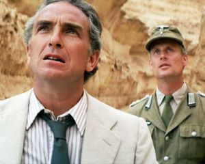
Seems to be a problem in all of the releases. Belloq's shirt is pink in this shot of the WOWOW:

Considering that both the jacket, and the shirt are very light colored, it seems likely that Belloq beige jacket was more green tinted than red, since his shirt should be white. Unless he was wearing a pink shirt.
NeverarGreat said:
It is a bit red, though now his cream colored suit is shifted green. Perhaps somewhere in between:
JEDIT: Imageshack is turning up the saturation of the image. This is part of why it's so hard to talk about color online. Here's one with less saturation:
Looks much better! Seems pretty consistent with the regrade.
Most of the issues are due to oversaturation, here what it looks like if you reduce the saturation in some of the color channels. It's very consistent with the Tech IB:

No the clip is not accurate. There are several color shifts in the clip, but most of the color is intact, and in several ways it is much closer to the Tech IB, than for example the GOUT or bluray.
NeverarGreat said:
Now this is interesting. I noticed in the trailer still, Belloq's tie is quite blue, but so is the balance of the frame. In the other grades and regrades, the tie turns quite green. So I searched for how the tie is supposed to look, and came across this:
Here the tie is clearly gray, whereas the Nazi officer's tie remains quite green. Overall, Belloq's suit seems more balanced here. Just some more data to consider :)
There appears to be a red shift in that image. Interestingly, when I apply autofix on this with my phone, I get:

yotsuya said:
Well, I'm assuming they are all off. I'm not trying to match the original theatrical colors. I'm trying to match the other Star Wars films. ANH is really messed up. Lowry's choices for how they balanced the colors (and possibly even the hardware they used to scan the film) produced magenta heavy coloring. Yes, the original has magenta toned flashes, but they aren't pure digital magenta, they have yellow undertones. The storm troopers seen through the flash should look yellowish and instead Lowry gave us magenta stormtroopers under the magenta flashes. Also, the burn through of the blockade runner should be brilliant white, not magenta. Remember, regardless of how close or off the pre DVD home video releases are, they are all done from original prints, color timed to the release. I believe the definative edition was from an interpositive, meaning first generation off the negative and used to make the internegatives the theatrical prints were struck from. I'm weighing my color choices based on that. I also don't trust technicolor prints for color saturation.
My goal is for C-3P0 to be the same golden color in episodes III, IV, V, VI, and beyond. Right now the best example of a gold that matches episodes III, V, and VI is the TR47 capture of the definitive edition. Also for R2-D2 to be the same brilliant blue in all 6 movies. That might be hard with how wacked the colors are in Ep I, but the rest should be doable.
And it is funny you posted that pic of the rebel trooper. I was just finishing my first draft of color correcting the ANH bluray today and what I ended up with looks a lot like the tech IB image. What I found works (in Sony Vegas) is something that I was leary to use, but none of my other tests came close. Channel Blend gave me the answer to change the colors in one step. It gave me a higher contrast image, brighter colors, muted the reds and magentas, gave nice peachy skin tones, and looks like the colors from TESB. I still need to manually color correct one scene (which requires retouching the color on every from from one camera angle of C-3PO on the sand) and I will be done. For me to even attempt to watch it I will also have to remove that damned rock, but that will be my viewing copy.
I'll post pictures if these color settings pass my viewing test.
Actually, the fact that George Lucas apparently wanted R2D2 to be the same brilliant blue in all six both, introduced a ton of trouble. In Star Wars R2D2's paint job was such, that the blue panels could seem almost black under certain light conditions. For The Empire Strikes Back the panels were given a different blue color, which would remain pretty much the same for the other five movies. Trying to color match R2D2's paint job in Star Wars to the others, introduced all kinds of blue artifacts, to the degree that Luke's shirt has blue streaks, and the homestead of Owen and Beru has blue in it's white paint job. It looks completely awful.
Here's how R2D2 looked in the first two original films:
Star Wars:

The Empire Strikes Back:

Trying to match these colors is going to be pretty much impossible, without introducing problems in other areas. This is why the best you can hope to achieve is to approach what was on the original negative, but in that case R2D2 is going to look somewhat different in Star Wars than in the others.
I will try to post a clip as soon as possible.
A while a ago I posted a color correction to the GOUT, based on an Technicolor IB print, that was criticized by some, who didn't believe Star Wars used to look this way, with greater contrast and blown out whites:
GOUT:

GOUT color matched to Tech IB:

I argued then that it was the poor quality of the GOUT that caused the lack of detail, but that the colors are accurate.
Well, turns out there is a video where David Prowse original voice heard during the filming of Star Wars is ridiculed. In this video there is a clip, which shows the Tantive IV scene in it's original color pallette. Here you can see for yourself that the color correction is accurate:

The clip can be seen here:
Here's another publicity shot, that confirms the accuracy of the 35 mm color regrade:
Publicity shot:

Regrade:

Here's a comparison to another interesting reference, the 35 mm 1981 trailer for Raiders of the Lost Ark:
35 mm trailer:

Bluray:

WOWOW:
Regrade:

nightstalkerpoet said:
I'd be very curious to see the prediction results from that, since it touches on all of the main colors.
It looks pretty awful, most of the other scenes don't have the same green hue, so it looks like it was delibirately shot this way.
I've been working on some other stuff, but SRV11 will be processing in a day or two.
Here's another comparison for the the latest regrade versus the bluray and WOWOW (top bluray, middle WOWOW, bottom regrade):


TServo2049 said:
It says the images were moved or deleted - are new ones coming?
Sorry, I made a mistake, the images are back online.
As with many Technicolor IB prints, there appears to be a slight green shift in the print, as is evident from this frame:

When we compare this frame to a 1977 publicity shot we see this:
Of course we can correct the Tech IB matched frame, such that we get this:

Both the bluray and the WOWOW have a problem, that I only noticed just now. The white in the Nazi flag is pink. It's worst in the WOWOW. The latest 35 mm regrade fixes this issue (top bluray, middle WOWOW, bottom regrade):


I decided that Ronster has a point that the colors are somewhat too blownout, so I adjusted the reference to an extend. Color palette is the same, and in my view consistent with the original theatrical color timing. Here's an update of the Raiders of the Lost Ark regrade (top bluray, middle WOWOW, bottom regrade):


Ronster said:
Right, Dr Dre color Matching program whilst fascinating in it's own right of what it can do and I also don't want to hijack his 35mm regrade thread but I like generally a lot of the results he is getting.
I also agree Litemakr that the WOWWOW although not perfect is the better source from what I can see.
The only access I have to it is when Dr Dre posts a picture so I am not disputing his work but in looking at the last picture posted I tried to pull as much as I could out of the WOWWOW and found it settles nicely and looks natural all apart from the people in the truck were magenta and blue hues behind the window. Some sort of issue there and it seems inherited in all versions. So perhaps that is an issue across all versions? but I will share what I did. I'd really just like to see something that looked natural looking to be honest I had to color correct the inside of the truck separately so the people driving it look like normal people. I'm not saying it's right either but I am trying and it's good fun to see things differently.
I don't mind critical voices, so keep 'm coming. The critics really helped to improve the super resolution script I wrote. I may resist at first, but I often end up agreeing with the critics in the end.
Let's not forget the bluray matched to Team Negative1's scan of a 35 mm print of the 1997 SE:

It's darker, but colorwise similar to the 1977 Technicolor IB print:

Here's another interesting color match/prediction. This is what you get when you match the Star Wars bluray to Team Negative1's scan of the 35 mm print of the 1997 Special Edition:
Team Negative1 35 mm scan:

Bluray:

Bluray matched to 35 mm:

Bluray:

Predicted correction using above reference frame:
The problem with all the home video releases is, that none are actually representative of the theatrical color grading. So, it's extrememely difficult to draw conclusions from any of them. The colors were pretty much regraded for every home video release, and the differences between them are sometimes very large.
I recently matched the bluray to the colors of most home video releases, and to a scan from a Technicolor IB print for two frames on the Tantive IV, and the differences are huge.
Set 1:
Bluray/2004 DVD:

1997 SE:

GOUT/1993 LD:

JSC:

Tech IB:
Set 2:
Bluray/2004 DVD:

1997 SE:

GOUT/1993 LD:

JSC:

Tech IB:

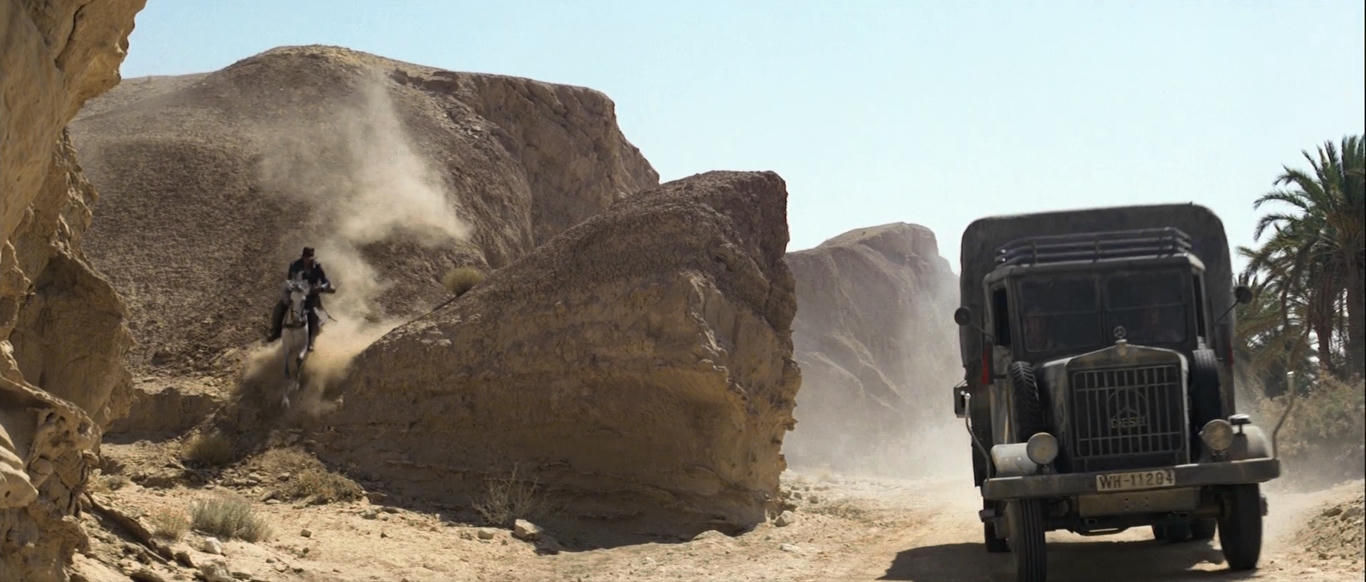
Another frame from the truck chase sequence (top bluray, middle WOWOW, bottom regrade):

To me the regrade just looks so much better than either the bluray and the WOWOW. Again the sky just doesn't look right in the bluray and the WOWOW, unlike in the regrade. The colors in the regrade are more saturated, but the regrade also has more depth. The bluray and WOWOW are pretty flat, with the bluray clearly the worst. The guys in the truck are also better visible in the regrade, where they are most difficult to see in the WOWOW.