logo Sign In

Cobra Kai

User Group
Members
Join date
20-Sep-2011
Last activity
3-Jun-2025
Posts
466

Post History

Post
#557217
Topic
Whose arm?
Time

csl said:

The blood is supposed to be there. The entire scene is a homage to a scene in Kurosawa's Yojimbo (which plays out almost identically), which also cuts to a shot of a bloody arm.

If anyone has a copy of Yojimbo and didn't catch it when watching it or haven't watched it yet, it happens about 19 minutes in.

Interesting - i didn't know that.  Yojimbo is a great movie.  Definitely a must-see for anyone that hasn't seen it.   

Post
#556389
Topic
Harmy's STAR WARS Despecialized Edition HD - V2.7 - MKV (Released)
Time

Harmy said:

Thanks guys.

I don't see the flicker. Anybody else sees this? Can you give a time where that happens? The pandown is a 2D animation of a premade matte and I didn't manipulate it's brightness in AE, so there shouldn't be any flicker.

@Flynn: By a rough estimate, all the work that went into this clip took about 10 hours. With the crawl and receding logo about 30hrs.


I'm having Christmas with the fam right now and don't have access to the clip, but I'll try to post an example later.  The brightness definitely goes up and down right before the end of the pan and then stabilizes precisely when the camera stops.

Post
#555949
Topic
Harmy's STAR WARS Despecialized Edition HD - V2.7 - MKV (Released)
Time

Harmy said:

If I can make it in time, I have a new Christmas surprise planned for every night for the next four days, culminating with the next part of the workprint on Christmas eve :-)

Sounds great, Harmy - looking forward to it.  I was originally hoping you would be completely finished by Christmas so I could give a few of my friends an awesome Christmas present.  But of course the most important thing is that you take your time and not rush things.  Very pleased with what I'm seeing so far - nice work.


Post
#555527
Topic
Harmy's STAR WARS Despecialized Edition HD - V2.7 - MKV (Released)
Time

PC-Max said:

I just have one question to those die hards out there. The SW the scene where Luck and Ben get stopped by the Stormtroopers in Mos Eisley. Two droids, white and yellow, pass in front of the camera. Now the White droid kinda feels right but the yellow feels added as it takes up more of the screen and REALLY breaks the viewers focus on the main characters. Is the yellow an addition or is it that I have not seen the original for so long in its purity that I have just forgotten it happened?

Merry Christmas people!


Yep, that yellow droid has always been there.

Post
#554779
Topic
Harmy's STAR WARS Despecialized Edition HD - V2.7 - MKV (Released)
Time

OMEN!-_-! said:

Cobra Kai said:

It looks to me like Harmy has done his homework and is simply trying to preserve the original colors as they appeared in the theater.  From different sources that I have seen, the theatrical version appears to have had somewhat of a warm look anyway, and obviously was much much warmer than the 2004 and later versions. (There's a great reference shot of Leia on Tantive IV over on mverta's site that illustrates the difference between the gout, 2004, and the corrected legacy preservation).

Obviously it won't be 100% accurate until a better reference source becomes available, but I am happy for the most part from looking at the wp.  

I don't doubt for one second that Harmy hasn't done his homework Cobra, I just have my doubts about the colour grading accuracy of sources like the saturated GOUT and the Star Wars frames on jedi1.net that have predominantly strong yellow fade. Only these few frames from Star Wars look fairly accurate to me (based on flesh tones) Of course, they have issues as well, just not as much as the others IMHO:

http://www.jedi1.net/images/1600/ANH-Ben_Kenobi-05919-1600.jpg

http://www.jedi1.net/images/1600/ANH-Stormtrooper-02011-1600.jpg

http://www.jedi1.net/images/1600/ANH-Rebel_Alliance-04406-1600.jpg

http://www.jedi1.net/images/1600/ANH-Rebel_Alliance-03102-1600.jpg

http://www.jedi1.net/images/1600/ANH-C-3PO-03272-1600.jpg

The first film is meant to be warm, no question, I agree 100%. The question is how warm though. I just think that the yellow is a little too overwhelming in the workprint sometimes, like watching the theatrical release through yellow sunglasses. The scene with Tarkin and his boys having a meeting on the Death Star is one such scene, their flesh tones are so yellow that they all look like they're suffering from yellow fever. Just my two cents. I'll shut up now.


No, I hear what you're saying.  Certainly the saturated gout isn't a reliable source by itself.  I wish I could look at that Tarkin scene again to see if we're seeing the same thing, but for some reason I already dumped the workprint off my computer. (dang it!)  It also probably doesn't help that we're all viewing this on completely different monitors. 

Someone here at the forum just needs to go ahead and find a pristine technicolor print for Harmy to look at. :)

Post
#554773
Topic
Harmy's STAR WARS Despecialized Edition HD - V2.7 - MKV (Released)
Time

It looks to me like Harmy has done his homework and is simply trying to preserve the original colors as they appeared in the theater.  From different sources that I have seen, the theatrical version appears to have had somewhat of a warm look anyway, and obviously was much much warmer than the 2004 and later versions. (There's a great reference shot of Leia on Tantive IV over on mverta's site that illustrates the difference between the gout, 2004, and the corrected legacy preservation).

Obviously it won't be 100% accurate until a better reference source becomes available, but I am happy for the most part from looking at the wp.  

Post
#554349
Topic
Harmy's STAR WARS Despecialized Edition HD - V2.7 - MKV (Released)
Time

Harmy, everything looks great so far.  I'm not scrutinizing this as closely as others here, but I did just notice a very significant color shift at around the 8:20 min. mark. 

The shot cuts away from Vader and when it cuts back to the last shot where he says "they'll be no one to stop us this time" the color has a little too much green:

It's most noticeable in the officer's flesh tone, but the whole shot has more of a "green tint" than the previous.


Post
#554197
Topic
Harmy's STAR WARS Despecialized Edition HD - V2.7 - MKV (Released)
Time

Harmy said:

@Cobra Kai: Yeah, no, because the video releases of the 97SE got their own colourtiming - just look at the whole Tatooine sequence, it has a distinctive pink tint throughout. I use the GOUT and photos like the one You_Too posted.

@Harmy

Yes but the GOUT is so undersaturated (as is illustrated on this page: http://savestarwars.com/goutcorrect.html), I would think it would not be a reliable source?  I'm not being critical, just trying to learn as you obviously know more than I do about this.

Thanks.

Post
#554185
Topic
Harmy's STAR WARS Despecialized Edition HD - V2.7 - MKV (Released)
Time

Harmy said:

You_Too said:

And in my opinion the change in this point is very visible too, especially on a calibrated screen:

http://img151.imageshack.us/img151/9385/swdeed1stworkprintmp4sn.th.pnghttp://img69.imageshack.us/img69/9385/swdeed1stworkprintmp4sn.th.png

And these pics are a nice example - they are clearly inconsistent but should I change the one on the left to look like the one on the right or vice versa?

My personal taste would lean towards the colour-timing of the one on the right, because it's more white than the left one, which has a blue/cyan tint but I think the left one is closer to the original, so I'll probably go with that.

What are you using as your reference when you say it is "closer to the original"? 

I've read that Lucas used a fade-free technicolor print as the color reference source for the '97 SE.  That being the case, wouldn't the '97 HD broadcast be our best available color reference? 


Post
#553768
Topic
Star Wars DVD Covers
Time

EyeShotFirst said:

ChainsawASH did the 90 box set, so I've decided to tackle the 92 box set.


I will upload these after I am confident in their quality, and I am done with the Blu Ray sized covers I am doing for Harmy's edits.

The images I used are the highest quality I could manage. Painstaking hours in front of a computer searching for the highest of quality images. The fonts I used aren't exact, but they are very close.


Anybody know if these covers are completed yet? Thanks.

Post
#553757
Topic
regrading/editing original trilogy using blu-rays and german hdtv streams to remove bad but not all specialised/blu-ray changes (* unfinished project *)
Time

OMEN!-_-! said:

Darf Muffy said:

Adywan's

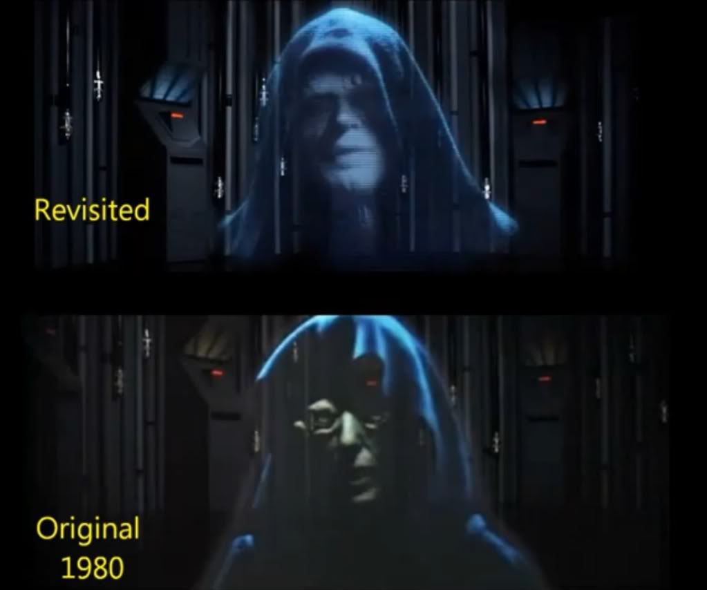
Adywan's emperor scene should be in place of the rubber face ghoul of old with this original gout dialogue ...

Clip Link: http://youtu.be/yZlSwBag61o


I was actually planning to use the original emperor, which I like the look of (always have). He looks a lot more sinister than the SE emperor and even Adywan's Emperor IMHO, I love the way his face is mostly concealed in shadow. I don't believe in this continuety revisionism that GL is so fond of to fit later films (like changing the voice of Bobba Fett to give another example).

I've been hearing rumours that Ian Holm may be replaced by Martin Freeman at the beginning of FOTR in a new FOTR 'ultimate edition' that'll be released when The Hobbit comes out, but I REALLY REALLY hope that's not the case. I'm pretty sure that Peter Jackson would never do that to Ian Holm. I just wish that they would just leave these old films that have already been released theatrically and seen and loved by so many millions alone. The old emperor looks much much better than the special edition emperor anyway (don't get me started on the dialogue changes...), so why change it!?

The work Adywan has done for his revisited versions is amazing but this project is about removing all the bad changes and reinstating the original theatrical versions of said changes, not creating totally new content like Adywan has done. For me at least, that's going too far. That said, I'm very much looking forward to seeing what Adywan's been up to these last few years with ESB revisited and especially all the new content he's added. :D


Yes, completely agree, OMEN.  The original scene is awesome and the emperor looks pretty creepy.  No need to mess with this scene.

Post
#553578
Topic
regrading/editing original trilogy using blu-rays and german hdtv streams to remove bad but not all specialised/blu-ray changes (* unfinished project *)
Time

So, what is the best color reference for ESB?  The GOUT? 

Harmy, I've noticed that your DeEd version differs considerably in color from Adywan's restoration, with his Hoth scenes appearing more white than yours.   These are my two favorite ESB restorations, so just wondering how each of you came to your conclusions on the color?

Thanks.