- Time
- Post link
ww12345 said:
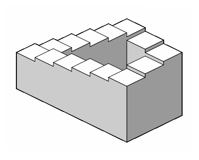
Whoa, I never knew that was supposed to be a circular building!
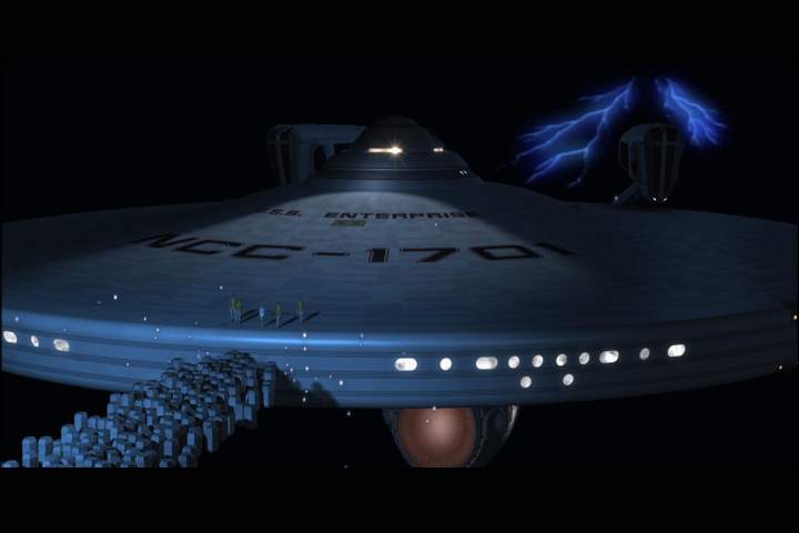
And that's exactly it. There is no context in the finished shot ..

If we put the context back in, by putting more of the matte painting back in (and taking the pointless foliage back out), suddenly it works ..

Well, except for that "curtain effect" of the bottom edge. (Next time, they shouldn't hire a matte cutter while he's stoned out ...)