
- Time
- Post link
Nah I didn’t listen to that piece of shit, just wanted to add to “Worst Album Covers” list.
I’ve literally made better album covers than that using MS Paint.

Opeth is cooool
Keep Circulating the Tapes.
END OF LINE
(It hasn’t happened yet)

The flows are insane.
Keep Circulating the Tapes.
END OF LINE
(It hasn’t happened yet)

Nah I didn’t listen to that piece of shit, just wanted to add to “Worst Album Covers” list.
Don’t do drugs, unless you’re with me.

I’ve never listened to a Kanye West song – at least not knowingly, I may have heard some without knowing they’re his – or album. Some people say he’s talented, but everyone hates his personality.
The Person in Question

I think we’ve reached a nadir.

I think we’ve reached a nadir.
As usual, I have no idea what you’re referring to.
The Person in Question
I think we’ve reached a nadir.
As usual, I have no idea what you’re referring to.
Album art and the album itself.
Kanye has some pretty good songs.
Keep Circulating the Tapes.
END OF LINE
(It hasn’t happened yet)
It’s like the anime discussion all over again.
I think we’ve reached a nadir.
As usual, I have no idea what you’re referring to.
Album art and the album itself.
Ok. I wasn’t sure if you were referring to the album art or me saying I’d never heard it.
The Person in Question
I’ve never listened to a Kanye West song – at least not knowingly, I may have heard some without knowing they’re his – or album. Some people say he’s talented, but everyone hates his personality.
I’m sure you have heard a hook or two through a radio or car stereo and in movie trailers. Probably most famous are Gold Digger and Black Skinhead which was used to great effect in the “Wolf of Wall Street” trailer. If you don’t care for hip hop you don’t have to bother. But if you want to know a little bit about Kanye… he made 5 mainstream, single-heavy successful albums. His last 2 were experimental and when I saw the pablo cover I didn’t know if it was joke or real.
Don’t do drugs, unless you’re with me.
Nah I didn’t listen to that piece of shit, just wanted to add to “Worst Album Covers” list.
I’ve literally made better album covers than that using MS Paint.
Nah I didn’t listen to that piece of shit, just wanted to add to “Worst Album Covers” list.
I’ve literally made better album covers than that using MS Paint.
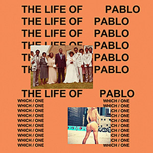
It looks absolutely horrible. The worst thing about it isn’t even how horrible it looks, but rather, it looks cheap. It’s like Times New Roman Font on a solid background with low-res jpg files. I’m also not even sure if the indentation is a mistake or not on the top line.
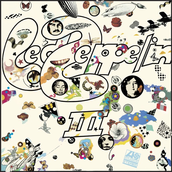
Compare that trash with this album cover:

This cover probably cost next to nothing to make, but it looks great and doesn’t look cheap and lazy.
The Person in Question

Nah I didn’t listen to that piece of shit, just wanted to add to “Worst Album Covers” list.
I’ve literally made better album covers than that using MS Paint.
It looks absolutely horrible. The worst thing about it isn’t even how horrible it looks, but rather, it looks cheap. It’s like Times New Roman Font on a solid background with low-res jpg files.
Looks like Arial font. Honestly, I don’t think it would look nearly as bad (yet still almost equally as cheap) if the images weren’t there and it was just the text.
Army of Darkness: The Medieval Deadit | The Terminator - Color Regrade | The Wrong Trousers - Audio Preservation
SONIC RACES THROUGH THE GREEN FIELDS.
THE SUN RACES THROUGH A BLUE SKY FILLED WITH WHITE CLOUDS.
THE WAYS OF HIS HEART ARE MUCH LIKE THE SUN. SONIC RUNS AND RESTS; THE SUN RISES AND SETS.
DON’T GIVE UP ON THE SUN. DON’T MAKE THE SUN LAUGH AT YOU.
Do I have to link all of these posts in the “Missed The Joke” thread? The point is that it looks bad. It’s supposed to look bad. =P
Keep Circulating the Tapes.
END OF LINE
(It hasn’t happened yet)
But it still looks bad.
Nah I didn’t listen to that piece of shit, just wanted to add to “Worst Album Covers” list.
I’ve literally made better album covers than that using MS Paint.
It looks absolutely horrible. The worst thing about it isn’t even how horrible it looks, but rather, it looks cheap. It’s like Times New Roman Font on a solid background with low-res jpg files.
Looks like Arial font. Honestly, I don’t think it would look nearly as bad (yet still almost equally as cheap) if the images weren’t there and it was just the text.
Arial is always a bad choice compared to most other fonts. It’s a cheap knock-off of Helvetica. If you need something that looks like Helvetica, spring for Helvetica.

The trick to liking Kanye is to think of him as a character. He’s a fascinating dude if you take a few steps back.

Nah I didn’t listen to that piece of shit, just wanted to add to “Worst Album Covers” list.
I’ve literally made better album covers than that using MS Paint.
It looks absolutely horrible. The worst thing about it isn’t even how horrible it looks, but rather, it looks cheap. It’s like Times New Roman Font on a solid background with low-res jpg files.
Looks like Arial font. Honestly, I don’t think it would look nearly as bad (yet still almost equally as cheap) if the images weren’t there and it was just the text.
Arial is always a bad choice compared to most other fonts. It’s a cheap knock-off of Helvetica. If you need something that looks like Helvetica, spring for Helvetica.
We understand that you don’t get it, but do you have to go on and on about it?
The trick to liking Kanye is to think of him as a character. He’s a fascinating dude if you take a few steps back.
Yeah, I kinda agree. And Gold Digger is a good song.
He can also be an annoying idiot.
Nah I didn’t listen to that piece of shit, just wanted to add to “Worst Album Covers” list.
I’ve literally made better album covers than that using MS Paint.
It looks absolutely horrible. The worst thing about it isn’t even how horrible it looks, but rather, it looks cheap. It’s like Times New Roman Font on a solid background with low-res jpg files.
Looks like Arial font. Honestly, I don’t think it would look nearly as bad (yet still almost equally as cheap) if the images weren’t there and it was just the text.
Arial is always a bad choice compared to most other fonts. It’s a cheap knock-off of Helvetica. If you need something that looks like Helvetica, spring for Helvetica.
We understand that you don’t get it, but do you have to go on and on about it?
I do get that it’s supposed to be terrible.
Do I have to link all of these posts in the “Missed The Joke” thread? The point is that it looks bad. It’s supposed to look bad. =P
Eh, you never know with Kanye.
The Person in Question
The trick to liking Kanye is to think of him as a character. He’s a fascinating dude if you take a few steps back.
This.
Keep Circulating the Tapes.
END OF LINE
(It hasn’t happened yet)
The trick to liking Kanye is to think of him as a character. He’s a fascinating dude if you take a few steps back.
This.
I just don’t like his style of music. I just don’t like it.
You have to like it, it’s mandatory.
Keep Circulating the Tapes.
END OF LINE
(It hasn’t happened yet)
The Person in Question