NeverarGreat said:
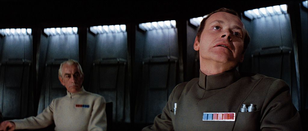
I think it looks quite good, I’d just make sure that Tarkin’s uniform remains green even in the shadows.
As you know my corrections have been manual in contrast to your algorithm. I think that this provides certain advantages. I was able to achieve my results with only a curves adjustment, saturation adjustment, and the channel mixer. The channel mixer is one of the most versatile tools on account of it’s ability to reduce the stressed color of the blu-ray. If the green-green channel is lowered and mixed into the red and blue channels, it reduces the green artifacts that pop up on the skin tones in these scenes, as well as give Tarkin’s skin tone a more consistent hue. Also, where the skin tones are a great deal darker than the film sources suggest, one way to fix this is to boost the red-red channel, then mix green-red and blue-red (while keeping the totals of these mixes at 100 of course). The result is reds which are substantially lighter and less saturated than the Blu-ray, and a good match to film sources. Of course you must keep an eye on the solid red, green, and blue lights in these scenes to make sure they don’t become too diluted, but often these lights are too saturated anyway. This makes me think that a channel mixer tool was used on the Blu-ray to get the colors this distorted in the first place, otherwise it wouldn’t work so well in fixing these problems.
The problem is not in the algorithm, but in the quality of the reference. For example, if I use the algorithm to match the bluray to your regrade,
NeverarGreat:

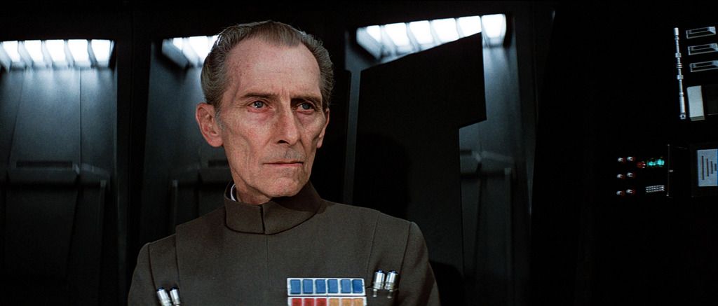
Bluray matched to NeverarGreat with algo:

So, if the reference is of high enough quality, the algorithm can probably reproduce it, to a high degree of accuracy.
I think your regrades are the best I’ve seen so far for these shots, so I think I will stay close to your grading for this scene. One thing I noticed in your regrade of the Tarkin shot, is that the walls have more teal, than for the other shots. I suspect this is, because you wanted to keep Tarkin’s atire green, which conflicts with the desire to have less green in the walls. The strength of the algorithm, is that it can solve such conflicts of interest. For example, I can manually adjust specifically for the teal to be blue, using GIMP:

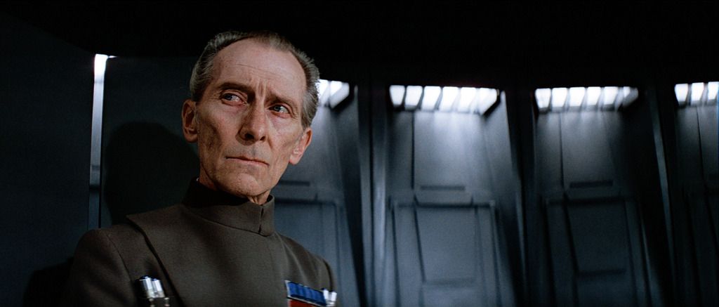
By doing this, Tarkin’s atire has the same green color, but the walls are now consistent with the other shots, which is difficult with curves adjustment. Subsequently, I can match the bluray to this adjusted grading:

The algorithm is in a sense a form of automated curves adjustment. If you use only one color space, it in fact is automated curves adjustment in the RGB color space. The curves are adjusted, by matching the cumulative probability distributions for the red, green, and blue channels. The problem is that this somewhat limits your degrees of freedom in terms of the colors than can be reproduced independently. This is why the algorithm repeats the same curves adjustment procedure in up to 100 different color spaces.