
- Time
- Post link
The cleverly re-created opening crawl aliases on my display somewhat - is that just me?

keep in mind harmy if you said "live with version 1 of SW" I would have no problem with that. It's certainly better than Georges alternative. I recently burned version 1 and watched it on my tv and it looks amazing.
you're pretty much just polishing gold at this point.
can't wait for the ROTJ work print. Hopefully we catch more things this time instead of finding them on version 1. :-)
"I will laugh my ass off a hundred years from now when the only version of STARWARS people remember are harmys despecialized editions. They will project it on a 20' by 40' screen with perfect quality."

Harmy, I know you toned down the overly-blue color on R2 as much as possible, but I think there's one that you missed. I don't have my disc with me right now, but I think it's around 8:40 or 8:50. It's the shot where, as the droids walk away from the pod, and R2's head comes up over a dune in the foreground.
You seem to have corrected the blue when the camera comes back to this angle a moment later. Can you give this shot the same treatment?
You know of the rebellion against the Empire?

Harmy said:
"A Game of Thrones - The Movie"

Erikstormtrooper said:
Harmy, I know you toned down the overly-blue color on R2 as much as possible, but I think there's one that you missed. I don't have my disc with me right now, but I think it's around 8:40 or 8:50. It's the shot where, as the droids walk away from the pod, and R2's head comes up over a dune in the foreground.
You seem to have corrected the blue when the camera comes back to this angle a moment later. Can you give this shot the same treatment?
I just checked my disc. This issue with the blue R2 occurs at 9:13 to 9:24.
You know of the rebellion against the Empire?

Well, that one will probably stay the way it is, sorry.

I'm very impressed with your version Harmy, I did find some things I didn't like - like the escape pod and the SE motion-blur that sticks out like dogs balls... and that shot with the stormtrooper and the bods in the speeder that has been "corrected" (with his shoulder-pad wavering).
I haven't gone through your whole movie yet, but just to let you know, check out 1:03:24 with the "blue wall" (I corrected this in my script) using this line:
SE04.t(91213,91277,"What a distracting blue wall!").tweak(10,-1,minsat=18,maxsat=150)


[ Scanning stuff since 2015 ]
Oh I could adapt the code in avisyth for the subtitles for you if you were interested.
"Power to destroy an entire planet" <--- there is a star between the A and N in "an" that gets carried with the text. There's another one between R and M in armored. "against the evil Galactic" <--- there's a star above A in Galactic. You have done an AMAZING job with the crawl. Only change I would like to see is a pan down to the GOUT version (keeping the stars as you've prserved them).
I'd also like to see the original version of Leia's hologram restored. When I did it in my version you could barely notice the quality difference between the 04 and the GOUT, and it should look equally as good for you!
I'll go through your version fully later for you, see if I notice anything else :)
Here's that blue wall I was talking about so you can see what I mean:
The blue is static, really, really awful distracting and ugly!
[ Scanning stuff since 2015 ]
RU.08 said:
I'm very impressed with your version Harmy, I did find some things I didn't like - like the escape pod and the SE motion-blur that sticks out like dogs balls...
Never really stuck out to me. I mean, I know it's a change but not one worth using GOUT footage.
and that shot with the stormtrooper and the bods in the speeder that has been "corrected" (with his shoulder-pad wavering).
Well, that's there and it'll stay. Although there are these minor mistakes that most people wouldn't notice, I think it's the best way to do the shot - this way it's actually 100% HD. I think it was actually the hardest shot I've worked on.
I haven't gone through your whole movie yet, but just to let you know, check out 1:03:24 with the "blue wall" (I corrected this in my script) using this line:...
I don't know how to use scripts and I'm not planning to learn. And I don't really mind it. There is a lot of blue walls like that that are actually original, so this one doesn't really bother me.
0:26:34, you used GOUT footage - it is better to do a chroma-swap with the GOUT like this:
That could be worth a try. Does anyone know if you can do chroma-swap in After Effects?
It'd be nice if you could redo the subtitles too:
That's using AlternateGotNo3D and double-spacing (and the subtitles fall in the bottom-spot of the 2-line one, not the top).
That's incorrect though. The single lines should appear on top and the second line should be bellow it. And I quite like my subs the way they are.

Definite +1 on the 0:26:34 shot - that was one of the shots that stood out for me when I watched this.
I didn't really notice any blue walls or left-over SE stuff, although now that I come to think of it the Leia hologram did look different but I thought it was just down to being in HD.
Correct me if I'm wrong, but are your Greedo subs slightly different to those in msycamore's script? It would be good use his subs in your version as they are closest to the original, but yours did seem pretty close.
Guidelines for post content and general behaviour: read announcement here
Max. allowable image sizes in signatures: reminder here
Yeah, I made the subs in my editing program and used a different font (although I did use one of those fonts suggested by msycamore in his thread as being close as well).
The cleverly re-created opening crawl aliases on my display somewhat - is that just me?
Never really stuck out to me. I mean, I know it's a change but not one worth using GOUT footage.
Well, that's there and it'll stay. Although there are these minor mistakes that most people wouldn't notice, I think it's the best way to do the shot - this way it's actually 100% HD. I think it was actually the hardest shot I've worked on.
I don't know how to use scripts and I'm not planning to learn. And I don't really mind it. There is a lot of blue walls like that that are actually original, so this one doesn't really bother me.
That's incorrect though. The single lines should appear on top and the second line should be bellow it. And I quite like my subs the way they are.That's interesting, I thought they should be on the bottom... why did you think they should be on the top?
[ Scanning stuff since 2015 ]
Check out the scene I posted a screenshot of. In fact, here is a comparison... first GOUT, then SE then corrected SE best of all it's only 10MB!
Dunno, don't really like the washed out GOUT colours. And you can see the edge of where the blu starts. And mainly, it's not HD.
If on the other hand you could please do the Luke and 3P0 shot chroma swap for me in 720p, I would be very grateful. I can't seem to figure out how to do something like that in AE. And I guess if you can't do it in HD, anamorphic SD would do but HD would definitely be better.
That's interesting, I thought they should be on the bottom... why did you think they should be on the top?
From various sources such as theatrical bootlegs and puggo grande.
One question for you - whis is the main 720p GOUT you used, which is the main 97 SE you used? Thanks.
I only tried to be constuctive in my critisim, I am still very impressed by your version and I hope you didn't take it the wrong way (I certainly don't want that)!
No no, I'm glad you pointed these things out, thank you. It's hard to convey tone in writing sometimes.
Yeah, it does that a little at the end. But even the official crawl does.

RU.08 said:
...and the subtitles fall in the bottom-spot of the 2-line one, not the top.
Like Harmy said, that is incorrect. If you're going by my screen-caps in this thread: http://originaltrilogy.com/forum/topic.cfm/Greedo-Jabba-subtitles-theatrical-placement-and-fonts/topic/11463/ you need to keep in mind that the 16mm transfer is cropped at the bottom of the screen, the single 2-line dialogue however is cropped at the top instead as I took that from the Swedish transfer to have the complete line visible, I think that may be what fooled you. When doing your placement, go for visual cues instead.
We want you to be aware that we have no plans—now or in the future—to restore the earlier versions.
Sincerely, Lynne Hale publicity@lucasfilm.com
Harmy,
There's one instance of jaggies that I noticed. It occurs at 1:42:30.
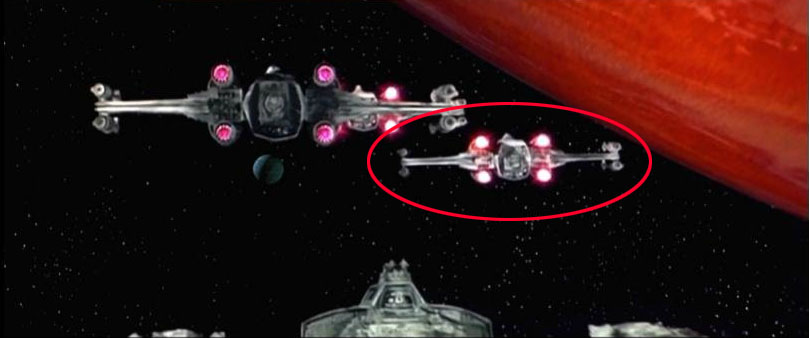
The jaggies occur in the wing as the fighter rotates slightly. Do you think you can reduce this by manually rotating a static image? The lighting might make that impossible though.
You know of the rebellion against the Empire?
Yeah, I tried that before. It's quite hard to track as well.

Harmy, are you using Mocha to do the tracking and stabilising or After Effects?
After Effects. I've heard of Mocha but never tried it. Would it work with AE7?
Mocha comes free as part of after effects cs4 & cs5. The standard tracking and stabilising that comes with after effects is useless . If you only have AE7 then i don't think it would work, plus i don't think you can get it separately
You can actually. But whether or not it will work with AE7 is another question. I'd like to upgrade but I just can't afford it right now. And I couldn't use CS5 at all because I'm running a 32bit system :-(

adywan said:
Harmy, are you using Mocha to do the tracking and stabilising or After Effects?
I doubt drinks will have an effect on computer software

;) <==winky
<span style=“font-weight: bold;”>The Most Handsomest Guy on OT.com</span>
Well, alcoholic drinks can definitely affect stabilization ;-)

Harmy, will you be updating your screenshots page on what improvements you have done?
looking for HDTV of the Attack of the Clones and Revenge of the Sith. Also HDTV of The Lord of the Rings trilogy
Yeah, definitely :-)