
- Time
- Post link
If the titles and numbers get removed, I'd like the idea of having the different colored logos replacing "Star Wars" for each movie. But overall, I think everything should be kept the way it is.
If the titles and numbers get removed, I'd like the idea of having the different colored logos replacing "Star Wars" for each movie. But overall, I think everything should be kept the way it is.

https://www.deviantart.com/users/login?ref=http://my.deviantart.com/messages#/d2slwuo
Found this cool pic. Thought people would appreciate it.

^not showing up

Link works for me, but it's not really ESB:R related from what I can see.
“It’s a lot of fun… it’s a lot of fun to watch Star Wars.” – Bill Moyers

corellian77 said:
Link works for me, but it's not really ESB:R related from what I can see.
Well for me its the view of the other end of Vader & Palpy's holocall, tiny Vader, huge Palpy....
J
Hold me closer, tiny Vader....
...
...
Sorry.

adywan said:
@ ImperialFighter
1. What you are seeing is the overlaying of the monitor bleeding over the top of the outer rim of the panel. It's been fixed
2. you are seeing the light from the outside of the chamber reflecting on the chamber as the door fully opens
1. Neat to know that you've been able to tweak the frame edges 'glitch' during this 'viewscreen' shot after all adywan!
2. This piece seemed distracting, compared to how the rest of 'chamber's exterior seemed to reflect as the entrance door opened, but it's likely to be a reflection from the very last moment of the door opening, after all. Thanks for clarifying.
adywan said:
All i'm doing is adding some small insects and other small creatures to dagobah. Nothing will be in your face but just there to give dagobah a little more life. Certainly no glowing creatures like in the ROTS deleted scene.
I caught the full snippet about this in doubleofive's 'Revisited' page. This sounds like a terrific subtle enhancement. The jungle environments in the 'King Kong' remake and 'Avatar' really came to life whenever there was insect-life included. Really looking forward to whatever you come up with concerning this addition. :)
Also, just wanted to throw in my own tuppence worth concerning the introductory titles, since it was brought up recently - personally, while I'd like to keep the original yellow 'STAR WARS' logo and 'chapter headings' exactly as they are, I agree with those that would ideally like to see the actual 'chapter numbers' removed for the 'Revisited' saga, since you're redoing 'ANH:R' one day.
My reasons are these -
It wouldn't tie me down to showning them in GL's 'saga' rotation from I to IV. In future, I could introduce the saga to family members and friends in the way they were originally released...without them being distracted by the fact that that there are 3 movies 'beforehand', that they might feel they should really watch first.
Those that want to show GL's current 'chapter order' of the saga's 'revised timeline' can still do so anyway if the existing numbers are removed...but this allows me (and others of the same mind) to introduce the whole saga with the original opening bang that 'A New Hope' offers, and hopefully gets newbies hooked on the saga in the same way I originally was, by the end of 'A New Hope'. Once they've seen how everything else plays out in the original trilogy, THEN they can watch the additional 'backstory' that the prequels spelled-out in all too-much detail...without them spoiling ESB's 'Vader is Luke's father' reveal...or ESB's atmospheric 'Emperor is Vader's boss' reveal...or ESB's atmospheric 'Yoda is the Jedi Master' reveal...or ROTJ's atmospheric 'Jabba in his lair' reveal...keeping the total mystery that his 'gangster' character still had at the end of ESB originally, when Han was taken to him...until things changed and he got added to ANH:'Special Edition', and then 'first' revealed as briefly starting a race in PHANTOM MENACE instead.
While I'm guessing/hoping that there's not going to be any mention of 'midi-clorians' in 'PHANTOM MENACE:Revisited' to ruin the whole mysterious 'Force' vibe established in ANH and ESB...I'd still like to have any future newbies just hear about the 'Clone Wars' first during Obi-wan's speech in ANH too...so that they've at least got the explanation of how things 'came about' to look forward to, by the time they eventually clap eyes on the prequels...

Ghostbusters said:
EyeShotFirst said:
Chainsaw had some good ideas a while back:
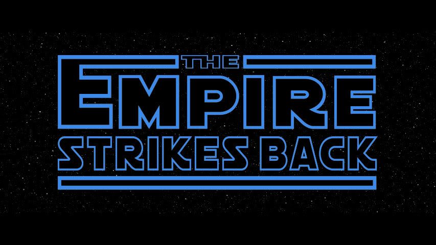
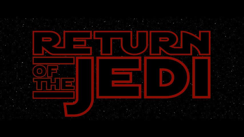
Then 005 had colour ideas
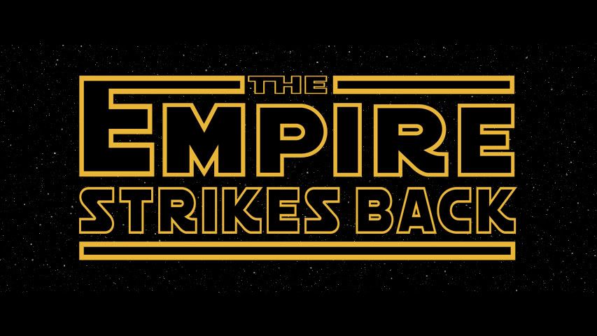
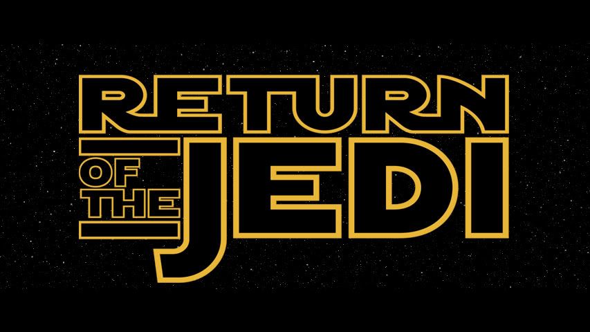
I'm all for this. I like the scroll being yellow, blue or red. When I think of ROTJ, I think of green more than red though, but red works too. Adywan I beg you, please get rid of the movie title numbers. I don't want the OT associated with those pieces of crap. I wanted this done, but I never thought it had a chance of happening since Adywan said he wasn't going back to ANH.
I like the idea of the title logos appearing instead of text too.
Cool logos - I have always associated ROTJ with red - I think is is from the original 'Revenge' posters that used red as the text.
He's more machine now than man...twisted and evil
He's more machine now than man...twisted and evil

So have I earned my nickel yet?

muddyknees2000 said:
So have I earned my nickel yet?
If we ever meet up, I'll give you a dime.
ray_afraid said:
muddyknees2000 said:
So have I earned my nickel yet?
If we ever meet up, I'll give you a dime.
Vindication!!!

Personally, I like the iconic yellow lettering with the traditional "Star Wars" logo at the beginning of each film. However, removing the chapter headings would not be too much of a problem......especially if Ady plans on doing so for the special edition of episode IV. I think that whatever changes are made.......they need to remain consistent across the board.
"Remember, the force will be with you....always."

....except for the fact that Ady is going to edit the PT also
John Williams score to Return of the Jedi Remastered/Remixed:
http://originaltrilogy.com/forum/topic.cfm/JOHN-WILLIAMS-Star-Wars-Episode-VI-Return-of-the-Jedi-Remastered-Edition/topic/14606/page/1/

Except that he's not seriously considering changing the crawl, so this bickering is pointless.
Star Wars Revisited Wordpress
Star Wars Visual Comparisons WordPress
What if I was given a nickel EVERYTIME the point was proven to be moot... *wrings hands greedily*

I just thought I would say that for the SW Radio Drama CD’s SW Was yellow TESB was orange And ROTJ was blue And for the Last release of the On VHS and LD SW was blue TESB was purple And ROTJ was Red And on the Last release boxes SW had a big SW & a little ANH TESB had little SW big TESB ROTJ had little SW big ROTJ

doubleofive said:
Except that he's not seriously considering changing the crawl, so this bickering is pointless.
No matter the times we tell them, they keep on arguing on and on and on...
Sooooo pointless.... ;)
Do you like astromech droids? Check The Astromech Collection fan page!

Well that's my colour blindness test out of the way :-)
Seeing as Ady has said he wasn't entirely serious is this the right place for this discussion?
It's already been raised in the Wishlist thread it might make more sense to continue the swatch comparison conversation over there.
Yes, please. I would like to ignore this discussion in the PROPER thread

Again, the last couple of pages have been "interesting." It was cool seeing those old logos again, even if they're not going to be used in this project.
If the colored logos WERE used, what colors would be used for the prequels?
Wrong thread.
We need Ady to come in again and mention something nigh insignificant so we can analyze it to death, as we are wont to do. Haha. ;)

What about that little bit of Cloud vapor on Chewie's foot?
its almost as annoying as that bit of sand, & don't get me started on the snow flake!
Bingowings said: Do you want to see the project finished as a playable film or a flick book?