Alright a new clip! Thank you for sharing, Ady! And in typical fashion, here is one of my long posts 😄
Regarding the 3PO/sand crawler shots, couldn’t speak much about filmmaking rules so I’d defer to the folks who know that stuff better, but I will say this: Did I find it jarring? A bit at first, but I think that was just because of how used to the original I am. Did I feel lost as a viewer? Nope, in fact I could confidently draw and label a triangular map. Can or should the 180 rule be broken in this instance? That I’m not sure, but if there is a possible way to avoid it then that might be ideal. So take that as you will 😃
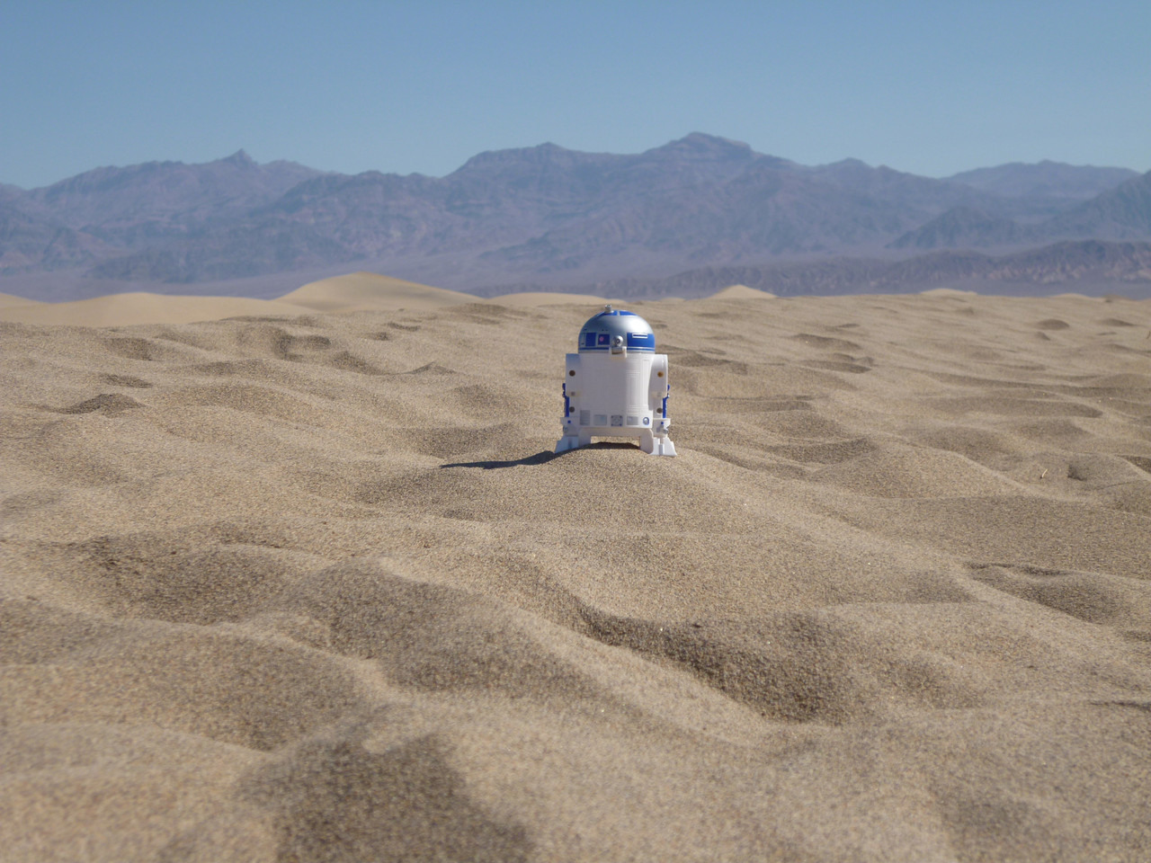
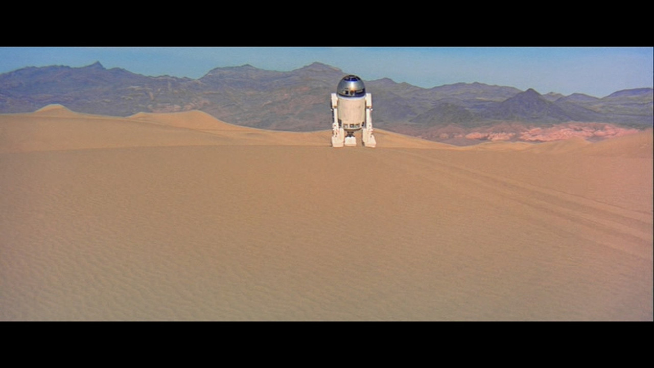
There is another shot I am hoping to bring attention to and it’s the one with R2 heading to the mountains immediately after parting with 3PO. Does anyone else notice how the mountains ahead appear to be less detailed in the Revisited:HD than the Official version? Here’s an image:
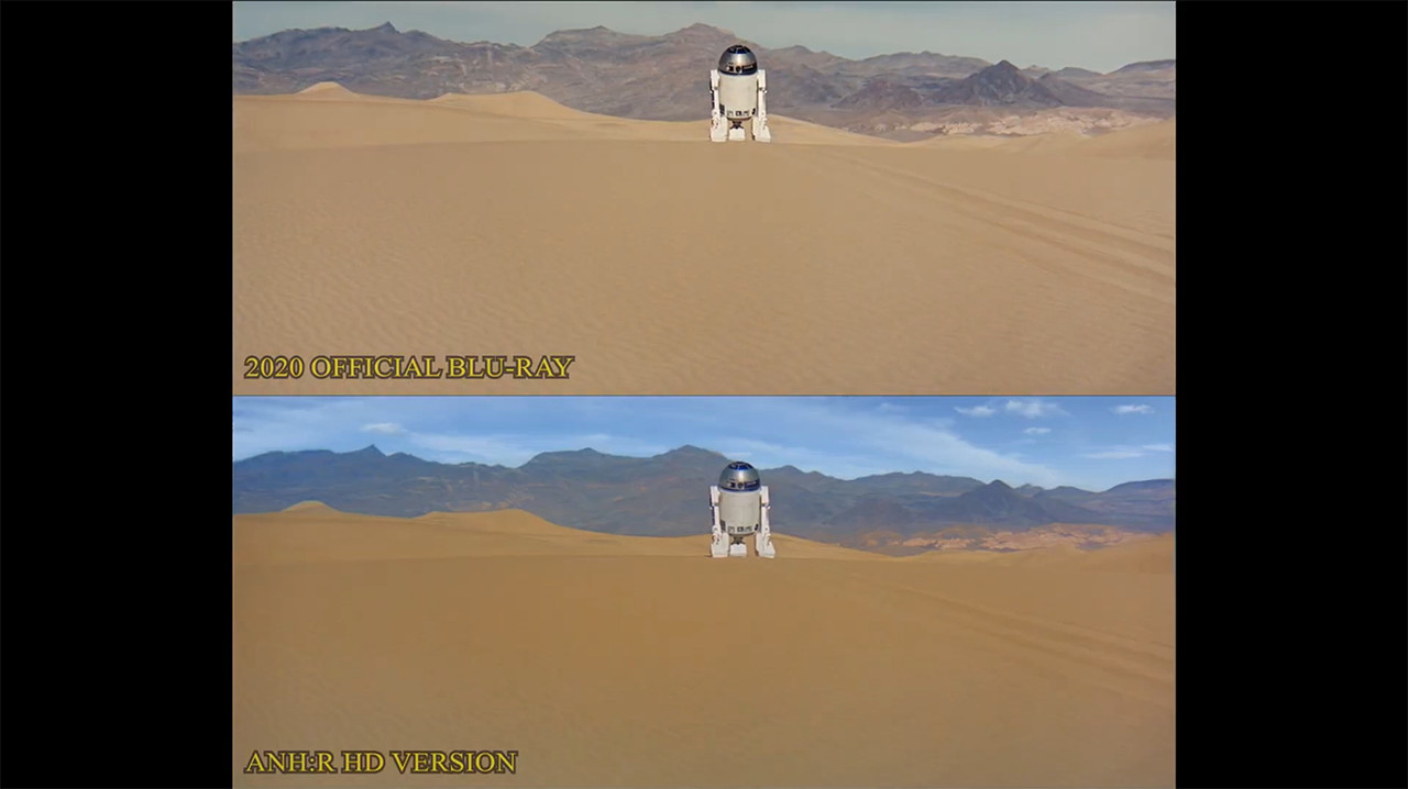
At first I thought it had to do with the blue atmospheric haze that was applied, but then I see at the bottom that the ripples in the sand are also less obvious. I rewatched the original Revisited and that has the details just fine. Here’s an image from the original Revisited:
Thought this would be worth mentioning, just in case 😉
And while we’re on this shot, if I may, from an artistic perspective, I have to admit I do prefer the mountains of the Official better for its dusty brownish color over the R:HD bluish color. I understand it’s because of the atmosphere, but the current dark blue hue does give the mountains a bit of a lush appearance, as if there is much vegetation (which of course there’s not 😄 ), whereas the dusty brown more clearly gives that dry and arid look as it should. So perhaps maybe just a little more brown and less blue could make all the difference? Even if more like the original Revisited in the above image. A constructive feedback at least worth considering I hope!
Now as for this next part, I had a long debate with myself if I should even bring it up or not, but since I’m already here, I my as well and let the chips fall as they may. And no worries if anyone disagrees 😃
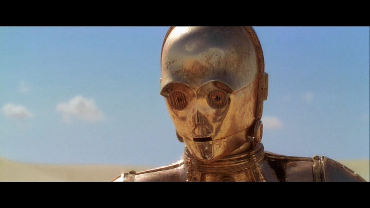
Let me first say I really do like the pretty, vibrant blue skies! That rich blue is striking and really pops against the sand, better than the Official’s mostly-colorless sky for sure. But… there is also the other part of me that thinks it could actually be too rich of a blue for Tatooine skies (most notably during the “Look sir, droids” and the sand crawler shot after that). Hear me out. Imagine if this blue hue were, overall, dialed down to be more of a light-blue with a slight hint of cyan, like how it was in the original Revisited, as a perfect example:
And for reference this is how it is currently in the Official and R:HD:
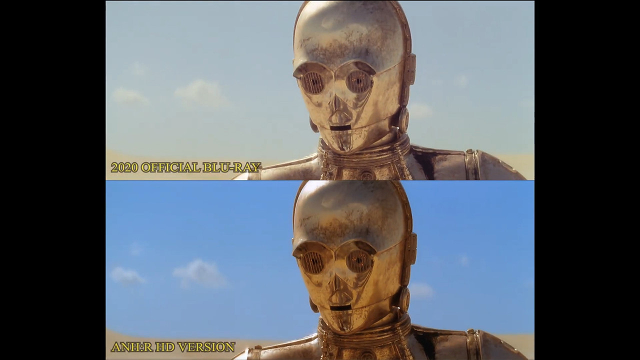
Notice how the original Revisited sky is somewhere between the Official and R:HD in color, which I feel could actually be the sweet spot for a normal sunny day on Tatooine. Then, what if that same deep blue color was instead applied to Yavin 4 and/or Endor, making it a noticeable and deliberate contrast to Tatooine. Indeed this makes sense from an artistic and storytelling standpoint by making a desert planet all the more different from the other planets we’ll see. And before anyone says “Earth has variations of blue skies,” yes I know and also know Tunisha can have vibrant blue skies too, but once again, from an artistic and storytelling point of view, I’d point out it’d look great to give each planet their own little idiosyncrasies, which is what makes a lot of these planets in Star Wars so great and memorable, even if it’s something as simple as what’s happening with the sky (such as Bespin always having beautiful clouds during the day and evening [which on a side note, if I’m completely honest, I might’ve preferred not seeing some of those beautiful clouds again for Tatooine, such as during the first good look of the sand crawler when the two gorgeous moons would have sufficed, but I admit that might be nitpicky]). But, Ady, if you are perfectly happy with how your Tatooine sky currently looks then you keep it - you’ll just have to forgive me as I tend to speak my mind from time to time 😄
I’ll finish this post by saying how I loved your attention to detail on everything else, Ady! Others have already spotted the various other fixes but I haven’t seen anyone yet mention the small blink-and-miss flash you added to the approaching sand crawler (for when the sun hits the cockpit windows), which is of course in homage to the flashing from the OG original (but not in the original Revisited). Chef’s kiss on that! Btw, I wonder if I was the only one, as a kid, who thought those flashes were actually hazard lights, lol.