- Time
- Post link
Isn’t that the official movie poster, though?
Nearly everything released through MGM looks horrible in one way or another, and that’s not counting the 007 movies.
.jpg)


Yikes
I decided to add a signature
Yikes. Between that notorious poster, and now this, poor Spidey’s had it pretty rough.
.
^![]()
You probably don’t recognize me because of the red arm.
Episode 9 Rewrite, The Starlight Project (Released!) and ANH Technicolor Project (Released!)
Re the last two examples. This isn’t the awesome coverart thread.
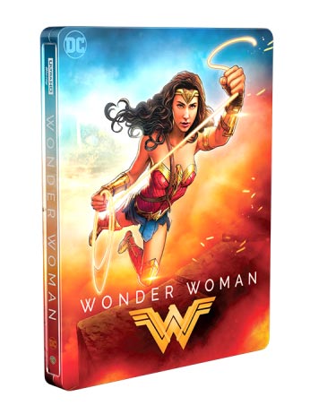
Considering the many, many lame photoshooped covers that the 5thE has had, that one is neat tidy, thought out (a consistent square motif) and colourful like the movie. You might not personally like it but it’s a good piece of design work.
The Spiderman one is supposed to look like a kid (Peter) drew it on his text book. True that the design idea has arguably been ruined by slapping the real title at the top and a drop shadow, instead of “Peter drawing it on” with a marker pen or something.
These are true related photo-shop nightmares…

+(Custom).jpg)
(Holy hell that 4K Kwai cover is terrible)
VIZ TOP TIPS! - PARENTS. Impress your children by showing them a floppy disk and telling them it’s a 3D model of a save icon.
Isn’t that the official movie poster, though?
Hopefully when this comes out on disc they will do something a bit more creative than have a photoshopped girl peeping behind a CGI chimp.


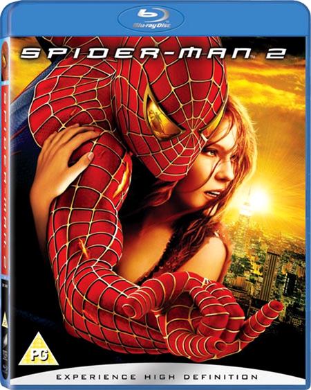
Oh dear me, you are right. The extra space on the BR to focus on that arm makes it worse. That reminds me of a recent movie poster that continues to freak me out (t’s also the DVD cover too)…

An uncanny valley effect of bad photo-shopping, where it’s close to being right but when you look harder everything is wrong.
VIZ TOP TIPS! - PARENTS. Impress your children by showing them a floppy disk and telling them it’s a 3D model of a save icon.
This image is hilarious.


Damn, that Spidey BD looks awful. Holy crap.
And in the time of greatest despair, there shall come a savior, and he shall be known as the Son of the Suns.
Yeah, thankfully it’s just the Target exclusive cover.
Has the standard cover been revealed anywhere yet? It seems odd to me that Target would announce their version of the product before Marvel shows anything.
.
No cover revealed yet for the regular release it seems. However, like Target, Best Buy has revealed their exclusive steelbook cover.
Very bland but it could’ve been worse, they could have used the Japanese poster:

VIZ TOP TIPS! - PARENTS. Impress your children by showing them a floppy disk and telling them it’s a 3D model of a save icon.

And in the time of greatest despair, there shall come a savior, and he shall be known as the Son of the Suns.

First question. Whose arm is that?!? There are many other questions.
The colour coordination is pretty good though.
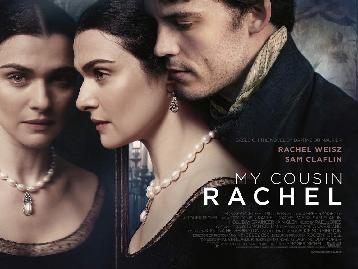
This following one isn’t actually completely terrible but a good example of taking the same piece of artwork and then f**king it all up. First the awesome US cover (which hues closely to the poster feel)…

…and the ruined UK cover…

I may have to get the more expensive film book edition, or import the US BR just to not have that on my shelf LOL.
VIZ TOP TIPS! - PARENTS. Impress your children by showing them a floppy disk and telling them it’s a 3D model of a save icon.
It wasn’t even Walt Disney Pictures when that was made. It was Walt Disney Productions well into the 80’s.
Where were you in '77?
First question. Whose arm is that?!? There are many other questions.
The colour coordination is pretty good though.
This following one isn’t actually completely terrible but a good example of taking the same piece of artwork and then f**king it all up. First the awesome US cover (which hues closely to the poster feel)…
…and the ruined UK cover…
I may have to get the more expensive film book edition, or import the US BR just to not have that on my shelf LOL.
*loudly sings God Bless the USA*
And here I was thinking the US Best Buy steelbook was bad.

.
And here I was thinking the US Best Buy steelbook was bad.
Yes.
This following one isn’t actually completely terrible but a good example of taking the same piece of artwork and then f**king it all up. First the awesome US cover (which hues closely to the poster feel)…
…and the ruined UK cover…
I may have to get the more expensive film book edition, or import the US BR just to not have that on my shelf LOL.
*loudly sings God Bless the USA*
And here I was thinking the US Best Buy steelbook was bad.
Wow, can’t beleive we actually “won” with WW:

This was the best poster for the movie IMO and it’s even hanging on my wall.
Sorry, not the “best cover art” thread…
And in the time of greatest despair, there shall come a savior, and he shall be known as the Son of the Suns.
Eh, it still sucks.
Eh, it still sucks.
Pretty much all poster art for wide releases look terrible nowadays, the only movie released this year that caught my attention based on poster art alone was Baby Driver. And that’s not even because I like minimalist poster designs (I think they can be quite pretentious actually), but because it was the most unique looking poster I saw in my nearest IMAX theater for duration of the year.
But anyway.


