logo Sign In

OMEN-_-

User Group
Members
Join date
20-Nov-2011
Last activity
5-Apr-2012
Posts
111

Post History

Post
#554531
Topic
regrading/editing original trilogy using blu-rays and german hdtv streams to remove bad but not all specialised/blu-ray changes (* unfinished project *)
Time

Okay, here's another clip, this time from ROTJ, when Leia first meets Wicket. In the blu-ray this scene has Wicket with blinking eyes and a creepy CG iris but i've used the hdtv streams to get rid of those and replace them with the original nonmoving eyes that don't scare the bejesus out of me each time I see them. Could you guys check this clip out and let me know whether you feel the parts with Wicket's original eyes taken from the hdtv fit in seemlessly with the blu-ray footage for you or not? Please feel free to comment on the brightness/contrast/colour grading as well.

Here's the clip:

http://www.megaupload.com/?d=530SJ54D

Post
#554527
Topic
regrading/editing original trilogy using blu-rays and german hdtv streams to remove bad but not all specialised/blu-ray changes (* unfinished project *)
Time

Hi terrasolo, thanks for your interest in this project. :)

Like you, I felt that many some of the changes were actually improvements and definately worth keeping. The Jabba scene in Star Wars was definately not one of them IMHO. It is far more effective to leave him as this sinister shadow hanging over Han Solo in the first two films until he's finally revealed in all his grotesque splendour in ROTJ. His added scene in Star Wars just makes him seem like a clown that couldn't hurt a fly, especially the bit when Han Solo steps on his tail, causing him to cry out in pain. I'm sorry, but the ROTJ jabba we all know and love would have had him killed then and there for that total lack of respect to his person. Instead GL plays the scene for laughs and in so doing totally undermines the threat that Jabba represents to Han throughout the rest of the trilogy. Very bad move IMHO and if I could only choose one scene to remove from the trilogy, it would most likely be this one.

As for making a 1080p mkv file, I don't see the need. You can just open the .m2ts video file that's part of the blu-ray folder and you can watch the films just fine without writing them onto blu-rays, exactly the same as watching a .mkv file.

Post
#554399
Topic
regrading/editing original trilogy using blu-rays and german hdtv streams to remove bad but not all specialised/blu-ray changes (* unfinished project *)
Time

Hey Darf Muffy, the edit's progressing very nicely, been busy the last few days sorting out stuff for Christmas but now that's done, I can get back to this. First I have to finish off looking through Harmy's workprint for any possible inconsistencies, then later on today hopeful i'll post a new clip for you guys to check out and hopefully provide feedback on. :)

Post
#554326
Topic
Harmy's STAR WARS Despecialized Edition HD - V2.7 - MKV (Released)
Time

Hey Harmy, was the list of shots I thought inconsistent that I posted before at all useful to you? I'm wondering whether or not you want me to continue where I left off. If not, no worries, i've always got my own project to get back to. :)

BTW I watched most of the work print on my TV and I feel you've done a great job maintaining colour grading consistency, the inconsistent shots were far less noticable that they were on my monitor, I'm not sure I would have noticed them if I hadn't known about them earlier in all honesty. I also enjoyed how your colour grading gives Star Wars an 'older' more vintage feel. Great job!

Post
#554181
Topic
Harmy's STAR WARS Despecialized Edition HD - V2.7 - MKV (Released)
Time

Harmy said:

I think the way you see colours also greatly depends at how long have you already been staring at your monitor, sometimes I colour-grade something in the evening and it looks fine and then I look again in the morning and it looks off.

Man, do I know exactly what you mean there. I think for this reason its best not to work for too long in one go on colour grading.

Post
#554180
Topic
Harmy's STAR WARS Despecialized Edition HD - V2.7 - MKV (Released)
Time

canofhumdingers said:


For the record, I think the walls looked fine and (while recognizing the pretty anal nature of my own points) think some people* are on the edge of ridiculousness with how anal they can be about the tiniest hint of blue or yellow or green or what-have-you. No doubt the official releases have atrocious colors that needed fixing, but I think we're pretty much there as evidenced by the fact that we're nitpicking over the smallest increments of color shades and tints.

*I'm not trying to single any particular person out with that comment. If we weren't all pretty anal about Star Wars to begin with, none of us would be here.


You wouldn't be talking about me by any chance? lol

Post
#554177
Topic
Harmy's STAR WARS Despecialized Edition HD - V2.7 - MKV (Released)
Time

You_Too said:

OMEN!-_-! said:

You_Too, I personally think the walls, the white light on the ceiling (yellow light in this case) and flesh tones are too yellow in this still and don't look 'natural' IMHO.

EDIT:

Just regraded this shot quickly so it looks more natural, at least to me. The walls/light look fairly white to me now, but the yellow tint is still noticable, annoyingly. Their faces could perhaps use a bit more red to make the flesh tones more natural. Saturation might also need to be boosted slightly. Anyway, definate improvement IMHO:

After a closer look and point sampling in photoshop, I can only agree. It was slightly too yellow. Your regraded version is slightly too blue though. So anyway, I did a final version, letting photoshop auto-balance the levels and now the RGB levels for white are very close. I also increased saturation slightly. So this will probably be the cleanest look for this image.

Your whites are still a little yellow there You_Too (at least on my monitor) but I like the flesh tones here the most of the three so it definately gets a thumbs up from me. Has your monitor been colour calibrated as well?

Post
#554171
Topic
Harmy's STAR WARS Despecialized Edition HD - V2.7 - MKV (Released)
Time

Harmy said:

Also OMEN, I'm not sure if your monitor doesn't add a bit of a yellow tint, you seem to see yellow a lot, where I don't see it at all. From what I see, the wall in the picture of Leia and Vader Yoo_Too posted, the walls are slightly bluish white with a bit of purple in the darker areas and I don't see even a hint of yellow anywhere in the walls. The faces of the people there seem to be a sort of pinkish orange, which I think is exactly what a normal natural skin colour. Actually, I'm sitting in a café right now and when I look around, people's faces seem even more orange than those in that picture.

EDIT: And in your regraded version, the walls now have a bit of cyan tint in the highlights and the faces seem unnaturally pale.

I definately agree that the faces are pale, which is why I suggested boosting red slightly or increasing saturation. As for adding yellow tint, its possible I guess but I don't think so, my monitor, a dell ultrasharp u3011, has been colour calibrated.

Post
#554167
Topic
regrading/editing original trilogy using blu-rays and german hdtv streams to remove bad but not all specialised/blu-ray changes (* unfinished project *)
Time

Harmy said:

Actually, there's already a HQ 720p MKV of Ady's Emperor scene, so with his permission, you wouldn't have to wait for ESB:R to come out.

Ah, didn't know that. Cheers Harmy! Can this 720p mkv be found in Adywan's ESB revisited thread or is it somewhere else? Feel free to PM me where it is if you can't post here.

Post
#554159
Topic
regrading/editing original trilogy using blu-rays and german hdtv streams to remove bad but not all specialised/blu-ray changes (* unfinished project *)
Time

Darf Muffy said:

OMEN!-_-! said:

 What I can do if you want is upload the version of this scene with just the one hatch using Harmy's matte footage for you in high quality and when I upload the finished release of ESB, you can use a program called TSMuxer and simply cut out the special edition hatch and reinstate the original theatrical hatch. If you don't know how to do that, I can run you through the whole process step by step no problem, its quite simple. Then you'll have the version you want of ESB without me having to upload another 50GB just for a single change.

As for all the guys in the cantina, i'm not changing anything there so that's all staying specialised, all the changes there look pretty good IMHO and are improvements as far as i'm concerned.

OMEN, your a gentleman and a scholar I'll be very glad if you could do that and yeah I think I'll need to take you up on the the step-by-steps you kindly offered on how to do this also, but apart from the hatch and the emperor scenes in ESB I'm in total agreement with what your views are for these films :D

Thanks Darf Muffy, it'd be my pleasure to lead you through that process. :)

Exactly the same thing could be done with the Emperor scene as well but that's footage from Adywan's revisited ESB which hasn't even come out yet. When it does, we should really get permission from him to use his newly created revisited emperor footage before I can regrade it to fit the rest of the footage in this project and upload it to you to edit into the rest of the film.

Post
#554157
Topic
Harmy's STAR WARS Despecialized Edition HD - V2.7 - MKV (Released)
Time

You_Too said:


By the way, about wall and skin tones, I'd say this production photo shows almost what it probably looked like, if aiming for natural tones:

You_Too, I personally think the walls, the white light on the ceiling (yellow light in this case) and flesh tones are too yellow in this still and don't look 'natural' IMHO.

EDIT:

Just regraded this shot quickly so it looks more natural, at least to me. The walls/light look fairly white to me now, but the yellow tint is still noticable, annoyingly. Their faces could perhaps use a bit more red to make the flesh tones more natural. Saturation might also need to be boosted slightly. Anyway, definate improvement IMHO:

Post
#554154
Topic
Harmy's STAR WARS Despecialized Edition HD - V2.7 - MKV (Released)
Time

Harmy said:

@canofhumdingers: I don't know, wouldn't red make it even more brown? If anything, I'd say it would need more blue and then the walls get too blue. And if you boost reds, the walls become purple.

Yes exactly, in order to remove the orange tint and get those walls closer to white, I believe you would have to actually reduce the reds a bit rather than increase them, then boost the blues by at least double the amount you've reduced the reds, in some cases a little more, in some cases a little less. That's what I've found from messing about regrading some of the scenes from your workprint anyway.

Post
#554147
Topic
Harmy's STAR WARS Despecialized Edition HD - V2.7 - MKV (Released)
Time

Okay Harmy, apologies for the delay, the clip's pretty long so I've been waiting to free up enough time to be able to go through it in its entirety. To speed things up in relation to pinpointing certain shots, i'm going to just state the frame number of the shot rather than the timecode in the clip, I hope you're fine with that. I not, let me know and i'll use the time codes instead. I'll put to one side my own project's colour grading in order to try and give as objective feedback as possible. All the shots I don't mention I think are fine as they are and this is of course all just IMHO. Here goes...


616: blue lettering is too dark

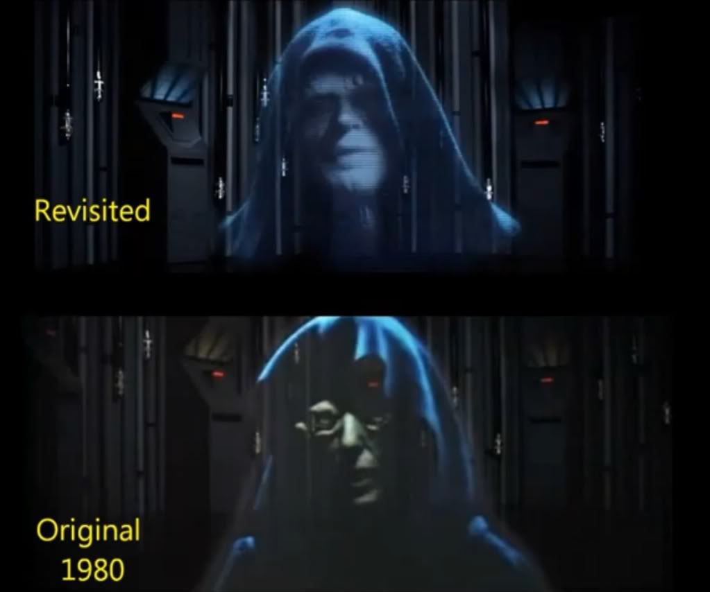
1151: 'Star Wars' letters and prologue scroll too dark

3934-3935: lighting inconsistent between the two shots

4223-4224: lighting inconsistent between the two shots

4287-4288: lighting inconsistent between the two shots

4999-5000: lighting inconsistent between the two shots

6283: too much red in shot relative to previous shot of c3po

6325: too much red/orange relative to previous corridor shots

6353: too much red/orange relative to previous corridor shots

6488: too much red/orange relative to previous corridor shots

6692: shot too dark relative to previous shots

6853: shot too dark relative to previous shots

7094: shot too bright for dark surroundings

8044: little bit too much red/orange relative to previous corridor shots

9124: shot perhaps a little too bright for dark surroundings

9200: shot perhaps a little too bright for dark surroundings

9261: shot a little too bright for dark surroundings

9288: shot too dark and inconsistent with previous shots of leia

10286: shot perhaps a little too dark relative to previous shots

10547: shot perhaps a little too dark

11029: shot a little too orange

11109: shot too orange, making leia's flesh tone overly orange

11165: shot a little too orange

11270: shot too orange, making leia's flesh tone overly orange

11377: shot a little too orange

11457: shot inconsistent with previous shot of leia, far too orange

11591: shot a little too orange

11618: shot inconsistent with previous shots of leia, far too orange

11645: much better, this is how whole scene should be colour graded IMHO, with a bit less orange to fit with the next shot

14830: sky too red

16115: sky a little too red relative to previous shot

16383: looks a little to red/orange compared to proceeding shots

22165: clouds/sky too red relative to previous shot with storm troopers

22570-22571: too bright at the end of shot, inconsistent with next shot

23185-23186: brightness/saturation inconsistent between shots

24218-24219: brightness/saturation inconsistent between shots

24305-24306: brightness/saturation inconsistent between shots


Going to take a break for a little bit but i'll be back to finish off. Hope this helps. :)

Post
#553980
Topic
regrading/editing original trilogy using blu-rays and german hdtv streams to remove bad but not all specialised/blu-ray changes (* unfinished project *)
Time

doubleofive said:


Harmy said:


For what it's worth, I think this is actually a pretty good change. It lends continuity not only to the light but also to the hatch opening in the shot from the outside. I'd actually recommend you keep it because these are exactly the kind of fixes that are not distracting and actually add to the film.
I like the hatch as well, they even timed it to match it opening in the model shot from the outside. However, it does add even more height to the already cramped Falcon. What one person can barely stand in from the outside now has enough room for people to stand below the main floor and go up an elevator and two doors to the top.


Ha ha, very true, hadn't thought of that! But who's going to be thinking about things like that when you're enthralled by ESB's exquisite storytelling, totally engrossed in the scene and the peril that the characters face at the hands of the Empire? Certainly not me. ;)

Post
#553978
Topic
regrading/editing original trilogy using blu-rays and german hdtv streams to remove bad but not all specialised/blu-ray changes (* unfinished project *)
Time

@Harmy: Cheers for the feedback Harmy! I am actually in total agreement with you here, I hadn't noticed the improved continuety between the hatch opening in the tunnel and the hatch opening outside in the special edition, thanks for pointing that out. I'm definately leaning towards leaving it as it is in the blu-ray, one of the good changes IMHO, like you say.


@Darf Muffy: I know where you're coming from but while you find the second CG hatch very jarring, I find the bright white light going to nowhere just as jarring in terms of lighting continuety. What I can do if you want is upload the version of this scene with just the one hatch using Harmy's matte footage for you in high quality and when I upload the finished release of ESB, you can use a program called TSMuxer and simply cut out the special edition hatch and reinstate the original theatrical hatch. If you don't know how to do that, I can run you through the whole process step by step no problem, its quite simple. Then you'll have the version you want of ESB without me having to upload another 50GB just for a single change.

As for all the guys in the cantina, i'm not changing anything there so that's all staying specialised, all the changes there look pretty good IMHO and are improvements as far as i'm concerned.

Post
#553949
Topic
regrading/editing original trilogy using blu-rays and german hdtv streams to remove bad but not all specialised/blu-ray changes (* unfinished project *)
Time

Okay, leaving all the differing viewpoints on correct flesh tones/colour grading to one side, what does everybody think about the dual hatch in ESB when Lando saves Luke? I've tried reinserting Harmy's great matte reconstruction of the original hatch with the rest of the blu-ray footage but i'm finding one thing a little jarring, the bright white light above the hatch. Where is that coming from? It doesn't seem to be part of another tunnel, there are no walls visible in that light. Not from outside, because the light outside isn't like that in the next shot, so there appears to be a lack of lighting continuety with the next shot, when Lando is coming out of the Millenium Falcon to pick up luke. That bright white light is nowhere to be seen in the outside shot. This would explain why GL felt he needed to change it for the special editions in the first place.  Wouldn't it be better to keep the special edition shot with no bright light that seems to have more continuety with the shot from outside the millenium falcon? I don't know whether to use the original hatch or leave the specialised change as it is, so please share your thoughts.

Here's a clip of how it was originally: http://www.megaupload.com/?d=0SFOENA7

Here's a clip of how it is specialised: http://www.megaupload.com/?d=5MGLT3VR

Post
#553916
Topic
regrading/editing original trilogy using blu-rays and german hdtv streams to remove bad but not all specialised/blu-ray changes (* unfinished project *)
Time

@Harmy: I am very much aware that flesh tones depend on the scene and lighting and have very much taken that into consideration when setting on a single setting for ESB, which is why I was in favour of the more bluish flesh tones in the wampa clip I posted before rather than the more balanced neutral colour grading that You_Too put up using photoshop, where Luke's flesh tone was too orange for his very cold surroundings IMHO.

Fair enough about the GOUT, I'm looking at the dvds and you're right, it is brighter than the dvd/blu-ray in a lot of places (or at least seems so due to its lack of contrast).  If you increase the contrast to get the image looking fairly decent, the image is a lot of the time darker than the dvd/blu-rays. The only part of the GOUT I have familiarity with recently is Lapti Nek and looking at the footage i've got, after boosting the contrast, its definately going to need its brightness boosted in order to fit with the rest of the blu-ray/hdtv footage.


@msycamore: Fair enough, I definately agree with you about detail getting lost in the clipped whites and yeah, that is clearly visible in the blu-ray itself. That it is already present in the blu-ray is not in itself a reason not to increase the brightness a little more though if it improves the image overall, as I believe it does here, even taking into account increased white crush in certain scenes. Sorry, it seemed from what you posted before that you believed I was using a single setting to regrade Star Wars, which is pretty much impossible because its so inconsistent. Didn't mean to jump down your throat there, sorry about that.

msycamore, we're going to have to agree to disagree about needing a shot by shot correction to get any decent results. If anything, its the exact opposite IMHO, a shot by shot correction is a slippery slope if ever there was one. Only the cinematographers of these films would be able to do that with any real accuracy IMO and even then, his colour grading sensibilities may have changed over the years and he could choose to grade certain scenes differently, much like Peter Jackson and Andrew Lesnie did with FOTR EE blu-ray, which has a very different palette to the theatrical release, even after the green tint is removed. This may even be the reason why the Lowry colour grading is so different, the cinematographers and GL may have decided to change the colour grading to fit more modern colour grading trends, much like what happened with FOTR EE.

For somebody not involved in the actual production of these films to regrade them shot by shot using a source as poor as the GOUT as a reference and get them close to how they looked in the cinema? Little to no chance IMHO and that's of course assuming that the GOUT's colours/flesh tones are accurate, which for me personally is open to debate. The contrast was definately not that messed up in the cinema, I'm pretty certain of that. No, shot by shot regrading is definately not the way to go, at least for me. The Lowry masters minus the blue tint will do.

Msycamore, thanks for wishing me luck with this project and I hope that you will continue to provide feedback on clips i post in the near future and maybe even check out this release when I get round to uploading it. Who knows, you might be pleasantly surprised.

Post
#553883
Topic
regrading/editing original trilogy using blu-rays and german hdtv streams to remove bad but not all specialised/blu-ray changes (* unfinished project *)
Time

Harmy said:

Yeah. Although, I don't just use the GOUT as a reference. Wherever available, I compare different sources and references, trying to colour correct it the way I believe is closest to the original colour grading (which most of the time coincides with what I like, so that's cool) based on all references available to me. And of course, choices will be made based on personal preference even in my project, because the references sometimes simply aren't there. But in those cases, I usually make my choices based on what I think was probably in the original. That's the nature of my project.

The nature of your project is different - your effort is to make a version you'll like, which, unlike for me, isn't necessarily the original version, so the original colour timing doesn't really have to mean anything for your project and that OK too :-)

Harmy, in my mind, a transfer that has correct looking flesh tones is the 'original version' (unless all the characters in the cinema looked orange or had some other strange colour of flesh tone, which I doubt). I am using the flesh tones of the characters as a guide for what is the 'correct' colour grading, not colour grading to my own preferences. Basically all the theatrical references I have seen, like that LD screencap posted earlier, have had incorrect flesh tones, basically all those 35mm shots that were on the website that You_Too posted earlier had incorrect flesh tones, with the majority being affected by either red shift, green shift or yellow shift (presumably due to the film degrading). It's very difficult to see the colour grading with the GOUT because it is so often dark and the picture quality so poor (contrast and brightness all over the place most o the time).

Are there any other clearer colour references for these films that i'm not aware of? If there are I would really like to see them because I assure you I am trying to get back to the correct colours, using flesh tones as a guide, not creating colour grading that fits my fancy. I definately consider this project a preservation, so if there is a reliable guide for colour grading these films so they look like the theatrical release that i'm not aware of, please tell me. If you can't post the answer on this thread for whatever reason, please PM me.

Post
#553870
Topic
regrading/editing original trilogy using blu-rays and german hdtv streams to remove bad but not all specialised/blu-ray changes (* unfinished project *)
Time

Harmy said:

I guess we'll just have to agree to disagree on that because I disagree so strongly that it would just lead to a pointless argument - to me the 2004 colour timing isn't appealing but appalling ;-).

This is your project and you should mainly do it so that you enjoy the final result :-)

No worries Harmy, i'm fully aware that my opinions on the lowry colour grading are going to be controversial on this forum and i'm really appreciative that you're still helping me out so much even though our opinions really differ in this regard. And don't get me wrong, I'm really looking forward to your despecialised editions, I loved what you did with the ones you've already released, these are just two totally different schools of thought when it comes to colour grading these films. At least people will have the choice of different versions with different colour grading, those based off the GOUT and similar sources and those based off the lowry 2004 masters. Choice is never a bad thing in my book. What more could they ask for? :)

Post
#553868
Topic
regrading/editing original trilogy using blu-rays and german hdtv streams to remove bad but not all specialised/blu-ray changes (* unfinished project *)
Time

You_Too said:

Omen, about the clip you posted, I think the difference is not very noticeable unless one looks at the screenshots you posted. (Why are the screenshots in 2560x1600 btw?)

Ah sorry You_Too! I realise I never got round to answering your question here. The reason the screenshots are in 2560x1600 is because in media player classic, I always go to fullscreen and do a 'Print Screen' because i've found in the past that if I capture a screencap via the mpc interface, the colours sometimes change slightly and with 'Print Screen', it looks exactly like it looks when i'm playing the video. My monitor's native resolution is 2560x1600 so that's why those screencaps are that size. :)

Post
#553864
Topic
regrading/editing original trilogy using blu-rays and german hdtv streams to remove bad but not all specialised/blu-ray changes (* unfinished project *)
Time

Wow, lots of posts while i've been gone.


@Harmy: Great work you've done there with the hatch! Like with the Sarlacc pit, i'll have to see whether I can get it to fit fairly seemlessly with the blu-ray/hdtv footage. Thanks for the suggestion about Adywan's colour corrected ESB and the old emperor footage. I thought I'd seen the old emperor looking good somewhere and that's where it must have been from. I watched Adywan's 13GB version a few years back.


@msycamore: I appreciate what you're saying about there being no magical single setting fix for ESB, but I have to disagree with you and Harmy about the 2004 transfer being such a horrible mess, colour grading appears fairly accurate to me as far as flesh tones are concerned (which is mostly how I judge colour grading, look to see whether the flesh tones are natural looking), excluding the blue tint of course. FOTR EE blu-ray is a horrible mess, this is nowhere near that travesty, this is actually a fairly decent transfer in terms of colour grading IMHO, give or take a few brightness inconsistency/tint issues, especially in Star Wars.

Yes, the 2004 dvd and by extention the blu-ray transfers have a few clipped whites, but neither the GOUT nor the SWE LD are 100% accurate representations of the theatrical releases either IMHO. In those cloud city screencaps, the flesh tones of the SWE LD are far too orange (all the characters look like they've been tangoed) and the GOUT is far too dark, with black crush, resulting in lots of shadow detail loss, very much present. Of the three screencaps, the 2004 dvd screencap is the most balanced and 'correct' looking, with flesh tones the most accurate as well, even with the whites blown out IMHO.

Look at it this way, the SWE LD is ruled out right from the start due to incorrect overly orange flesh tones. So you just have two possible colour references left, the lowry 2004 dvd/blu-ray masters and the GOUT. The dvd/blu-ray transfers lose detail in the highlights with white crush, the GOUT loses shadow detail with black crush, so they even each other out. The blu-ray has that lost shadow detail of the GOUT, the GOUT has that lost highlight detail in the whites due to it being unnaturally dark IMHO. All things being equal, you'll go for the higher quality HD transfer in terms of picture quality, which is quite clearly the blu-ray transfer.

The way I see it, the white crush is there on the blu-ray, that detail cannot be recovered, even if you were to reduce the brightness, so why not boost the brightness slightly more to make the image overall more appealing. You don't lose much more than what's already been lost due to white crush on the original blu-ray (and of course only in the few scenes throughout the film where white crush is an issue) and you get a far more appealing transfer throughout the whole film.

BTW msycamore, just to clarify one thing, you said (or at least implied) in your post that i'm using just one colour/brightness setting for Star Wars. That is actually very much incorrect. While you're right in saying that i'm only using one grading setting for ESB (because I believe that only one setting is necessary, the colour grading is fairly accurate and consistent without the blue tint), the first Star Wars film in this project has far more than just one colour regrade setting, many scenes have been regraded seperately, especially the blockade scene at the beginning that isn't all that colour consistent from cut to cut. Many scenes with Tarkin had to be desaturated seperately as well. ROTJ will also be using just one brightness/colour setting because I also believe that after you remove the blue tint, flesh tones are fairly accurate and the colour grading is consistent, like with ESB, IMHO.

This is just my opinion on the colour grading of these three films, no more, no less. I'm not trying to imply that the blu-ray grading is correct and the GOUT and LD incorrect. I'm not old enough to have seen these films theatrically in the cinema, so I don't know what it looked liked originally on the big screen (that said, even if I had, would I be able to remember exactly what it looked like after so many years... me personally, not really), I just doubt it was as dark as the GOUT or as orange as the LD. Of all the available sources I have seen in my lifetime (VHS/TV/GOUT/DVD/Blu-ray), the blu-ray transfer is the most 'natural looking/appealing' to my eyes if you remove the blue tint. I can't really say any more than that in defence of my colour grading choices. And for the record, I consider this project to be very much a 'preservation' of the theatrical editions plus all the good specialised changes rather than a 'fan edit', for what its worth.

Post
#553756
Topic
regrading/editing original trilogy using blu-rays and german hdtv streams to remove bad but not all specialised/blu-ray changes (* unfinished project *)
Time

Darf Muffy said:

Adywan's

Adywan's emperor scene should be in place of the rubber face ghoul of old with this original gout dialogue ...

Clip Link: http://youtu.be/yZlSwBag61o


I was actually planning to use the original emperor, which I like the look of (always have). He looks a lot more sinister than the SE emperor and even Adywan's Emperor IMHO, I love the way his face is mostly concealed in shadow. I don't believe in this continuety revisionism that GL is so fond of, changing earlier films to fit later films (like changing the voice of Bobba Fett to the NZ guy in the prequel trilogy to give another example). If anything, it should be the other way round.

I've been hearing rumours that Ian Holm may be replaced by Martin Freeman at the beginning of FOTR in a new FOTR 'ultimate edition' that'll be released when The Hobbit comes out, but I REALLY REALLY hope that's not the case. I'm pretty sure that Peter Jackson would never do that to Ian Holm. I just wish that they would just leave these old films that have already been released theatrically and seen and loved by so many millions alone. The old emperor looks much much better than the special edition emperor anyway (don't get me started on the dialogue changes...), so why change it!?

The work Adywan has done for his revisited versions is amazing but this project is about removing all the bad changes and reinstating the original theatrical versions of said changes, not creating totally new content like Adywan has done. For me at least, that's going too far. That said, I'm very much looking forward to seeing what Adywan's been up to these last few years with ESB revisited and especially all the new content he's added. :D

Post
#553752
Topic
regrading/editing original trilogy using blu-rays and german hdtv streams to remove bad but not all specialised/blu-ray changes (* unfinished project *)
Time

Thanks for all the feedback guys!!! :)


@Harmy: Yeah, the change in brightness is quite subtle, at least it seems so in this scene. I'm glad you think its a step in the right direction here. :)

In the clip with the wampa though, you saw how the same brightness increase was really pushing the white highlights to the limits of acceptability. This brightness increase really is the upper limit for ESB IMHO. Right now, I'm really leaning towards increasing the brightness, it just makes the image more appealing throughout the film, even if a few whites here and there get blown out in the process, I definately think its a worthwhile sacrifice to make for a better image overall. 100% agree with you about the set, it definately supposed to be quite dark and murky, with lots of shadows.


@Darf Muffy: Thanks for showing interest in this project! It's guys like you that make me more motivated towards finishing this asap. My plan is to have these ready to upload by the new year, about the same time as I should be getting a big upload speed upgrade.

Don't worry about all the background creatures in Mos Eisley (I like the extra hustle and bustle as well), they're all still going to be there, the only thing being cut is the droid being knocked to the ground (it cuts to when the speeder enters the frame) and the Jawa falling off its mount and swinging from side to side, everything else is still there.

The wampa scene in the cave is definately staying untouched (Luke's lightsaber might require a slight change of colour in one shot where it becomes darker just for the sake of consistency) but removing that dual CG hatch could be a problem. As far as i'm aware, only the GOUT has that clip intact without the dual hatch and I don't want to mix GOUT footage with the blu-ray footage in such a small shot, it'll be too jarring. Perhaps Harmy's done another great matte job to get round that as well and he doesn't mind me borrowing that as well as the fantastic work he's done with the Sarlacc pit.

The humungous door from Return of the Jedi is definately gone, i've reinstated the original shot from the german hdtv stream without any problems so it flows seemlessly. And Jedi Rocks is definately gone and Lapti Nek reinstated, that bit is so awful in the special editions, it just kills the whole shady gangster vibe that Jabba's Palace has going until then. Lapti Nek just fits that seedy atmosphere so much better IMHO.


@You_Too: It's great that you and Harmy both think that it's better a little brighter. I agree 100% with you guys so I think i'm definately going to go with brightening ESB now. Thanks for all your feedback and helping me to finally make my mind up! :)

Yeah, the changes in colour and brightness are pretty subtle, at least in that scene between Han and Leia. When there's snow or anything else that's meant to be white like the Hoth battle, the colour change is a lot more obvious. The star wars original trilogy on blu-ray is far from the colour grading mess that was the FOTR EE blu-ray, so the colour grading change doesn't need to be so extreme IMHO. For ESB, i'm only using one setting to remove the blue tint throughout, much like you are with the Star Wars blu-ray, I think it works pretty well that way, so i've had to be very careful with the amount of blue I remove. If you go any further than I have in removing the blue tint, I find that the whites and the image as a whole starts to turn a little too yellow for my liking, especially the snow during the Hoth battle and the walls when they're running around the corridors in Cloud City at the end of ESB.

As you know, it's a really fine line when you're using only one setting, you're having to balance so many different scenes and locations throughout the film. Ultimately, it also boils down to ones own colour preference as well without any 100% reliable theatrical source to use as a reference for colour grading. I hope i've struck a fairly good balance in that regard.