Laserschwert said:
Very nice! Thanks!
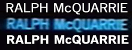
Although I don't think it was necessary to fix the "y", as it was correct in "Johnston" (I just forgot to list it in my post).
I used the Johnston "y", and customized it a bit.
I noticed a few minor problems with the font:
The vertical stroke of the Johnston "J" is shorter than those of Gill Sans (I think all Johnston capitals are "shorter" than the Gill Sans verticals, including "b" and "d"). If "J" is the only capital you've used from Johnston, that's the only one that needs to be fixed.
The "t" still doesn't look right to me. I think the crossbar still has to be even shorter on the right side.
Do you think we should make the "g" narrower in the font? If you do, make sure to make the vertical strokes fatter again after scaling the letter down.
I will fix all of these. As for substitutions, I used your post 51 above as reference.
Apart from these I think this will work wonderfully!
I think so too. It's a custom job, and it's all work that needs only to be done once, that's what I like about it.
BTW, since Johnston/Gill are basically "the font of Britain", might it be safe to assume that the subtitles for the international versions of SW were made in the UK?
It's a possibility.