- Post
- #1473907
- Topic
- Star Wars: Serialized (WiP)
- Link
- https://originaltrilogy.com/post/id/1473907/action/topic#1473907
- Time
May I have a link to the workprint?
Replace all uses of John Williams’ Imperial March and substitute it for AC/DC’s Big Balls.
I agree, I’m digging this one.
My only suggestion, and it’s an odd one, is maybe to do a separate grade for the scenes that show the surface of Crait. The dark, rich, deep reds that spray up in contrast to the pale white are such a great visual, and literally the only downside to this grade is that it mutes them a bit. Other than that, I think this one looks good across the board.
Since I’m aiming for a cinematic looking grade, the desaturation is intentional. I have faith that the reds on Crait will look rich enough since the viewer will have already been adjusted to the grade by that point.
Check out the movie Three Colours: Red by Krzysztof Kieslowski - you might be able to do some colour analysis on it and really amp up both the reds and the filmic look on Crait and in Snoke’s throne room (though I like your grade on Snoke’s throne room). It’s shot on 35mm and (as you might imagine) it extensively uses all different types of the colour red throughout.
The Three Colors trilogy. Now that’s a franchise I’ve not seen in a long time. A long time.
Jokes aside, I decided to try increasing the saturation on my node tree to see what it does, and well…
Original:
Saturation adjustment:
Original:
Saturation adjustment:
Original:
Saturation adjustment:
…I don’t know. For me, it looks too colorful for a Star Wars movie, and the increase in saturation takes away some of the detail. Look at Snoke’s knights in the background. They’re blending in to the red wall a little too much, making them harder to see. I’m open to the possibility of being wrong, but it looks off on my desktop.
No, I agree, the first image looks better - the second loses some of the colour depth and looks flatter.
Yup. Oh well, I tried.
I think I’m gonna start work on the sound editing next.
I agree, I’m digging this one.
My only suggestion, and it’s an odd one, is maybe to do a separate grade for the scenes that show the surface of Crait. The dark, rich, deep reds that spray up in contrast to the pale white are such a great visual, and literally the only downside to this grade is that it mutes them a bit. Other than that, I think this one looks good across the board.
Since I’m aiming for a cinematic looking grade, the desaturation is intentional. I have faith that the reds on Crait will look rich enough since the viewer will have already been adjusted to the grade by that point.
Check out the movie Three Colours: Red by Krzysztof Kieslowski - you might be able to do some colour analysis on it and really amp up both the reds and the filmic look on Crait and in Snoke’s throne room (though I like your grade on Snoke’s throne room). It’s shot on 35mm and (as you might imagine) it extensively uses all different types of the colour red throughout.
The Three Colors trilogy. Now that’s a franchise I’ve not seen in a long time. A long time.
Jokes aside, I decided to try increasing the saturation on my node tree to see what it does, and well…
Original:
Saturation adjustment:
Original:
Saturation adjustment:
Original:
Saturation adjustment:
…I don’t know. For me, it looks too colorful for a Star Wars movie, and the increase in saturation takes away some of the detail. Look at Snoke’s knights in the background. They’re blending in to the red wall a little too much, making them harder to see. I’m open to the possibility of being wrong, but it looks off on my desktop.
I agree, I’m digging this one.
My only suggestion, and it’s an odd one, is maybe to do a separate grade for the scenes that show the surface of Crait. The dark, rich, deep reds that spray up in contrast to the pale white are such a great visual, and literally the only downside to this grade is that it mutes them a bit. Other than that, I think this one looks good across the board.
Since I’m aiming for a cinematic looking grade, the desaturation is intentional. I have faith that the reds on Crait will look rich enough since the viewer will have already been adjusted to the grade by that point.
Add them to the background of all scenes with rey, so that she’s never alone.
Why stop there when you can add all the jedi to the background too?
Sorry, the post accidentally got duplicated. Ignore this post.
Okay, here’s what I’ve come up with now for the color grading. The top example is the previous grade I did:
The bottom example is what I’ve done to lower the reds and raise the blues:
This latest grade doesn’t have as gigantic a difference as I’d hoped, but the subtleties do exist. It’s also the last hurrah for the orange film look. If I adjust the reds any lower, or the blues any higher, the film look is gonna break. Let me know what you think. As usual, the screencaps are under the spoiler tag below.
Yeah, I feel like it needs less red and more blue too. Especially since some of the blue areas look more white than blue (You can see this on Leia’s hologram, as well as the
destruction of the First Order fleet).
I’ll see what I can do to tweak the red grade. Hopefully, we’ll get a Goldilocks situation where it’s “just right.”
…Aaaand here’s the rest!
The top example is the previous blue grade:
The bottom example is the newer faded red grade I’m considering:
Let me know what you think. I’ve done my best to lessen the number of screencaps, but just in case, I’m still putting them under the spoiler tag below.
I’m curious to see it. If it was me, I’d grab a much smaller number of screenshots as a quick litmus test - maybe something from daytime Ahch-To, the Resistance ship, Snoke’s throne room, rainy nighttime Ahch-To, and Crait. Those are broadly the largest differences in colour and lighting across the film.
You make a good point there. I tend to get carried away when I’m taking screencaps, so I end up with too many of them. I’ll see if I can ease up on the number (that, or get carried away again).
Okay, it’s time for an update. Yes, I have been working on the color grading, and well… I think I need to discuss it. I have a feeling this new grade might be controversial.
So, I’ve taken Captain Faraday’s advice on the grade. I’ve lowered the brighter areas, I’ve raised the gamma up, and I’ve even decided to change to the orange look instead of the blue look (with a serious wound in my pride). Overall, I’m not sure about it. To understand why, I’m going to post a screencap of my opening crawl. It gives a picture of what the darkest parts of the image look like.
Here’s what the opening crawl looked like with my previous color grade:
Here’s the opening crawl with the progress I’ve made so far:
As you can see, this new grade has a slightly faded red look to it. I personally don’t think it looks bad. In fact, it reminds me of Puggo Grande’s 16mm preservations of the OT, which is a plus for what I’m aiming for. However, I’m not sure it works for a movie that was released in 2017. Seeing a movie like TLJ with this kind of look is a little… Different. I’m gonna work on getting some more screencaps, but I want to throw this post up as a foreshadowing of what to expect, and/or to ask if it’s really worth taking the color grading in this direction. What do you think? Wanna see more, or should I change it up fast?
Oh, how I’ll miss this guy. I’ve appreciated his support and the last post I received from him was a good luck on both my moving situation and my sequel trilogy fanedits. I wish him the best in whatever he does next.
I am not going to have spaghetti for dinner tonight.
Mamma Mia!
Add the Pinky and the Brain theme song every time Darth Vader and Palpatine are on-screen together.
Change the whole franchise into something like this:
Gone back and tested it again. Everything looks good, but I forgot to throw in my own end credits. So, I’ll be working on that next (When I find time in between TLJ, TROS, and my day job).
Oh yeah good shout, I think that’s exactly the kind of thing we need. I really hope we see AlaskaSandman back soon.
Me too. He sent me on the right track when I first started work on fan editing, and I owe him for the progress I’ve made since. Needless to say, I miss him.
Seals. They’re squishy. They’re cute, adorable and squishy.
The girl I was seeing broke up with me.
I am so sorry to hear that, Jack. My first crush died in a car accident when I was 13, so I know way more than most how much it hurts to lose someone who meant the world to you. I wish you the best of luck when you’re ready to get back out in the dating world.
That’s…not a terrible idea.
It is when you visualize it.
TLJ has a very warm and very soft light appearance. Which I personally like, but I still completely agree that the film is visually too dark for the same reasons you’ve pointed out. My own suggestion is that the new grade ups the contrast too much - it’s making the bright parts stand out even more from the scenery, while also washing out the lighting gradient on people’s faces like they’re standing under fluro tubes. In my opinion, the lighter areas don’t really need to get much lighter at all, it’s just the mids that need to be brightened a bit. You’ll also be fighting against the theatrical lighting by going for a blue tint, which isn’t to say that you shouldn’t do it (it would certainly be an interesting change), but it’ll be a lot more difficult.
I feel like that sounds overly negative, which isn’t my intention; I always like seeing your colour grading process.
No problem, Cap. I wouldn’t be posting a lot of screencaps if there wasn’t room for improvement somewhere.
I suppose you make a fair point on the contrast. I think I’ll try moving the brightest areas down from “as far as broadcast safe will allow” to “somewhere in the 75% range” instead, then raise up the gamma some more for the mids. I’ll see how that goes.
Anyway, Github blocked the second half of the comparisons on the previous post (probably because they exceeded the size limits), so I had to go back and re-upload the second half. I’m not sure if any new insights will be found, but if you want to see a few more warmer-looking scenes (Yoda’s scene, for example), or you want to see what Crait looks like, you can find those shots in the spoiler tag below:
Time to showcase the screencaps! 😃
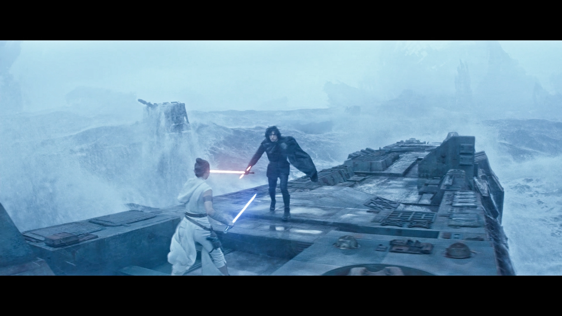
Now, when I discussed the color grading on my TFA edit, I stated that I didn’t plan on doing too much to the movie, because the blu-ray was pretty good (Although I guess I did a lot more to it than I expected in order to give it a more cinematic look). TLJ, however, is a different story. One of the biggest issues I have with the blu-ray for Episode VIII is how shockingly dark the whole thing looks. Here’s an example of what bothers me:
I’m looking at this shot with the scopes that are installed on DaVinci Resolve. This shot in particular occurs in broad daylight. The sky is blue, as you can see in the background. The sun is shining (and if you look closely at the bottom left side, you can see Luke’s shadow). But even with all of that, the image is so dim that it looks cloudy. In fact, it might actually be darker. I know this because the brightest parts of the image are somewhere between the halfway mark to the 2/3rds mark on the parade scope.
I understand that this is Star Wars and it’s possible that the planet itself was intended to be darkly lit, but it looks so wrong. Like someone put a 25-50% opacity filter on the whole thing. And it’s not just Luke’s planet that suffers from this. The whole movie happens to be this dim. I feel like I have to turn off all the lights in the room in order to watch it appropriately (Although I’ll be fair when I say that I do watch most movies in the dark in real life. Still, for the general public, this is ridiculous). So a big alteration I’ve done with the color grading is brighten up the image. A lot. I raised the brightest levels of the image up to the top (and maybe a little over the top, but not by too much) in order to get something like this:
In addition to the brightness adjustment, I also wanted to make this one look more cinematic too, just like my Episode VII edit. Now, back on that thread, I mentioned that I was able to make three particular film looks. The orange look, the blue look, and the faded purple look. Episode VII ended up with the orange look, but I mentioned that my favorite was the blue look, and I’m happy to say that I think TLJ looks great with the blue look. I was worried that I might have to go with the orange look again because a lot of us associate TLJ with the color red. But I think the blue look really adds something to the film (I especially think the blue lighting on Snoke’s throne is a nice touch). But hey, I’m cuddling with the blue look, and I think it’s best to let everyone else decide for themselves. Click on the spoiler tag below to see the rest:
While you’re at it, reinstate the original audio of Ewan McGregor making lightsaber noises.
Better yet, don’t bring Ewan McGregor into this. Get some random nobody to do the lightsaber noises and have him say things like, “pew pew” every time a blaster or spaceship fires.
I’ve been meaning to ask - is your colour grade applied to the entire film with the same settings, or do you go in and tweak individual scenes/shots once you’ve got the overall grade figured out?
I would say it’s mostly applied to the entire film, with some scenes and shots tweaked on occasion. This is especially true with my Episode II edit, where I had to change the color scheme of certain shots in the Geonosis droid factory from blue to red, so that they would match. Otherwise, I like to take a more generalized approach to the color grading.