- Post
- #568143
- Topic
- Did the prequels have boring visuals?
- Link
- https://originaltrilogy.com/post/id/568143/action/topic#568143
- Time
DavidBrennan said:
American Hominid said:
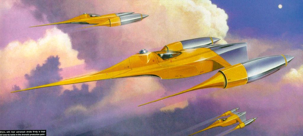
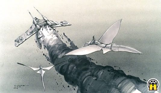
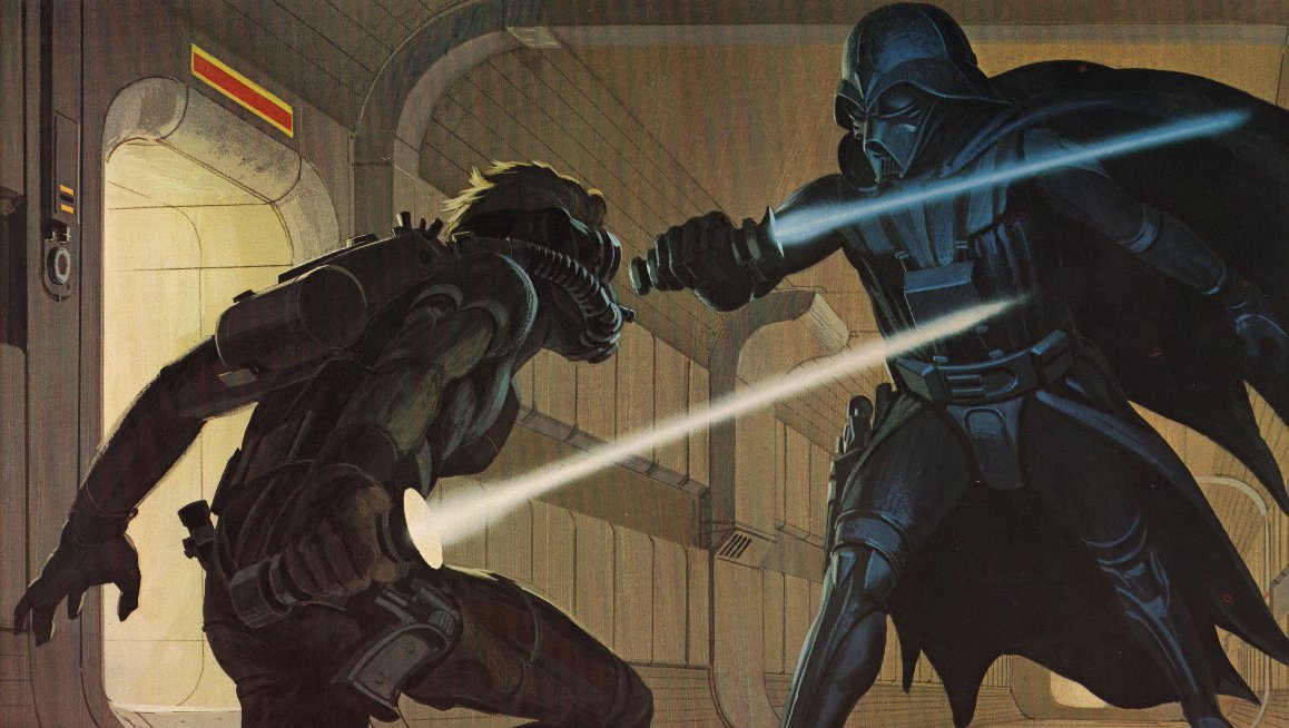
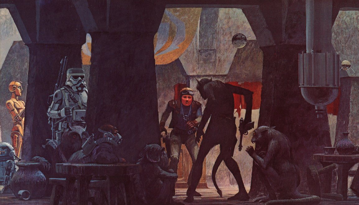
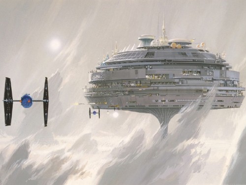
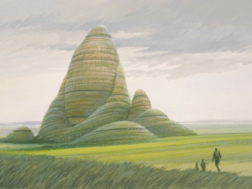
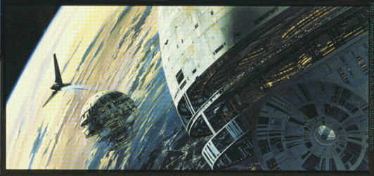
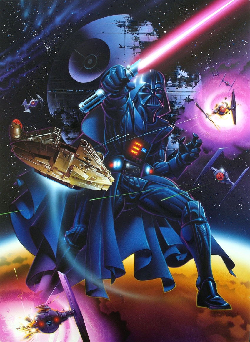
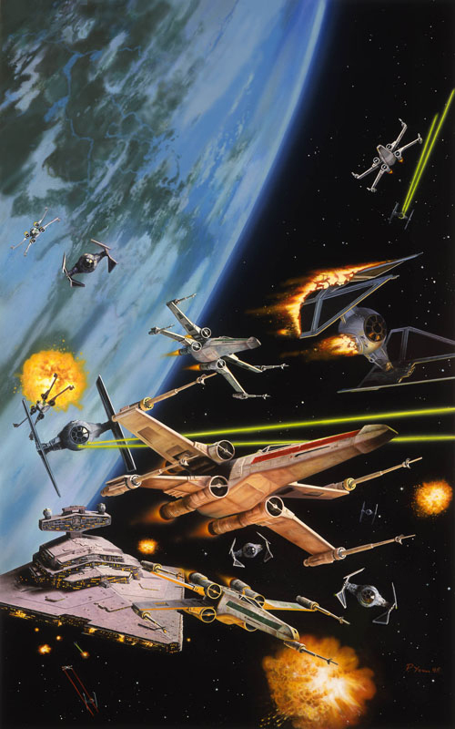
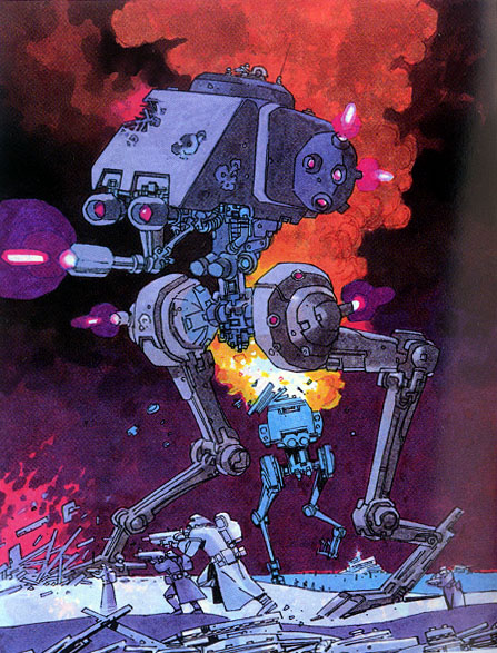
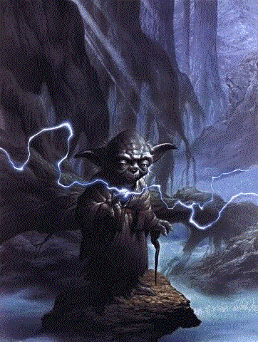
To me, the prequels had some pretty evocative designs/preproduction work too:
[....]

Granted, some of that was not used as-is, but I don't think there was a lack of interesting design. Though I do see a difference in how McQuarrie's work, along with the rest of the artists on the OT, creates a sense of "world" in me that some of the prequel art does not. This might be due to the use of traditional media and generally sketchier aesthetics (there are some nice prequel pieces like that too). I'm not sure. McQuarrie's world definitely feels more lived-in, but I also like the nouveau/deco/early 20th century feel that shows up in the prequel designs, especially in TPM.
I do think that the OT, though it was created and viewed as a spectacle when it was made, struck a nice balance between good filmmaking and showing off the designs. I think the PT got progressively more showy, and it can just seem garish.
Not only did they seem to construct shots specifically to show off the design work (in very in-your-face ways, I mean), there were so many designs that it was hard to keep track of things. I never felt the OT was impoverished in its numbers of new ship/character designs per movie. It became a bit overwhelming in the prequels.
I think one major distinction between the PT and OT art can be viewed by contrasting the Alderaan design - and bear in mind that the above Alderaan design is among the more detailed and grand designs used for AOTC or ROTS (by far, in my opinion). It's clearly more of an impressionist design, whereas Ralph McQuarrie's were much more tactile and definitive - and yet every bit as grand (in my opinion).
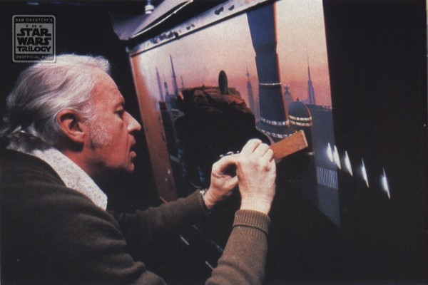
I highly recommend the book, The Illustrated Star Wars Universe. which features I think almost all of McQuarrie's great paintings (woven together in a faux travelogue of the galaxy by Kevin J. Anderson).

TISWU is one of my favorites. :)
And that's a good point - McQuarrie's work, and the OT in general, is much more modernist/minimalist in flavor than the PT. In some ways this is intentional (Theed, etc). But in other ways it probably reflects the changing styles in illustration, architecture, and design over the last 30-40 years. Personally I tend to prefer the "70s-80s future" look.