logo Sign In

kk650's Star Wars Saga: Regraded and Semi-Specialized (Released) — Page 5

Author
Time
 (Edited)

poita said:

I might need a better image to start with, the blacks look really crushed on that preview.

I'll check out the linked image and see how it looks, they might not be as crushed as they look on the forum.

It might be a week or so before I can get to it, I am pretty snowed.

Check out Davinci Resolve 10 lite, it is completely free for anything up to UHD resolution, is available for OSX, Linux and Windows, and allows you much more control than most programs. The lite version is basically the complete version apart from resolutions above 3184x2160 and the ability to use more than one GPU.

http://www.blackmagicdesign.com/au/products/davinciresolve

The blacks don't look crushed to me, all the shadow detail is clearly visible, at least on my screen. The blacks have been brightnened a fair bit compared to the blu-ray already, I don't want to be increasing the brightness of the blacks any more than I already have. There does seem to be a little wiggle space in the highlights though before they start getting blown out. I'll see if I can get a little more punchiness out of the frames by boosting highlights without blowing them out while maintaining the black levels where they are.

I have done all my semi-specialised versions with all edits, colour grading and encoding using the program I'm using now. I'm sure Davinci Resolve 10 lite is a good program but I'm very happy with what i'm using right now and have all the project files using this program so I see no reason to change.

Author
Time

kk650 said:


I've found it can be a slippery slope though in film grading because in the past i've got carried away and boosted contrast too much to get that extra punchiness. I've then played back the video on my tv and almost burned my eyes out the contrast was so strong

 Yep that's the look I actually go for! It's just that no one else does :(  

Author
Time
 (Edited)

frank678 said:

kk650 said:


I've found it can be a slippery slope though in film grading because in the past i've got carried away and boosted contrast too much to get that extra punchiness. I've then played back the video on my tv and almost burned my eyes out the contrast was so strong

 Yep that's the look I actually go for! It's just that no one else does :(  

haha maybe you've just got the contrast on your tv a lot lower than everyone else so you can take more of a contrast boost before your eyes start burning? I certainly like having my contrast fairly high so the image looks nice when I watch normal tv.

Author
Time

A lot of people have their brightness, contrast and sharpness set way to high on their televisions, and aren't seeing movies the way the director intended.

The easiest way to calibrate a TV these days is with the THX app for iOS or Android. You will need a cable to connect your device to the TV (or an apple TV if you have one) and the software is only a couple of bucks.

http://www.pcmag.com/article2/0,2817,1975752,00.asp

If you don't have a device, then the Disney WOW: World of Wonder Blu-ray disc has a fantastic calibration set on it, or if you want to be a little more hardcore, the Spears and Munsil disc set.

http://www.spearsandmunsil.com/

http://www.amazon.com/gp/product/B00CKWI13O/ref=as_li_tf_tl?ie=UTF8&camp=1789&creative=9325&creativeASIN=B00CKWI13O&linkCode=as2&tag=speaandmuns-20

BTW kk650, what software are you using for grading?

Donations welcome: paypal.me/poit
bitcoin:13QDjXjt7w7BFiQc4Q7wpRGPtYKYchnm8x
Help get The Original Trilogy preserved!

Author
Time
 (Edited)

I've got different settings for when i'm watching films off my blu-ray player/laptop to when i'm watching whatever's on TV. I'm configured my blu-ray/laptop viewing settings on my TV so that films look exactly the same as they do on my monitor.

As for the program I use, it called TMPGEnc Video Mastering Works 5. I'm able to do my colour grading, editing and encoding all in the same program so i've found it very useful.

I boosted the highlights a little bit in my latest settings, nothing like as much as your example but enough to make a noticable difference without blowing out highlights in the rest of the film or brightening the blacks. Here are screencaps with my latest and I think final settings for now:

I'll be putting up some screencaps for Empire Strikes Back with my current settings tomorrow.

Author
Time
 (Edited)

That has a nicely saturated and punchy, yet more natural and a bit less flat look than your first one.

Donations welcome: paypal.me/poit
bitcoin:13QDjXjt7w7BFiQc4Q7wpRGPtYKYchnm8x
Help get The Original Trilogy preserved!

Author
Time
 (Edited)

poita said:

That has a nicely saturated and punchy, yet more natural and a bit less flat look than your first one.

Thanks poita, I think it's an improvement as well, albeit a subtle one. I'll be sticking with these settings for the natural version of star wars for now.

EDIT: Removed overly green screencaps

Author
Time

It's… It's green.

I’m just here because I’m driving tonight.

Author
Time

I agree with Tack that it's heavy on the green, but not by too much.  It's almost balanced from my casual viewer's POV.

A Goon in a Gaggle of 'em

Author
Time

Yeah, you're right now that you mention it, a little too much green. Might as well scrap those shots above. What about this screencap below, how is the balance of colours?

Author
Time

Be careful with clipping your colors kk, the blue levels are fine but the red and green are both too high. Here's a comparison based on one of your previous screenshots:

The top one is your screen, the middle is the DVD, lower is my guesstimate based on some production stills culled from the web (shown on right). But other than keeping an eye on the histogram levels, I'd say aim for keeping the whites (such as snow and highlights) at a neutral white.

You probably don’t recognize me because of the red arm.
Episode 9 Rewrite, The Starlight Project (Released!) and ANH Technicolor Project (Released!)

Author
Time

Okay, this is that shot with the latest settings. Let me know what you think:

-

In terms of fleshtones, which of these three screencaps below do you guys prefer (its easier to see the difference if you open them up in seperate windows and switch between them):

Author
Time
 (Edited)

It's looking much better, but the green is still getting blown out leading to a loss of highlight detail.

I really can't tell which of the three is better, I think there's much greater difference in skin tones between the Tauntan Luke and the convalescing Luke than there is between the comparison images below.

The infirmary is looking very natural in either case, excellent balance I'd say.

JEDIT: It looks very much like the deleted scene:

You probably don’t recognize me because of the red arm.
Episode 9 Rewrite, The Starlight Project (Released!) and ANH Technicolor Project (Released!)

Author
Time

Okay, after much experimenting I think i've finally settled on settings for Star Wars that i'm happy with across the whole film pretty much.

There have been a few changes compared to my previous settings, mostly being a reduction in the overall amount of green because I felt in hindsight after coming back to Star Wars after a two week break that there was still too much green overall and I also finetuned the fleshtones a bit.

Here are some screencaps below with my latest and most likely final settings. Please let me know what you think.

Author
Time
 (Edited)

No comments or feedback yet? I suppose that no out and out critisism like I had with the Empire Strikes Back screencaps is a good sign haha

You guys were definately right about the Empire Strikes Back screencaps having too much green, which was very helpful to me. If anything stands out as looking wrong or off in these star wars screencaps please let me know, these setting are not final by any means, I have no problem changing them if someone spots a problem. Its very easy to lose perspective when you spend a long time working on a single film, making it easy to miss problems staring you straight in the face so I always appreciate the thoughts of those looking at these screencaps with a fresh set of eyes.

On a slighly seperate issue, what are your thoughts on the saturation of these screencaps, keeping in mind that these preview screencaps are always a little more saturated than the encode itself? Do you think that I should also release a version of Star Wars with more muted colours like the screencaps I posted for poita before or should I just stick with just releasing this more colourful release?

Author
Time

They look good to me, for what little that's worth. I think as long as you aren't trying to necessarily restore the original, there's less of an objective standard. 

Looking forward to the release. I plan to cannibalize it by making just a few changes and rendering myself a nice version of the film to use to watch when I watch all six in chronological order. 

My stance on revising fan edits.

Author
Time

It looks like you've gotten the blues well under control here, it looks much more 70's now.

A persistent problem of the Blu-ray is the amount of green in the supposedly white areas of the picture, such as stormtrooper armor and R2's dome. If you are able to add blue and red to just these greenish-white areas it would liven up a lot of shots. It's a tricky situation, as there's often too much blue and red in the shadow areas, so you'd be shifting the color balance very selectively.

In any case, your settings seem to be an improvement to every shot.

You probably don’t recognize me because of the red arm.
Episode 9 Rewrite, The Starlight Project (Released!) and ANH Technicolor Project (Released!)

Author
Time

This is looking really really good. Warmed picture, 70's style. Did you made anything about the crushed blacks? Just asking.
Anyway, the one I'm pretty anxious to see is ROTJ. I really liked the first Semi-Special Edition because it's the only version with 83's Lapti Nek and 97's Victory Celebration. Best of both worlds.

Author
Time

kk650, one thing you'll want to be careful of is some purple making its way into certain shadow details. The shot of Uncle Owen at the sandcrawler exemplifies that a bit. I know You_Too did an avisynth script to get rid of it back in the day. I'd check his color correction thread for more info on that one. Not sure how you may be able to address with what tools you're using.

Author
Time

Funcha said:

kk650, one thing you'll want to be careful of is some purple making its way into certain shadow details. The shot of Uncle Owen at the sandcrawler exemplifies that a bit. I know You_Too did an avisynth script to get rid of it back in the day. I'd check his color correction thread for more info on that one. Not sure how you may be able to address with what tools you're using.

 I'd really look into Davinci Resolve, it is free and lets you make the colour changes you require without causing problems in the other areas.

Well worth learning and there are tons of online training resources.

Donations welcome: paypal.me/poit
bitcoin:13QDjXjt7w7BFiQc4Q7wpRGPtYKYchnm8x
Help get The Original Trilogy preserved!

Author
Time

I guess my only complaint left would be the lightsabers; otherwise, this might just be the perfect version for me.  There's not much you can do about those with basic color correction.  I'd recommend using the Despecialized Edition for those scenes, but honestly that's down to preference -- and I don't know how Harmy would feel about that.

A Goon in a Gaggle of 'em

Author
Time
 (Edited)

@Hal 9000: That they look good to you is exactly the sort of feedback I was looking for so thank you.

With this release I am mostly trying to make Star Wars appealing to watch on a purely visual level, of course I am trying to get the film looking as accurate as possible to how it looked in the cinema but making it visually appealing supercedes that in my mind. If you feel that i've achieved that then that's great.

-

@NeverarGreat: I can see where you're coming as far as the whites having a very slight touch of green in certain shots like the stormtrooper armour but there is also slight purple in the armour as well. There at times where there's a touch of purple in the shadow areas in certain shots as well. Howver both these issues are within acceptable grading variation limits IHMO, remember that Star Wars is a very inconsistent film colour grading wise.

I have experimented with getting rid of both the slight green and purple selectively and while those particular shots are 'improved' in the sense that the purple is reduced and the white of the armour are more 'white', the rest of the film that doesn't suffer these issues is adversely affected. Using a single setting is about striking a balance and i'm happy with the balance i've struck here, a touch of purple and green that's barely noticable in a few individual shots across the whole film doesn't bother me greatly.

These 'problems' could also be part of the optics of the film when it was shot, slight purple in shadows is not uncommon in photography depending on lighting conditions, in particular in bright sunlight like that shot with Uncle Owen. In You_Too's regrading thread one guy here says much the same thing: http://originaltrilogy.com/forum/topic.cfm/Digging-up-those-blacks-using-the-STAR-WARS-Blu-ray-for-preservations/post/549794/#TopicPost549794

I do a fair bit of photography myself and I have found what he says to be true in my experience.  As for the stormtrooper whites being slightly green, I believe the star wars has always had a slight green tint to it as a lot of the films shot at this time did from what i've seen so that doesn't bother me, so long as the whites from white light sources and the fleshtones look right to me.

I'm glad that at least you find all the shots an improvement on my previous settings, that's really the most important thing.

-

@bttfbrasilfan: Thanks bttfbrasilfan! That 70's warm technicolor feel is exactly what i'm going for here. I did do something about the crushed blacks, the blacks are now substancially brighter than the blu-ray with a lot more shadow detail visible so all the crushed blacks have been removed to my satisfaction.

-

@Funcha: As I said to NeverarGreat above, I have experimented with removing the purple from the shadow details and it has a detrimental effect on the rest of the film. I suspect a lot of it was part of the optics when the film was shot, especially that shot outdoors in the direct sunlight with Uncle Owen where the purple in his hair is a lot stronger.

-

@poita: I have all the project files of my semi-specialised editions using the same program that has served me very well for colour correcting, editing, audio editing, adding transitions and finally encoding. If I need to be very very specific in terms of selective colour grading, I use photoshop like I did to correct the lightsaber colours and make them all consistent with my first semi-specialised releases.

-

@bkev: It's great to hear that you like how this looks, calling it the perfect release for you is quite the compliment so thank you! Just to clarify though, do you mean that its perfect for you in terms of the colours/image dynamics from the screencaps or in terms of this release including the good additions/changes of the special edition while removing the bad additions/changes?

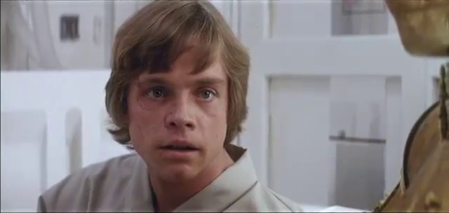
Lightsaber color/consistency will not an issue with this release, the colours have already been fixed and been made consistent, I fixed all that already with my first star wars semi-specialised release and I have kept all the source files with the corrections so that will be very easy to implement. That lightsaber screencap was taken straight from the blu-ray with just the basic regrading applied but not selective colour grading so it doesn't reflect how the lightsabers will look in the actual release. If that's your only complaint then its a good sign.

Author
Time
 (Edited)

kk650 said:

On a slighly seperate issue, what are your thoughts on the saturation of these screencaps, keeping in mind that these preview screencaps are always a little more saturated than the encode itself? Do you think that I should also release a version of Star Wars with more muted colours like the screencaps I posted for poita before or should I just stick with just releasing this more colourful release?

 I'm torn on this because taken together the settings in post 8 which were more muted have a more natural blend/balance to them. They look like a naturally faded print (natural but unexciting). With the new settings while some of the individual shots look really really good some of them look a bit unnatural/corrected.

On my EC2 release (available now folks!!) I went for more saturation/more boosted/exciting so I could bring up certain scenes to shine and the over-boosted scenes: well I just have to sit through. (But I've got some additonial VLC settings which I can toggle on and off, so if I want to take it down to a more faded print look again). In the end, you've got choose what you want it to look like based on what you can get, because from what I can see even the same print frame can look different based on the light behind it/how its projected/captured. So even if you could say X print is the definitive version there would still be several ways to present it - I may get flak for saying this but there can never be a truly exact version, because film is organic and changes in time.

Author
Time

hmm thanks for your thoughts frank678. The saturation is actually exactly the same between the screencaps in post 8 and these latest screencaps, the only difference is that the screencaps in post 8 have more green overall which make them appear more muted in colour compared to these screencaps.

What i'm finding is that those preview shots are pretty misleading because i've just discovered that they are slightly different to what I actually see when I export the frame and the encode itself, the whites, especially of light sources, seem more yellow. From now on i'm going to post clip comparisons that actually reflect what the encode looks like.

The real question is how much green to go with, choices, choices... I'll put some comparison clips up later on so you guys can help me get out of this labyrinth that is regrading Star Wars...

Author
Time

kk650 said:

hmm thanks for your thoughts frank678. The saturation is actually exactly the same between the screencaps in post 8 and these latest screencaps, the only difference is that the screencaps in post 8 have more green overall which make them appear more muted in colour compared to these screencaps.

whoops. fortunately, i have no credibility as a corrector to lose. :)

i have collected about 75 new images of 70mm scans from ebay listings this week. Alot of them have a very green tint/discolouration, let me know if you have any key scenes you work to, that you might want to have additional references for.