logo Sign In

Star Wars: A New Hope DEVASTATOR EDITION (V.1 RELEASED) — Page 23

Author
Time

I think the laser is good but the tie fighter is not needed. But what I will say is that purple in the highlights needs rolling into white or yellow. This is the whole magenta highlights issue in full effect.

I think gout and 97 version it is not so magenta if at all?

Author
Time
 (Edited)

Ronster said:

I think the laser is good but the tie fighter is not needed. But what I will say is that purple in the highlights needs rolling into white or yellow. This is the whole magenta highlights issue in full effect.

I think gout and 97 version it is not so magenta if at all?

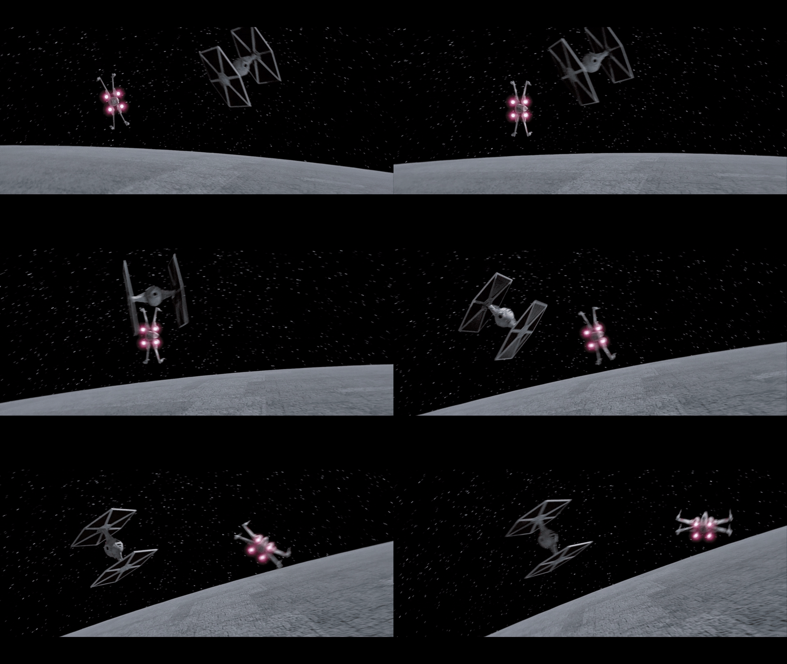
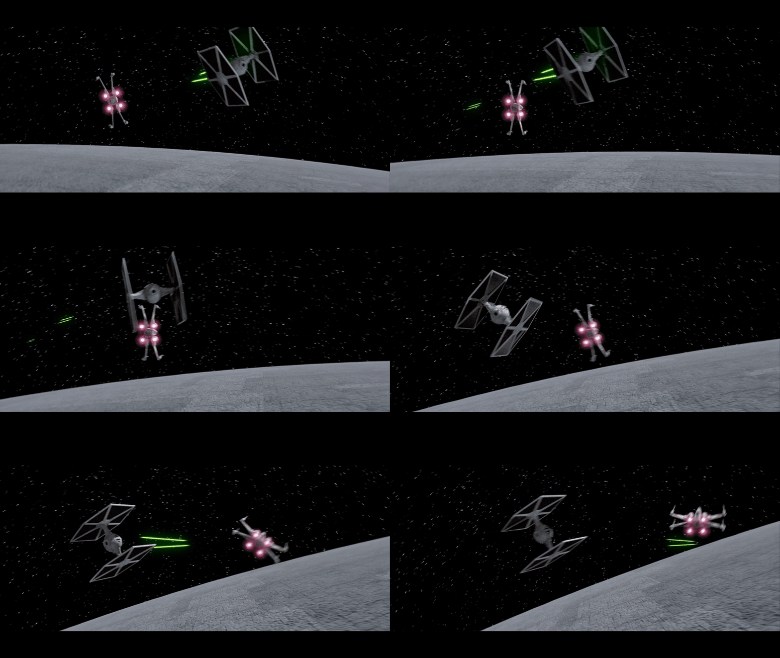
ok, here I fixed the color:
old:

New:

Why don’t you like the tie fighter? it makes the shot more lively and less like a miniature shot.
full shot: https://drive.google.com/file/d/1oRTmKlD5-_zMNL3iRR_A15ogvsu7AvIc/view?usp=sharing

-TGWNN

Author
Time

I love the added TIE fighter. Makes the shot more interesting.

Author
Time

That’s so much better, it actually makes the original shot look awkward without it lol.

Author
Time
 (Edited)

[That guy with no name

Why don’t you like the tie fighter? it makes the shot more lively and less like a miniature shot.
full shot: https://drive.google.com/file/d/1oRTmKlD5-_zMNL3iRR_A15ogvsu7AvIc/view?usp=sharing

Yes it adds more but thr background is scrolling so the ship is exploding in motion. That makes the tie fighter suddenly accelerate to twice the speed.

Not that big of a deal but I think it kind of defies the physics.

That new shot is Brilliant though from Special edition.

Author
Time

NeverarGreat said:

Nice engine glows!

However, one thing I can never unsee in this shot is how the Falcon doesn’t fully rotate toward the planet. All the other ships are facing forward with their engines pointed back at the camera while the Falcon’s engine is doing the Corellian Drift.

Do you think a 3D model could work?

-TGWNN

Author
Time
 (Edited)

This is probably one of the most minor of minor suggestions, but I saw you were updating the 20th Century Fox logo to a more recent version of the logo. Have you considered updating it to the newer 20th Century Studios logo?

20th Century Studios

I went ahead and rendered it out in 4K.
https://drive.google.com/file/d/1w3aniHZRkLVm7Wpguxp8Au0KZzr-Gm_x/view?usp=sharing

The 20th Century portion is from this 8K source: https://www.youtube.com/watch?v=MZwd0PZBSVc
I basically cut it when the camera fly around ends, slowed it down so that the timing would match the stationary versions used in most Star Wars films, and added fade to/from black.

Feel free to use it if you (or anyone else) wants.

Author
Time

Shane said:

This is probably one of the most minor of minor suggestions, but I saw you were updating the 20th Century Fox logo to a more recent version of the logo. Have you considered updating it to the newer 20th Century Studios logo?

20th Century Studios

I went ahead and rendered it out in 4K.
https://drive.google.com/file/d/1w3aniHZRkLVm7Wpguxp8Au0KZzr-Gm_x/view?usp=sharing

The 20th Century portion is from this 8K source: https://www.youtube.com/watch?v=MZwd0PZBSVc
I basically cut it when the camera fly around ends, slowed it down so that the timing would match the stationary versions used in most Star Wars films, and added fade to/from black.

Feel free to use it if you (or anyone else) wants.

I’m using adywans, which is literally that but with a better background and no palm trees. To match the old ones aesthetic.

-TGWNN

Author
Time

Ah, ok. I thought the one Adywan used still said “FOX”. I was going for the updated Disney version.

Author
Time

Shane said:

Ah, ok. I thought the one Adywan used still said “FOX”. I was going for the updated Disney version.

Of course it said fox…
why would I want to update it to the Disney version?

-TGWNN

Author
Time

That guy with no name said:

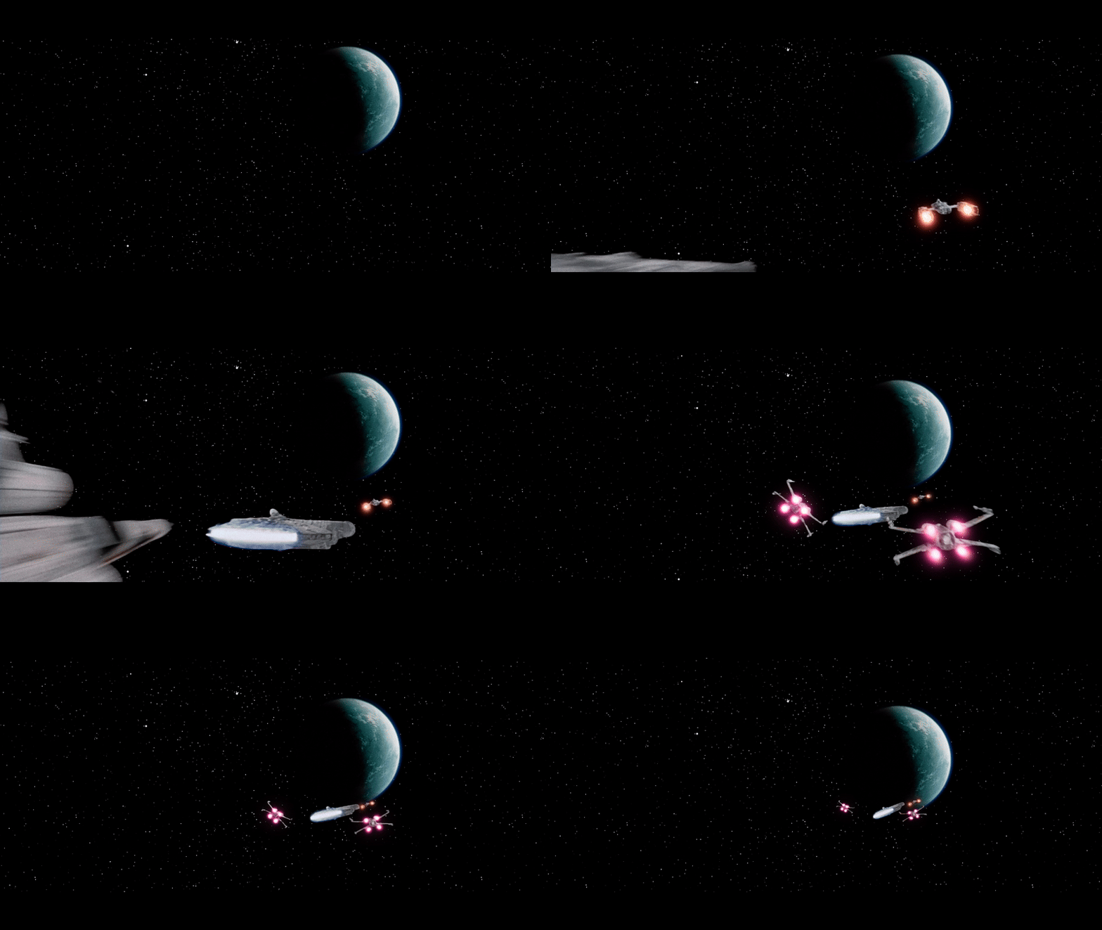
oops. Accidentally posted the top comparison without the falcon glow layer turned on.
here is the updated comparison:
(still working on the 3d model neverar, I haven’t forgotten that.)

(wipe removed for comp only)

original:

DevEd v.2

Full shot: https://drive.google.com/file/d/1ARgf0HUgH8pAiEEkicaik6_xcYBVik5I/view?usp=sharing

I think you nailed the trajectory on that shot to be honest. You have made the best of what is there. I think it is very charming to keep the original model fix the position and nice engine glow.

However the Planet still looks very green I distinctly remember to get it looking the right shade of Blue as when they arrive earlier it needed hue shifting quite a lot via selective correction. Obviously all the way through from green cyan to blue. Don’t be scared to be quite brutal there it is probably blue screen degredation or something. But looks very good when shifted into blue you must try it and you will see and feel when it looks like correct. Otherwise really great job on that shot 😃 Thanks


Author
Time
 (Edited)

Ronster said:

That guy with no name said:

oops. Accidentally posted the top comparison without the falcon glow layer turned on.
here is the updated comparison:
(still working on the 3d model neverar, I haven’t forgotten that.)

(wipe removed for comp only)

original:

DevEd v.2

Full shot: https://drive.google.com/file/d/1ARgf0HUgH8pAiEEkicaik6_xcYBVik5I/view?usp=sharing

I think you nailed the trajectory on that shot to be honest. You have made the best of what is there. I think it is very charming to keep the original model fix the position and nice engine glow.

However the Planet still looks very green I distinctly remember to get it looking the right shade of Blue as when they arrive earlier it needed hue shifting quite a lot via selective correction. Obviously all the way through from green cyan to blue. Don’t be scared to be quite brutal there it is probably blue screen degredation or something. But looks very good when shifted into blue you must try it and you will see and feel when it looks like correct. Otherwise really great job on that shot 😃 Thanks
Yavin IV is green NOT blue. Since 2004 the colouring of Yavin IV was screwed and it became blue during the SE additions. But pre 2004 it was green in every other shot apart from this one, which shifted towards blue. The original closeup matte painting used when the falcon approaches showed a green planet with blue oceans. Sadly Rogue One went for the “blue planet” look also, but it was originally more green, especially being a more forest planet and it helps differentiate between Alderaan.

ANH:REVISITED
ESB:REVISITED

DONATIONS TOWARDS MATERIALS FOR THE REVISITED SAGA

Author
Time

adywan said:

Ronster said:

That guy with no name said:

oops. Accidentally posted the top comparison without the falcon glow layer turned on.
here is the updated comparison:
(still working on the 3d model neverar, I haven’t forgotten that.)

(wipe removed for comp only)

original:

DevEd v.2

Full shot: https://drive.google.com/file/d/1ARgf0HUgH8pAiEEkicaik6_xcYBVik5I/view?usp=sharing

I think you nailed the trajectory on that shot to be honest. You have made the best of what is there. I think it is very charming to keep the original model fix the position and nice engine glow.

However the Planet still looks very green I distinctly remember to get it looking the right shade of Blue as when they arrive earlier it needed hue shifting quite a lot via selective correction. Obviously all the way through from green cyan to blue. Don’t be scared to be quite brutal there it is probably blue screen degredation or something. But looks very good when shifted into blue you must try it and you will see and feel when it looks like correct. Otherwise really great job on that shot 😃 Thanks
Yavin IV is green NOT blue. Since 2004 the colouring of Yavin IV was screwed and it became blue during the SE additions. But pre 2004 it was green in every other shot apart from this one, which shifted towards blue. The original closeup matte painting used when the falcon approaches showed a green planet with blue oceans. Sadly Rogue One went for the “blue planet” look also, but it was originally more green, especially being a more forest planet and it helps differentiate between Alderaan.

That’s exactly what I’ve always thought. thanks for this.

-TGWNN

Author
Time

I can see the reasoning behind making it more green like forest planet as you say the Special edition confuses things. It’s no biggie to me but i always thought that arrival matte of the planet looked pretty blue. But I always considered it confusing with Alderaan as you say. I think it is a good choice in retrospect. But then It does make me then think is the matte shot where they arrive a decent representation of the look too. It kind of feels like it all needs unifying whatever the choice.

Author
Time

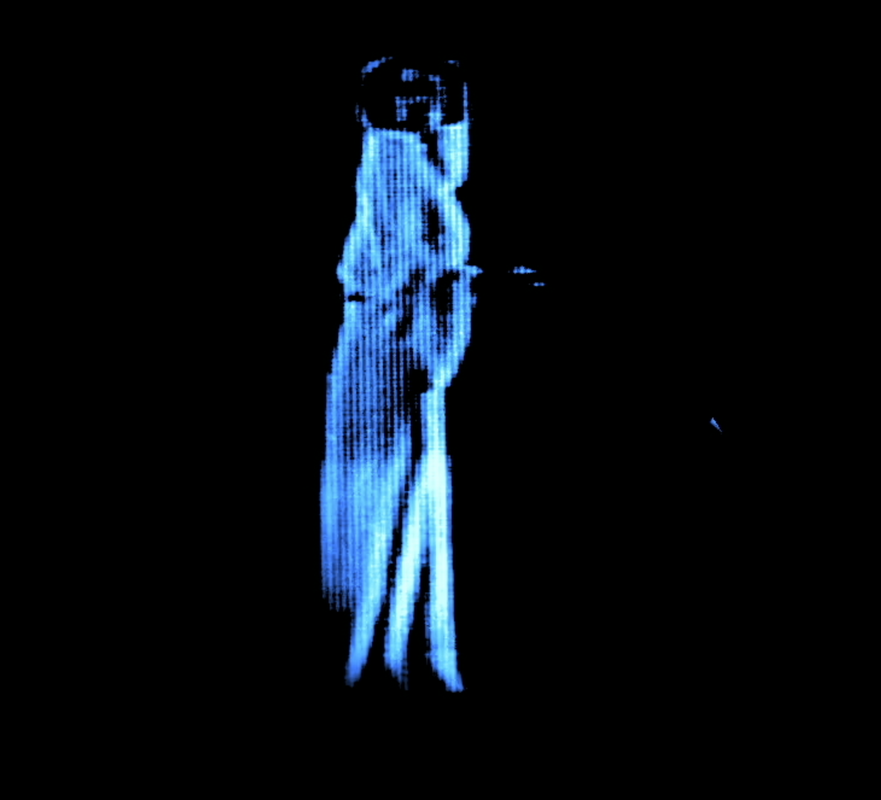
That’s really nicely done! Did you use the behind-the-scenes footage (and add the hologram & scanlines effects), or did you use the existing hologram footage? Either way, you’ve done some great rotoscoping there! Was it a case of doing some refined rotoscoping, or did you use another method for isolating the footage?

My edits:
https://ifdb.fanedit.org/fanedit-search/tag/faneditorname/phase3/