
- Time
- Post link
That's amazing. I read the comments first and didn't expect it to live up to them but it did. Crazy.
That's amazing. I read the comments first and didn't expect it to live up to them but it did. Crazy.

adywan is it going to look better than that is geonosis going to look a little less like tatoonie and not look so dark? if you fix those two problems with the color correction it will be perfect.

Hi Guys I saw this on a site, thought id share cos i think it looks
quite elegant... I DID NOT MAKE THIS
Link to website where i saw this below, all sorts of interesting art there
LINK HERE


I'm always amazed how people ignore the other 99% of this site.

Too bad there isn't an entire sub forum dedicated to stuff like this. Oh wait, there totally is.

It's nice to hear from sky regardless of his topicality.

Perhaps Sky_ was simply implying how beautiful that would look with the word "Revisited" slapped on it.
Guys chill out I only posted it here as it was Empire Strikes back art
as this is entire thread is about Empire ..
I was like Nightstalkerpoet said was thinking that would look cool with Revisited
also thank you Bingowings.
Once i posted an animated Adywan Logo i made, that went at the beginning of A new hope should a also post that elsewhere?
so relax people and chill out
Sky_ said:
Once i posted an animated Adywan Logo i made, that went at the beginning of A new hope should a also post that elsewhere?
Objection, Your Honor, not relevant.
Possessed said:
Too bad there isn't an entire sub forum dedicated to stuff like this. Oh wait, there totally is.
Objection, Your Honor, bad link.
nightstalkerpoet said:
Perhaps Sky_ was simply implying how beautiful that would look with the word "Revisited" slapped on it.
Objection, Your Honor, conjecture and/or leading the witness.
Sky_ said:
this is entire thread is about Empire ..
Objection, Your Honor, not admissible. Also not true.
The poster would need a few changes to make it "Revisited ready" (AT-ST escorts, the red window blanked out etc).
We have had posts like this before approved by Ady himself so I agree toning down the hysteria would lead to happy ending.
Bingowings said:
toning down the hysteria
You must be reading a different thread.

I'm sorry but the AOTC color correction done by Ady just looks too cyan to me. The whites like Dooku's hair and Padme's outfit look cyan pushed. NeverarGreat's looks better, but still not quite right.

Just remember that this is not the official final correction as Ady is merely testing the waters at the moment. Plenty of time until we get to see the finished product so no need to jump to any conclusions. :-)
“Did you know, the word ‘gullible’ is not in the dictionary?! Look it up.”

Someone else has seen this error?


I know ady posted his colour correction of some AOTC stuff, but that wasn't an invitation to start pointing out fixes for that movie. Save it for the forthcoming Prequel thread ;)
It's true . We'll have time to correct some errors. :)
HEY LET'S TONE DOWN THE HYSTERIA BRASH!!! NO NEED FOR HYSTERICS!!!!!

SWAlien said:
Someone else has seen this error?
I have, unfortunately. I first saw it after renting it from the local video store back in 2003. I then watched it again a number of times afterward, not knowing any better at the time.

If I didn't know any better I'd say Frink maaaaad.
To stay on topic I see no issue with any cyans in Ady's attempt. I mean it'd be preferable if the color was perfect, but I'd at least have this over the Blu-Ray colors.

Lust-In-Phaze said:
If I didn't know any better I'd say Frink maaaaad.
To stay on topic I see no issue with any cyans in Ady's attempt. I mean it'd be preferable if the color was perfect, but I'd at least have this over the Blu-Ray colors.
Technically, that is still off-topic. I know Ady brought it up, but still.
“Lifes a song you don’t get to rehearse, and every single verse can make it that much worse”

This is not a suggestion... I said earlier I tried to recreate that storyboard I posted up a while back from empire of dreams documentary which also does not appear in the OT storyboards book BTW. So to get things back on topic a bit I thought I would post the recreation I did here, although I don't mean to be intrusive and I just thought it looked (even by my crappy art standards)) good that is all. But I am also very sure that it can be done a lot better than what I have done also.
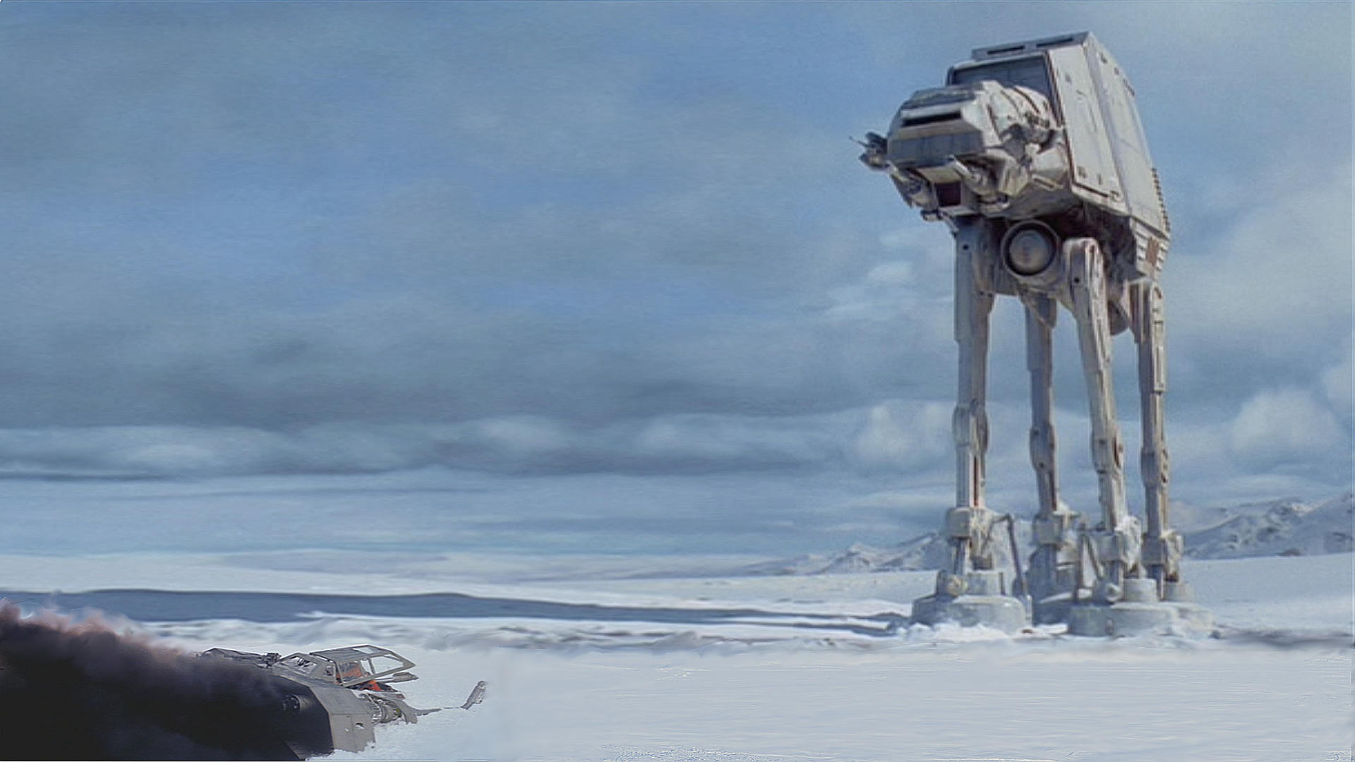
So I hope people like it and I have no idea if the scaling is correct that is way beyond my skills to know that! but I think it is about right or almost there. It also reminds me a bit of the iconic Ralph Mcquarrie painting too which I think is why i like what I did here using the story board idea. Looking forward to the HIC update whenever it comes no pressure keep up the good work folks.

I dunno if the scaling and all is correct or not, but I really like this and think Revisited needs something like it to replace the shot of the lone AT-AT after Luke crashes.
As it stands, the AT-AT appears to be in the middle of nowhere and it seems Luke has plenty of time to get out before the slow, lumbering thing gets to him. Then, suddenly, it's about to step right on him.
Even in Ronsters mock-up it looks like Luke would have plenty of time before the AT-At reaches him. He should be more worried about being blasted by it's AT-ST escort than being stomped by the AT-AT.
I know suggestions are closed, but this scene really bugs me.