
- Time
- Post link
Hey Neverar, have you reached any milestone during the last month ? 😉
Hey Neverar, have you reached any milestone during the last month ? 😉

No milestones, but at this moment I’m giving the Mos Eisley sequence another look based on the discussion in the Silver Screen Edition thread. It’s extra tricky since there are Special Edition shots in my version that weren’t originally graded for the '77 look.
You probably don’t recognize me because of the red arm.
Episode 9 Rewrite, The Starlight Project (Released!) and Terminator Ultimatum,
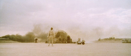
The destiny of this shot lies along a different path than Despecialized. Nevertheless, it deserves to look its best:
You probably don’t recognize me because of the red arm.
Episode 9 Rewrite, The Starlight Project (Released!) and Terminator Ultimatum,
Your regrade on top and Despecialized on bottom ?

Wow, that looks amazing!
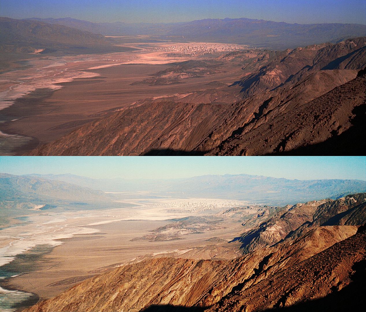
@UnitéD2: No, the top is clearly the Blu-Ray and bottom is the regrade - Despecialized used the original matte-paining, whereas this is the altered SE one.
Oh ok ! Not easy for me to say if it’s the original or the SE for this shot. Were the Mos Eisley houses digitaly added to te matte painting ?
Anyway, the Blu Ray is desolate. 😄
Yes, and digital ships were added and the framing got altered too.

The destiny of this shot lies along a different path than Despecialized. Nevertheless, it deserves to look its best:
Amazing work! Apart from the very natural color palette, I think the greatest achievement of this regrade is the much improved depth of the shot. It also is a clear reminder of how the bluray shots simply don’t have that photorealistic quality.
Thanks guys 😃
You probably don’t recognize me because of the red arm.
Episode 9 Rewrite, The Starlight Project (Released!) and Terminator Ultimatum,

The destiny of this shot lies along a different path than Despecialized. Nevertheless, it deserves to look its best:
Gorgeous!

I couldn’t put my finger on why I liked the bottom one so much more – until Dre mentioned the depth. The difference is night and day. Great job!

Wow, nice job on that shot! I love the more dynamic use of color.
Again, thanks. I’m pretty sure that this is how it would have looked when shot. However, since I’m trying to get back to the look of the actual film, There’s just no way it ever looked this nice back then. There was definitely a warming filter applied to the Tatooine scenes, as evidenced by Poita’s scans
 and even these photos from Ebay show:
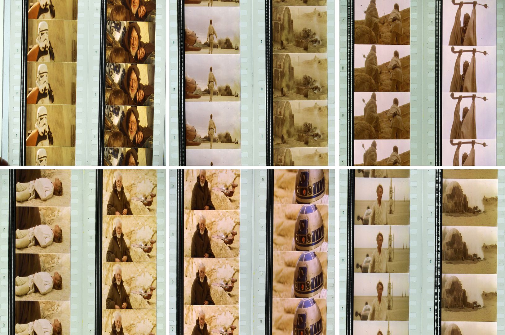
And after I’ve white balanced the frames:

Notice how similar this is to Poita’s frame!
After applying a single cooling filter, these scenes look a lot more natural, but it’s obvious that this isn’t how they looked on the film since the borders are now blue:
Of course photos can’t be trusted etc etc, but Poita’s scan and others are in agreement on this point. Also, it’s not that this reel is faded, since these shots come from the same reel, sandwitched between yellow Tatooine scenes:
My first grade of these scenes had them looking a lot like this dusty warm filtered film, but upon reviewing it would be a whole lot prettier if it looked like the original photography, and how I’ve graded Mos Eisley in the canyon. So what do you think should be done?
You probably don’t recognize me because of the red arm.
Episode 9 Rewrite, The Starlight Project (Released!) and Terminator Ultimatum,
Maybe you could give to each shot the best look possible ? So, the restoration of the filtered grading would be part of the despecialization and your final product would be useful for other fan edits ?
As for the Burning Homestead scan, I have recently tried to make it deeper and more colorful and contrasty and the result was pretty nice but certainly not true to the original theatrical grading.

Your result looks a lot like the GOUT.
I think it might look something like this with the warmer grading:

Maybe it would be a nice idea to post a few examples of the warm grade vs the natural grade?

The more I see of Star Wars from original film sources, the more I think that this warm appearance is the only way that it looks even remotely correct. Applying a natural or cooler color scheme totally destroys this distinctive look to the Tatooine scenes, making them much more generic and uninteresting, even if they can be ‘prettier’ that way. The yellow sand and rocks, the nearly colorless skies, the grain and softer focus all combine to create the feeling of an empty wasteland, which is certainly what they were going for at the time. Later revisions to this look only serve to undermine this aspect of their appearance.
Yeah, that looks more like how it’s supposed to be.
You probably don’t recognize me because of the red arm.
Episode 9 Rewrite, The Starlight Project (Released!) and Terminator Ultimatum,
Yeah, that looks more like how it’s supposed to be.
To me the desaturated ones look more film like.

I like the desatured ones too!!
for comparison these are from the super8


For me Tatooine is like a beautiful wasteland. It has great mountains and a beautifiul sky, but on that planet, where the grimy people live. Smugglers, Ship stealers and more stay in Mos Eisley under its beautiful view. Kinda like a country with a dark side to it. And I like the saturated ones.
super8 frames color corrected (very similar to your grading):


Sorry I didn’t respond sooner. Those shots have an interesting teal tone similar to some other prints I’ve seen from the 80’s. I don’t have the Super8 print as a reference, so it’s nice to see it.
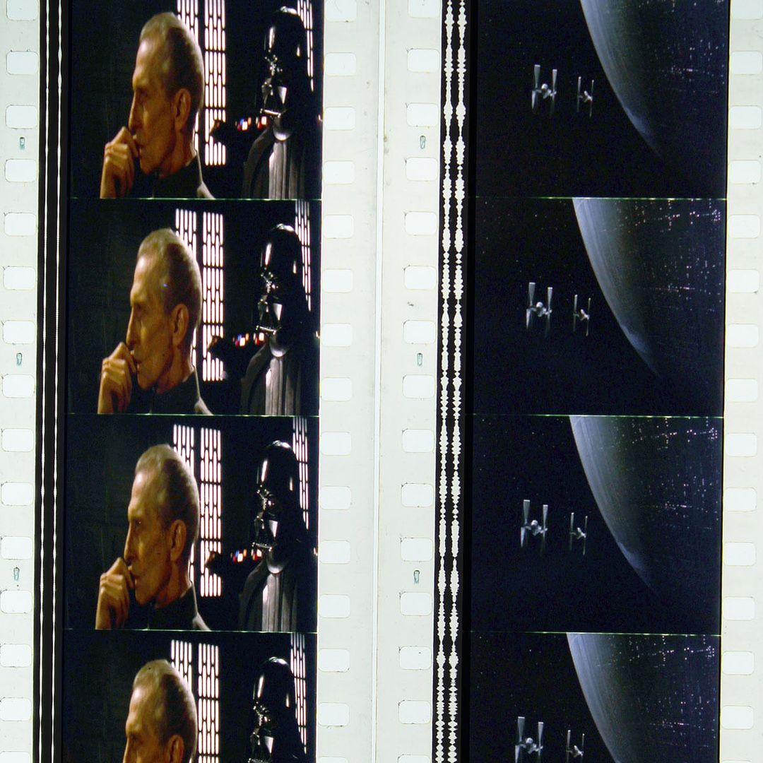
A mini update: Work continues apace with finalizing the first three reels. Most of reel 3 is finalized, and I’ve just signed off on the opening scenes:
You probably don’t recognize me because of the red arm.
Episode 9 Rewrite, The Starlight Project (Released!) and Terminator Ultimatum,
It’s hard to wait for the entire movie because every shots look great,your technicolor recreation is totally different from the bluray