logo Sign In

A New Hope DVD Color Correction (*unfinished project * - a mass of information) — Page 6

Author
Time

NeverarGreat, is it your intention to start undoing SE changes or simply to color-correct?  If it's the latter, I would question whether that shot is even worth touching.  I know it wasn't colored the way it is in the SE originally, but if it can't be fully fixed without rotoscoping (or a similar technique) and you're ultimately releasing the 2004 SE anyway, I'm not sure it matters much.

Author
Time

The intention is conflicted with regards to shots like this. The goal is to return the movie to its '77 technicolor look, but do as much as possible with color correction. So do I attempt to fix the color on things like the sky in this shot or the Leia hologram even though these elements have been physically altered? I think that the answer is a cautious yes, for though the offending elements would need to be replaced in a true restoration, I would like to release a version of the movie that is in the spirit of the original, colorwise. Perhaps I've gone too far in worrying about something that is a non-issue, but someone who knows how the original looks would probably be bothered by a blue sky instead of a red one. So as long as the color correction of an SE element doesn't compromise the correction of the original elements of the shot, I'm going to try and fix it as much as I can. Harmy did the same thing with his version 1 of Despecialized where the blue of the Leia hologram was corrected. Later he replaced the element altogether.

Basically, I'll do my best to make it look like the 77 technicolor version unless it compromises the rest of the image.

You probably don’t recognize me because of the red arm.
Episode 9 Rewrite, The Starlight Project (Released!) and ANH Technicolor Project (Released!)

Author
Time

While I'd go the other way and answer no that question, I understand your decision.  I'll look forward to your release. :)

Author
Time

In preparation for working with the Blu ray, I thought it would be a good idea to determine in what ways it differed from the DVD. Looking at the pink flashes and the highlights, it seems to me that the DVD is actually better than the Blu ray. The Blu ray seems to turn the highlights red to a greater extent than the DVD, and in some cases the highlights actually have less detail than the DVD!

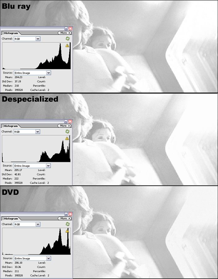
I used a screenshot of the Blu ray that I found online for this comparison. The highlights are clearly blown out in the Blu ray, and also in the GOUT for this shot, though I didn't include it in this comparison. Despecialized seems to fix this problem to some extent, but some detail has already been irretrievably lost in the Blu ray, such as in the bright part of Luke's hair and the ridges on his armor, so it's obviously not present in Despecialized in these places. I'll continue examining the Blu ray, but I'm disappointed that the DVD is a better source in some regards than the Blu-ray.

You probably don’t recognize me because of the red arm.
Episode 9 Rewrite, The Starlight Project (Released!) and ANH Technicolor Project (Released!)

Author
Time
 (Edited)

Well, actually, I never saw this as a problem in the SW BD or even the DVD for the most part don't really suffer from blown out highlights - if anything, the highlights are usually too muted - it is logical that you'll get blown out highlights in a flash frame and it's the way it should be - there may be more highlight detail on the O-Neg but there definitely wouldn't be on a print.

Now ESB is a different story unfortunately - there they somehow managed to severely blow out the highlight and crush the blacks at the same time in some scenes (you just have to look at the lightsaber duel to see that this is definitely not the case with the whole transfer) but in SW, I think it's not really an issue.

Author
Time

Looking at the I.B. Reference, I think you took the green way too far there - on the I.B. print, the wall seems to be pretty much the same shade as the BD with a bit less saturation and just a very slight green shift in the highlights. The skintone, on the other hand, seems right on the money in your picture.

Author
Time

Harmy said:

Looking at the I.B. Reference, I think you took the green way too far there - on the I.B. print, the wall seems to be pretty much the same shade as the BD with a bit less saturation and just a very slight green shift in the highlights. The skintone, on the other hand, seems right on the money in your picture.

Ah, the limitations of color-correcting in 8bpp... :-(

A picture is worth a thousand words. Post 102 is worth more.

I’m late to the party, but I think this is the best song. Enjoy!

—Teams Jetrell Fo 1, Jetrell Fo 2, and Jetrell Fo 3

Author
Time

AntcuFaalb said:

Harmy said:

Looking at the I.B. Reference, I think you took the green way too far there - on the I.B. print, the wall seems to be pretty much the same shade as the BD with a bit less saturation and just a very slight green shift in the highlights. The skintone, on the other hand, seems right on the money in your picture.

Ah, the limitations of color-correcting in 8bpp... :-(

What's that got to do with anything?

Author
Time

Harmy said:

AntcuFaalb said:

Harmy said:

Looking at the I.B. Reference, I think you took the green way too far there - on the I.B. print, the wall seems to be pretty much the same shade as the BD with a bit less saturation and just a very slight green shift in the highlights. The skintone, on the other hand, seems right on the money in your picture.

Ah, the limitations of color-correcting in 8bpp... :-(

What's that got to do with anything?

8bpp = low dynamic range, which might explain why the skintone is a good match, but the wall isn't.

I'd bet that he can't get the skintone and the wall to match the IB reference due to the low dynamic range; there just isn't enough "room" for the correction.

A picture is worth a thousand words. Post 102 is worth more.

I’m late to the party, but I think this is the best song. Enjoy!

—Teams Jetrell Fo 1, Jetrell Fo 2, and Jetrell Fo 3

Author
Time

Not really - these have been done in 8bit, quickly through color correction tools only, no manual separation of elements:

Author
Time

Harmy said:

Not really - these have been done in 8bit, quickly through color correction tools only, no manual separation of elements:

Ah, OK, but the low dynamic range is sometimes a significant drag on color-correction. I'm glad to see it isn't in this case.

A picture is worth a thousand words. Post 102 is worth more.

I’m late to the party, but I think this is the best song. Enjoy!

—Teams Jetrell Fo 1, Jetrell Fo 2, and Jetrell Fo 3

Author
Time

It can be, sure, but not quite as much as some people say, especially when your output is still just 8bit anyway.

Author
Time

NeverarGreat said:

The green is for you Frank!

Well, and also for matching to the Senator photos, and, yeah.

For me the colour balances you've got remind me alot of this 70mm frame (as well as the senator):

http://i44.tinypic.com/auv9rm.jpg


Author
Time

just to be contrary, i prefered your first result! can you make two versions? one theatrically accurate one and then one with a green/yellow tint called the "limited edition/frank edition" or something

Author
Time

frank678 said:

"limited edition/frank edition"

lol :-)

A picture is worth a thousand words. Post 102 is worth more.

I’m late to the party, but I think this is the best song. Enjoy!

—Teams Jetrell Fo 1, Jetrell Fo 2, and Jetrell Fo 3

Author
Time

frank678 said:

just to be contrary, i prefered your first result! can you make two versions? one theatrically accurate one and then one with a green/yellow tint called the "limited edition/frank edition" or something

That's not contrary, I like the first one better as well. This is why I keep referring to the Senator photos, though they're probably inaccurate in several ways. They just look gorgeous. I'll try to match them, then pull it back to the other sources. The final will land somewhere between the available sources in terms of brightness and color.

You probably don’t recognize me because of the red arm.
Episode 9 Rewrite, The Starlight Project (Released!) and ANH Technicolor Project (Released!)

Author
Time

The Complete Saga Blu-ray has arrived! This marks the fourth time I've bought copies of the original trilogy. Luckily I got this one half-off, because I wasn't prepared to pay money for the prequels. Dirty rotten thing to do, making someone pay for that just to get the bonus features. Anyway, the project continues....

You probably don’t recognize me because of the red arm.
Episode 9 Rewrite, The Starlight Project (Released!) and ANH Technicolor Project (Released!)

Author
Time

NeverarGreat said:

This is why I keep referring to the Senator photos, though they're probably inaccurate in several ways. They just look gorgeous.

Have you seen this - its an IB tech print for a film from the same year as Star Wars - the colours are absolutely incredible on this projection:

http://www.youtube.com/watch?v=MEX49eJW1M4