
- Time
- Post link
I took a quick stab at quickly correcting the 70mm frame in Photoshop. I think it’s probably closer to accurate. Certainly more natural-looking.
70mm Uncorrected:

70mm Corrected:

I took a quick stab at quickly correcting the 70mm frame in Photoshop. I think it’s probably closer to accurate. Certainly more natural-looking.
70mm Uncorrected:
70mm Corrected:

I took a quick stab at quickly correcting the 70mm frame in Photoshop. I think it’s probably closer to accurate. Certainly more natural-looking.
70mm Uncorrected:
70mm Corrected:
I think you’re right. Mine still has too much green/yellow.
And just for the heck of it, here is the bluray with the corrected 70mm frame’s color mapped onto it.

I would add a little more contrast, closer to the 70 mm, but otherwise great colors. I will go with your colors, and my contrast 😉.
Well I didn’t muck about with the blurays contrast at all. Just aligned the corrected 70mm frame in photoshop so it was registered and matched up to the bluray, then set the blend mode to ‘color’, so I could see how the bluray luminance looked with those colors.
I’ve done some quick and dirty corrections of some of the 70mm frames.


![]()


Thanks! They look awesome. These will be very useful.

Wow, those corrections do look really good. The elevator walls look a bit brighter/whiter than I usually think of them, but that might just be due to the fact that the perimeter of the frame looks washed out in many of the cells.

These are certainly in the ballpark.
You probably don’t recognize me because of the red arm.
Episode 9 Rewrite, The Starlight Project (Released!) and Terminator Ultimatum,
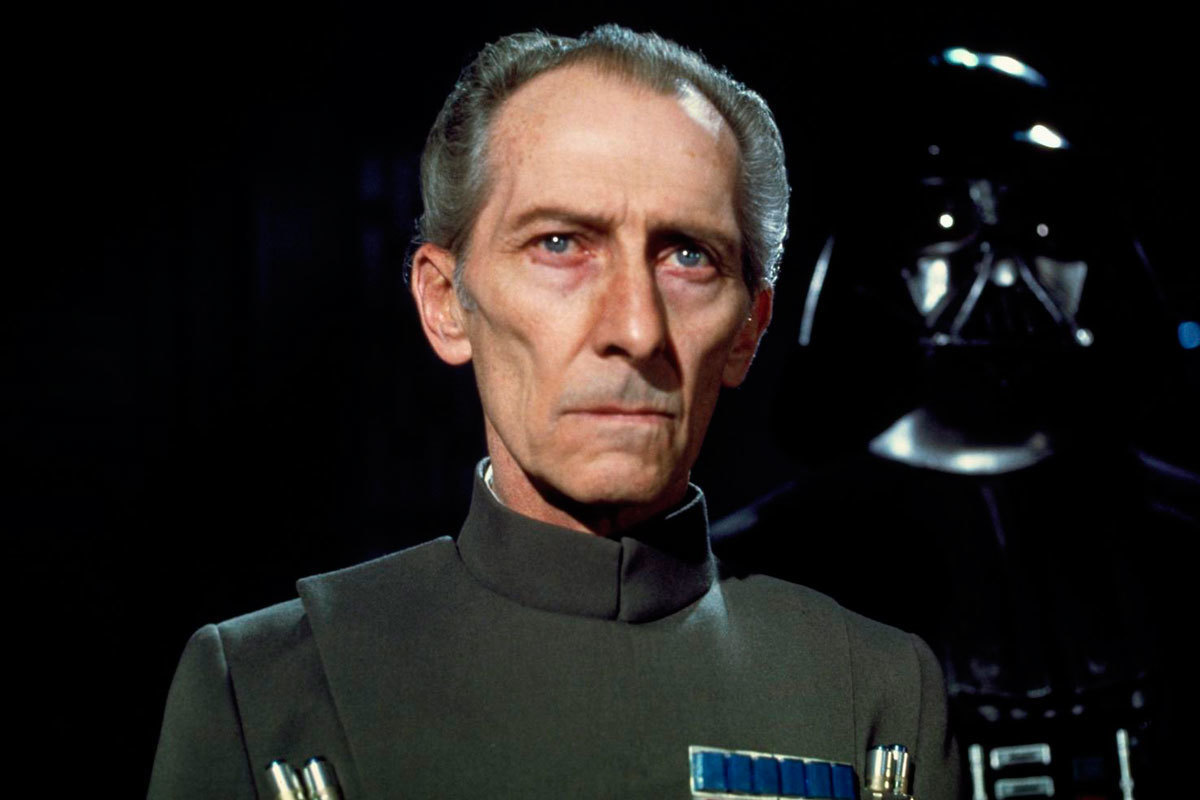
Having re-examined my reference materials, I’ve concluded there’s something wrong with the Tarkin/Motti color grading. The Tarkin frame for example looked like this:

…and should look closer to this (preliminary):


Having re-examined my reference materials, I’ve concluded there’s something wrong with the Tarkin/Motti color grading. The Tarkin frame for example looked like this:
…and should look closer to this (preliminary):
Just thinking out loud:
You’re trying to get some of the “warmth” back (which is good)… When I look at a lot of these correction threads I see very similar results… pulling the blue/magenta out of the blu ray gets us something a bit cold and when white balanced tends to push towards greens in some of the highlights. Looking at photos like this though and the Tech-Preview I see a lot more “peach” in the skin tones that seems to be really hard to get at from the blu ray. It almost feels like the film should have a mild orange/yellow push in it’s grading which looks more in line with some of your 70mm regraded shots before you white balance them.
In this case it’s not a problem of the bluray, but an issue of correcting the print. I can match the 70 mm print colors, as is evident from the previous page of this thread. The problem is that the print has a pronounced green shift, that has to be corrected for the regrade. The question is, how much green do you remove? This requires extensive examining of other references, such as the frame you posted. Often something will seem a major improvement, but then while examining more references, the inconsistencies with some of these references become difficult to ignore, and it’s back to the drawing board. The bluray has many issues, and so do the references. Getting a clear picture of how you believe it should look takes time, and a lot of hits and misses.

There is a guy on ebay who is (edit: was) selling what appears to be a chopped up Technicolor print.
This is what the Motti scene looks like according to this sample image that he posted:

Shouldn’t the soundtrack be grey on a technicolor? Not an expert, just repeating what I’ve heard.
Are there any other samples?
Here is the seller: http://www.ebay.co.uk/usr/movie.maniac?_trksid=p2047675.l2559
I have about 30 sample images from previous sales.
I think the 70 mm frames illustrate the challenges of color grading, even when the references are of very good quality. How do you make it look like something that was shot on film, rather than some digital hokus pokus.

I think all of this illustrates not only how subjective color grading is, but also that there really is an art to it. Some of Dre’s samples look fantastic, while others less so, and sometimes you can really tell that he’s just been working on a shot for far too long - it clearly looked “right” to him when he posted it, but I bet coming back to it a day later it didn’t look nearly so good.
I have found this myself - playing with the color wheels I can look at a shot and think “that looks good”, but small moves toward green or red or blue may also look just as good, as long as the colors are still natural looking. So while I know how to use Resolve to balance the colors and to tweak them this way and that, and to apply LUTs, I also know that I don’t have the same eye for color that other people have. I must confess that often the little tweaks between posted samples of the same frame are completely lost on me, even if one is right above the other.
Consider Raiders of the Lost Ark on Blu-ray. I watched it and thought it looked great. I didn’t notice any color changes. Now that I have seen the OT thread with the side by side images I can see the difference of course, but I wouldn’t have noticed it otherwise. (Same with Back to the Future. But I did notice the tint applied to the Aliens and The Terminator blu-rays without having to be shown!)
Anyway, I think you are on the right track here - I like how you are all collaborating to find a pleasing result for each shot. So far, all the projects graded by individuals (which includes TN1’s Silver Screen Edition, and Harmy’s projects) have had some shots that looked right, others that looked almost right and a few that just looked wrong.
I look forward to seeing Mike Verta’s final reference shots, then we can all just point Dre’s tool at those, generate a LUT and grade our projects the easy way. Hopefully, given Mike’s level of expertise and the degree of research he put into restoring each shot, his final grade will be as close as we’ll ever get to the original colors. Although I bet we’ll all be able to point to at least one shot (and probably not the same one!) and say that it doesn’t look quite right…
TheStarWarsTrilogy.com.
The007Dossier.com.
Donations always welcome: Paypal | Bitcoin: bc1qkpytnklvlg7yhm4u35xxa6w653f5da9d96p34e
You’ve touched on some good points, Williarob.
Despite working on a color correction type project, I’m not terribly skilled at the process, though I’ve learned a lot along the way. I can absolutely relate to staring at the same thing for so long and getting lost in it, coming up with something I see as perfect. And then looking at it the next day and it is quite clearly terrible. I’m making large enough shifts towards colors that, generally, were present at another stage along other people’s color correction process. So I can bring some of that back out when I’m lucky.
But working from the blu-rays (and not simply to remove the magenta and fix the contrast, but get it looking properly like other sources), requires patience that I am quite impressed by.
And I, too, am probably less picky about color than many people here. While “A New Hope” looks quite awful, in its 2004 master, for many other films my eyes/brain adjust to them quite rapidly even if they are less than ideal. If we didn’t all do that to some degree, I doubt we would ever find a single film to be watchable. 😃 And I agree that there are cases where I either don’t see the difference as substantial, or don’t care. And then there are cases where it seems huge and one version looks very wrong.
And there is definitely always going to be a need for judgement calls, because complete accuracy is unattainable. But I think that striving for it anyway, as people in this thread have been, gets things on as close to the correct track as possible. Mike Verta will definitely have made some judgement calls based on what he thinks looks right, and he has said as much. Though no one can achieve perfection, I do not think that they need to with how good things are looking. If Disney ever does anywhere near as good a job as Dre, Neverar, or (presumably) Mike, I’ll be quite happily surprised with them.
As always I prefer to develop an algorithm to do my corrections for me, since unlike people algorithms are always objective and unbiased by personal taste. So I’ve developed an algorithm, that automatically corrects the 70 mm frames (or any other frames). The algorithm requies no other input, but the uncorrected frame, and automatically estimates the correct colors. Here are my results for the frames darth lucas posted:


Here are examples for five Tatooine shots:


I believe this method to be pretty accurate for most frames. Here’s another example on a set of red shifted 70 mm frames from ROTJ:


Try it on TN1’s 70mm clip
it/she
As always I prefer to develop an algorithm to do my corrections for me, since unlike people algorithms are always objective and unbiased by personal taste. So I’ve developed an algorithm, that automatically corrects the 70 mm frames (or any other frames). The algorithm requies no other input, but the uncorrected frame, and automatically estimates the correct colors. Here are my results for the frames darth lucas posted:
The black levels are a bit off, but I’m pretty impressed how close this came to my manual adjustments.

Very much looking forward to this DrDre! I tried your color correction tool and it’s very admirable as well. Keep up your good efforts.
Palpatine: Make the galaxy great again!
I like it.
TheStarWarsTrilogy.com.
The007Dossier.com.
Donations always welcome: Paypal | Bitcoin: bc1qkpytnklvlg7yhm4u35xxa6w653f5da9d96p34e