logo Sign In

Star Wars Trilogy SE bluray color regrade (a WIP) — Page 9

Author
Time
 (Edited)

NeverarGreat said:

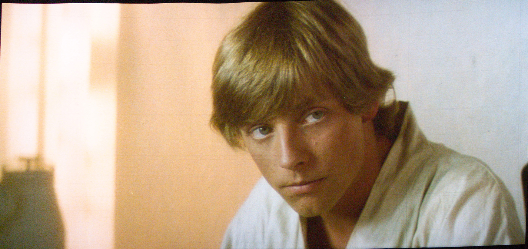
I very much doubt that the look of Tatooine is because of fading.

from this article: http://www.wilhelm-research.com/pdf/HW_Book_10_of_20_HiRes_v1c.pdf :

“Based on the many Technicolor imbibition prints he has
examined in recent years, Robert Gitt of the UCLA film archives had this to say about the image stability of the process: If you took a Technicolor dye imbibition print and you projected it many times at a drive-in theater and put a lot of light through it, the dyes do fade a little bit — particularly the cyan — although not that badly. But if you are careful with Technicolor imbibition prints, and keep them in the dark and don’t show them a lot, they don’t seem to fade at all. I’ve never seen one that has faded if properly cared for. It is a remarkably good process. Technicolor imbibition on triacetate base is very, very good.”

Of course, the process itself can be (and was in the case of Star Wars) uneven in terms of color across shots, but I highly doubt that every shot is wrong. For example, many shots in the Death Star are simply too green, but among these incorrect shots are shots where the color is accurate, and it’s easy to tell the difference. With Tatooine, you say that every shot has these issues, so there are no shots where you can get a good idea of what it should look like on the print. I know that there are Tatooine shots without the pink shift, so my recommendation would be to simply take the most color accurate shot of Tatooine you have (the one that most matches the actual shooting conditions and/or other reference photos) and work from that as a basis for the correction - it’s what I’ve done with the Death Star interiors.

Very interesting information from that link…thanks for it.

I find that TN1’s Silver Screen Edition, is a really decent gauge for how SW looked in the theaters in '77. It isn’t anywhere near perfect, and it’s a bit grainier than it should be, but it’s a good reference to build on.

Also, would you care to show us some comparison screenshots of those Death Star interiors? Perhaps this one from DeEd 2.5:

And from SSE:

There are probably better ones.

Author
Time
 (Edited)

Here’s an update of the grading of the Lars homestead scene. Especially the Luke shot has been much improved:

Author
Time
 (Edited)

The Luke shot is now actually a close match to the Senator print photo.

Senator print:

Bluray regraded:

Author
Time

Just an observation . .

I’ve found that color correction, especially where color results vary widely from the source, cause stressed color. That is, there are large “steps” between neighboring-pixel colors – from those that are affected a little to those that are affected allot. This effect may also vary across the individual R-G-B layers. It almost looks like artificial grain has been applied. I tried the JPEG Artifact Removal function in my paint program that I surmise looks for out-of-place pixels normally found in jpeg compression and massages them back into place . .

I like this particular “noise reduction” because it does it’s job with very little effect on actual (as opposed to perceived) sharpness. However, this whole problem might be avoided by first expanding the color-depth, then doing the corrections, and finally reducing back to the original color-depth. (I don’t have the hardware/software to test the effectiveness of that procedure. Can anyone try it?)

Author
Time
 (Edited)

The corrections with the algorithm are always done at an “infinite” color depth. In other words the rgb values are always converted to a double with range 0 to 1 for both the source and the reference. Although I agree that in some cases “stressed” color may be a problem, especially with color crush, blown out colors, and compressed images, I believe in the example you posted, you may have actually smoothed skin texture reconstructed by the color correction algorithm. The downside to every smoother, is that you always sacrifice detail for smoothness, although some definitely work better than others.

Author
Time

DrDre said:
The corrections with the algorithm are always done at an “infinite” color depth.

So, does that mean from a 24-bit (R-8, G-8, B-8), the color-depth is increased to, for example, 48-bit (R-16, G-16, B-16)? [Details are beyond me and this laptop.] 😃

… in some cases “stressed” color may be a problem, especially with color crush, blown out colors, and compressed images, … you may have actually smoothed skin texture reconstructed by the color correction algorithm.

I looked at the original Blu-ray (posted previously) and saw that you were starting off with Lucasfilm stressed color®. Your regrade just brought it out stronger (mostly from the contrast, it seems) . .

. . . . . . . . original Blu-ray . . . . . . . . . . . . . . . . . . . . . . color regrade . . . . . . . . . . . . . . . . . color regrade w/JPEG-DNR

Since it’s damaged to begin with, maybe a first step could be JPEG-DNR to the original, and then the regrade?

. . . . . . . . original Blu-ray . . . . . . . . . . . . . . . . . original Blu-ray w/JPEG-DNR
Author
Time

Maybe that’s why Owen looks so off to me. Could you try it on that shot at the dinner table?

Author
Time

No, I mean that each color channel is transformed from an integer to a double. For an 8 bit color color space, there are 256 possible color intensities. For 16 bit there are 256x256 possible color intensities. Doubles have a practically infinite number if possible numbers, and thus color intensities.

Author
Time
 (Edited)

I’ve updated the color grading on this shot, inspired by Darth Lucas’s grading, that I really like:

Author
Time
 (Edited)

Welcome YveX.

DrDre said:

I’ve updated the color grading on this shot, inspired by Darth Lucas’s grading, that I really like:

Looks nice…a little more contrast?, more Red? and the sky is a nicer Blue, than in some earlier posts:

Did you also turn up the Saturation a bit as well?

Author
Time

Wazzles said:
Maybe that’s why Owen looks so off to me. Could you try it on that shot at the dinner table?

Sure! With the same settings . .


.

@ DrDre

While doing the above, I tried different instances of JPEG-DNR: 1 application on “high”; 4 repeat applications on “low”; a split-RGB application – RED on low, GREEN on normal, BLUE on high (for progressively worse damage). Unfortunately, all the instances looked identical when inspecting pixels at high magnification.

Thanks for the integer/double explanation. In reconsideration of color-depth, although it’s good for number precision, it would be a lost cause due to down-rez rounding or truncation that would lose most or all that pixel precision anyway.

Rather, how about the resolution approach? If resolution were doubled (not pixel-doubling, but a standard averaging [not “smart resize”] for minimal processing to the original pixels), the new pixels between the original pixels would better catch your color regrade. Then, on downsizing, that new pixel information would distributed into the neighboring, original pixels. (If that would prove workable but insufficient, various resizers could be tested for both up-rez & down-rez to a best result.)

Here’s a test using that approach – with JPEG Artifact Remover on “maxium”, and using weighted average for both up and down resizing . .

. . . . . . . . . . . . . . color regrade . . . . . . . . . . . . . . . . . . . . . . . with up-rez / JPEG-DNR max / down-rez

See how this up-rez/down-rez method keeps more detail, even at the highest DNR setting, than the previous, direct application at the next lower DNR setting.

(Note that the original Blu-ray has R/G/B-crush on this shot, which results in only the red showing in the beard shadow, looking quite flat. Also, a DNR-pass [a la Spaced Ranger?] on the Blu-ray to reduce or eliminate those anomalies will prevent your regrade-pass from bringing them out even stronger.)

Author
Time
 (Edited)

dlvh said:

Welcome YveX.

DrDre said:

I’ve updated the color grading on this shot, inspired by Darth Lucas’s grading, that I really like:

Looks nice…a little more contrast?, more Red? and the sky is a nicer Blue, than in some earlier posts:

Did you also turn up the Saturation a bit as well?

Yes, I played around with a bunch of settings, so in the end I increased the contrast and saturation somewhat. The blue sky indeed looks better 😃. I still think it needs a little work, though. There are some artifacts, and it misses the film still quality, that some of the others have.

Author
Time

Spaced Ranger said:

Wazzles said:
Maybe that’s why Owen looks so off to me. Could you try it on that shot at the dinner table?

Sure! With the same settings . .


.

@ DrDre

While doing the above, I tried different instances of JPEG-DNR: 1 application on “high”; 4 repeat applications on “low”; a split-RGB application – RED on low, GREEN on normal, BLUE on high (for progressively worse damage). Unfortunately, all the instances looked identical when inspecting pixels at high magnification.

Thanks for the integer/double explanation. In reconsideration of color-depth, although it’s good for number precision, it would be a lost cause due to down-rez rounding or truncation that would lose most or all that pixel precision anyway.

Rather, how about the resolution approach? If resolution were doubled (not pixel-doubling, but a standard averaging [not “smart resize”] for minimal processing to the original pixels), the new pixels between the original pixels would better catch your color regrade. Then, on downsizing, that new pixel information would distributed into the neighboring, original pixels. (If that would prove workable but insufficient, various resizers could be tested for both up-rez & down-rez to a best result.)

Here’s a test using that approach – with JPEG Artifact Remover on “maxium”, and using weighted average for both up and down resizing . .

. . . . . . . . . . . . . . color regrade . . . . . . . . . . . . . . . . . . . . . . . with up-rez / JPEG-DNR max / down-rez

See how this up-rez/down-rez method keeps more detail, even at the highest DNR setting, than the previous, direct application at the next lower DNR setting.

(Note that the original Blu-ray has R/G/B-crush on this shot, which results in only the red showing in the beard shadow, looking quite flat. Also, a DNR-pass [a la Spaced Ranger?] on the Blu-ray to reduce or eliminate those anomalies will prevent your regrade-pass from bringing them out even stronger.)

Thanks for all that work! I will try to incorporate the DNR pass or something similar in the workflow. It does look better, with less artifacts.

Author
Time

DrDre said:

I’ve updated the color grading on this shot, inspired by Darth Lucas’s grading, that I really like:

It’s pretty funny how many hands that image has passed through, if I’m not mistaken.

You_too -> Harmy -> me -> DL -> you grading something based on it.

Author
Time
 (Edited)

Here are updated regrades for two of the Tatooine frames, with a little less saturation.

Bluray:

Bluray regraded:

Bluray:

Bluray regraded:

Author
Time
 (Edited)

Spaced Ranger said:

Wazzles said:
Maybe that’s why Owen looks so off to me. Could you try it on that shot at the dinner table?

Sure! With the same settings . .


.

@ DrDre

While doing the above, I tried different instances of JPEG-DNR: 1 application on “high”; 4 repeat applications on “low”; a split-RGB application – RED on low, GREEN on normal, BLUE on high (for progressively worse damage). Unfortunately, all the instances looked identical when inspecting pixels at high magnification.

Thanks for the integer/double explanation. In reconsideration of color-depth, although it’s good for number precision, it would be a lost cause due to down-rez rounding or truncation that would lose most or all that pixel precision anyway.

Rather, how about the resolution approach? If resolution were doubled (not pixel-doubling, but a standard averaging [not “smart resize”] for minimal processing to the original pixels), the new pixels between the original pixels would better catch your color regrade. Then, on downsizing, that new pixel information would distributed into the neighboring, original pixels. (If that would prove workable but insufficient, various resizers could be tested for both up-rez & down-rez to a best result.)

Here’s a test using that approach – with JPEG Artifact Remover on “maxium”, and using weighted average for both up and down resizing . .

. . . . . . . . . . . . . . color regrade . . . . . . . . . . . . . . . . . . . . . . . with up-rez / JPEG-DNR max / down-rez

See how this up-rez/down-rez method keeps more detail, even at the highest DNR setting, than the previous, direct application at the next lower DNR setting.

(Note that the original Blu-ray has R/G/B-crush on this shot, which results in only the red showing in the beard shadow, looking quite flat. Also, a DNR-pass [a la Spaced Ranger?] on the Blu-ray to reduce or eliminate those anomalies will prevent your regrade-pass from bringing them out even stronger.)

I don’t prefer the smoothed out look from what appears to be a spatial median filter.

-G

Author
Time

Here’s an update of the Owen and C-3PO shot.

Bluray:

Bluray regraded:

Author
Time

The diner scenes look great, the 3PO shot still looks a bit too green.

Author
Time
 (Edited)

pittrek said:

The diner scenes look great, the 3PO shot still looks a bit too green.

It needs a bit of fine tuning, but I think this is much better:

Author
Time
 (Edited)

Great work DrDre i really like how your handling the colors, although i would avoid using any dnr, if you look at the close up of luke with the jpg dnr applied he has plastic hair.

Author
Time
 (Edited)

Kingherb said:

Great work DrDre i really like how your handling the colors, although i would avoid using any dnr, if you look at the close up of luke with the jpg dnr applied he has plastic hair.

I was thinking the same thing, though I didn’t notice Luke’s hair, rather I thought Owen’s beard looked like smeared paint.

Army of Darkness: The Medieval Deadit | The Terminator - Color Regrade | The Wrong Trousers - Audio Preservation
SONIC RACES THROUGH THE GREEN FIELDS.
THE SUN RACES THROUGH A BLUE SKY FILLED WITH WHITE CLOUDS.
THE WAYS OF HIS HEART ARE MUCH LIKE THE SUN. SONIC RUNS AND RESTS; THE SUN RISES AND SETS.
DON’T GIVE UP ON THE SUN. DON’T MAKE THE SUN LAUGH AT YOU.

Author
Time

DrDre said:

pittrek said:

The diner scenes look great, the 3PO shot still looks a bit too green.

It needs a bit of fine tuning, but I think this is much better:

Beautiful!

“Stargazing wizards, stare into the night,
Hurricanes and blizzards, here comes the final fight”

Author
Time

Kingherb said:
… if you look at the close up of luke with the jpg dnr applied he has plastic hair.

Dek Rollins said:
I was thinking the same thing, … rather I thought Owen’s beard looked like smeared paint.

Just for clarification:
The Luke picture was applied JPEG-DNR to the full size. The Uncle Owen picture used the newer technique of applied JPEG-DNR to double it’s size (and then reduced back to normal size). Note the results difference.
A different matter is Owen’s beard, which has Blu-ray crush problems. In the beard’s shadow area, it’s a flat color missing most of the BLUE and GREEN components (unrelated to any application).