logo Sign In

Star Wars Trilogy SE bluray color regrade (a WIP) — Page 8

Author
Time
 (Edited)

towne32 said:

Looks better. But Owen’s skin and robe look a bit green. I don’t know why he looks so utterly bizarre in some of the 04/11 blu-ray shots in this scene.

Damn, that will teach me to use my uncalibrated monitor. It’s been corrected. 😃

Author
Time

Hmmm…I was hoping you’d be able to get rid of what I call Luke’s Honey Colored Hair. I was hoping it would come out a bit more Brownish, with maybe some Green in there, like the color of his hair in this shot:

The shot of Luke and Owen eating is quite nice though. That’s the best I’ve seen of that shot in a while.

Author
Time
 (Edited)

That’s just what Mark Hamill’s hair looks like on the print and real life (40 years ago). I don’t want to get rid of anything that’s supposed to be there. He has dark blond hair, which may appear brown under some lighting conditions, and blond under other lighting conditions.

Just look at this still from the end celebration (it actually looks like this on the print as well):

Author
Time

I personally just hope you make his hair bright yellow like the old Kenner toys.

Author
Time

DrDre said:

Here’s another shot from the same sequence.

Funny tidbit: on the print the food in the bowl is actually orange/yellow. Good ol’ George probably thought people didn’t like yellow food, so he turned it into gray goo for the bluray release. Some of these changes are just weird.

Bluray:

Bluray regraded:

I’ve finished this scene in my version, and the yellow is actually gone from entire shots (if you notice, the flowers in the lower left are supposed to be yellow as well). It’s a problem with hundreds of shots of the blu-ray, which means that I’ve had to pull these colors from other sources since they simply no longer exist in the blu-ray.

You probably don’t recognize me because of the red arm.
Episode 9 Rewrite, The Starlight Project (Released!) and ANH Technicolor Project (Released!)

Author
Time

Darth Lucas said:

I personally just hope you make his hair bright yellow like the old Kenner toys.

How about this?

Author
Time

NeverarGreat said:

“I’ve finished this scene in my version, and the yellow is actually gone from entire shots (if you notice, the flowers in the lower left are supposed to be yellow as well). It’s a problem with hundreds of shots of the blu-ray, which means that I’ve had to pull these colors from other sources since they simply no longer exist in the blu-ray.”

And what did your shots of this scene look like, my we see?

Author
Time

DrDre said:

Darth Lucas said:

I personally just hope you make his hair bright yellow like the old Kenner toys.

How about this?

Lol…No, something more on these lines:

Author
Time
 (Edited)

Here’s a comparison with the Senator screening photos (that has the yellow flowers and food, and a blonde Luke Skywalker 😉), that were not used for the regrade, since they are not very reliable:

Senator screening:

Bluray regraded:

Senator screening:

Bluray regraded:

Author
Time
 (Edited)

dlvh said:

NeverarGreat said:

“I’ve finished this scene in my version, and the yellow is actually gone from entire shots (if you notice, the flowers in the lower left are supposed to be yellow as well). It’s a problem with hundreds of shots of the blu-ray, which means that I’ve had to pull these colors from other sources since they simply no longer exist in the blu-ray.”

And what did your shots of this scene look like, my we see?

Sure:
http://screenshotcomparison.com/comparison/164143/picture:1

Screenshot Comparison has recently been increasing image saturation for some reason. I also may give it another look since Silver Screen was made available after I finished this scene.

Jedit: Now two comparisons at link

Dinner 1
Dinner 2
Reuploaded the images at more accurate saturation.

You probably don’t recognize me because of the red arm.
Episode 9 Rewrite, The Starlight Project (Released!) and ANH Technicolor Project (Released!)

Author
Time
 (Edited)

Thanks for that NeverarGreat!

That one looks good…Perhaps the other shots of him looked off to me because of his odd face coloring, and how it clashed with his hair color?

NeverarGreat’s:

Versus the one that just seemed off:

Thank you all for the hard work you are doing!

Author
Time

NeverarGreat said:

dlvh said:

NeverarGreat said:

“I’ve finished this scene in my version, and the yellow is actually gone from entire shots (if you notice, the flowers in the lower left are supposed to be yellow as well). It’s a problem with hundreds of shots of the blu-ray, which means that I’ve had to pull these colors from other sources since they simply no longer exist in the blu-ray.”

And what did your shots of this scene look like, my we see?

Sure:
http://screenshotcomparison.com/comparison/164143/picture:1

Screenshot Comparison has recently been increasing image saturation for some reason. I also may give it another look since Silver Screen was made available after I finished this scene.

Jedit: Now two comparisons at link

Dinner 1
Dinner 2
Photobucket seems to increase the saturation as well. Ah well, you get the idea.

Those are really nice NeverarGreat!

Author
Time

If Harmy pulls in both Dre’s and Neverar’s methods into his next versions, there’s going to be little left for us to gripe about in terms of color.

Nice work, both of you!

-G

Author
Time
 (Edited)

Thanks G! I’ve adjusted the brightness of both my regrades somewhat:

Author
Time
 (Edited)

Here’s what the Luke shot looks like on the Technicolor IB print:

Author
Time
 (Edited)

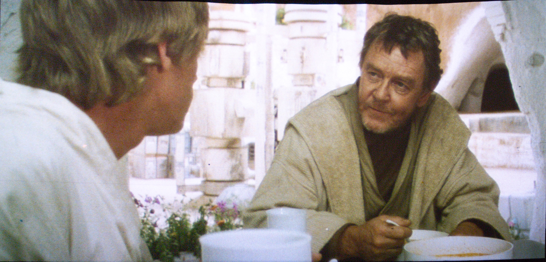
So, why do my regrades have so much more color, when the Technicolor IB print scans suggest that the Tatooine footage is fairly monochrome and desaturated? Well, it’s because imo the Technicolor print scans most of us have been using as a color reference, has many color issues. The saturation, brightness, contrast, and tones fluctuate wildly. Take the scene of Luke, R2-D2, and C-3PO at the Canyon, just before Luke is attacked by Tusken Raiders. This is what it looks like on the Technicolor print scans:

It looks like ****. It’s desaturated, and lacks contrast. There’s a pink shift. It’s just awful. Of course I thought: it’s a Technicolor IB print, so these must be the colors. Tatooine is supposed to be a barren wasteland. Maybe it’s a delibirate choice? Then again the Senator print photos didn’t look so lifeless.

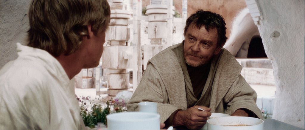
I also came across this still frame from the same canyon sequence:

It’s then that I realized that Star Wars actually is supposed to have color, and that the print scans, although still a valuable reference, require substantial corrections. Consequently, one reference source was not going to be enough. So for my final color grading for this scene, I corrected the print scans, and ended up with this:

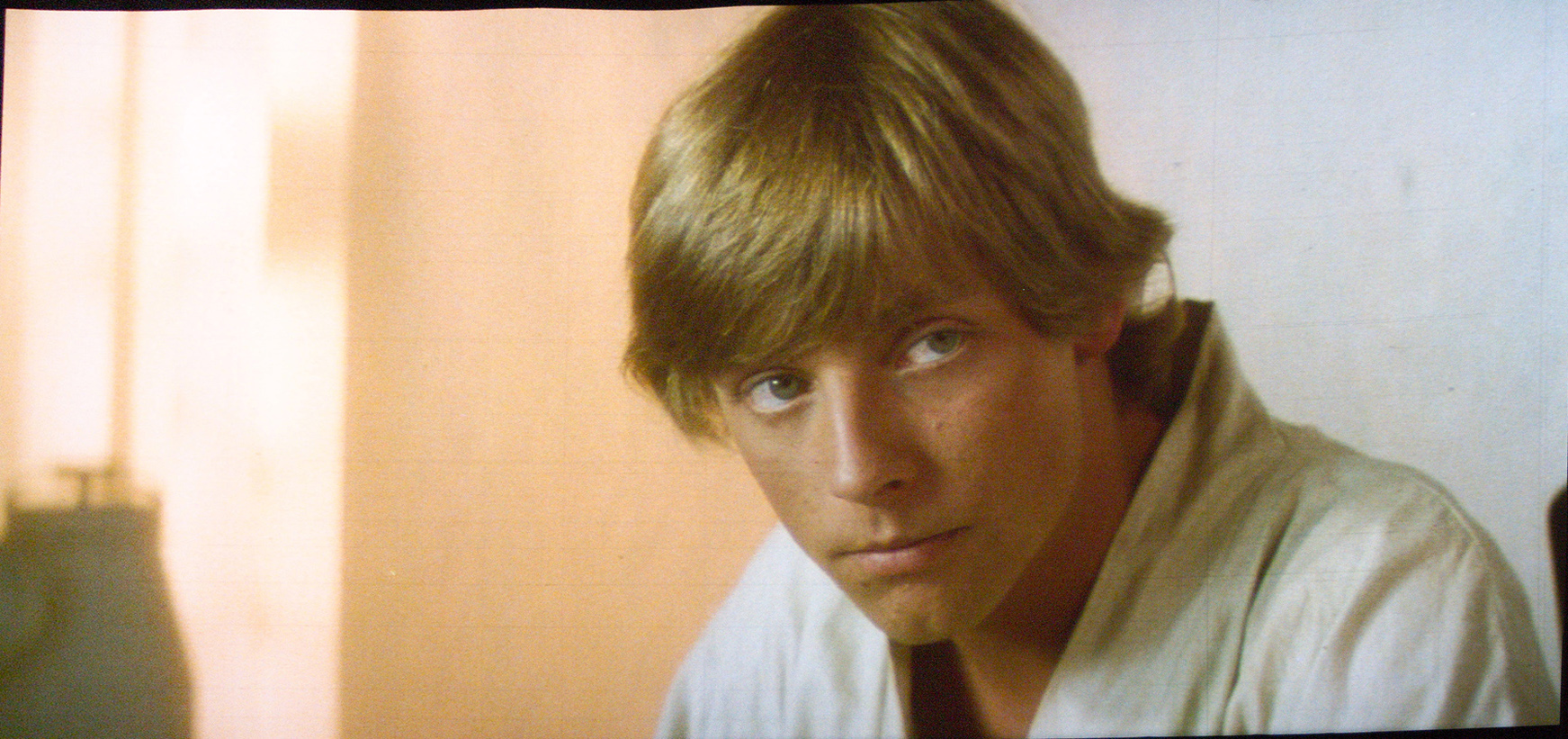
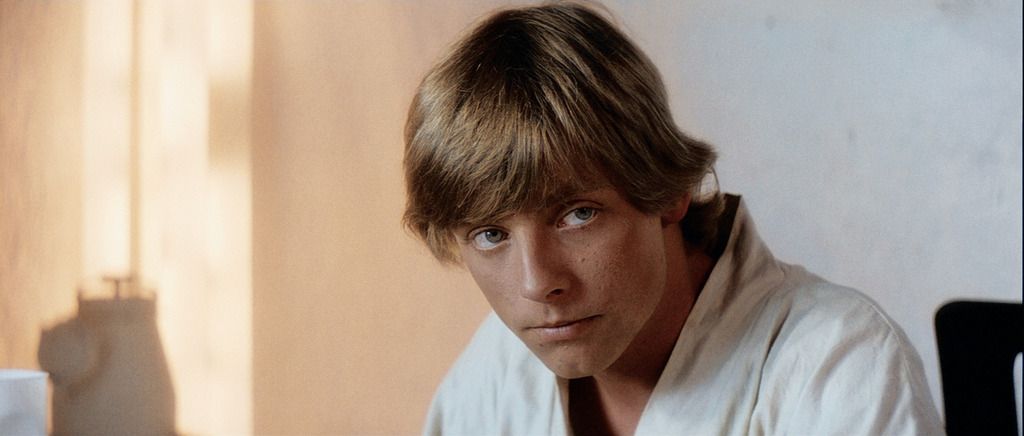
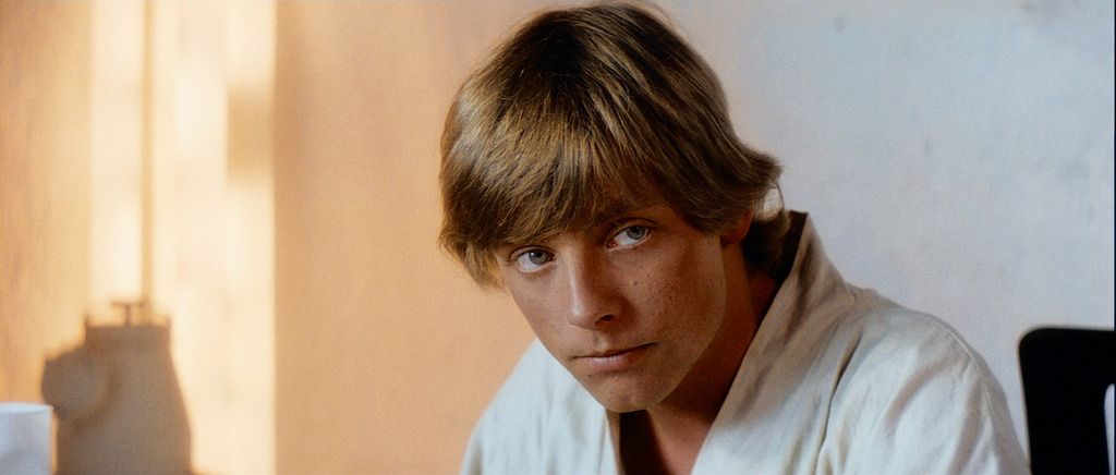
Applying the same technique on the Luke Skywalker shot, the colors thus go from this:

to this:

As with the canyon scene the color dynamic, saturation, and contrast have been much improved, compared to the faded colors of the print.

Author
Time
 (Edited)

Here’s an improved regrade of that shot:

It actually unintentionally very closely matches an unfaded still I found on the web, so I’m pretty confident the color grading is accurate:

Author
Time
 (Edited)

I very much doubt that the look of Tatooine is because of fading.

from this article: http://www.wilhelm-research.com/pdf/HW_Book_10_of_20_HiRes_v1c.pdf :

“Based on the many Technicolor imbibition prints he has
examined in recent years, Robert Gitt of the UCLA film archives had this to say about the image stability of the process: If you took a Technicolor dye imbibition print and you projected it many times at a drive-in theater and put a lot of light through it, the dyes do fade a little bit — particularly the cyan — although not that badly. But if you are careful with Technicolor imbibition prints, and keep them in the dark and don’t show them a lot, they don’t seem to fade at all. I’ve never seen one that has faded if properly cared for. It is a remarkably good process. Technicolor imbibition on triacetate base is very, very good.”

Of course, the process itself can be (and was in the case of Star Wars) uneven in terms of color across shots, but I highly doubt that every shot is wrong. For example, many shots in the Death Star are simply too green, but among these incorrect shots are shots where the color is accurate, and it’s easy to tell the difference. With Tatooine, you say that every shot has these issues, so there are no shots where you can get a good idea of what it should look like on the print. I know that there are Tatooine shots without the pink shift, so my recommendation would be to simply take the most color accurate shot of Tatooine you have (the one that most matches the actual shooting conditions and/or other reference photos) and work from that as a basis for the correction - it’s what I’ve done with the Death Star interiors.

You probably don’t recognize me because of the red arm.
Episode 9 Rewrite, The Starlight Project (Released!) and ANH Technicolor Project (Released!)

Author
Time

DrDre said:
It actually unintentionally very closely matches an unfaded still I found on the web, so I’m pretty confident the color grading is accurate:

It’s not the color that’s the problem, there’s just something about his face that looks artificial. Something that’s not present in that still.

Author
Time

After I finish an update for the color correction tool, I will be away for a few weeks. We’ve bought a house, so there will be little time to spare…