logo Sign In

Raiders of the Lost Ark - 35 mm regrade (a WIP) — Page 3

Author
Time
 (Edited)

NeverarGreat said:

Now this is interesting. I noticed in the trailer still, Belloq's tie is quite blue, but so is the balance of the frame. In the other grades and regrades, the tie turns quite green. So I searched for how the tie is supposed to look, and came across this:

Here the tie is clearly gray, whereas the Nazi officer's tie remains quite green. Overall, Belloq's suit seems more balanced here. Just some more data to consider :)

 There appears to be a red shift in that image. Interestingly, when I apply autofix on this with my phone, I get:

Author
Time

NeverarGreat said:

It is a bit red, though now his cream colored suit is shifted green. Perhaps somewhere in between:

JEDIT: Imageshack is turning up the saturation of the image. This is part of why it's so hard to talk about color online. Here's one with less saturation:

 Looks much better! Seems pretty consistent with the regrade.

Author
Time

I guess what threw me was this frame:

The cream colored suit has turned green, and on closer examination seems to have some green artifacts in it. This shot however:

seems to be much closer to normal, though his striped shirt is closer to pink. So it looks like the shots are inconsistent from the outset, and simply correcting both with the same settings isn't going to fix these sorts of problems. If you want a global color fix (as you indicated earlier) then I entirely understand and retract my nitpick. Life is too short for shot by shot color corrections and sanity is a good thing :)

You probably don’t recognize me because of the red arm.
Episode 9 Rewrite, The Starlight Project (Released!) and ANH Technicolor Project (Released!)

Author
Time
 (Edited)

NeverarGreat said:

So it looks like the shots are inconsistent from the outset, and simply correcting both with the same settings isn't going to fix these sorts of problems. If you want a global color fix (as you indicated earlier) then I entirely understand and retract my nitpick. Life is too short for shot by shot color corrections and sanity is a good thing :)

 That's what I noticed, it seems like it could do with a going over on a shot by shot basis in some regards. And I actually thought that was the purpose.

It would be quite something to really, go through it shot by shot and do CC on it.

I do think that is what it ultimately needs which is an awful lot of work but it's nothing too drastic either.

Author
Time
 (Edited)

Seems to be a problem in all of the releases. Belloq's shirt is pink in this shot of the WOWOW:

Considering that both the jacket, and the shirt are very light colored, it seems likely that Belloq beige  jacket was more green tinted than red, since his shirt should be white. Unless he was wearing a pink shirt.

Author
Time
 (Edited)

I think most of the green/pink problems were introduced with the last update, so here's another update, that I think fixes most of these issues (top bluray, middle WOWOW, bottom regrade). The problem with this frame is, that the green shift/artifacts are probably in the negative, or the original scan of the negative because even the WOWOW, which is slightly red shifted, has patches of green on Belloq's jacket (most noticeable below his right arm). There's even a pink blob on his right arm.

Author
Time
 (Edited)

35 mm:

Bluray:

WOWOW:

Regrade:

35 mm:

Bluray:

WOWOW:

Regrade:

35 mm:

Bluray:

WOWOW:

Regrade:

Author
Time

I really like these shots, the other releases look dull in comparison. Looking forward to the release of this regrade, what format do you plan to release this in?

Author
Time

These are great settings! Very filmic. The first comparison made me notice a potential issue with your settings that I have had to deal with when making a custom LUT for the Star Wars blu-ray.

In this shot you can see the that the darker areas of the (supposedly neutral) blackboard are indeed neutral, yet the areas where the light is striking it appear yellowish green. The 35mm frame perhaps goes too far, making the entire board blue, but in my opinion the regrade goes too far in the green direction. This was a big problem with Star Wars, and made things which were supposed to be white look green. A good way that I found of making things look filmic was to boost the blues in the highlights while reducing the blues in the shadows, though usually you will want to just aim for neutral highlights.

You probably don’t recognize me because of the red arm.
Episode 9 Rewrite, The Starlight Project (Released!) and ANH Technicolor Project (Released!)

Author
Time
 (Edited)

NeverarGreat said:

These are great settings! Very filmic. The first comparison made me notice a potential issue with your settings that I have had to deal with when making a custom LUT for the Star Wars blu-ray.

In this shot you can see the that the darker areas of the (supposedly neutral) blackboard are indeed neutral, yet the areas where the light is striking it appear yellowish green. The 35mm frame perhaps goes too far, making the entire board blue, but in my opinion the regrade goes too far in the green direction. This was a big problem with Star Wars, and made things which were supposed to be white look green. A good way that I found of making things look filmic was to boost the blues in the highlights while reducing the blues in the shadows, though usually you will want to just aim for neutral highlights.

 I was still fiddling with the settings a bit. I've updated the above screenshots, so I guess the old ones were v1.4 beta. ;-)

I think this looks much better (as do the others):

Author
Time

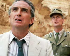
Hmm, the blues are somewhat better, though that's making some things such as skin tones and highlights turn that dreaded pink, and it's losing the filmic quality that was so good about the previous version. This is where I usually break out the channel mixer. If you decrease the blue in the red channel while putting that blue into the red channel, and also decrease the green in the green channel while putting that green into the blue channel, it can often give a more filmic look. Here are your latest screenshots with an RGB and Channel Mixer adjustment:

Some things to look for:

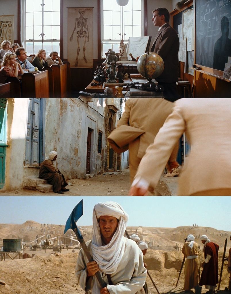
The sand in the bottom picture is of relatively uniform color, a yellowish brown with no shifts to pink or green. The greenish tub on the left is now closer to the brown indicated in the 35mm print. The green door in the middle shot is now less saturated as well. Incidentally, it's useful to choose screenshots which have areas of very saturated color in the red, green, and blue channels so that you can see easily if one channel is more dominant than another. In this case, it looks like there was too much information in the green channel and not enough green filling out the blue channel.

You probably don’t recognize me because of the red arm.
Episode 9 Rewrite, The Starlight Project (Released!) and ANH Technicolor Project (Released!)

Author
Time
 (Edited)

This is what I get if I use one of your adjusted frames as a reference (with a few tiny adjustments):

Author
Time

Kingherb said:

I really like these shots, the other releases look dull in comparison. Looking forward to the release of this regrade, what format do you plan to release this in?

 I plan to release it as an mkv, as that is the most vertasile.

Author
Time
 (Edited)

These two screenshots remain my favourite examples of how dull the bluray and WOWOW are compared to the regrade (top bluray, middle WOWOW, bottom regrade):

Author
Time

A video sample of the opening scene should be done by tomorrow...

Author
Time
 (Edited)

Here's the video sample for the Raiders of the Lost Ark - 35 mm regrade (available until October 5th, 2015):

http://we.tl/1frdO3e5k4

I think it looks pretty awesome, very film like. The  shot of Belloq laughing looks very descent, unlike the bluray and WOWOW, where it looks pretty bad, because the contrast was reduced revealing a lot of noise, and such. Anyway, enjoy!

Author
Time

Looks great to me! Thanks for sharing your hard work. Looking forward to seeing the whole thing! :)

Author
Time

It looks good. I can't tell if it's my monitor, but the video looks a little dark.

Author
Time

rockin said:

It looks good. I can't tell if it's my monitor, but the video looks a little dark.

 It is somewhat too contrasty, and there's a little too much red in the dark areas. I will adjust both, and prepare a new video sample. 

Author
Time

The new video sample is almost ready. The darkness issue has been adressed. It's looking very good IMO. 

Author
Time
 (Edited)

Here are a couple of frame comparisons for the video sample that will be posted soon of the latest regrade (bluray top, correction bottom):

Author
Time
 (Edited)

Here's the comparison against the 35 mm frames, the bluray, and the WOWOW:

35 mm:

Bluray:

WOWOW:

Regrade:

35 mm:

Bluray:

WOWOW:

Regrade:

35 mm:

Bluray:

WOWOW:

Regrade:

Author
Time

I personally think you had it right to begin with at post 12, 13, etc.