logo Sign In

Raiders of the Lost Ark - 35 mm regrade (a WIP)

Author
Time
 (Edited)

There have been many discussions about the color grading of the recently released Raiders of the Lost bluray. Although many liked the new colors, others complained about the orange and teal look of this classic film, and prefer the color grading used for the dvd’s (and used in a number of HD broadcasts), released in 2003. However, in my opinion neither is actually representative of the original 1981 color timing. For example, both versions have a very noticeable red shift in the bar fight scene, that is not in the release and re release trailers, or in the 1980s home video releases. This project is aimed at creating a version of Raiders of the Lost Ark closer to the original theatrical colors. Although an original unfaded 1981 35 mm print would be the ideal reference, sadly it is not available. As such I will use the 1984 laserdisc release as a reference for a shot by shot regrading:

Stay tuned for more information…

================================================================================================

Original start of the thread:

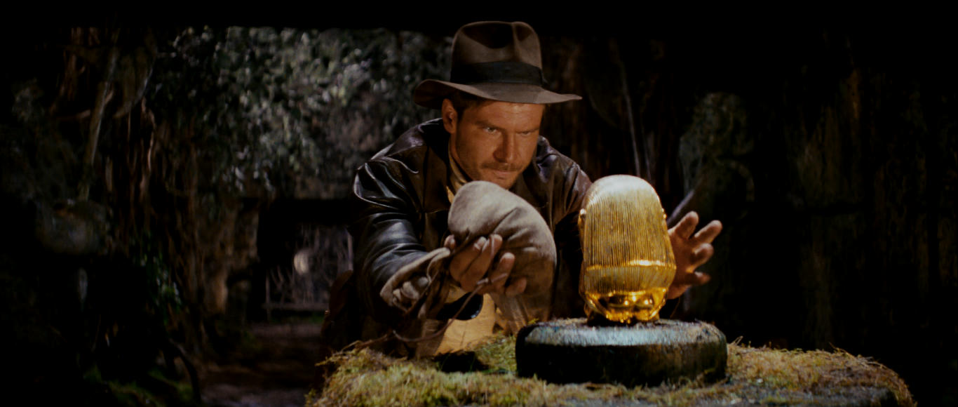
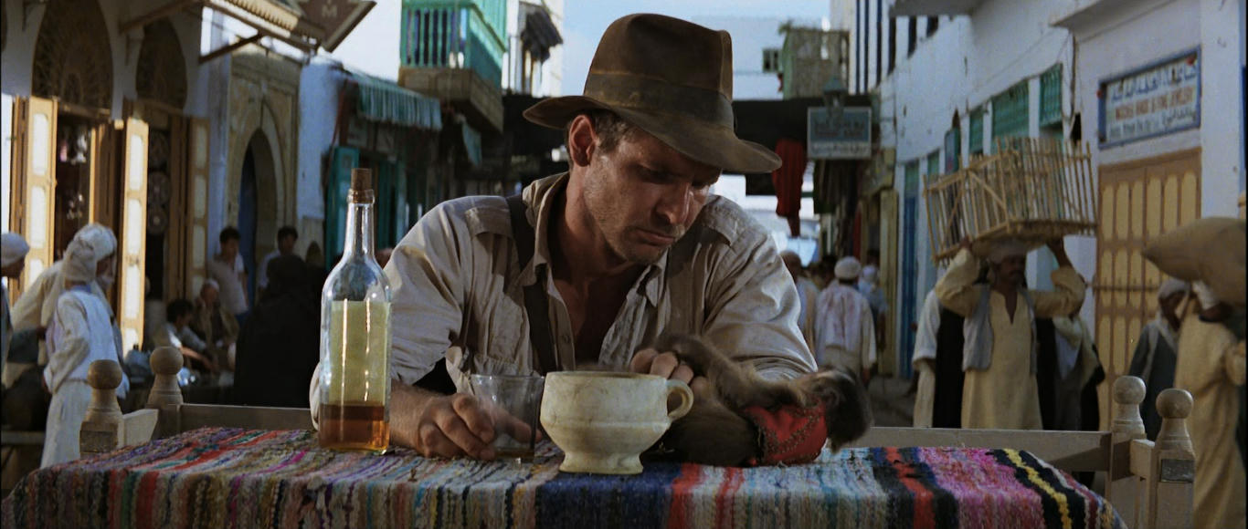
I used this 35 mm frame as a reference:

Calibrate a color correction model to match the bluray to this frame.

Bluray:

Bluray matched to 35 mm frame:

Here’s how the color correction model would color grade a number of other frames (bluray top, correction bottom):

Author
Time
 (Edited)

As I said in your colour-matching thread; I think it looks awesome and I definitely think that you should do the regrade. Really cool this.

Author
Time

In the Raiders color timing thread it was remarked that the bluray was an attempt to approach the theatrical color grading, and that the original color grading was more yellow, especially in the desert scenes, as is evident from this 35 mm frame:

Well the color correction model predicts the following for desert shots:

Bluray:

Bluray corrected with single frame color correction model:

I think the color correction model nailed it.

Author
Time

Those regraded frames look excellent!  Can't wait to check out the whole film this way!  :-D

Author
Time

What I noticed in your regrades though (including the SW shots in the color matching thread) are the occasional blown out highlights. In the shot of Indy and Sallah by the map room, the sky has some areas where at least red and green are at their full value of 255 (which you should try to never reach in an image), while the original image still has some variation in there.

The dark areas show similar problems with some details just being swallowed in black. It's not by much, so flattening the gamma curve just a bit could help with these problems.

Apart from that I feel the images look a bit oversaturated, but I'm not sure if this is a tendency 35mm material has.

Author
Time

Laserschwert said:

What I noticed in your regrades though (including the SW shots in the color matching thread) are the occasional blown out highlights. In the shot of Indy and Sallah by the map room, the sky has some areas where at least red and green are at their full value of 255 (which you should try to never reach in an image), while the original image still has some variation in there.

The dark areas show similar problems with some details just being swallowed in black. It's not by much, so flattening the gamma curve just a bit could help with these problems.

Apart from that I feel the images look a bit oversaturated, but I'm not sure if this is a tendency 35mm material has.

 In principle this method is mainly aimed at reproducing the color properties of the reference. If the reference has blown out highlights, and is saturated, so will the regrades be. 

Author
Time

Anything's better than the gold jungle in the beginning of the BD... that just bothers me.  I default to the WOWWOW for that alone.  This would be a nice alternative.  When Harmy added the '70s colors to Star Wars it took a little getting used to because it had been a long time since I'd seen it that way.  But then it felt right.  That's how it's supposed to look.  Maybe with Raiders it's the same deal.  It just seems like the BD went off the rails somehow.

Author
Time

While I still think this process leaves a lot to be desired when it comes to Star Wars, this looks F#cking Amazing. That shot of Belloq on the Island looking at Indy seals the deal for me. Looks great.

Author
Time
 (Edited)

Think about the color of the Water it's not right in the Blu-Ray and it's not right in your color match.

The cyan shift is probably so the plane could be matted in...

Common Sense and your color matching will give you better results. Don't be too drastic either because it's not that bad.

Think Naturally about it.

Author
Time
 (Edited)

I agree the regrade is too saturated. I decided to use a different reference, namely a 1981 publicity still:

Bluray:

WOWOW:

Bluray matched to reference (slightly corrected for blue shift): 

The sky is has a more natural blue color than in the bluray or the WOWOW. More screenshots to come...

Author
Time
 (Edited)

Here's how the color correction model would color grade a number of other frames based on the new reference (bluray top, correction bottom):

I think these are close to perfect...

Author
Time
 (Edited)

Here are a two more comparisons to the WOWOW (top WOWOW, bottom regrade)

Author
Time
 (Edited)

yep that is more like it :)

Belloq is Brilliant from WOWWOW, but your still overdoing something look at the Hat.

Like this perhaps?

Regardless the WOWWOW has Blue in this so it is the choice and the BLU-Ray is no good.

The first Image does not need to be altered really it's more or less correct as it is.

Author
Time

I noticed that your regrade pictures looked brighter than the 35mm, is that due to the Bluray video itself or a personal choice?

Author
Time

Publicity stills are a bit dangerous to use, they do not necessarily have the same timing. Notice it's a slightly different angle.

I guess this looks good, but it's not contrasty anymore. I do agree that those print frames are probably too saturated - digitizing a film frame won't necessarily reproduce how it looks projected, either. But I would love to actually see a print (either in a theater, or scanned). It could answer more of our questions...

Author
Time
 (Edited)

Correct me if I am wrong but isn't he just showing what can be done, not a final color fix? I mean I thought from what I have been seeing he is pretty much showing what can be done here with the different sources for reference.

I mean color correcting is so darn touchy, not everyone is going to like all the changes, heck we see this in some of our releases, you just have to try and please most lol, either way this program is a great little tool and thanks a ton for sharing it.

Author
Time

I'm interested in comparing the WOWOW version to my other versions, but I can't find it anywhere. Would anyone be willing to point me in the right direction? Thanks!

Author
Time
 (Edited)

Ronster said:

yep that is more like it :)

Belloq is Brilliant from WOWWOW, but your still overdoing something look at the Hat.

Like this perhaps?

Regardless the WOWWOW has Blue in this so it is the choice and the BLU-Ray is no good.

The first Image does not need to be altered really it's more or less correct as it is.

 I don't necessarily argree, one of the nice things to come from the still is the greater dynamic range. This is most obvious in the frame of Indy running in the grass, but the reference as well. The bluray colors are very monotone. The colors you use are more muted. These scenes were shot in extremely warm conditions in Egypt, so I think the regraded frame reflects that pretty well.

This what you get if you use your regrade as a reference for my reference frame.

Ronster:

DrDre:

I prefer the latter, but I admit that I generally prefer higher dynamics.

Author
Time
 (Edited)

And the Blu Ray here you posted.

Let's put it this way... When you used that reference Picture to re-grade, that's when I immediately thought. Ok now this is really something that is making it look much better. You can feel it now bursting through.

Author
Time
 (Edited)

I think the general consensus is that the bluray is too orange, the WOWOW is more reddish, while the theatrical grading was more yellow. Although the 35 mm stills are too saturated, it's still interesting to see if the regrade is closer to those colors, than the bluray. Here are some comparisons (order: 35 mm, bluray, WOWOW, regrade):

The sky just doesn't look right in either the bluray or the WOWOW. It's supposed to be blue, like in the regrade. Also, particulary in the last example, the colors in both the bluray and the WOWOW are flat, too orange in the bluray, too red in the WOWOW. The regrade has a full spectrum of colors, and looks much more natural. 

Author
Time
 (Edited)

I think those 3 are more or less nailed.

here is a picture of the actual canyon for comparison of the rock color and shrubberies in Tunisia.

And Another looking away from the sun

Author
Time

I like the latest regrade the best.