
- Time
- Post link
Bambi?
Snow White?
Pinocchio?

Pre-CAPS system (google it), I actually find many of their movies visually dull. Sure, they're fine stories, but there's nothing special about how the animation works. Not for me at least... especially when they stopped cleaning the lineart and you began to see the pencil markings/ink/etc. in a way that makes it look very rough (I think that started with 101 Dalmatians and went all the way thru Great Mouse Detective).
Though in all fairness I had forgotten about Fantasia when I said that.
A Goon in a Gaggle of 'em
Bambi?
Snow White?
Pinocchio?
Fine movies, sure, but the animation doesn't speak to me in any real way. I wouldn't watch them just for that. I might watch Sleeping Beauty just to see its gorgeous backgrounds.
A Goon in a Gaggle of 'em
alright, to each their own, I guess.
I take it back. These ones from the UK are the worst.
A Goon in a Gaggle of 'em

Those wouldn't be bad slip-covers, with the original posters in the actual cases.

FanFiltration said:
I'm still very fond of the 90's computer edited MGM VHS covers. They may not be perfect but they usually reflect the spirit of the film extremely well. In most the composition is very well done and the usual MGM/UA fake actor publicity still applied to random scene isn't very noticeable.
http://www.007homevideo.com/vt_vhsbeta_usa_hands_index.html
But for some unknown reason in 2000 they decided to VERY quickly and hastily redo cover for OP and TMWTGG. The latter I guess because Bond looked slightly frightened. But the OP redo shown above has always been an abomination. Still is.
VADER!? WHERE THE HELL IS MY MOCHA LATTE? -Palpy on a very bad day.
“George didn’t think there was any future in dead Han toys.”-Harrison Ford
YT channel:
https://www.youtube.com/c/DamnFoolIdealisticCrusader

This one's really weird. It's an old vhs tape of mine.
The Person in Question
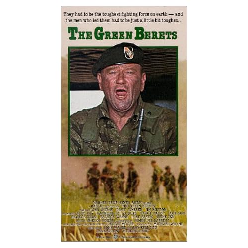
Wow... Of all the great shots in that film, they decided on that frame for the cover?
The Duke looks like he just got punched in the gut!
Or he's about to puke...
Or both.
ray_afraid said:
Wow... Of all the great shots in that film, they decided on that frame for the cover?
The Duke looks like he just got punched in the gut!
Or he's about to puke...
Or both.
Yeah that was my reaction too. I feel like it had to have been a joke, like the people making the box art wanted to see how ridiculous of a cover they could get away with using.
The Person in Question

Thought I would check out the DVD of Murder By Death (1976) as I had not seen the film in a while. The old VHS featured the poster art but the DVD....

Bantha Poodoo !

You guys should check some of those Asian bootleg DVDs and VCDs. The cover art and translations on those are WTF treasure troves!

Back cover is alright but the front, wow.
VIZ TOP TIPS! - PARENTS. Impress your children by showing them a floppy disk and telling them it’s a 3D model of a save icon.

Honorable mention goes to:

While they look sleek at first glance, an iota of scrutiny reveals a failure to stick to any real theme. Yoda for AOTC just makes no sense when the rest are villains.
Generic Stormtrooper instead of Boba Fett? Heck, if they wanted to stick to big bads they could have used Tarkin for SW and then Vader for ESB.
Ultimately, lazy floating head designs are always a fail.
Bonus points for dropping the episode numbers. But points docked for just slapping STAR WARS on each with the film's title underneath. Each cover should have had the film's title as a logo:


The front cover (Based on the poster) is fairly lame but the real problem is the back. It's like the guys who designed it wanted to put you off buying the movie. The artwork lists it as 4:3/stereo/no-special-features. When you pop the disc in it's actually 16:9/5.1/commentary/deleted-scenes/making-of/easter-egg/trailer.
VIZ TOP TIPS! - PARENTS. Impress your children by showing them a floppy disk and telling them it’s a 3D model of a save icon.

Tobar said:
Honorable mention goes to:
I'd love to stick them all in an incredibly hot furnace together and watch the faces distort into hideous forms as the metal cases melt down into one big pile of molten goo.

Tobar said:
Honorable mention goes to:
While they look sleek at first glance, an iota of scrutiny reveals a failure to stick to any real theme. Yoda for AOTC just makes no sense when the rest are villains.
Generic Stormtrooper instead of Boba Fett? Heck, if they wanted to stick to big bads they could have used Tarkin for SW and then Vader for ESB.
Ultimately, lazy floating head designs are always a fail.
Bonus points for dropping the episode numbers. But points docked for just slapping STAR WARS on each with the film's title underneath. Each cover should have had the film's title as a logo:
I'll give them a pass for the title logo because the prequels would have felt really left out (not that that matters, but I understand the want for consistency).
Still the title design could have been a lot better. The colors on the main logo look sort of cheap. And why not use TFA's Serif Gothic font for the film titles? Just a thought, but it would have looked cool.
Anyway the characters included are an obvious dumb. Though I'll admit some of them actually look pretty good (Maul, Grievous, Vader). Yoda looks like shit, and so does Palps for that matter.

Oh my god! Terrible cover!!!!!!!!! It hurts my eyes!
Oh, and BTW, if you ever stumble across a copy of the above, for the love of all things holy, DON'T BUY IT. I bought a copy second-hand, and I still feel ripped off.

DuracellEnergizer said:
Oh, and BTW, if you ever stumble across a copy of the above, for the love of all things holy, DON'T BUY IT. I bought a copy second-hand, and I still feel ripped off.
Too late, I have it too!
“First feel fear, then get angry. Then go with your life into the fight.” - Bill Mollison
I cry for both of us.
I know some people don't like this film, but this cover is very bad!
“First feel fear, then get angry. Then go with your life into the fight.” - Bill Mollison
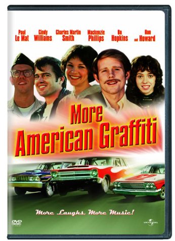
That image of Ron Howard with a mustache is broadcasting creepy vibes.

It's uncle Paul Harghis!
Suuuuuure....


Tobar said:
Honorable mention goes to:
While they look sleek at first glance, an iota of scrutiny reveals a failure to stick to any real theme. Yoda for AOTC just makes no sense when the rest are villains.
Generic Stormtrooper instead of Boba Fett? Heck, if they wanted to stick to big bads they could have used Tarkin for SW and then Vader for ESB.
Ultimately, lazy floating head designs are always a fail.
Bonus points for dropping the episode numbers. But points docked for just slapping STAR WARS on each with the film's title underneath. Each cover should have had the film's title as a logo:
I don't mind those, though I wish the character choices were a bit better. I would have gone:
Episode I: Darth Maul
Episode II: Jango Fett
Episode III: Either Darth Vader or Palpatine
Episode IV: Either Darth Vader, Tarkin, or Trooper
Episode V: Boba Fett
Episode VI: Either Darth Vader or The Emperor
Not enough people read the EU.
