
- Time
- Post link
Oh, I've used Fraps myself sometimes but never got any black level problem.
Anyway, your color correction is still very visible in the after-pics.

You_Too said:
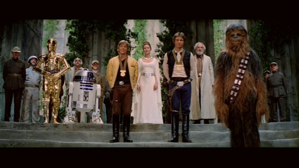
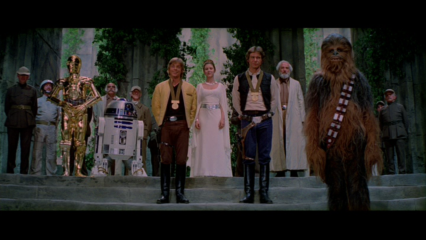
Why does all the before-pics have a black level of 15? Makes them look very grey. Either something is wrong with the source you're using or something is wrong with the way the screenshots have been captured.
Thanks for pointing that out. I don't really have any tools for doing this sort of thing properly, so the only thing I had on hand was Fraps. That is what lightened the black levels, and from what I can see it lightened everything pretty much evenly. So the comparison isn't entirely accurate, as the brightness of the source should be about 15 points lower.
You probably don’t recognize me because of the red arm.
Episode 9 Rewrite, The Starlight Project (Released!) and Terminator Ultimatum,
Oh, I've used Fraps myself sometimes but never got any black level problem.
Anyway, your color correction is still very visible in the after-pics.
I wonder what could be causing that shift if it isn't Fraps. What software did you use to play the DVD? I used KMPlayer to play the DVD from the hard drive, that may be the problem. This lightening may also cause the white levels to be crushed in bright scenes, such as the burning homestead scene. I guess I should experiment some more with some better software.
You probably don’t recognize me because of the red arm.
Episode 9 Rewrite, The Starlight Project (Released!) and Terminator Ultimatum,

Digital video luminance levels are stored in a range from 16-235, or something like that, and when decoded/displayed should be stretched out to 0-255. Looks like something didn't work right somewhere in the chain.
DE
My venerable Premiere Elements crashed on me, and despite reinstalling the software, starting my XP 64bit in safe mode, and rolling back my video driver, it seems to be dead. Incidentally, if anyone knows how to fix
"The exception unknown software exception (0xc0000005) occurred in the application at location 0xOc7f10e3."
please let me know. In the meantime, I got the program to run in compatibility mode on a windows 7 machine, and cranked out this sample tonight:
Here's the original 2004 DVD frame for comparison:
Enjoy!
You probably don’t recognize me because of the red arm.
Episode 9 Rewrite, The Starlight Project (Released!) and Terminator Ultimatum,

frank678 said:
Re: the flatness of faces, i wonder if in part this has to do with the fact that they used gauze in front of the lens (which i read about in the making of star wars book) to give the film a soft retro look.
No, it is from botching the scanning and subsequent grading. Film has so much latitude for peak whites to be 'whiter than white', such as the specular highlights on a chrome bumper, the little highlights in people's eyes etc. are what make film seem alive.
When you scan it, if you don't take into account the toe and shoulder of the film, you end up setting your white point at for example at 255/255/255 (in 8bit) and have nowhere to go for the bits of the film that are whiter than that. This leaves you with flat, leathery looking faces and no life in the eyes and a matte feel to everything in the film, and crushed blacks.
When we used to do conversions, black was set at 95 and white was set at 685 (the scale was from 0-1023) that left lots of headroom for lovely shadow detail and lively highlights off the skin, eyes, metallic surfaces etc.
Donations welcome: paypal.me/poit
bitcoin:13QDjXjt7w7BFiQc4Q7wpRGPtYKYchnm8x
Help get The Original Trilogy preserved!
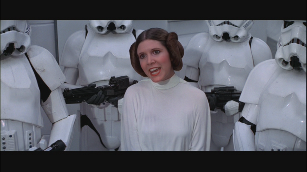
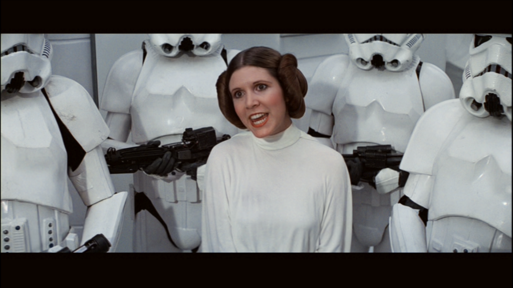
I've probably crushed some blacks again, and I'm still using the old source for lack of a better method and the aforementioned technical difficulties, but I'm more interested in getting the colors right at this point rather than the black and white points. Though if anything stands out, feel free to point it out.
You probably don’t recognize me because of the red arm.
Episode 9 Rewrite, The Starlight Project (Released!) and Terminator Ultimatum,

NeverarGreat said:
I've probably crushed some blacks again, and I'm still using the old source for lack of a better method and the aforementioned technical difficulties, but I'm more interested in getting the colors right at this point rather than the black and white points. Though if anything stands out, feel free to point it out.
Great work! For me this is definitely your best result for for this frame, you've managed to get it much closer to the legacy frame. To my eyes in the skintones on the original the faces look a little pink and pasty and you've managed to make them a touch more burnt sienna(or whatever that colour is) which gives them more of a full bodied likelike feel. To me earlier in the thread your second version was too yellow and the first looked too thin in colour. I'd love to see some more frames especially of faces.
Thanks, unfortunately due to the computer problems, I haven't had the time to transfer anything but the final few scenes to the other machine. I'd really like to see what these settings do to the whole movie though, so perhaps I'll get to more scenes later.
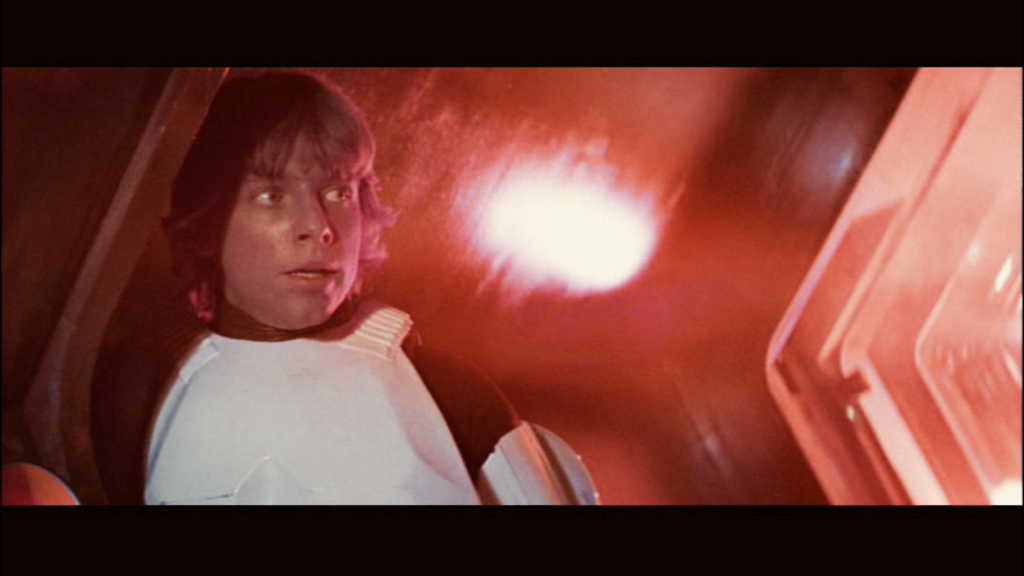
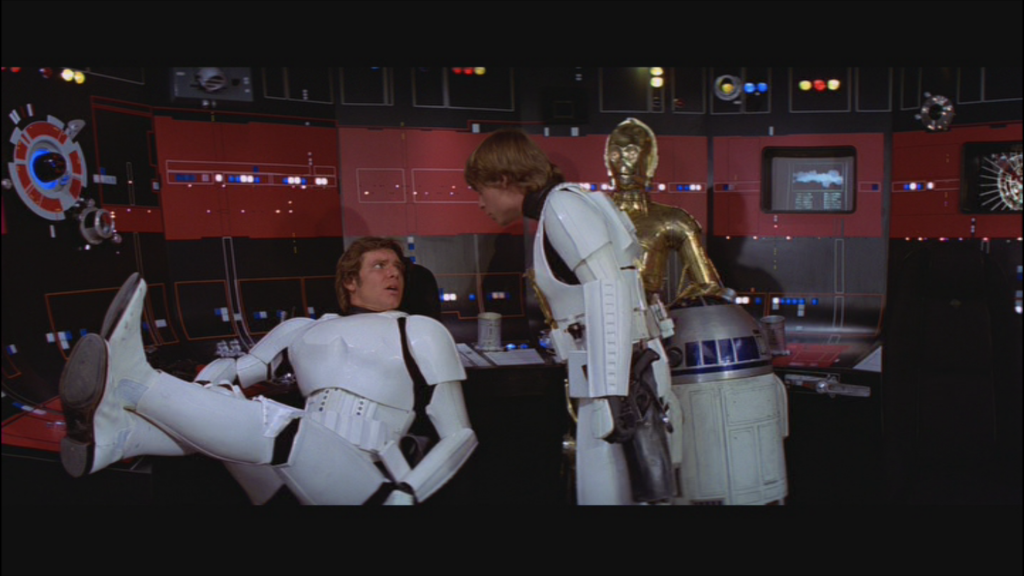
Though I used the same color changes here, the gamma has been boosted while the contrast has been lowered compared to the final shot of the movie. This is because the final shot is darker than the previous scene, and I didn't want to blow out any highlights. Looking at these again, I could probably bring the brightness down a bit without crushing the blacks.
I'm still not entirely happy with the color here, I think that it should probably be slightly more red. However this is really difficult to do without it bleeding into other parts of the image, or giving the entire movie a reddish cast.
JEDIT: Here's an updated frame:
You probably don’t recognize me because of the red arm.
Episode 9 Rewrite, The Starlight Project (Released!) and Terminator Ultimatum,

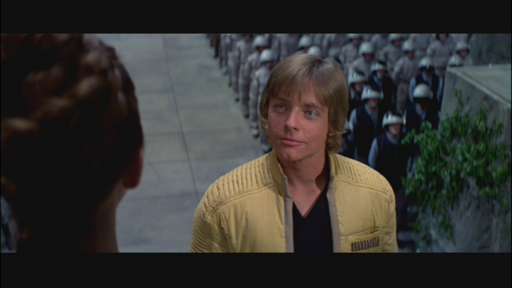
So far pretty good, I've always maintained the 2004 DVDs wouldn't be so bad to watch if the color correction wasn't so god awful.
Can you post your result for this frame or near abouts?
I looked again at the throne room frame and its pretty much spot on to the legacy!!!
Sorry Frank for not getting back to you, I've been working on what will be the final version, at least for me.
Here's the link to the 60 or so screenshots for that version:
http://s649.photobucket.com/user/NeverarGreat/library/Star%20Wars%20Color%20Correction%206%206%2013%20Exposure?sort=3&page=1
or if that doesn't work:
http://s649.photobucket.com/user/NeverarGreat/slideshow/Star%20Wars%20Color%20Correction%206%206%2013%20Exposure
Password: starwars
This final shot now has the same lighting and color settings as every other shot in the movie. This was possible because of Premiere Elements 11 which I bought yesterday, and I found new settings for contrast and exposure that worked wonders for the lighting. The color settings have been adjusted as well, most notably increasing the lightness of the foliage in the above shot.
These settings minimize certain persistent problems with the movie, such as pink flashes:
Blue flashes:
And the general strange color casts of the movie:
The settings for the project in Adobe Premiere Elements 11:
Final Movie Settings:
Adjustments:
Lighting:
Contrast 20
Exposure 70
Effects:
Image Control:
Brightness -1
Saturation 75
Channel Mixer:
100
50
-45
-2
3
126
-20
-5
-10
24
90
-6
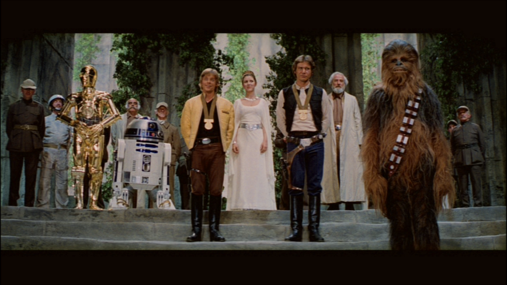
And here's a shot that showcases many of the problems of the movie:
Sorry about the picture heavy post. I just want to show you all the screenshots, so go to the link!
You probably don’t recognize me because of the red arm.
Episode 9 Rewrite, The Starlight Project (Released!) and Terminator Ultimatum,

Just went over to the link with the 60 odd screenshots and I can definitely see a big improvement! They look fantastic!
This is a really nice adjustment. It's a tricky business trying to undo the heavy pinks and get natural flesh balance back in there and get it perfect with one setting with all the ups and downs in balances in the film. Looks like you've nailed down a really nice setting here. You might consider releasing this, from my experience with the version of Gout I just made, its hard to demonstrate the radical effect each specific tweaking has on the feel of the whole film from stills alone.
I'm not familiar with your project, do you have a thread somewhere?
As for releasing this project, it began as just an experiment to see if the entire movie could benefit from a single change of color and lighting settings. I think that this experiment was a success, because I can't find a single scene that did not improve in some way from this change. The settings have been made available here on this thread so that anyone who wishes to recreate this effect can do so. It would be very cool if someone with more patience and expertise than myself uses this as a starting point for their own restoration from the DVD or better yet the Blu-ray, as it is from the same video file.
I hope this information is useful. Incidentally, here is one more configuration which I found after uploading the screenshots, that I think is the best so far:
Adjust:
Lighting: Contrast 30, Exposure 100
Applied Effects:
Image Control: Brightness -5, Saturation 78
Channel Mixer:
98
46
-38
0
5
122
-20
-2
-10
24
89
-3
You probably don’t recognize me because of the red arm.
Episode 9 Rewrite, The Starlight Project (Released!) and Terminator Ultimatum,
The above are my final channel mixer settings. However, I was playing around in Premiere and found these lighting settings brightened the entire movie while keeping the highlights intact:
Adjustments:
Color: Saturation -20
Lighting: Brightness -10, Contrast 60, Exposure 90
Gamma 8
Effects: Image Control: Brightness -5, Saturation 100
No link to an album as of yet, but as the color has not substantially changed, the images are basically unchanged except for a slight increase in brightness.
You probably don’t recognize me because of the red arm.
Episode 9 Rewrite, The Starlight Project (Released!) and Terminator Ultimatum,

This actually looks awesome! Will you do a complete DVD? I'd love to see a color-corrected version of the 2004 cut

I've been wondering that lately myself! While I don't come close to holding the skills required, I would rather enjoy a color corrected set of the blu releases.
Thank you for your support, I'm glad you like it.
However, I just don't have the technical know-how to make a DVD release of this project, and my computer can't even handle Blu-rays (although ideally this project would be in Blu-ray quality). This was always intended as an experiment to find out if this movie could be color corrected to an acceptable degree, not a complete DVD or Blu-ray release.
I've been through thousands of combinations of settings in search of something that will work for the entire film, so I hope someone with the technical knowledge will make use of this resource to make a DVD or Blu-ray release.
You probably don’t recognize me because of the red arm.
Episode 9 Rewrite, The Starlight Project (Released!) and Terminator Ultimatum,
I just want to thank You_Too for pointing out that the source I had been working from was not correct. I thought that it would be easy to simply apply the settings from my previous work to the correct source (a demuxed video stream of the DVD), but the difference in brightness screwed everything up.
Sigh.
I started over, discarding my previous work. I ended up using two copies of the video file, layered on top of each other, in an attempt to correct the underexposed source. The settings for the top layer of video, set to "screen" in the opacity menu, are:
Image Control: Contrast: 30
Color: Saturation: -100
The lower video is:
Image Control: Contrast 85, Saturation 85.
Gamma 11
Lighting: Brightness 50, Contrast 30, Exposure 80.
Channel Mixer (top to bottom): 78, 23,-6, 1, 5, 82, 5, 1, -12, 8, 90, 0.
The results are almost identical to the previous attempt, but with a very slight increase in overall brightness and slightly less muddy colors. All hundred or so images are here, password starwars as usual:
Some observations that I had during this project:
It seems like some of the color has been pulled down out of the image, especially in the red and green range. I say this because when upping the red and green constants in the channel mixer, the Death Star interior suddenly looks correct. The walls, which have little color in them to start with, are definitely more blue than normal in the DVD. Adding this red and green "fills in" this color, making them much more even and natural looking, especially in the shadows. I didn't want to add too much color here, but the difference is noticeable:
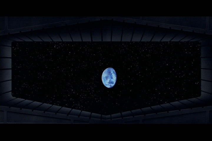
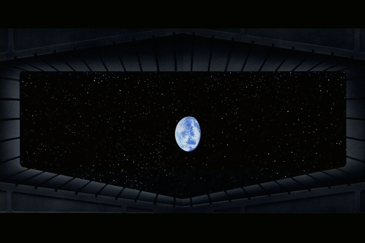
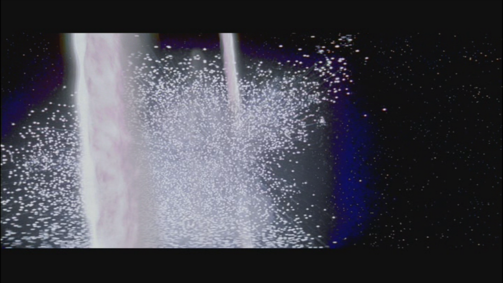
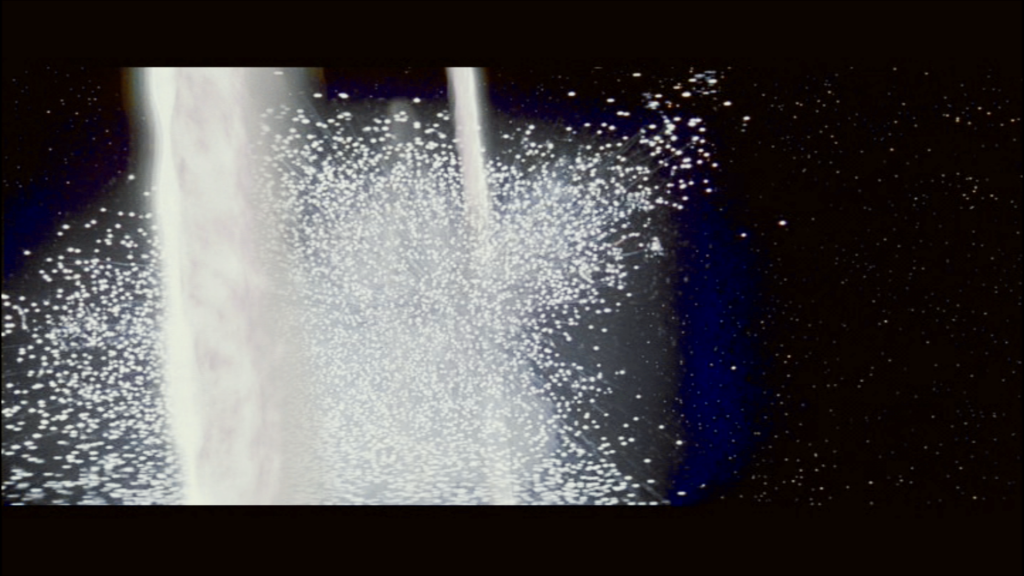
The starfield is also noticeably brightened.
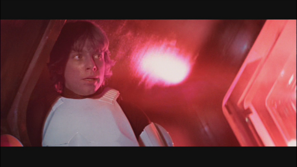
The reds were blown out in the DVD, so dialing them back and increasing the brightness did wonders:
The Binary Sunset looks much better, the red lights throughout the movie are accurate, and the pink flashes are much less noticeable, mostly because of the somewhat repaired highlights.
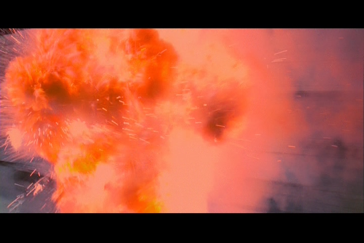
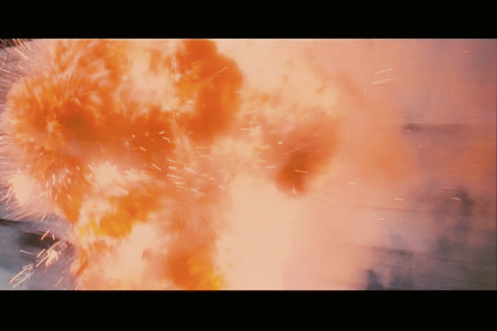
The downside to these settings is the burning homestead scene, which was actually too bright in the DVD. I settled for not technically clipping anything in that scene, although it definitely looked better before. This is where the limitations of the source become apparent. In the above explosion, the GOUT shows some highlights that simply do not exist in the DVD. Most other issues can be solved by a scene by scene correction, but crushing the lowest and highest parts of the image simply cannot be corrected entirely. However, there is still some wonderful detail hiding in there, and I hope that these settings are at least taken into consideration by other correctors out there (now that the source is correct, that is)!
You probably don’t recognize me because of the red arm.
Episode 9 Rewrite, The Starlight Project (Released!) and Terminator Ultimatum,

The second image in the album (this one), looks like it came from Team Negative1's LPP print, note the green stain and the frame edges.
TheStarWarsTrilogy.com.
The007Dossier.com.
Donations always welcome: Paypal | Bitcoin: bc1qkpytnklvlg7yhm4u35xxa6w653f5da9d96p34e
Williarob said:
The second image in the album (this one), looks like it came from Team Negative1's LPP print, note the green stain and the frame edges.
Aye, it did. That album has last year's attempt at a correction, as well as that attempt to repair the Negative1 frame, among with some other miscellaneous items. The most recent album is titled "7-9-13 Star Wars Color Correction", that shows the final effort, and has almost a hundred comparison shots in it.
You probably don’t recognize me because of the red arm.
Episode 9 Rewrite, The Starlight Project (Released!) and Terminator Ultimatum,
My eyes like what they see :-) Any chance "somebody" will use the settings and create a full DVD ?
NeverarGreat said:
Williarob said:
The second image in the album (this one), looks like it came from Team Negative1's LPP print, note the green stain and the frame edges.
Aye, it did. That album has last year's attempt at a correction, as well as that attempt to repair the Negative1 frame, among with some other miscellaneous items. The most recent album is titled "7-9-13 Star Wars Color Correction", that shows the final effort, and has almost a hundred comparison shots in it.
Ah, that makes sense: Williarob's looking in the wrong folder again... But for a moment there I thought there might be another version of Star Wars that had a green stain on it in that scene.
TheStarWarsTrilogy.com.
The007Dossier.com.
Donations always welcome: Paypal | Bitcoin: bc1qkpytnklvlg7yhm4u35xxa6w653f5da9d96p34e