logo Sign In

SW fonts — Page 6

Author
Time

XyZ said:

negative1 said:

Sluggo said:

I thought I posted these before, but I don't see those around. Anyways, I'm bumping the thread to get some action on the font scene again.

http://i10.photobucket.com/albums/a117/Sluggomatic2000/Fonts/distanggalaxyfont.jpg

i like this font..


could use it for an upcoming project.


later

-1

 What project ?...

... Snack Bars ?

mmm... chocolate bars..


oh sorry..


later

-1

[no GOUT in CED?-> GOUT CED]

Author
Time
 (Edited)

@ DavidBrennan

I do think there have been graphists who reworked these famous fonts at the time they designed the posters. If you want to make it authentic, just get the higher res scan you can get of the 80's logos. There's no other ways to have them 100% accurate. I never found the least copy or custum logo wich was accurate. And I can tell you people really appreciate these logos when you use the good ones.


Author
Time

XyZ said:

@ DavidBrennan

I do think there have been graphists who reworked these famous fonts at the time they designed the posters. If you want to make it authentic, just get the higher res scan you can get of the 80's logos. There's no other ways to have them 100% accurate. I never found the least copy or custum logo wich was accurate. And I can tell you people really appreciate these logos when you use the good ones.

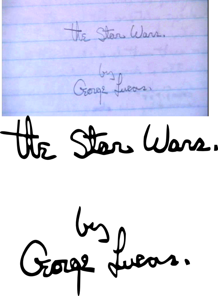
Okay.  I'm not going to be using that same text, though.  (If I were, I'd turn it into a .SVG by using Gimp  >  Selecting the Text  >  Selection to Paths (Curves).) 

So....I guess what I'll do instead is write the text out in Times new Roman that I will be using ("& False Flag Terror") and then customize the endpoints of the letters by copying-and-pasting the endpoints of the letters from the ROTJ logo.

Author
Time

You can also search for LP covers scans, not only the soundtrack, but the Story of Star Wars LP (if you want the rectangular box logo). Some posters are good too, but once the best I found was on one of those LP's. Might be a long search Googling every keyword that comes in your mind, "LP" or "Vinyl" being sometimes not enough for digging those high res pictures.


Author
Time

There is a difference between Times Roman and Times New Roman and I believe the ROTJ logo used the first one, at least as a basis.

And in the time of greatest despair, there shall come a savior, and he shall be known as the Son of the Suns.

Author
Time

Nod.  Times *New* Roman is a Windows 3.1 system font - it's not likely it would have been used before Windows 3.1 even existed.

"Right now the coffees are doing their final work." (Airi, Masked Rider Den-o episode 1)

Author
Time

Does anybody know what the precise angle the opening crawl is relative to the camera is? 


If not, I'm pretty sure I could figure it out.

Author
Time
 (Edited)

In re-creating the opening crawl, I had a hillbilly way of trying to emulate the angle of the text from the camera: I screencapped the ROTS opening crawl, then had a dummy rectangle, and tilted that back until the vertical lines were parallel.  It appears that 75 (or 15-degrees raised from the ground) is the proper angle of the text:

If anybody knows of a more precise way to measure this, I'd definitely be happy to hear them (just to refresh my geometry, which has clearly gone soft!) 

Author
Time

I'm fairly certain it's slightly different for every film.  Maybe not for the PT, but most likely for the OT (I'm sure the 77 and 81 SW crawls are different from one another, too).

Author
Time
 (Edited)

DavidBrennan said:

Does anybody know what the font is (or a good approximation of it) for the 'Return of the Jedi' text in the original ROTJ logo?

(I now see that Times New Roman has been cited.  If anybody has a better suggestion, please share it.)


 Just stumbled across this by accident.


See... There's quite a difference to me. I don't have the technical vocabulary in English to comment further.

edit: seems there are a lot of boxes like puzzles or toys from wich you may find high res scans through Google.


Author
Time

Times New Roman is so freaking close. I traced over the logo for the improved Returning to Jedi logo, and its only really off by a few pixels when you get the right kerning.

Star Wars Revisited Wordpress

Star Wars Visual Comparisons WordPress

Author
Time

Whenever I've recreated a crawl I've assumed the camera to be parallel with the crawl, and then offset the render. So all you have to tweak is the offset (easy, because you can extend the sides of the crawl to find where the vanishing point should be), the FOV and perhaps the vertical scale of the crawl image itself.

DE

Author
Time

doubleofive said:


Times New Roman is so freaking close. I traced over the logo for the improved Returning to Jedi logo, and its only really off by a few pixels when you get the right kerning.
You know, its possible the file I lined up could be a recreation with Times New Roman. I may have to investigate further.

Star Wars Revisited Wordpress

Star Wars Visual Comparisons WordPress

Author
Time

This doesn't really count as a Star Wars font, but I made George Lucas's signature on his handwritten Star Wars script into a .SVG for a project I'm working on.  (Well, really, I didn't need it anymore, but I like giving myself arbitrary tasks to become more comfortable with Inkscape, the free andopen-source vector art program.)

So the signature is in .SVG format so, if I were still going to use it, I could have extruded it out into 3D and also scaled it up infinitely.


Author
Time

Sorry for bumping an old thread but does anyone know what this font is?

Thanks

Author
Time
 (Edited)

I'm pretty sure it's Trajan Pro, you probably still have it... you used it for the old SW DVD menus IIRC.

We want you to be aware that we have no plans—now or in the future—to restore the earlier versions. 

Sincerely, Lynne Hale publicity@lucasfilm.com

Author
Time

That's definitely Trajan Pro. That and Albertus were the two big fonts used for the prequels.

Author
Time

Does anybody knows what font is used on the GOUT DVD R1?

Author
Time

I'm pretty sure most DVD subtitles are actually generated by the player, so they'd be different depending on how/where you watch it.

Star Wars Revisited Wordpress

Star Wars Visual Comparisons WordPress

Author
Time

Nope, closed captions are output device generated, but subtitles are just bitmaps.  Looks kinda Trade Gothicky to me, which seems consistent.  The lowercase "f" isn't quite right though, but a perfect match may not be possible, especially considering how it's scaled down and probably stretched due to the DVD format.

Project Threepio (Star Wars OOT subtitles)

Author
Time

I've seen a font on a lot of DVDs that looks like Syntax LT but don't quote me.

"Right now the coffees are doing their final work." (Airi, Masked Rider Den-o episode 1)