Great stuff indeed Cerbero! I love all these covers! Am I the only one who thinks the official ones are photoshopfugly?
One thing though, I'm pretty sure the TR47 set doesn't have the commentary. Whoops, somebody already mentioned it! Sorry! The original Star Wars trilogy: Our cultural history deserves to be preserved and should be available to the public like all great works of art!
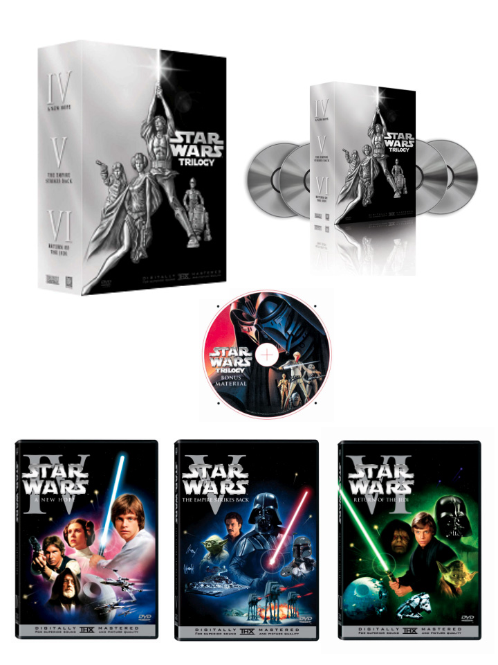
Originally posted by: sweyland Great stuff indeed Cerbero! I love all these covers! Am I the only one who thinks the official ones are photoshopfugly?
One thing though, I'm pretty sure the TR47 set doesn't have the commentary.
No Sweyland, I think the official covers are atrocious, and if you buy the widescreen versions, the spines on the two sets won't match together at all. I don't know what the Lucasfilm art department was smoking when they designed those, but apparently it wasn't good. And Cerbero, good work! I'm half-tempted to use them (I've already got two different cover designs for my set from Rikter, but I might consider yours. I'm just trying to decide if I want mine to match with my prequel DVDs, or if I want to go with some other option, like Rikter's Japanese LD-inspired art or the THX covers or yours, Cerbero. Keep it up!
On the side: if I was an artist, I'd do this, but...I know somebody made up some chapter inserts awhile back, but they weren't sized properly seem to work the best. If someone would be interested, I would tag-team with them on making a set of inserts--they could make the artwork, I'd come up with chapter titles that are more than just dialogue (I could only do this with the anamorphic set, though, since that's all I have). I would probably take my titles from the soundtracks and other sources. We could also add some additional text with some pictures...perhaps the production notes word-for-word, or some info on the different releases of the trilogy. Heck, we could also insert OriginalTrilogy.com in it somewhere... Let me know if you're interested, because chapter inserts would make our sets a bit more professional feeling.
My Blog Currently Reading: Shatterpoint, by Matthew Stover Unrepentent Nader Voter
That's a great idea Galahad. We already have a great bunch of covers to choose from, but not many inserts. I wish I could help, but unfortunately I'm no artist either. And where do you get all the high resolution art anyway?
So who's up to the challenge? The original Star Wars trilogy: Our cultural history deserves to be preserved and should be available to the public like all great works of art!
Originally posted by: sweyland Am I the only one who thinks the official ones are photoshopfugly?
No, your not. I don't care for the style of the prequel DVD covers either. And I am amazed and baffled by all of the people who are praising these covers because they match the prequel covers. I prefer my OT to look as little like the PT as possible, thank you very much.
thedalek & sweyland: Whoops! Fixed it, thanks for pointing that out
thedalek: I'm toying with the idea of making my own hard paper box to put the keep-cases in, like the one in the official Indiana Jones set. Should be possible... If it's not though, I might do one for a quad keep-case instead.
BTW, I agree on the official DVD covers, they're awful. Looks like they're made by some kid who's just learning Photoshop having a field-day - with the glows and the lens-flares etc.
Hey Cerebro. These are great covers. I'm definitely going to print these out. I haven't decided which set I am going to use though.
The only thing I noticed about them, was that in your description for the featurette "How the Walkers Walk", the word "create" is mssing the "e" on the end. I think this is on both of the supplemental covers (though I only downloaded the anamorphic versions.) Anyway, it's just a quick fix. Usually on my covers, I have about 50 typos.
These official covers are ridiculous, as I've said before. They're a joke; I mean, does anyone else find those little halos on the lightsabers annoying and pointless?
Maybe Cerebro and some others could make covers for the official releases for those who are going to buy them and yet hate the artwork. My Blog Currently Reading: Shatterpoint, by Matthew Stover Unrepentent Nader Voter
It pisses me off that the Mark Hamil on ANH cover is from post Empire, Luke in 'Jedi' looks shit......actually they all look shit. I was never that happy with the covers on 1 & 2, but man, these are pretty shit.
Galahad... I agree the halos are overdoing it a bit. Did anyone else happen to notice how there is a blue saber on ANH with a red glow around everyone, a red saber on ESB with a blue glow, and a green saber on ROTJ with (imagine that) a green glow. Why not have the glow correspond to the saber color on ANH and ESB like it does on ROTJ? "You fell victim to one of the classic blunders, the most famous of which is 'Never get involved in a land war in Asia'." --Vizzini (Wallace Shawn), The Princess Bride ------------------------- Kevin A Webmaster/Primary Cynic kapgar.typepad.com kapgar.com
Originally posted by: Bossk Cerbero... nice covers.
Galahad... I agree the halos are overdoing it a bit. Did anyone else happen to notice how there is a blue saber on ANH with a red glow around everyone, a red saber on ESB with a blue glow, and a green saber on ROTJ with (imagine that) a green glow. Why not have the glow correspond to the saber color on ANH and ESB like it does on ROTJ?
No clue. But then again, how much of this trilogy release makes much sense, anyway?
My Blog Currently Reading: Shatterpoint, by Matthew Stover Unrepentent Nader Voter
Can't believe this is the official artwork - it look so childish!! Agree that that lens flare looks very tacky indeed! What's happening to George Lucas these days? Presumably he OK'd these?! Doh! I was really hoping for some cardboard slip boxes (like UK edition of Fight Club) with the original theatrical posters reproduced in every detail. Oh well..... :-(
I was wondering if anyone would be willing to produce some REALLY retro 70's style (i.e. rounded corners galore!!) original trilogy dvd covers? I know the THX faces edition is (currently!) the best way to experience the non-SE trilogy, but even closer to the version we all would have seen at the cinema were the widescreen Fox LD releases in 1989. Fair enough there's loads of dirt and stuff on the print.. but in a way I kind of like that! This is how I remember it at the cinema - dust specs and all! Call me strange, but I'd rather have the dust and scratches but with a pin sharp picture, rather than the THX versions with so much digital dirt concealment that the image loses it's clarity, and you get that weird digital smearing effect on some fast moving objects - yuck!! Also the 1989 LD version has the original 70mm soundtracks (plus C3PO's line of dialogue which was missing from the THX versions). Star Wars on the faces edition LD's was totally remixed by Ben Burtt, with a few new sound effects added in that certainly weren't there when we all saw it in the cinema! The other two films were just cleaned up, but not remixed.
Once my Laserdisc player has been given a proper service, and calibrated up to the highest standards by a professional, then I'll be archiving these original editions onto DVD-r's... I'll keep you posted! It would be grand to have some retro DVD covers to go with this set though - the funkier the better!!!
The challange has been set - so put on yer flares, cue up yer Star Wars Meco LP and get designing folks!!
On the TR47 set I've put "Fullscreen Version 4:3", and on the Anamorphic set I've put "Widescreen Version 16:9", so it's supposed to be that way. Maybe a misuse of terminology... Did anyone else react to it?
TR-47's set is fullscreen? I hadn't heard that before, but maybe I'm just confused. My Blog Currently Reading: Shatterpoint, by Matthew Stover Unrepentent Nader Voter
They are anamorphic. George Lucas seems to be a big supporter of widescreen televisions. The prequel DVDs have all extras in anamorphic widescreen and the Clone Wars cartoons were framed in widescreen.
Fullscreen would be incorrect. TR47 is simply widescreen or letterbox format of 2:35:1. It is not ANAMORPHIC. When you start talking about Fullscreen that is a cropped image formated to fit a TV screen.
TR-47's set apparently has somewhat better picture quality than the anamorphic sets, since it doesn't contain all of the little extras of the anamorphic, like the menus, commentary, production notes, and the like. My Blog Currently Reading: Shatterpoint, by Matthew Stover Unrepentent Nader Voter